This article is brought to you by Datawrapper, a data visualization tool for creating charts, maps, and tables. Learn more.
No perfection, just the best possible compromise
Isotype, explained

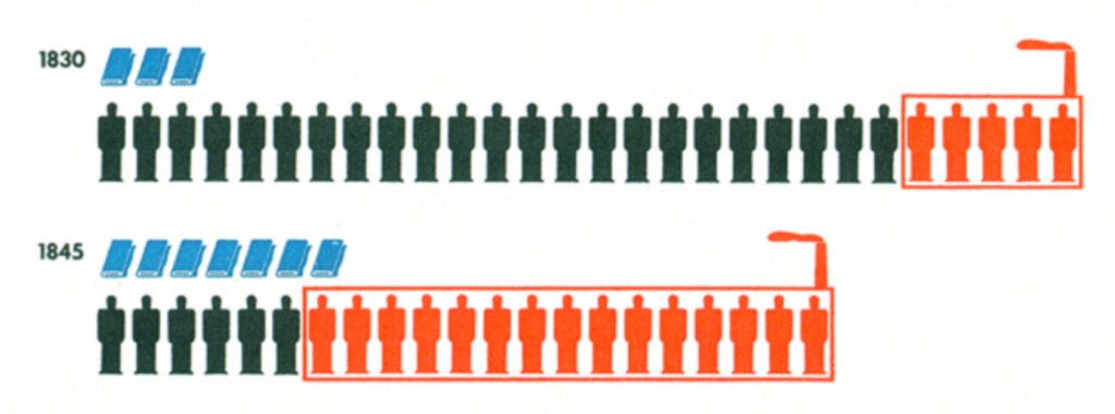
This week’s Weekly Chart is a bit of a show-off – and a history lesson. Last weekend, my coworkers Gregor and Ivan and I visited the Information+ conference in Potsdam, close to Berlin. The first day started with a reminder of the Isotype method. It’s a style of presenting information developed by Otto Neurath in Vienna in the 1920s and 30s. Neurath used pictograms to show data, like this:
After hearing about it at the conference, Gregor said during the break: “You know, you could do that with our new locator maps.” I was🤯. But he was right. Here it is:
We can see that more and more people have lived in San Francisco over the years. The share of Asians increased over the decades, while the share of black people decreased between 1990 and 2010. But in general, the population in the city got more diverse: In 1970, more than 70% of all citizens were white. By 2010, that decreased to half of the population.
Chart Choices
This Isotype chart works in a similar way to a Marimekko chart (which I explained here). Both chart types show the numbers in relative and absolute terms. In the chart above, we can easily spot that in 2010, every fourth person in San Francisco was Asian (blue). But we can also count them exactly: Each cube represents 50,000 inhabitants. Five cubes are blue, that means that 250,000 Asians lived in San Francisco.
As opposed to a Marimekko chart, an Isotype chart doesn’t need hover effects or even number labels to communicate quantities: We just count cubes. Like, you know, when we were three years old. These unit charts are some of the most simple chart types out there and therefore fairly easy to read.
But every simplification comes with a downside: inaccuracy. The population of San Francisco did not develop in neat 50,000 blocks. In 1940, there were 27,000 Asians, not 50,000. And while the chart up there suggests that the Asian population doubled in the next thirty years, it actually more than tripled.
So if you create an Isotype chart, you want to strive for a balance between simplicity and accuracy: If you add more pictograms (like our cubes), it gets harder to read. If you add fewer, it becomes less accurate. Perfection is impossible to achieve. Just the best possible compromise.
If you’re curious to learn more about the Isotype method, I recommend reading “The Transformer: Principles of Making Isotype Charts” by Marie Neurath. She was Otto Neurath’s wife and lifelong collaborator, and coiner of the word “Isotype”. I’ll see you next week!


Comments