This article is brought to you by Datawrapper, a data visualization tool for creating charts, maps, and tables. Learn more.
No more white Christmas?
This is Simon, a software engineer at Datawrapper. For this Christmas edition of the Weekly Chart series, I’m looking at data about snow during the holidays.
Like many people in the Northern Hemisphere, I strongly associate Christmas with snow. During the holiday season, the image of a “white Christmas” is everywhere — in movies, on magazine covers, and of course in that ever-present Bing Crosby song. However, I cannot remember the last time I saw actual snow during Christmas. With this year’s holiday approaching, I was wondering if I had ever witnessed a real white Christmas.
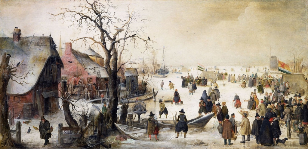
Based on weather data for the Berlin region, my last experience with snow during Christmas must have been in 2010. While snow is part of an idealized image of Christmas, it is actually quite rare here and in many other parts of Europe. The idea of a white Christmas has been traced back to popular depictions of Christmas from the 19th century, such as Charles Dickens’ “A Christmas Carol,” or the popular German Christmas song Leise rieselt der Schnee (“The snow falls softly”). These were likely inspired by a series of particularly cold winters at the end of the “Little Ice Age,” a phase of cooling in the Northern Hemisphere during the 15th-19th centuries. In his Christmas stories, Dickens preserved his own childhood memories of those snow-heavy winters, shaping our idea of Christmas to this day.

But white Christmas is not only a historical phenomenon. There are, of course, regions that still regularly experience snow at the end of December. In Europe, these include the Alps, Scandinavia, the Baltic states, and most of Eastern Europe. And if we go back 50 or even 100 years in Berlin’s weather data, we also see a much higher frequency of snowy Christmases there.
Due to global warming, the chance of snow at Christmas is expected to go down much further in coming years. We are already seeing a significant increase in temperatures, including in Berlin, as well as a decrease in snowfall. For reference, the Little Ice Age saw a relatively moderate temperature change over the course of several centuries. As we are moving towards a world that will be 2-3 degrees hotter at the end of this century, there are likely much worse consequences than a lack of snow in Decembers ahead.
Chart and data choices
These charts are based on Datawrapper’s heatmap tables, with some custom HTML and CSS code to render the axis labels. The charts were inspired by an earlier article by my co-worker Lisa, who used a similar technique to render daily temperature data.
All data used in these charts comes from the German Weather Service (DWD), which provides open data for many weather indicators via their Climate Data Center. For the weather station in Berlin-Dahlem, they provide time series data going back to 1950. There’s also a historic weather station at the same location (Berlin-Dahlem LFAG), with time series from 1892 to 1962. For the 100-year comparison, I combined data from both sources. If you are interested in how I analyzed the data and prepared it for publication, have a look at this Observable Notebook.
As always, do let me know if you have feedback, suggestions, or questions. I am looking forward to hearing from you! You can get in touch with me via Mastodon, Twitter, and my personal website.


Comments