
Julius Tröger, ZEIT Online, will speak about animations, live dashboards, and scroll formats


We’re excited to announce that Julius Tröger from Zeit Online will speak at our Unwrapped conference about “How we ditched D3 and mostly used Datawrapper.”
Julius leads Data and Visualization, an interdisciplinary team of data journalists, designers, and developers, at the German newsroom Zeit Online. His responsibilities include all data journalism projects, extending beyond graphics and interactive tools. When joining Zeit Online in 2018, he brought expertise from his previous role as head of the interactive team at Berliner Morgenpost.
Time to ask Julius some questions:
Hi Julius! What will you talk about at Unwrapped?
A few years ago, we used to code even basic charts from scratch. But we learned that Datawrapper offers many features and workarounds for creating not just simple charts but also animations, live dashboards, and scroll formats. I’ll demonstrate how we utilize these at Zeit Online to enhance our storytelling and data presentation.
How do you use Datawrapper at Zeit Online?
We leverage Datawrapper daily to create charts of news, like the latest polls in Germany, or locator maps of breaking events, like the ship collision in the North Sea. Charts like this are created not only by my team, but also by colleagues from different departments like the economics, politics, or science desks.
On the other hand, we make extensive use of the Datawrapper API and the DatawrappR package. Thanks to them, we can
- automatically update our daily updated energy monitor
- create scrollytelling features, e.g., about housing prices in Germany
- create personalized charts, e.g., to let readers see the rent price trend in their city
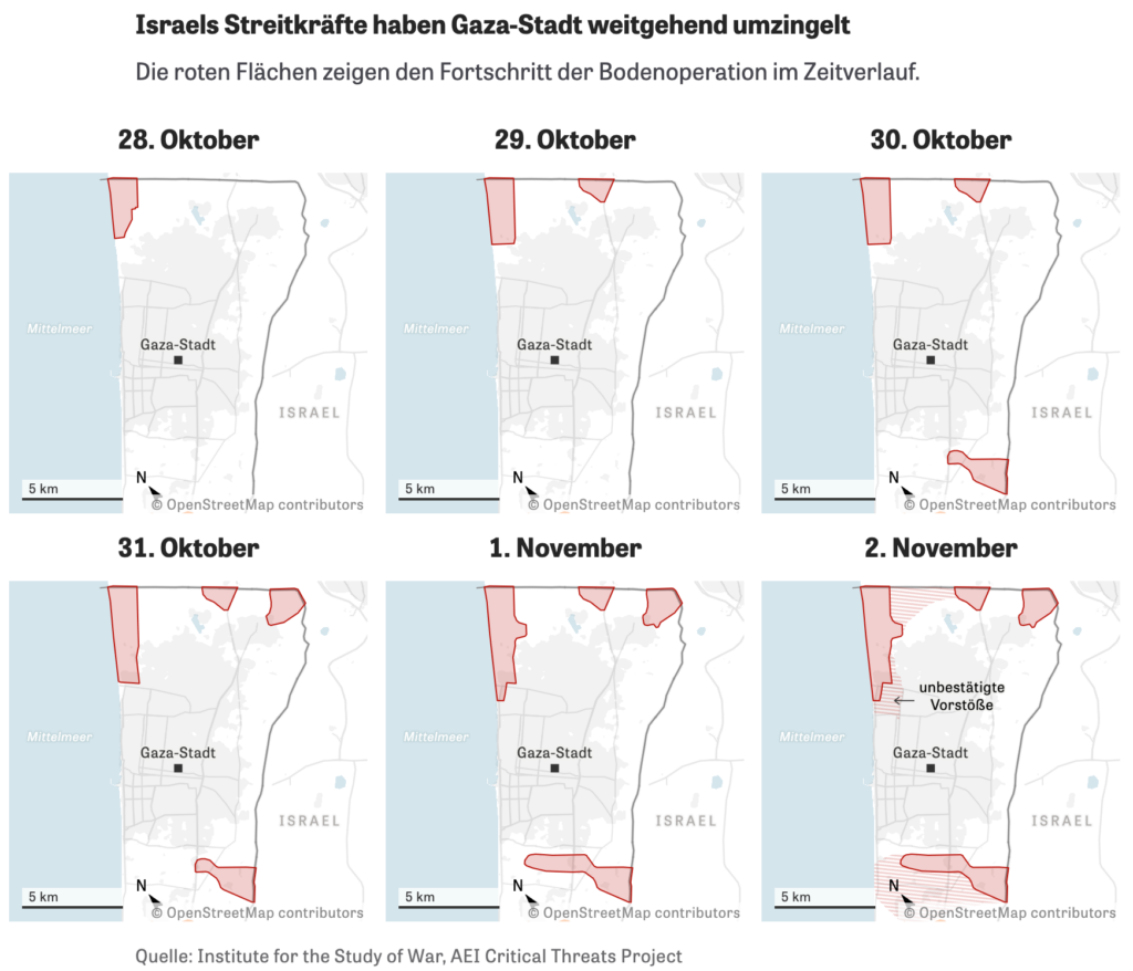
We can also create animations, like this map of changing inflation rates in Europe, and even build small multiples, like about the war in Gaza:
How has data visualization at Zeit developed since you started using Datawrapper?
In the earlier days, everyone at Zeit Online could put Datawrapper charts they created in their articles, resulting in a wide range of quality in the charts we put out. Now we have a process in place: Our team edits every single chart before publishing. This way, we can ensure high standards. We now treat charts with the same care as texts, applying a four-eye principle and involving our proofreading team. With a dedicated Slack channel, we monitor chart creation and editing and support our chart-creating coworkers.
What's your guiding principle when working on data visualizations?
Even as nerds, we strive to create charts that are as unnerdy and nontechnical as possible. Our focus is primarily on line charts, bar charts, and maps. (We create a lot of maps at Zeit Online!)
We also aim for personalization in our charts, addressing the reader's question: "What does this mean for me?" (By the way, since I’m here: it would be awesome to have search features in maps and scatter plots, similar to those available for tables in Datawrapper.)
Noted :) Last question: What's your favorite Datawrapper feature?
The ease of annotating charts and maps in Datawrapper is fascinating. Every chart should be self-explanatory, addressing questions that arise at specific data points and eliminating the need for supplementary text. Datawrapper’s editor makes that really easy.
We're looking forward to Julius' talk at Unwrapped! Until then, you can find him on X, LinkedIn, and Bluesky, and see more of his work at his Zeit Online page.
To sign up for Unwrapped and hear Julius and other great speakers, visit our conference website.
Liked this article? Maybe your friends will too:
NEWSLETTER
Sign up to our newsletters to get notified about everything new on our blog.


Comments