Data Vis Dispatch, May 7

The best of last week’s big and small data visualizations

Welcome back to the 141st edition of Data Vis Dispatch! Every week, we publish a collection of the best small and large data visualizations we find, especially from news organizations — to celebrate data journalism, data visualization, simple charts, elaborate maps, and their creators.

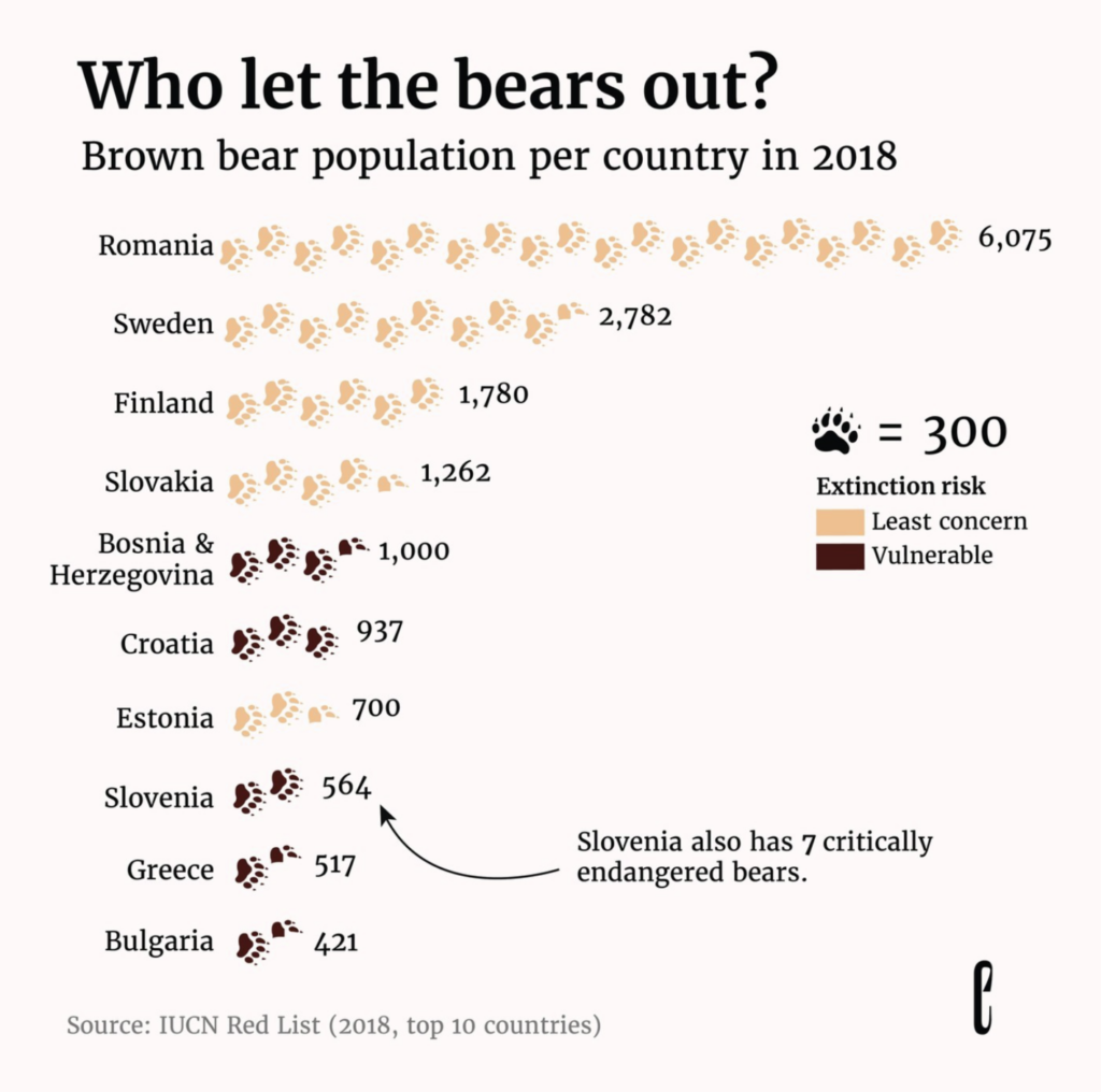
Recurring topics this week include abnormal heat, abnormal wetness, animals of all speeds, and cocaine.

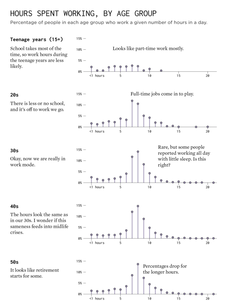
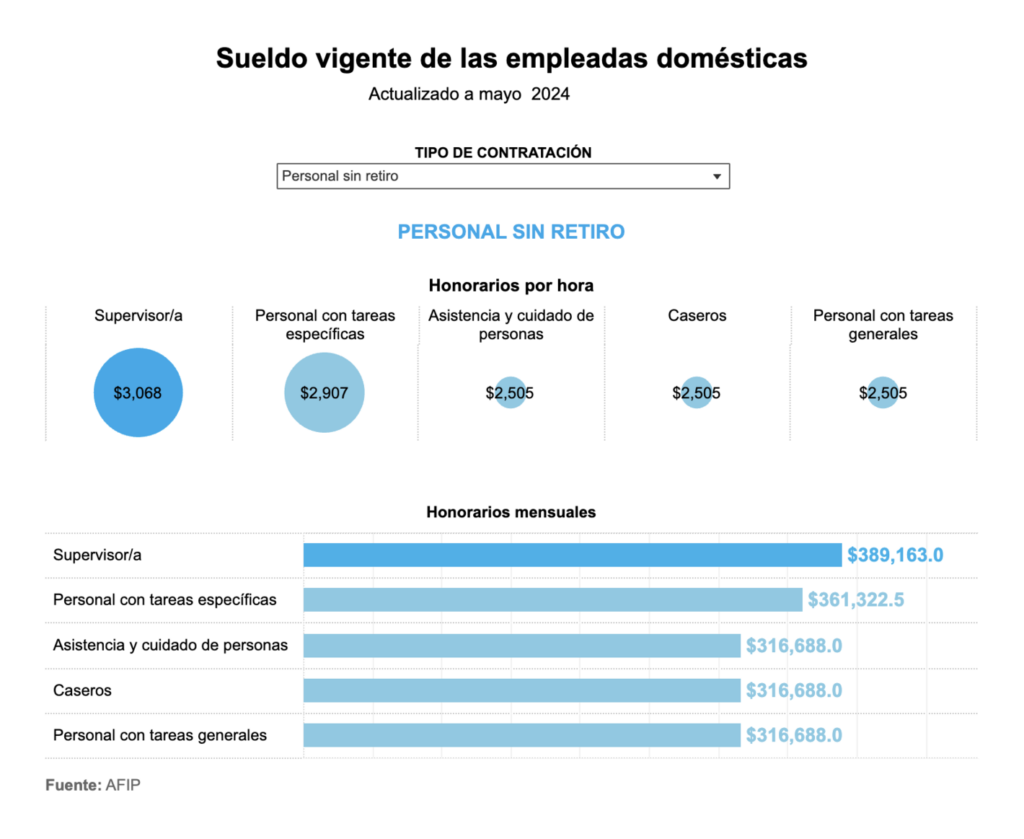
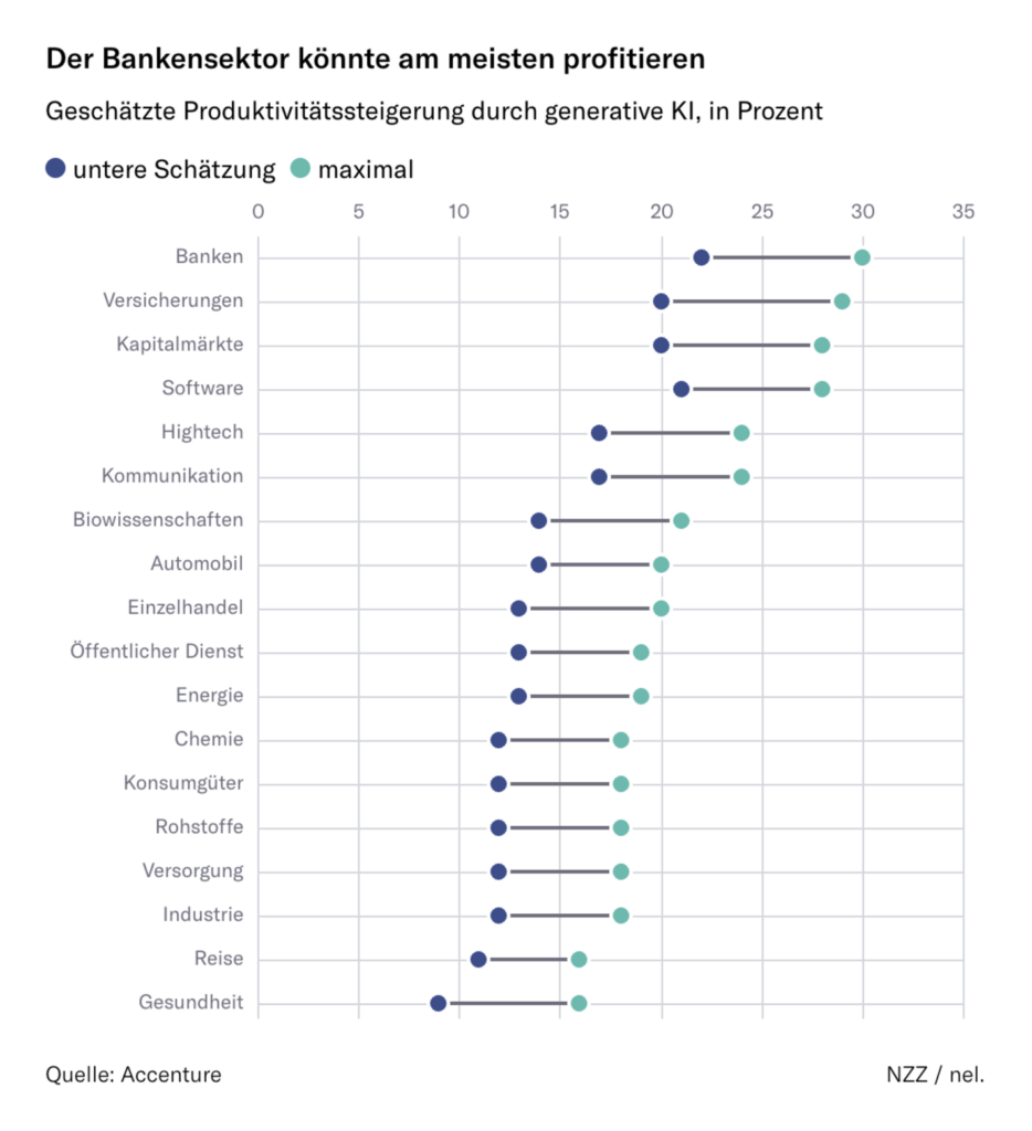
In light of International Workers’ Day on May 1, we found data visualizations on working hours, gender pay gaps, and a remarkable wage increase for domestic workers in Argentina — as well as predictions on how artificial intelligence might change different industries:

FlowingData: How Much We Work, May 2
Financial Times: UK’s gender pay gap will take decades to close at current rate, May 6
La Nación: Cuánto cobran las empleadas domésticas en mayo 2024, May 6
Neue Zürcher Zeitung: Risikojob Akademiker? Welche Berufe am meisten durch KI bedroht sind, May 5

This week also marked World Press Freedom Day. Scandinavia maintained its lead in Reporters Without Borders’ 2024 Press Freedom Index, while Hungary ranks at the bottom of the EU. And let’s take a look at the war in Sudan, which has resulted in the displacement of hundreds of journalists:

Átlátszó: Magyarországon az egyik legrosszabb a sajtószabadság helyzete az EU-n belül a Riporterek Határok Nélkül indexe szerint, May 3
Inkyfada: ARIJ | Guerre au Soudan : les journalistes réduit·es au silence, May 1

As war continues in Gaza, this map shows Israel’s possible plans for the area:

Le Monde: Comment Israël remodèle la bande de Gaza, May 3

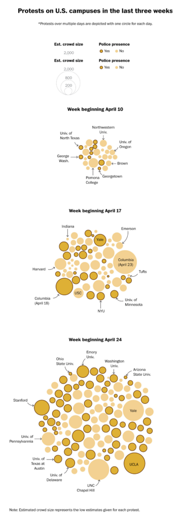
Meanwhile, student antiwar protests, and visualizations of them, only grew larger this week:

The Washington Post: How pro-Palestinian college protests have grown, visualized, April 30
The Wall Street Journal: Hundreds of Protesters Arrested as Universities Blame Outsiders for Escalating Violence, May 1

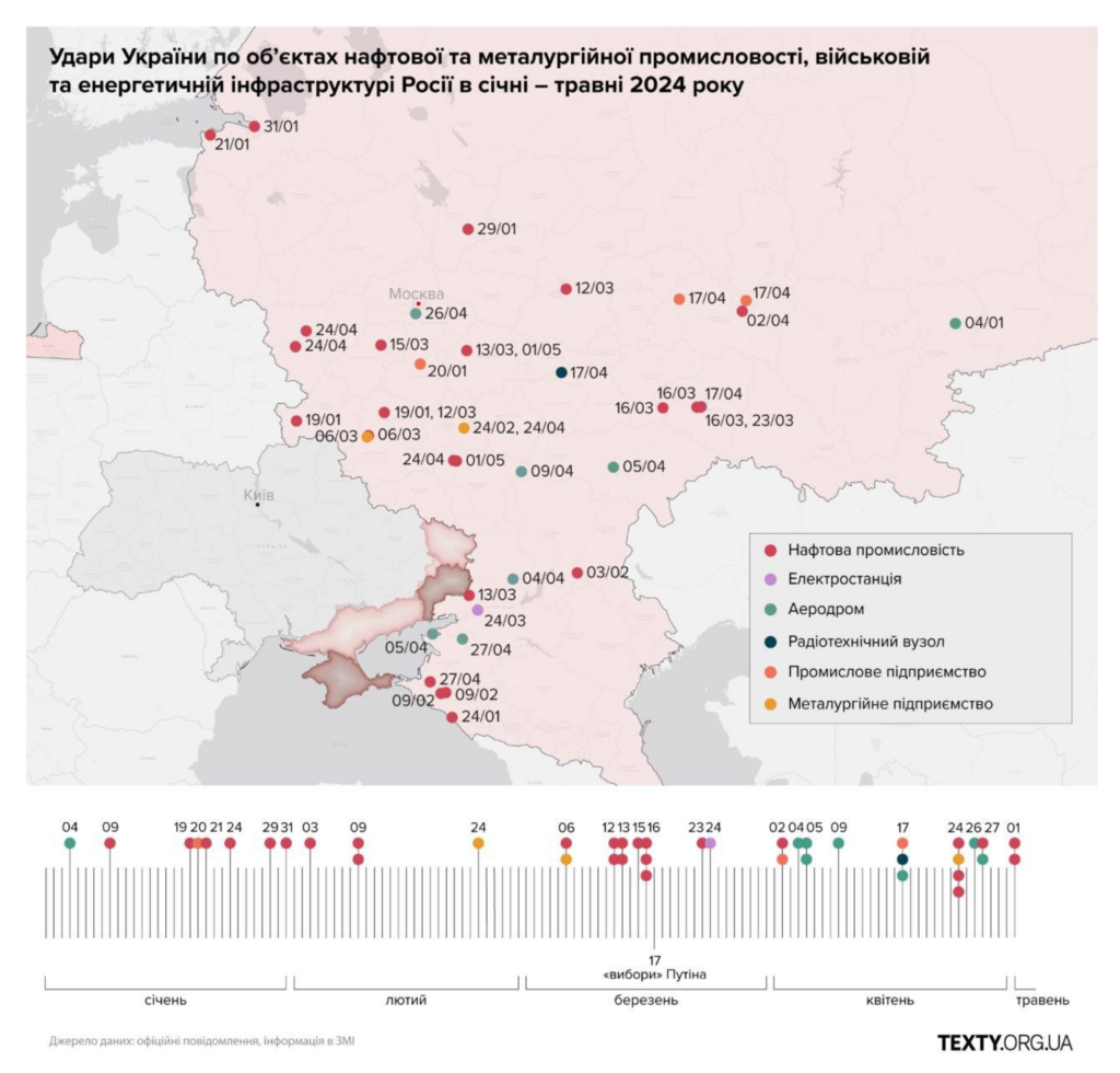
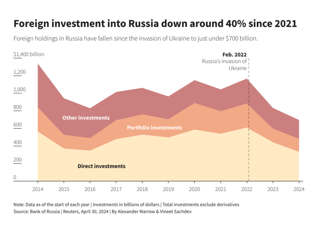
Visualizations of the Ukraine-Russia war highlight Ukraine’s financial reliance on Black Sea trade, drone strikes on Moscow’s warships, and declining foreign investment in Russia:

Financial Times: How Ukraine broke Russia’s grip in the Black Sea, May 2
Тексти: Нафтопереробка і військові обʼєкти. Удари по Росії від початку року (карта), May 3
Reuters: Russia can’t match a Western asset seizure, but it can inflict pain, March 2

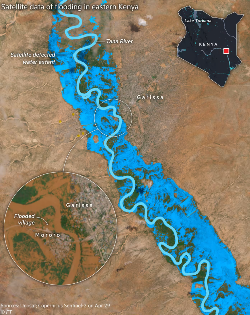
In Mexico, extreme heat is becoming the norm, while massive flooding in Kenya kills more than 200 people and displaces 160,000:

La Data Cuenta: ¡México lindo y ardiendo!, May 3
Financial Times: Kenya brings in emergency measures to combat ‘unprecedented’ floods, May 3

The next section can (unfortunately) be summed up as “efforts to go green that are not going well”:

Bloomberg: A Billionaire Wanted to Save 1 Trillion Trees by 2030. It’s Not Going Great, May
SBS News: “2050년 감축 목표도 없다” 영유아까지 참여한 ‘기후 소송’, May 2

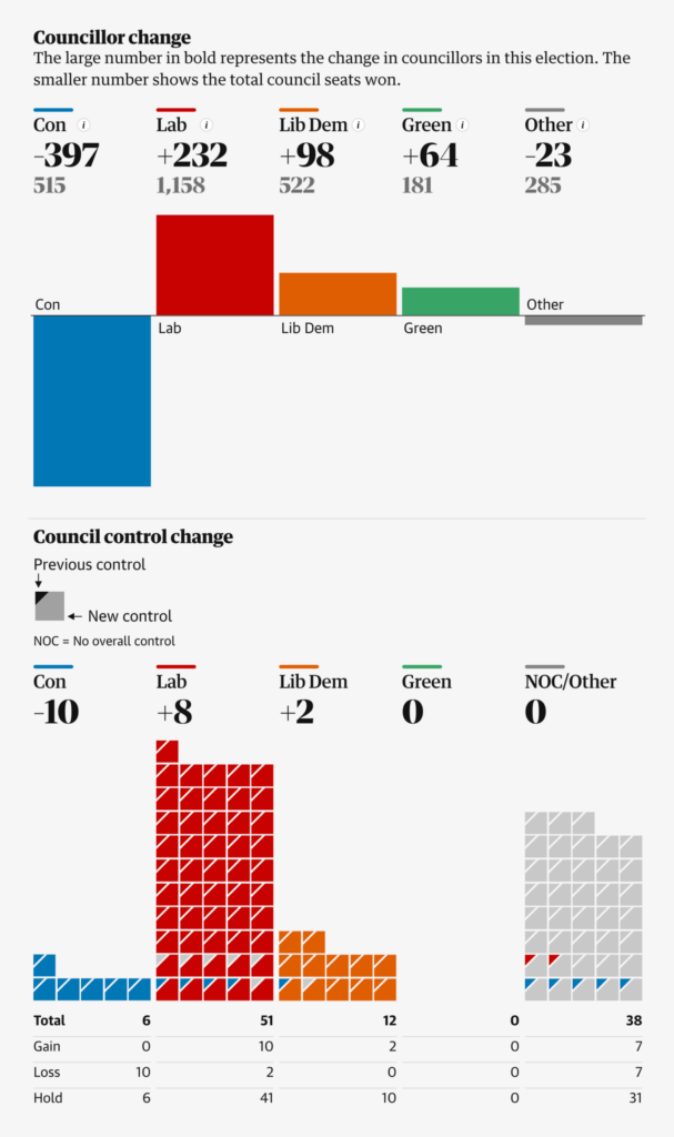
Another week brings a fresh set of election visualizations. An analysis of local elections in The Guardian shows support for the Conservative Party at its lowest level since 1998:

The Guardian: Big Tory losses but no Labour landslide. What might happen at Westminster? – a visual analysis, May 4
The Guardian: Local elections 2024: full mayoral and council results for England, May 4

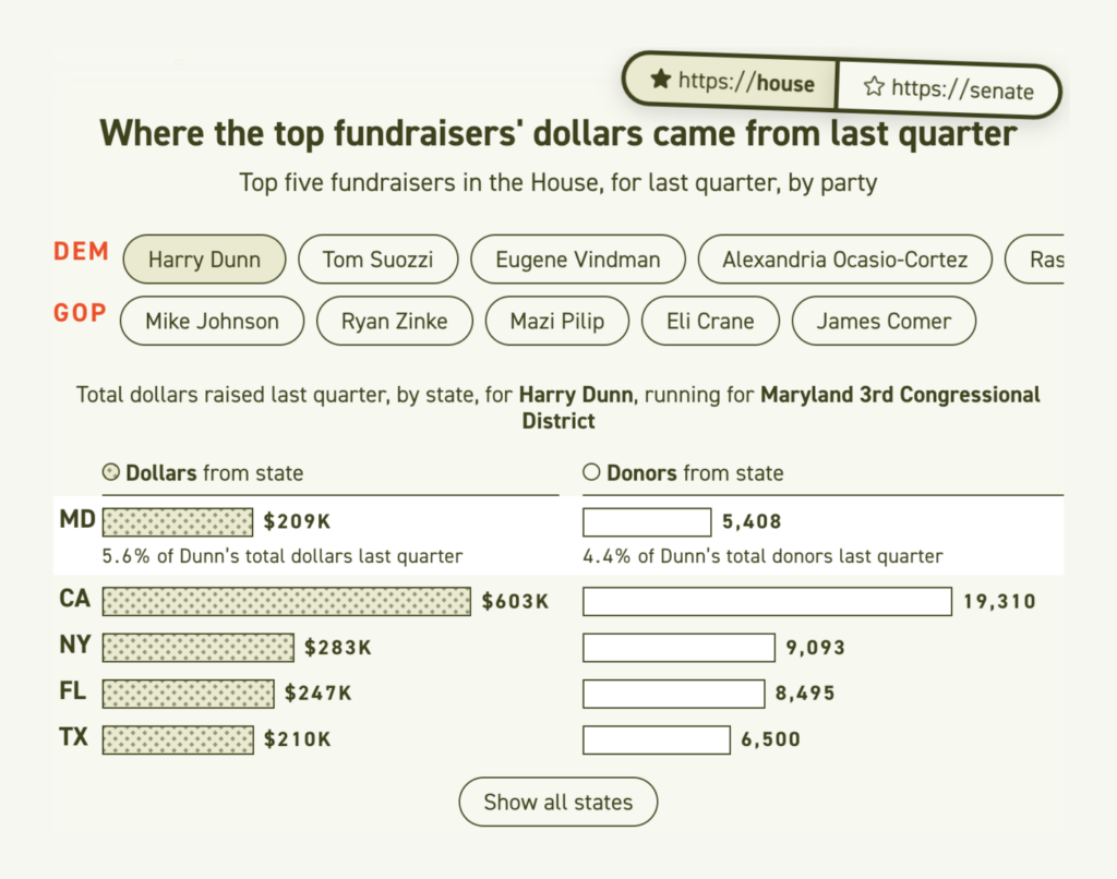
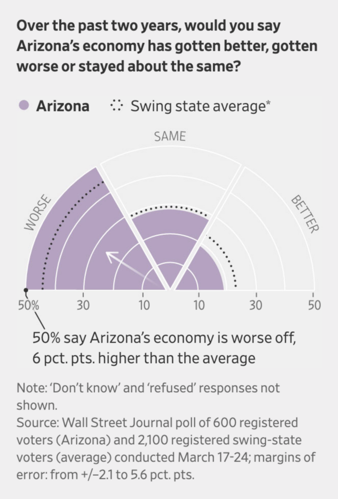
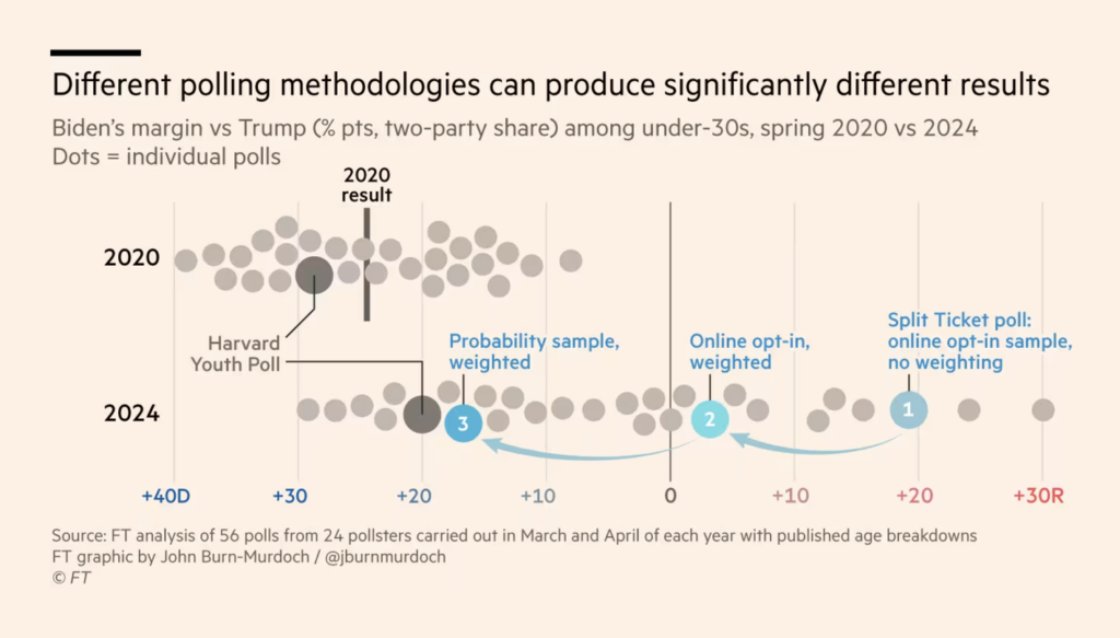
We’re also looking ahead to this year’s U.S. elections, from the impact of online donations, to Republican skepticism of Trump, to voter sentiment in Arizona. Plus, the Financial Times gives us a look at polling methods and how they can lead to different results:

Politico: How online donations are fueling the election, May 1 Great Article
Der Spiegel: So steht es im Rennen ums Weiße Haus, May 6
The Economist: The Republicans who still haven’t endorsed Donald Trump, May 1
The Wall Street Journal: Arizona Is Booming, but Restless Voters Feel Downbeat About Economy, May 4
Financial Times: The problem with polling America’s young voters, May 3

So what happens after an election? In recent American administrations the decisions of predecessors have been reversed:

The Wall Street Journal: Biden Races to Trump-Proof His Agenda, May 6

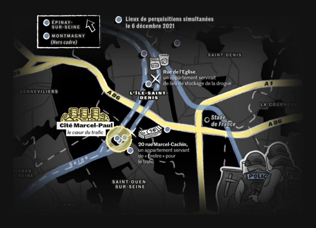
A quick, addictive cut… to cocaine, on its smuggled route from the Balkans to Paris:

Le Monde: Au Ceur D’une Pme De La Drogue, May 1 Beautiful Visual Story

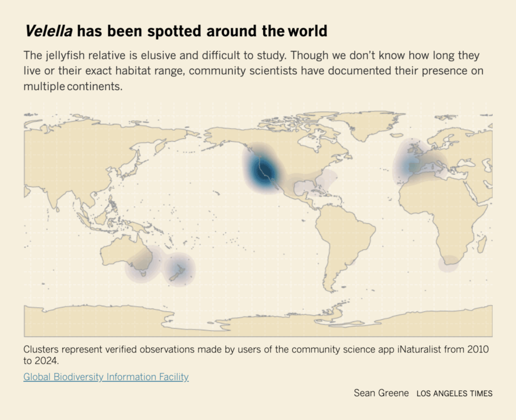
The world of animals is as diverse as the world of data visualizations, from racehorses to animals that can’t even move on their own. Have you ever heard of Velella velella, also known as “the zooplankton so beautiful they named it twice”?

USA Today: Here’s your inside track to understanding – and enjoying – the 150th Kentucky Derby, May 3
theeuropeancorrespondent: “Bears in mind 🐻 Romania, Slovakia, and Finland recently sent an information note to the European Council urging the EU to downgrade the protection status of bears from “in need of strict protection” to “may be subject to management measures” following the implementation of conservation efforts initiated under the Habitats Directive in 1992,” (Instagram)
Los Angeles Times: What are the blue blobs washing up on SoCal beaches? Welcome to Velella velella Valhalla, May 3

Here are some unusual visualizations that we liked for their interactivity, their storytelling ideas, or their experimental creativity:

Le Temps: Cette si chère santé qui nous rend tous malades, May 6
India- State and District Evolution: “Clickable map of India state and district evolution threads,” May 3 (Tweet, Map)
Jill Pelto: “‘12,000 Years in Greenland’ based on the 2023 PhD Dissertation of @rogercreel 4 line graphs all showing 12,000 years: -Top sky curve: June Insolation at 65 degrees N -Lower sky curve: surface air temperature at the GIS -Top of the ice: volume of the GIS -Bottom of the ice: GMSL,” May 3 (Tweet)

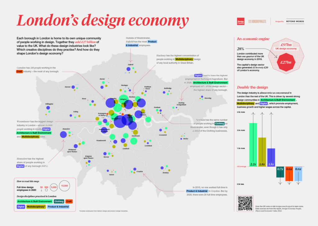
The final section includes tips for extending your vacation (as long as you live in Hong Kong), the aging of Brazil’s urban indigenous population, and insights into London’s design economy.

South China Morning Post: How can Hongkongers use public holidays strategically for longer breaks in 2025? The Post has answers, May 3
Folha de S.Paulo: População indígena cresce no Norte, mas envelhece ao redor das cidades, May 3
Beyond Words Studio: “In our collaboration with the @DesignCouncil, we experimented with different ways of mapping how design businesses were distributed across London’s boroughs. We wanted to highlight the distinctive design communities in the capital and how they are different from each other. Read the full case study for our approach to this project, and see the final poster that was showcased at the V&A during London Design Festival 2022,” May 4 (LinkedIn, Article)

What else we found interesting

JasonForrest: “I ran into this old article I wrote and the whole esoteric predition of the stock market from “The Archeometer: Key to All the Religions and All Sciences of Antiquity; Synthetic Reformation of All Contemporary Arts” is totally wild!” May 4 (Tweet, Article)
visionscarto: Des cartes pour dénoncer l’impérialisme, May 3
Libération: «Le Blanc des cartes», l’envers à moitié vide, May 2

Applications are open for…


Help us make this dispatch better! We’d love to hear which newsletters, blogs, or social media accounts we need to follow to learn about interesting projects, especially from less-covered parts of the world (Asia, South America, Africa). Write us at hello@datawrapper.de or leave a comment below.

Want the Dispatch in your inbox every Tuesday? Sign up for our Blog Update newsletter!

Comments