


New: Stay organized with a more powerful, faster visualization archive
June 25th, 2024
3 min
This article is brought to you by Datawrapper, a data visualization tool for creating charts, maps, and tables. Learn more.
We’re excited to introduce and explain to you two measures to improve the accessibility of our data visualizations: Alternative descriptions, and improved fallback descriptions of our chart content.
There are many good reasons to care about accessibility: Because you want to increase your audience, believe in making information accessible as a principle, and/or because you’re legally obliged to (e.g. because of the European Accessibility Act or the Americans with Disabilities Act). So far, we focused on colorblindness with our inbuilt colorblind check. Starting today, we’re going one step further.
According to the WHO, there are 285 million people in the world with visual impairments; 39 million of which are blind. Many of them rely on screen readers to get information from websites. That works well for text-based content – but not so well for data visualizations. That’s why both alternative descriptions and good fallback descriptions are so important.
You can now write alternative text descriptions that screen readers will read out. This new option waits for you in step 3: Visualize, in the Annotate tab – no matter which visualization type you choose.
We care about your readers – so we really want you to add an alternative description of your chart content. That’s why we decided to give the new field the same prominence as e.g. the field for the chart title.
Let’s see how it works. Here’s an example of a chart showing the U.S. unemployment rate over the last few years:
Without an alternative description, a screen reader will read out something like this (the colors indicate the different chart elements):
U.S. unemployment rate.
Seasonally adjusted, January 2016-February 2021.
Line chart with a single line.
Horizontal axis ranging from 2015 to 2021.
Vertical axis ranging from 0% to 14.8%.
The chart has one annotation: In April 2020, the unemployment rate rose to almost 15%.
The title, descriptions, and footer are read out, no matter the visualization type you choose. Without the annotation in this chart, it would be useless for a blind person.
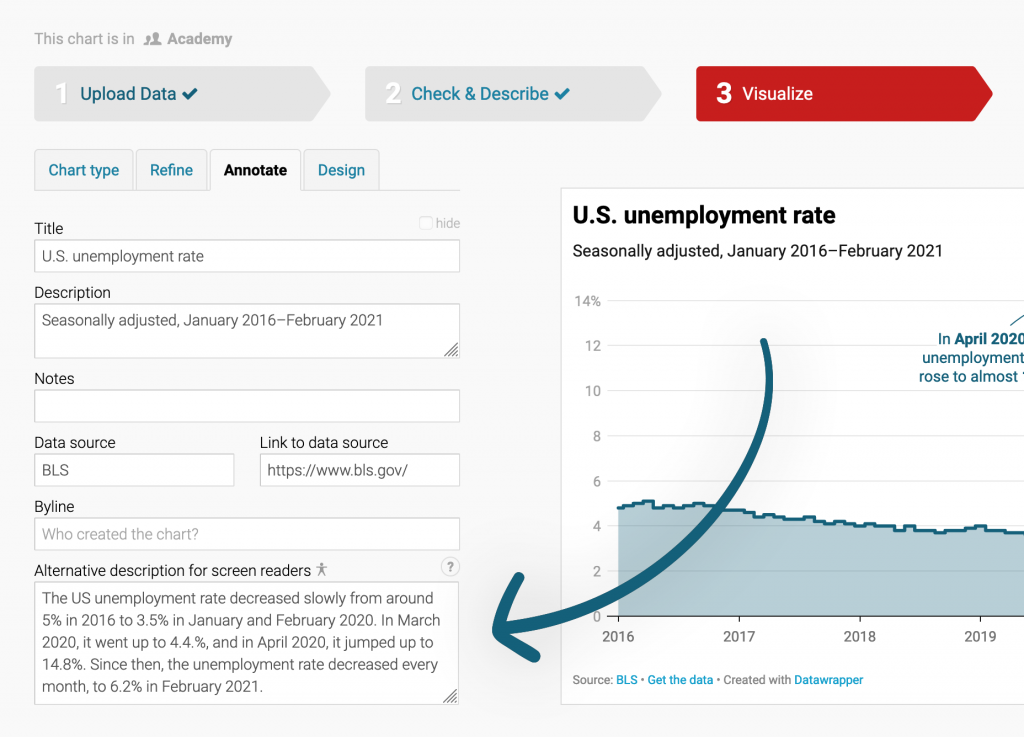
With an alternative description, here’s what the screen reader will read out:
U.S. unemployment rate.
Seasonally adjusted, January 2016-February 2021.
The US unemployment rate decreased slowly from around 5% in 2016 to 3.5% in January and February 2020. In March 2020, it went up to 4.4.%, and in April 2020, it jumped up to 14.8%. Since then, the unemployment rate decreased every month, to 6.2% in February 2021.
Way better! Writing an alternative description won’t take more than a couple of minutes, but it will be a tremendous help to readers with visual impairments.
Note that annotations and information about the chart are not read out anymore once you put in an alternative chart/map description, because they both might be redundant with your description. Under the hood, Datawrapper places the alternative description inside the HTML code of the chart and sets the chart body, including annotations, to aria-hidden.
You’re not sure what to write in such an alternative description? We put together a whole Academy guide on what to consider when writing alternative descriptions.
In a perfect world, you and every other Datawrapper user will now start to write alternative descriptions for every chart and map you create.
In reality, a lot of visualizations will still be published without alternative descriptions. That’s why we’ve started to experiment with what screen readers read out by default. Here’s what we changed:
So far, we only rolled out these new automatic descriptions for line charts and scatter plots.
To understand our improvements better, let’s have a look at this scatter plot:
Before this new update, screen readers announced the chart like this:
The richer, the healthier
GDP per person adjusted for differences in purchasing power (in 2011 international dollars) and life expectancy in years for selected countries, 2018. The bigger a circle, the more people live in a country.
Asia & Australia. Africa. North America. Europe.
50, 60, 70, 80.
1k, 5k, 10k, 50k, 100k.
Liberia, Timor-Leste, Afghanistan, Nicaragua, Lesotho, … China’s life expectancy and GDP per capita are higher than India’s.
GDP per capita. Life expectancy.
Now, the screen reader will announce something like this:
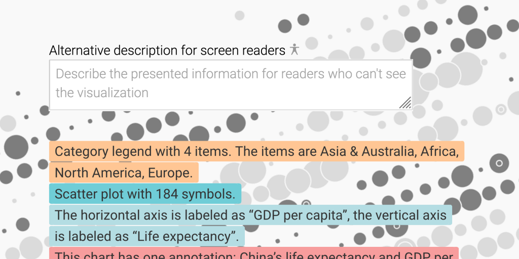
The richer, the healthier
GDP per person adjusted for differences in purchasing power (in 2011 international dollars) and life expectancy in years for selected countries, 2018. The bigger a circle, the more people live in a country.
Category legend with 4 items. The items are Asia & Australia, Africa, North America, Europe.
Scatter plot with 184 symbols.
The horizontal axis is labeled as “GDP per capita”, the vertical axis is labeled as “Life expectancy”.
This chart has one annotation: China’s life expectancy and GDP per capita are higher than India’s.
To see another example for our fallback descriptions, scroll up again to the line chart.
You probably notice that our fallback descriptions don’t state what the chart actually tells us. They’re better than what blind people have heard so far, but they can’t replace an alternative description (yet).
This is only the start. Here’s what we’re planning to do:
The most important thing we want to do is to listen to you. Many of you wrote us in the past with accessibility concerns – please keep them coming. Let us know how we can improve. Are you using a screen reader yourself? What would be most useful to you? We’d love to learn from you. Please send us an email at support@datawrapper.de or leave a comment below.
Comments