
Remind readers of the colors in your data visualization
October 11th, 2023
12 min
This article is brought to you by Datawrapper, a data visualization tool for creating charts, maps, and tables. Learn more.
The goal of a color key — also called a color legend — is to help your reader figure out as quickly as possible what the colored elements in your visualization mean. A carefully designed color key can mean the difference between readers glancing at your visualization and deciding it’s too hard to figure out, and readers actually reading it.
In this article, I’ll explain how to create useful, truthful, easily skimmable color keys for categorical and quantiative color scales. We’ll start with simple tricks and end with a collection of complex, clever, and fun color keys.
1 Make sure you actually need a color key
2 Making a categorical color key as readable as possible
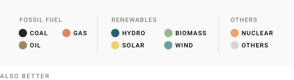
Use grids and groups
Structure long items
Use form, not just color
Sort your color key items
3 Making a quantitative color key as readable as possible
Consider skipping classes
Add axis ticks
Consider not showing values
Design your color key like your visualization
Make interpolations obvious
In diverging color scales, make uneven extremes obvious
4 A big collection of great color keys
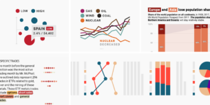
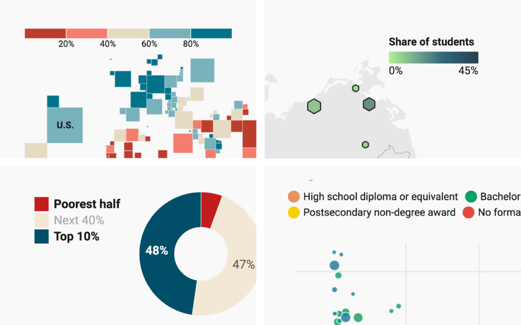
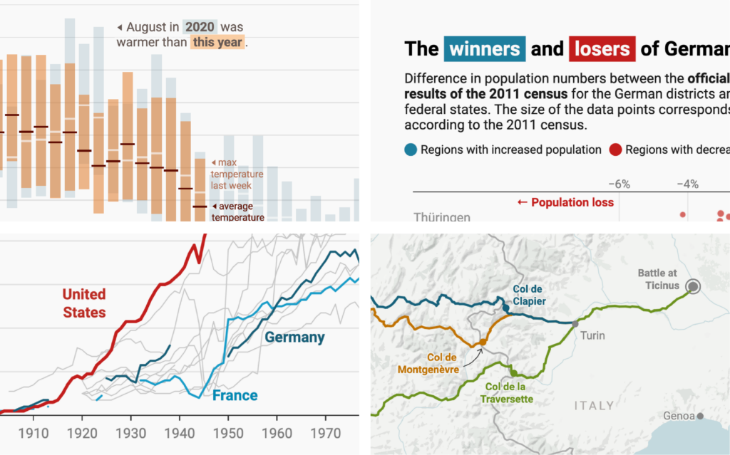
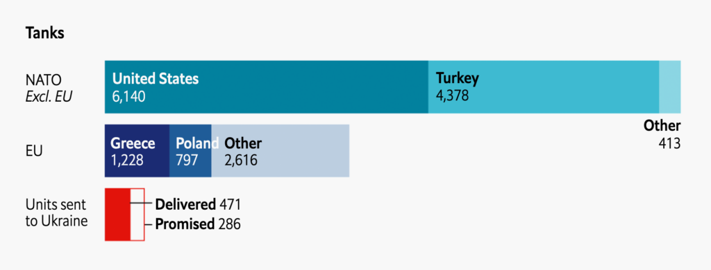
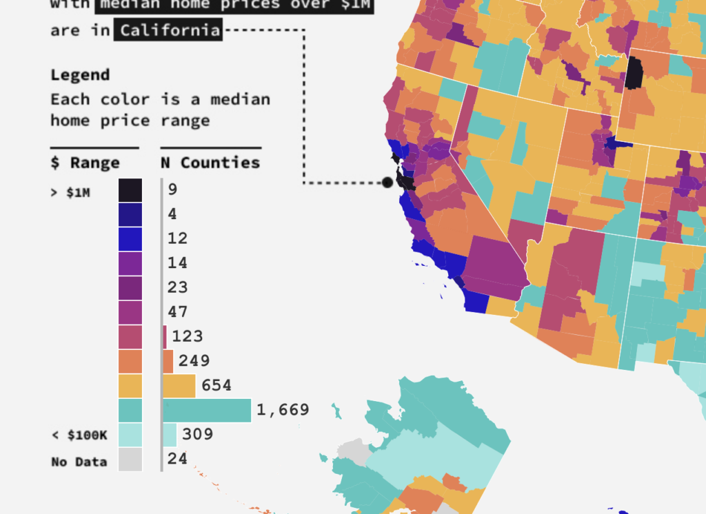
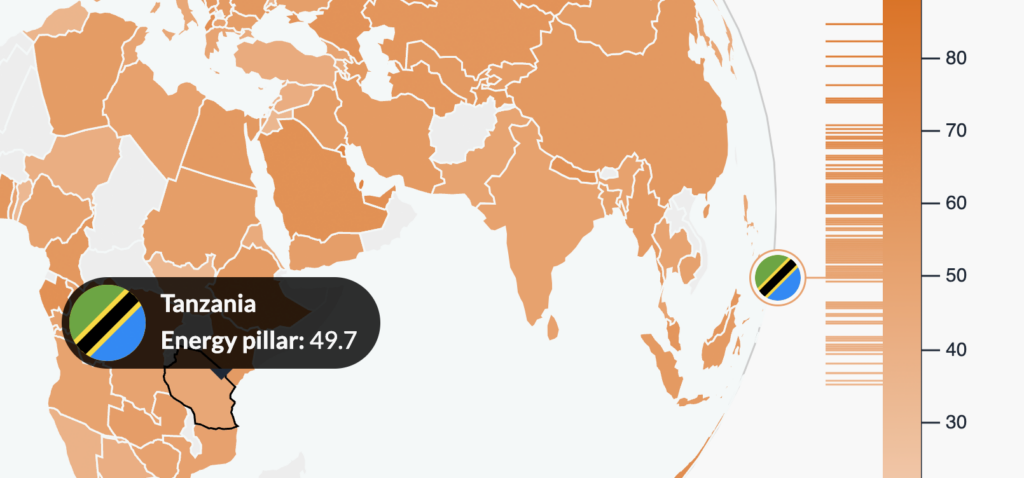
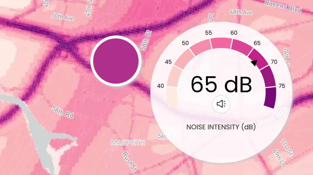
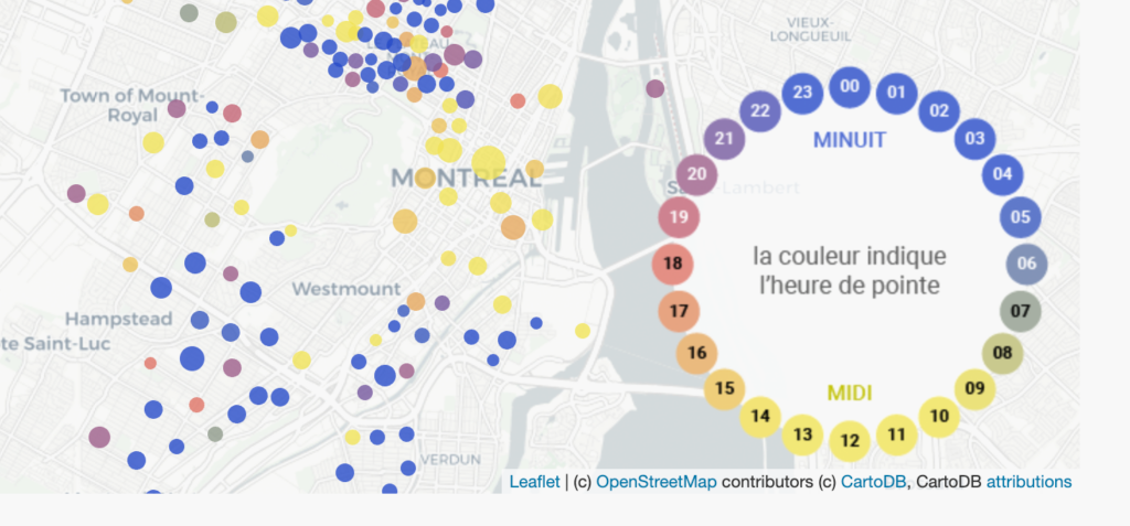
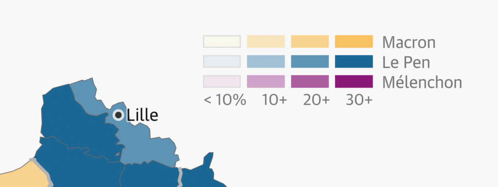
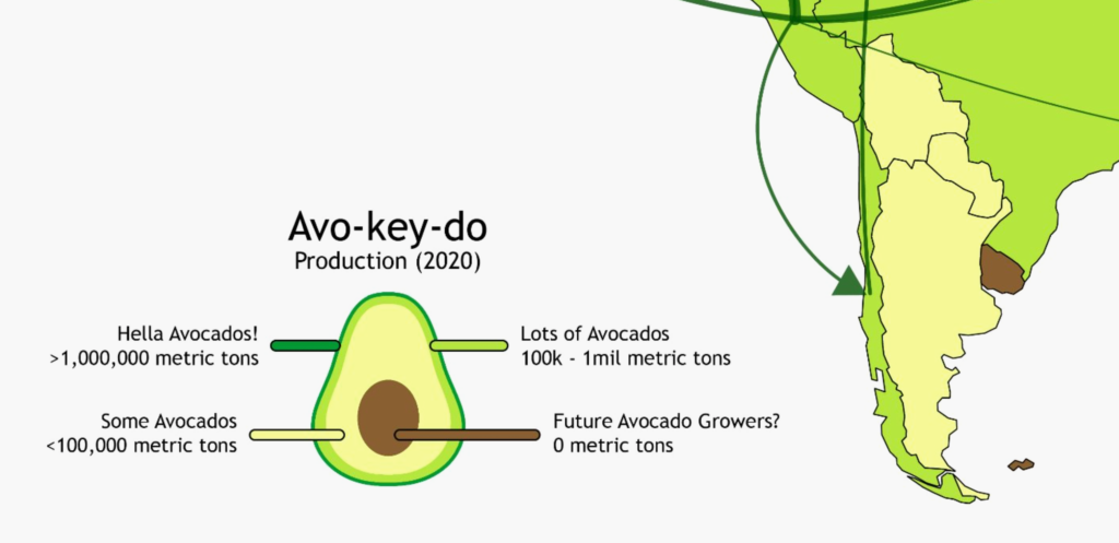
Color keys that give additional information
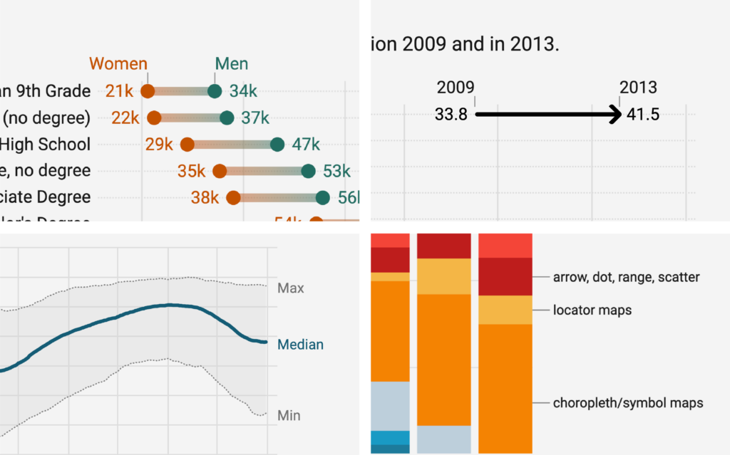
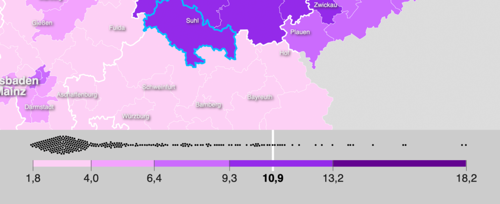
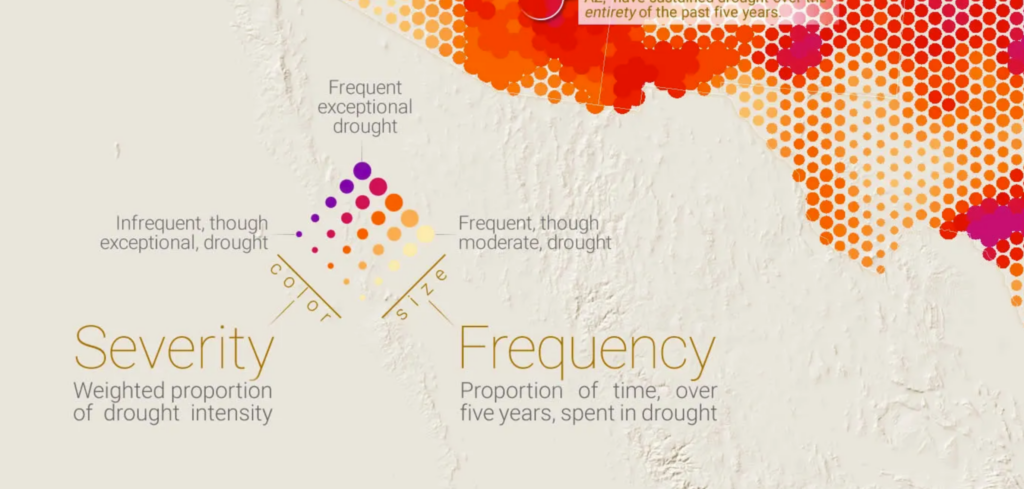
Color keys that show the distribution of the data
Color keys with unusual forms
Two disclaimers before we start. First, this article won’t talk about which colors to use in your visualizations. Instead, it’s about making color keys easier to understand for your readers. To learn how to choose better colors, visit our articles:
Second: You might be here to learn how to use color keys in our tool Datawrapper. When creating a visualization in Datawrapper, color keys are shown by default:
But you can also design your own color key in Datawrapper, either with HTML in the chart title, description, or notes, or by using text annotations:
For a practical guide, visit our Academy articles How to create text annotations, How to turn your title into a color key and How to create a custom color key.
Let’s start with ideas for designing better color keys:
Your readers won’t know what a color indicates if you don’t explain it to them. But that explanation doesn’t need to happen in the form of a key. You might be able to use direct labels instead:


When different colors represent different named categories — like blue for wind energy and yellow for solar — you’re looking at a categorical color key. Here’s what to pay attention to when designing these keys:
It might be tempting to fit your color key items into as few lines as possible. This takes the least space, but only works for a few, short items. If your key has lots of items, or you need a lot of letters to describe them, it can become overwhelming. If this is the case, consider using a grid layout — it’s easier to skim and looks tidier.

If you can group your color key items, that’s even better:
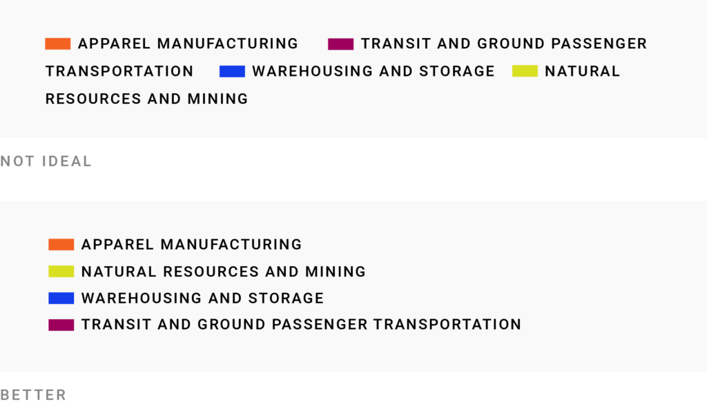
If your color key items are fairly long, the first thing you should do is attempt to rewrite and shorten them. You can find more information in our article What to consider when using text in data visualizations.
You can’t shorten your labels? Then consider putting each item on a separate line.
A grid is possible (and potentially more space-efficient) for long items too, if you introduce line breaks:

For better readability, make these longer items left-aligned, choose a legible font, and don’t go all uppercase as I did here — lowercase letters are easier to read.
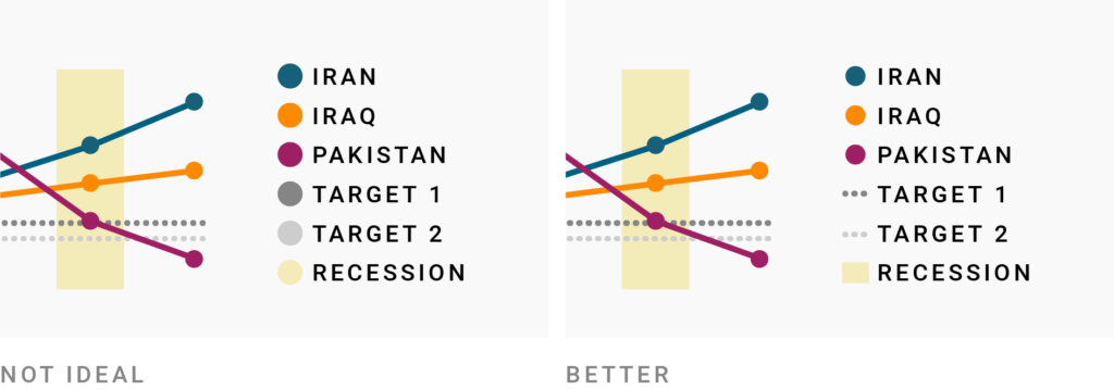
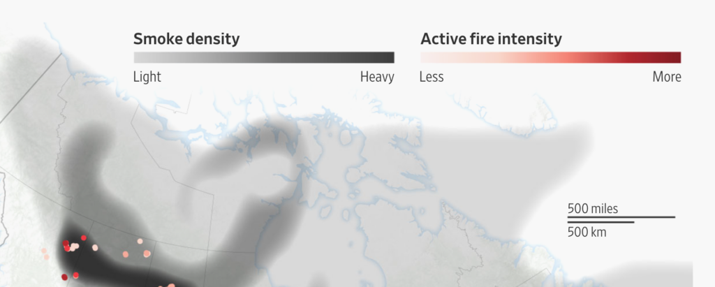
If your colored elements have different forms (thick lines, thin lines, dashed lines, rectangles…), then showing these forms in the color key is an excellent way to help readers quickly find them in the chart.
You’ll see that often in locator maps, like this one:

Datawrapper does this by default for locator maps, lines in line charts, and confidence intervals in column and bar charts:

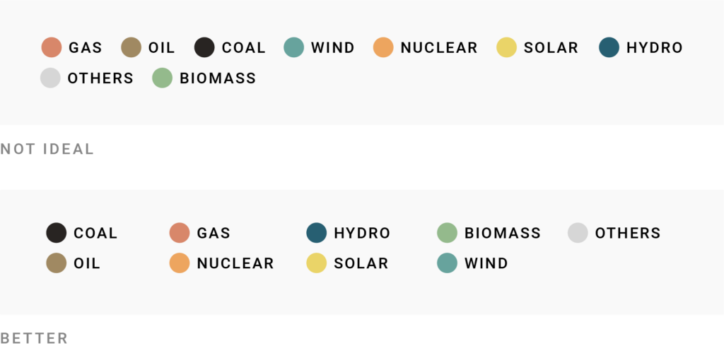
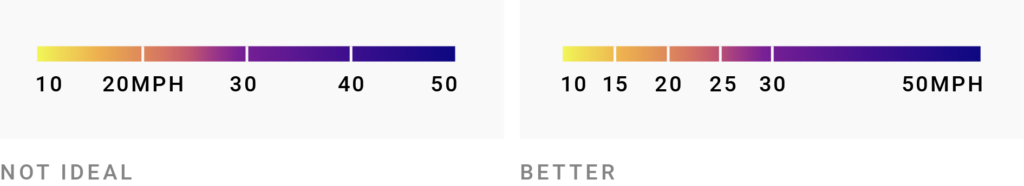
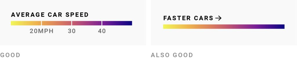
Another little trick is to place your colors in the same order in both key and chart. Readers who are used to reading from left to right will first want to know what the color in the top left of the chart represents, so it should come first in the color key too.
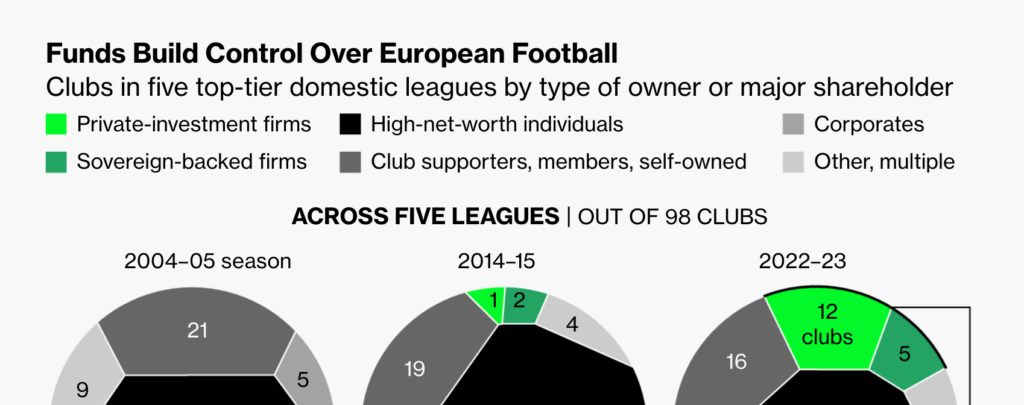
That’s only true if your colored elements are all the same size, though. If your colored elements are of different sizes (for example, in a pie chart, categorical choropleth map, or bubble chart), consider displaying the “biggest” color first in the key, then the second biggest, the third biggest, and so on.
And forget all this if your categories already have a natural order — like “left, center, right,” or “good, ok, bad,” or “2015, 2020, 2025.” This natural order should be the order of the items in the color key. Here’s how to make such quantitative color keys work:
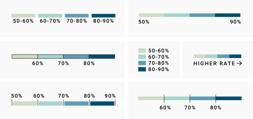
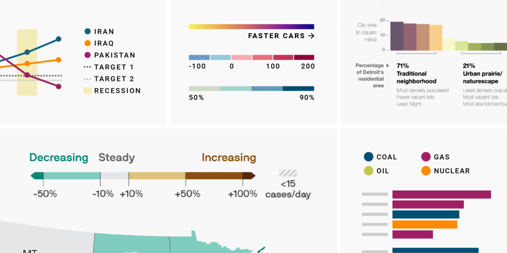
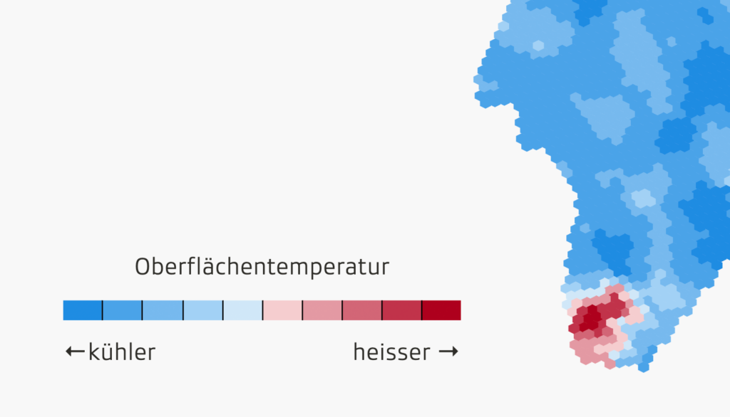
When designing color keys for sequential and diverging color scales, consider these design decisions to make them easier to understand:
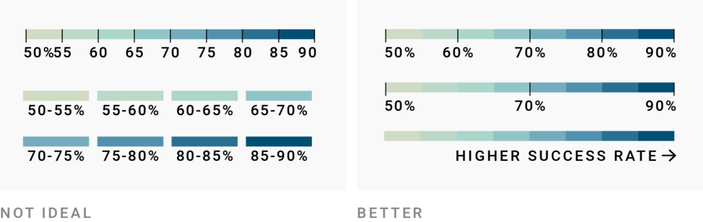
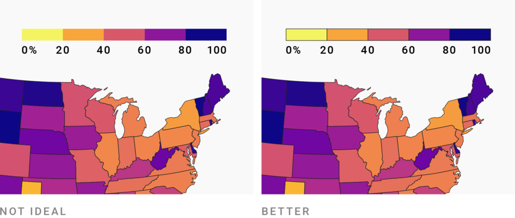
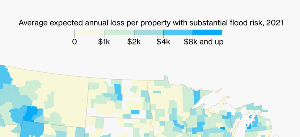
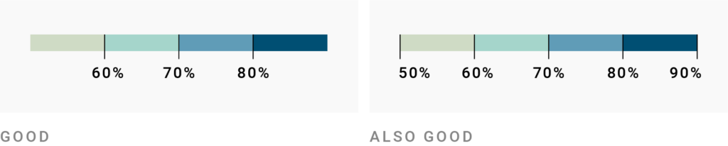
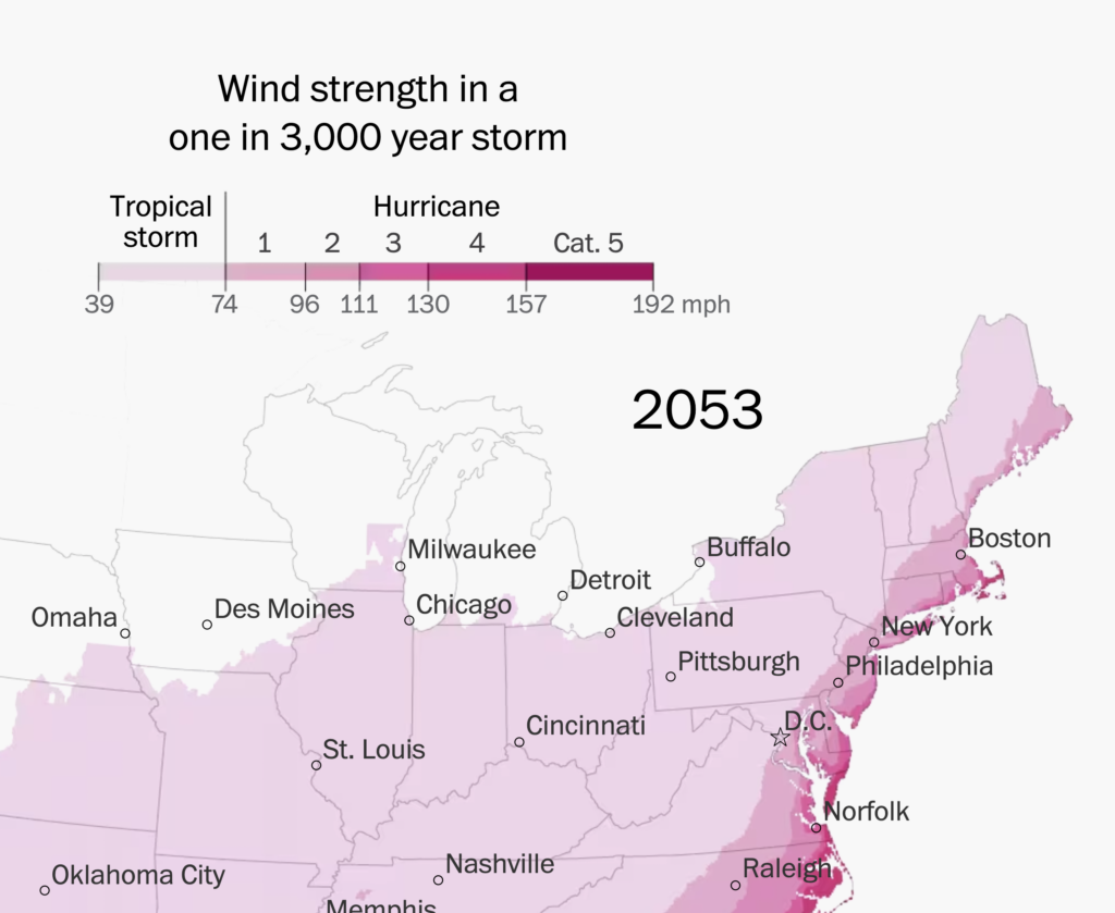
How many values should you show on your color key? For classed color scales, the answer may seem obvious: Let’s label as many values as there are classes! But if you have a lot of classes, showing values for all of them is often not the best choice. They may overlap, and your color scale may look too busy to invite the reader’s eye.
Instead, if the borders are obvious, consider skipping every other class. Here are some examples:

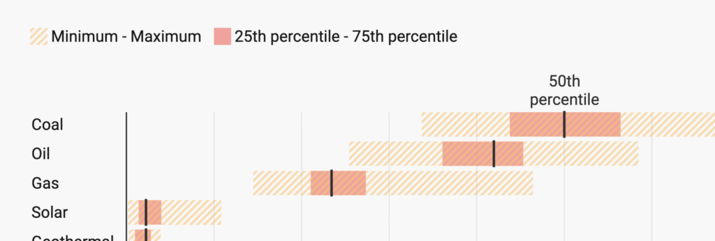
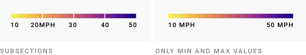
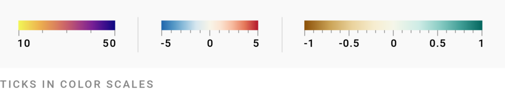
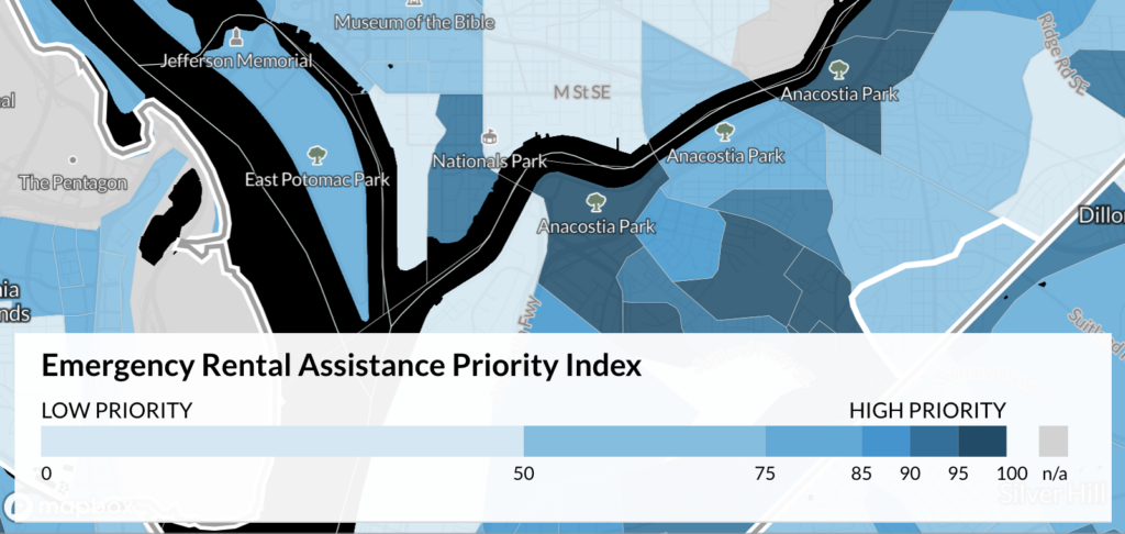
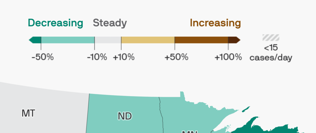
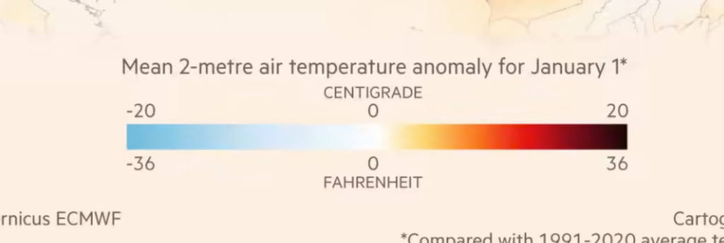
The same is true for unclassed color scales: You can show lots of subsections, only a few of them, or only the min and max values (and, in case of diverging color scales, the center value):
How detailed you should get depends on what you want readers to see in your visualization. Is it enough to give them a general trend, or are they supposed to read exact values? If the visualization is interactive, the exact values can also hide in tooltips. In static visualizations, err on the side of showing more values in a color key.
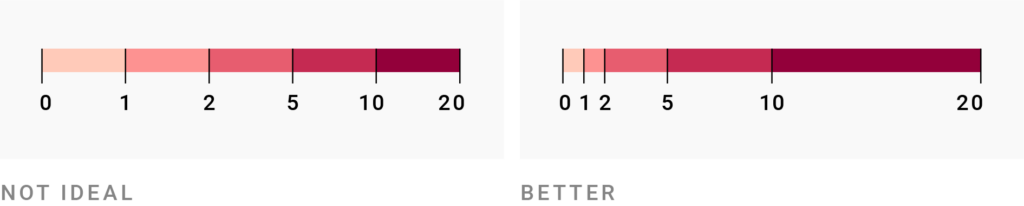
Make sure to only label visibly distinct colors, though. In a highly interpolated color scale like the following, there’s no need to label both the “almost dark blue” and the “dark blue” — readers won’t be able to tell them apart anyway.
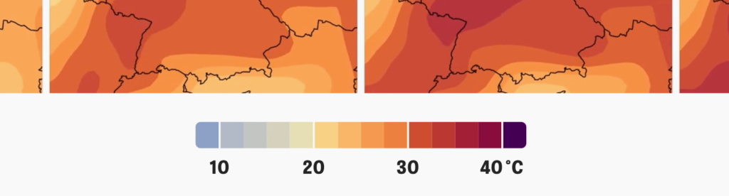
If you go for a continuous instead of a classed color scale, you might be tempted to label more values in your key. But there’s no need: You can add “axis ticks” to your color scale, even if you don’t label them. Note that this only works well if the ticks are spaced in a useful, predictable way.
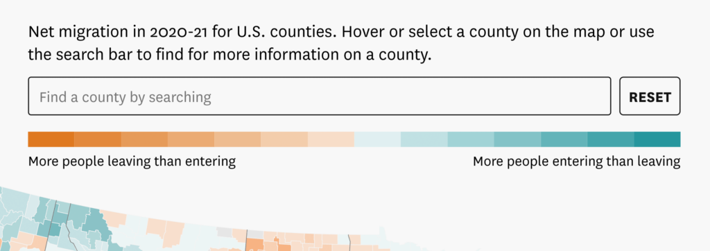
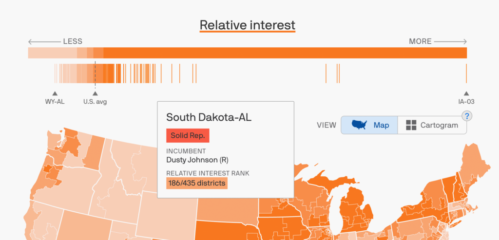
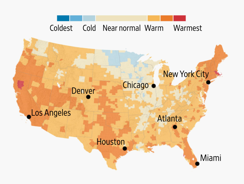
You also can not show any values and units at all, just a general “less/more” or “worse/better.” If your chart is based on a metric that needs lots of explanation, might confuse readers, and doesn’t add anything useful to their understanding, then a general trend might be sufficient — and increases the chances that your reader gets the general idea.
This is more common than you might think. I’m going to show you a whole bunch of examples to encourage you to consider this simplification the next time you label a color key:

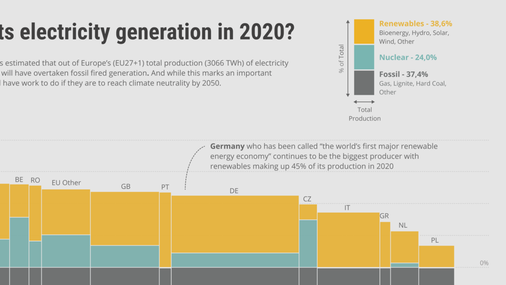
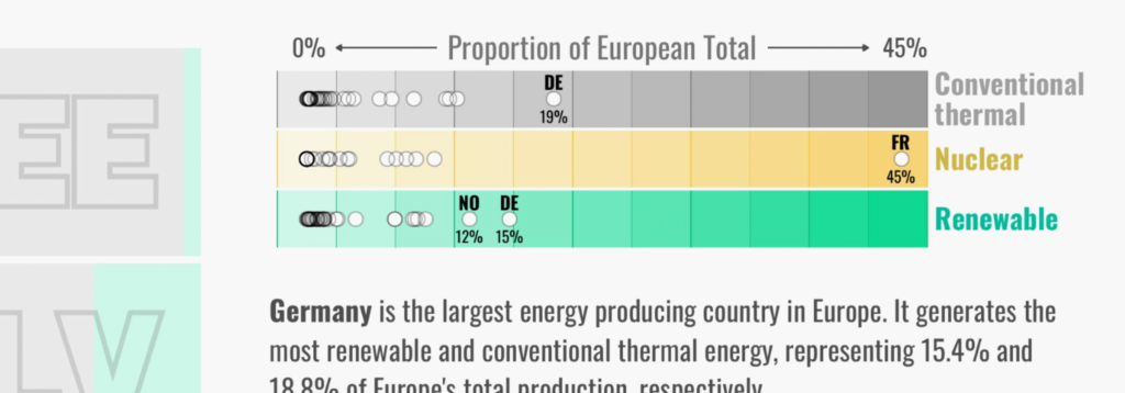
If you have special elements in or around your colored regions, consider including them in the color key too.
For example, if the colored data points in your visualization have outlines, use outlines in your color key. This is more than just an excellent way to increase the accessibility of your brightest colors. Colors appear differently depending on their stroke, so an outline in both visualization and key will make it slightly easier for your readers to match the colors.

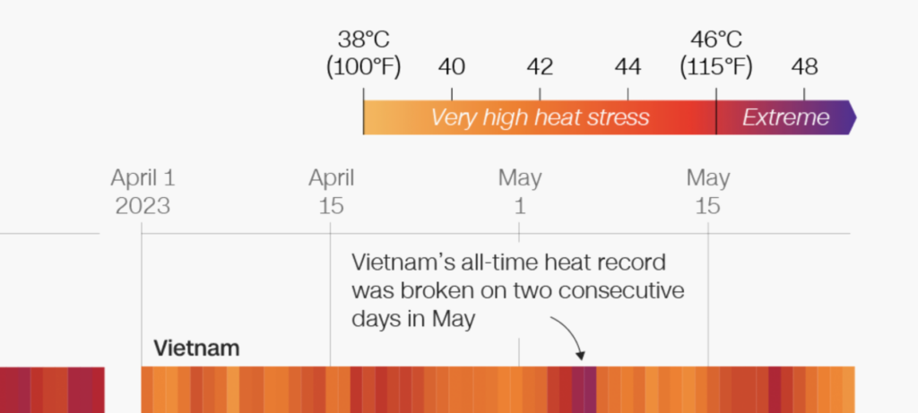
If your color scale makes use of non-linear interpolations, communicate them well. In the example above, the first and last classes are much bigger than the others — but readers won’t know that unless you tell them. Label the min and max values in such a case.
If your classes are consistent, labeling the min and max values isn’t necessary, but it does remove any doubt readers might have about your color key:
An elegant approach is to give your color key classes different widths depending on the range they fill:
When space permits, this makes your color key look more interesting and communicates your interpolation nicely. Win-win!
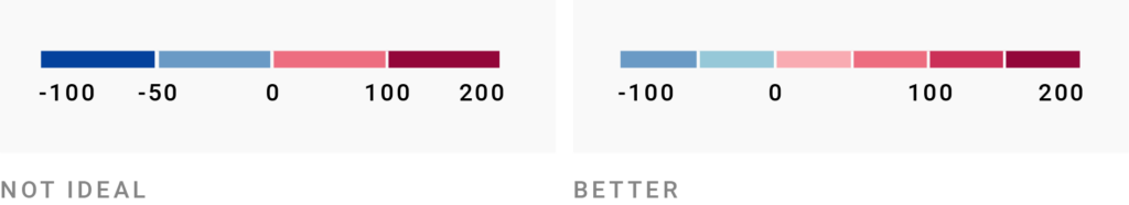
If the extremes in your diverging color scales don’t cover the same range from the center, make that obvious in both colors and color key. If your center is closer in value to one extreme, it should also be closer in the design of the key.

Enough with the explanations; let’s look at some more great examples! Here you’ll find lots of smart color keys that people have told me about and that I’ve stumbled upon over the past few years. Let’s begin with the ones that show extra information:


Thanks to everyone who helped me find great examples! A special thanks to the people whose submissions I ended up including: Rob Fry, Jacque Schrag, Víctor Pascual Cid, Ahmad Barclay, Marian Eerens, Dennis Kao, Alexei S., June Choe, Nicholas Kruchten, Michael Neutze. You made this article more interesting.

Comments