
How to design a useful (and fun!) color key for your data visualization
August 28th, 2023
19 min
This article is brought to you by Datawrapper, a data visualization tool for creating charts, maps, and tables. Learn more.
You designed a useful (and fun!) color key for your data visualization to explain to your readers what your colors mean? Great! Now you’ll want to make sure people don’t forget those associations between colors and categories. This article explores a few ways to do so:
1 Keep your color key always close by
2 Reuse your colors in annotations
3 Make your color key interactive
3 Reuse your colors in tooltips
5 Reuse your colors in text around your visualization
In a longer visualization, make sure the color key is never far away. In print, every visualization should be on the same page as its key. In digital formats, don’t let readers scroll farther than roughly the height of their screen to see the key.
To achieve that in digital visualizations, make your color key sticky, so that as you scroll it stays visible on the top, bottom, or side:
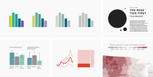
Another solution is to simply repeat your color key. It might be tempting to show the key only once — readers know the colors now, don’t they? But if you pay attention, you’ll notice that even you need to check the color key repeatedly when reading a data visualization for the first time. Readers won’t be annoyed by seeing the same color key three times, but they will be annoyed if they can’t quickly check what the colors are all about in the moment they want to.
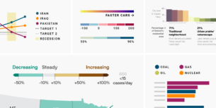
FiveThirtyEight knows that and repeats the same color key again and again:
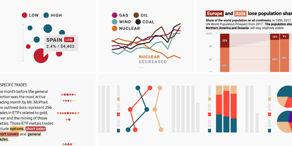
Annotations are often already closer than the color key to your actual data points. That makes them a neat and powerful tool for reinforcing your colors. When you repeat colors in an annotation, readers won’t need to go searching for the color key and then traveling long distances between data and key with their eyes before understanding what your visualization is supposed to show.
Annotations also draw attention to certain data points, so they become an additional way to lead a reader’s eye to the categories you want them to see. (For other ways, read our article Emphasize what you want readers to see with color.)
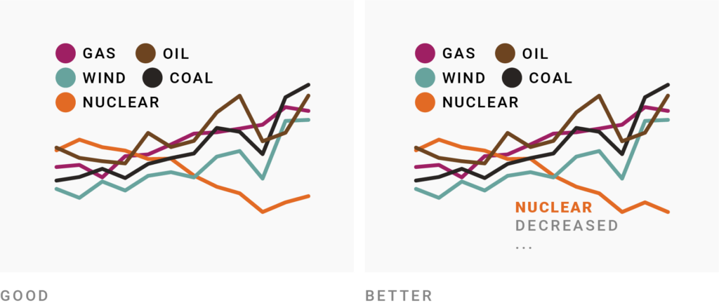
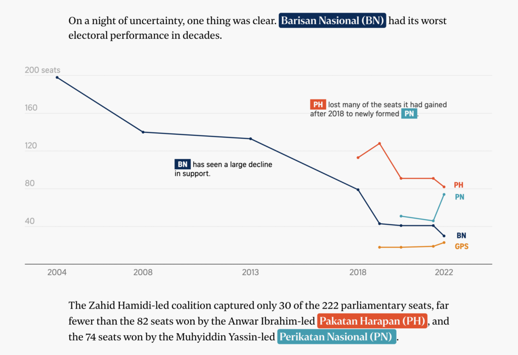
For an effective annotation, make a statement about some specific data point and place the annotation right next to it. Then color the relevant part of your statement in the color of its corresponding category.
For example, in the annotation “Nuclear energy decreased its share since 2018,” only the words “Nuclear” or “Nuclear energy” should be colored in orange. Orange stands for the category “Nuclear (energy),” not for the fact that the share of nuclear energy decreased.
In Datawrapper, you can add annotations to many visualization types, including symbol and choropleth maps. To color only part of a phrase, you can use simple HTML. Here’s how that looks for the annotation below:
In California, <b style="color:#107487">Biden will likely win.</b>
Everything between the HTML tags <b> and </b> will be bold. (<strong></strong> will achieve the same.) And #107487 is the blue we want to use:

Go to our Academy article How to create text annotations > Format your text to learn more.
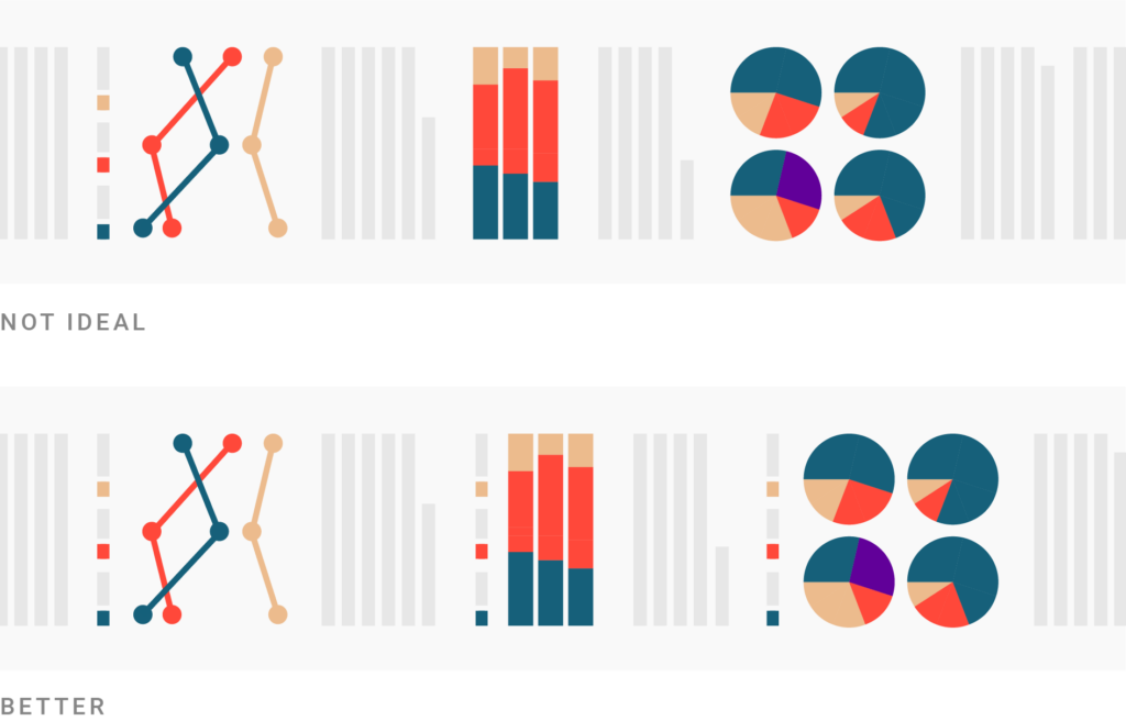
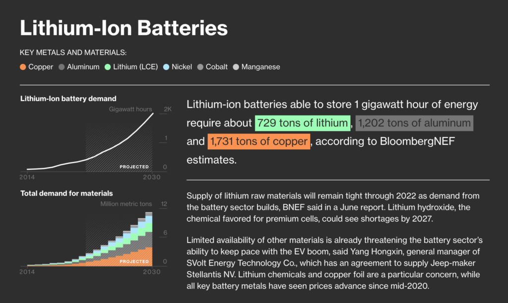
When you color annotation text to refer to a category of the same color, the contrast between text color and background color should be high enough for reading. Unfortunately, bright colors that work fairly well for a bar in a bar chart become illegible as thin letters. One small trick is to make the text color a bit darker than the category color — so this annotation for a bar like ▇▇▇ can be made more legible with a darker text color as in this annotation ▇▇▇. In the following chart by The Economist, the label “Hispanic” is darker than the corresponding line:

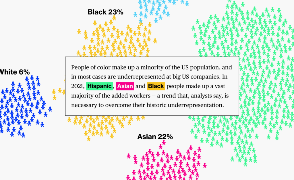
Another way around illegible text can be to use color as a background. Here’s a visualization I created in October 2021 for a Weekly Chart. You can see that every time I mentioned 2020 or 2021, I used category colors to highlight the text:
The HTML inline code to color a text background is a bit more complex than defining a simple text color. Here’s how one of the annotations was defined:
In mid June, the max temperature was higher in <b style="background-color:#FFD2A8; padding:0px 3px">2021</b> than in <b style="background-color:#DCE7EA; padding:0px 3px">2020</b>.
background-color defines the background color of everything between the two <b></b> tags. And padding:0px 3px gives this background ”rectangle” a 3px padding to the left and right, but no padding to the top and bottom.
Again: Readers won’t get annoyed by seeing the same color key three (or four, or five) times, but they will give up on reading your visualization if they don’t quickly know what the colors are all about.
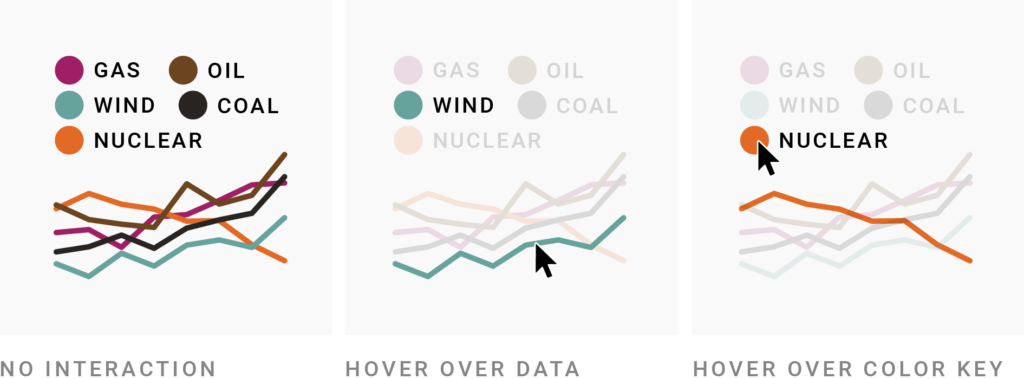
Especially if your visualization shows lots of different colors, interactivity can help readers to navigate them. This interactivity often goes both ways:
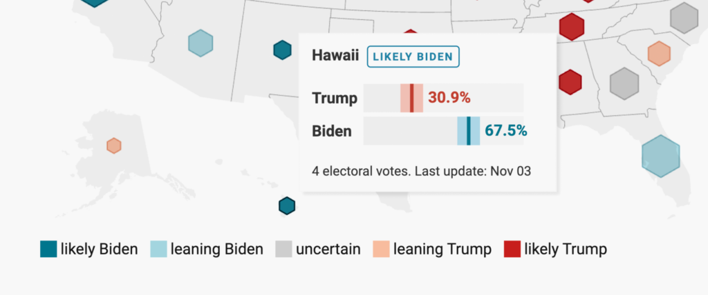
This is the default in many Datawrapper visualizations, be it stacked bar charts, line charts, pie charts, symbol maps, or choropleth maps. In the two kinds of maps, color keys for both quantitative and qualitative color scales can be made interactive, like so:
When readers hover over a point on a continuous color scale, the map will show all regions with approximately that value. It's fun! And helpful. Win-win!
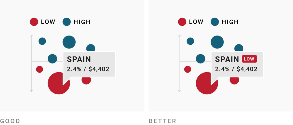
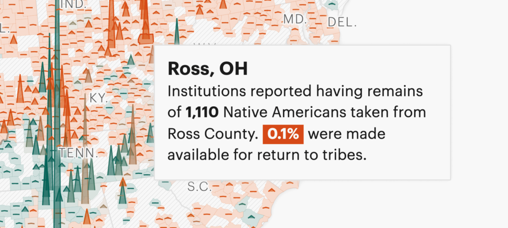
Tooltips, also called pop-ups, are another type of interactivity. Tooltips are great. They show the exact underlying data value(s) of each point in your visualization — and can use colors to remind readers of each point's category. There are a few reasons to use them that way:
Here are a few examples of tooltips that use category colors:
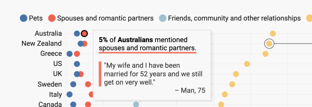
There are lots of other ways to add color to your tooltips: You can try colored shapes next to the text, or a background color for the whole or just part of the tooltip.
All the tooltips you can see here are created with HTML code like I showed you above. If you're using Datawrapper, you can see all the code snippets and their explanations in our Academy articles How to customize tooltips and How to add charts to tooltips.
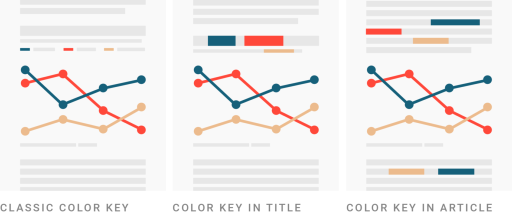
Your visualization and the text around it can be linked with colors. There are two ways to do so: Use the category colors in the title and description, or use the colors in the article surrounding the visualization.
Here’s an example of the first approach:
The title is a statement about what readers can see in the visualization. At the same time, it explains to readers: “Everything Europe-related is colored in dark red, everything Asia-related in red, and everything Africa-related in dark blue.”
We wrote a whole article on how to turn your title and description into a color key (with lots of HTML inline code snippets) for our Academy. Head there to learn more.
Having the color key in the title means you don’t need an additional, “classic” color key — it saves space and can make the visualization feel simpler and easier to understand:
That said, keeping the color key or direct labels can still be a good idea, to — yes — remind people of your colors and make sure they understand them, no matter where in your visualization they start reading:

(When trying this approach, keep in mind that blue text will be perceived as a link. If you’re using blue for a category and then use it as a text color, it might confuse readers.)
Including a color key in the surrounding article — and hence creating a deeper integration between article and visualization — seems to be less common. Here are two attempts, but both keep a traditional color key as well:
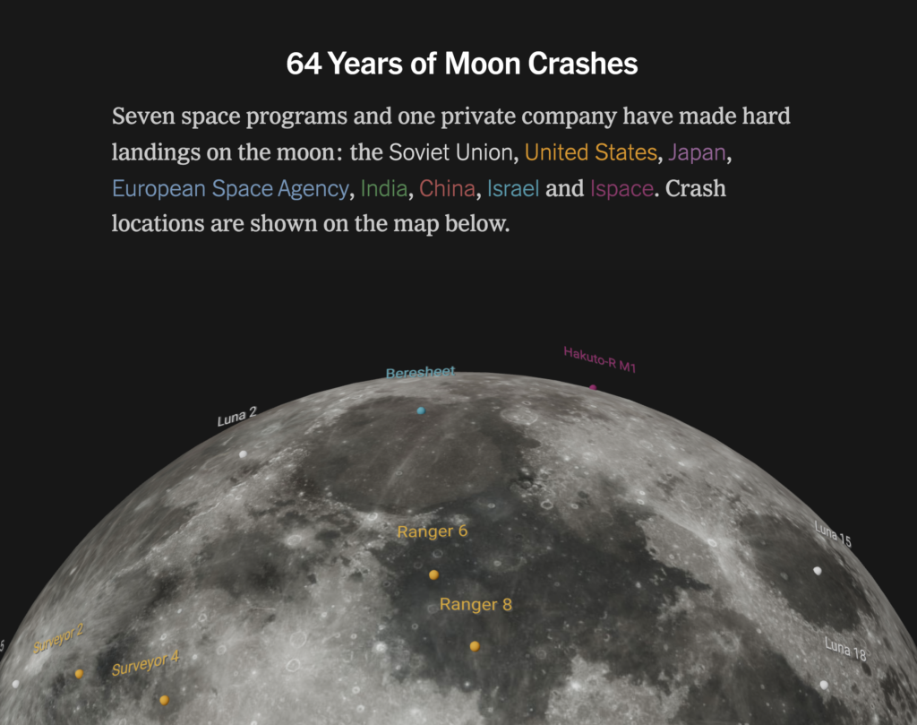
Most visualizations that use parts of the surrounding text (or its background) as color keys are scrollytelling projects. The color key is part of an overlay — and when the visualization changes, so does the overlay:
I hope you enjoyed this article! If you have any comments, please let me know at lisa@datawrapper.de or here in the comments.

Comments