
Remind readers of the colors in your data visualization
October 11th, 2023
12 min
This article is brought to you by Datawrapper, a data visualization tool for creating charts, maps, and tables. Learn more.
One of the biggest superpowers of colors might be to lead a reader’s eye. By emphasizing certain data points and de-emphasizing others, you can decide what you want readers to see first, second, third, and last. And it works with any color scale: Whether you’re showing numerical data in a gradient from yellow to blue, or categories in different hues like purple, yellow, and orange, you can always highlight certain categories, ranges, or values that you consider especially important to your audience or story. This article explains how.
Here’s what we’ll talk about:
01 Start by thinking about which information is most important
02 Make everything else gray
03 Don’t use gray like other colors
04 Use the same hue for less important categories, but desaturate it
05 Don’t use new hues for (de-)emphasized categories
06 Use more saturated colors for more important categories
07 Use saturation to emphasize categories a bit more or less
To emphasize or de-emphasize data points, you first need to decide what’s important. What should people take away from looking at your visualization? What do you want them to see and understand about your data? What question(s) should readers be able to answer?
I recommend writing down the answers if you’re just starting out.
I also recommend prioritizing your goals: What’s most important to show — what should people definitely not miss? What point would be great, but not essential, for readers to spot? And what might be your personal darling data point or category, but is probably not of the highest importance to others?
For example, in a chart about life expectancy, your main priority might be to show that life expectancy improved in all countries over the last hundred years. It might be less important, but still useful to show that life expectancy today is higher in countries with a high GDP. And you might personally really like the fact that life expectancy has increased faster in countries with a high GDP — but if you had to decide, you’d say the first two statements are more important for readers to understand.
Prioritizing means making tradeoffs. If everything is important and emphasized, nothing is — and readers might be so overwhelmed by your visualization that they stop looking at it. It’s better for readers to take away your most important statement than none at all.
Do you know your goals and priorities? Sweet! Let’s start designing.
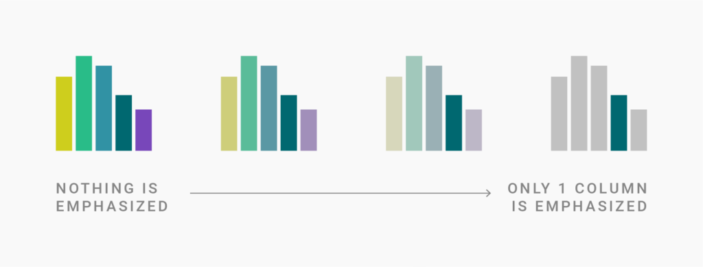
Your priorities will guide decisions about your visualization. You’ll decide which categories are important to show and which ones can be grouped together or removed; you’ll choose a visualization type that brings across your message; you might even adjust the headline so that it states what you want to say; you’ll decide where to place your chart on the page — and, yes, you change the visual design. You create a hierarchy:
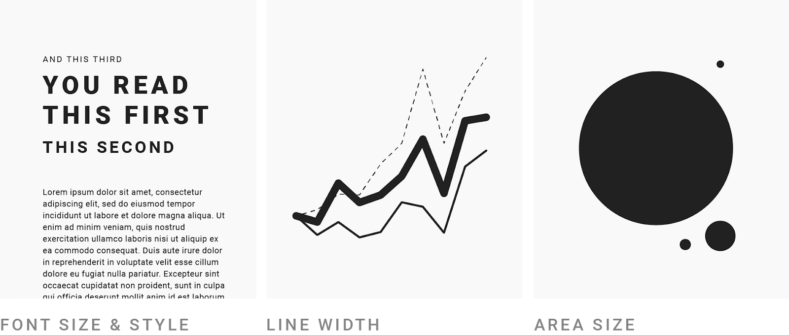
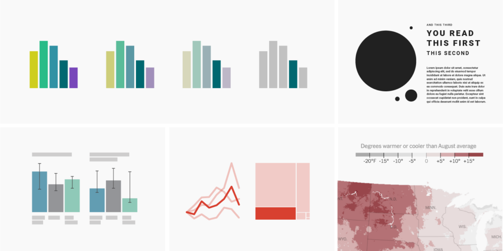
The bigger and bolder you make something, the more attention your readers will give it. Our eyes are immediately drawn to big things.
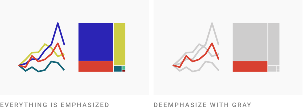
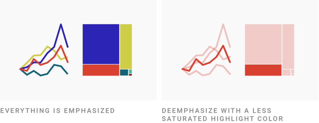
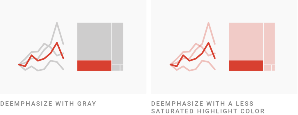
But you know what draws the eye even more? Color. Color is our most powerful tool to control where the reader looks. It can balance or even outweigh the effects of size — especially if we tone down everything else by making it gray:
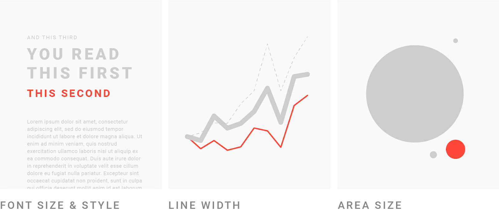
Gray is a storytelling tool: Against gray elements, colored ones will stick out. People look first at the highest-contrast, most saturated color in your chart. Then at the slightly less saturated colors. Then at the grays.
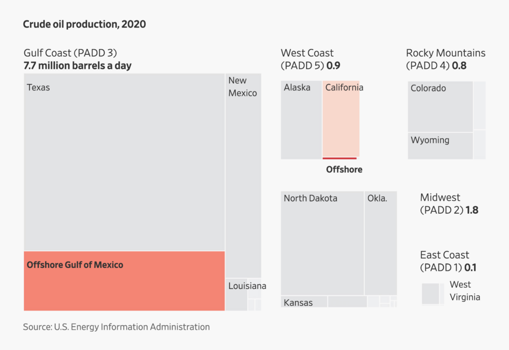
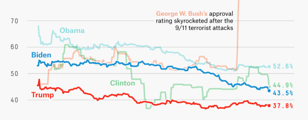
The Wall Street Journal demonstrates that in this chart, where our eyes are drawn to the smaller red areas ⬤ instead of the bigger gray ones ⬤:

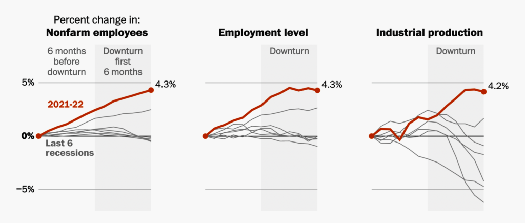
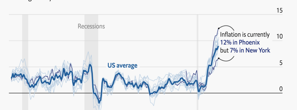
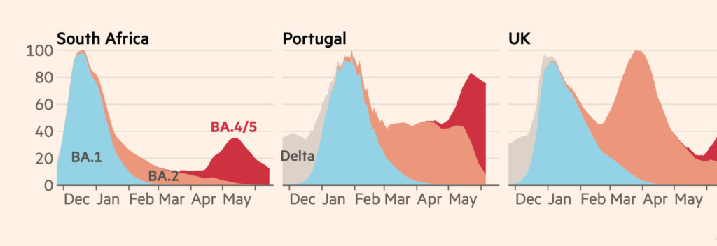
By sacrificing some legibility for your gray categories, you can gain great clarity for the highlighted few. Look at the following example: The designer decided to leave the last six recessions gray and unlabeled, which helps the 2021-22 line really stand out:
By making the average category a little harder to see, you help readers immediately notice the most important one. Here’s another example:
In short: Goals (“people should get this message”) and priorities (“this category is more important than that one”) lead to design decisions (“I’ll make the other categories gray”).
I actually recommend graying out all your colorful categories first. To do so in Datawrapper, click on Customize Colors > Select all > Color picker and then choose gray. Then hover over the data points in the preview and remember the interesting ones. These are the ones you should change from gray to a color like red, blue, or whatever else you fancy.
As we’ve seen, gray is special and should be treated as such. By now, many of your readers are used to colorful visualizations that use gray for less important categories. If a category is as important as other, colorful ones, don’t make it gray.
You might want to use gray as a normal category color because you “ran out of colors” in a chart with lots of categories. Or maybe the data vis style guide you’re following is limited and doesn’t offer enough colors for your needs. If that’s the case, get in touch with the people who can change that in your organization (for your current project and also long-term).
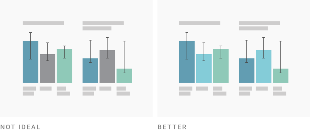
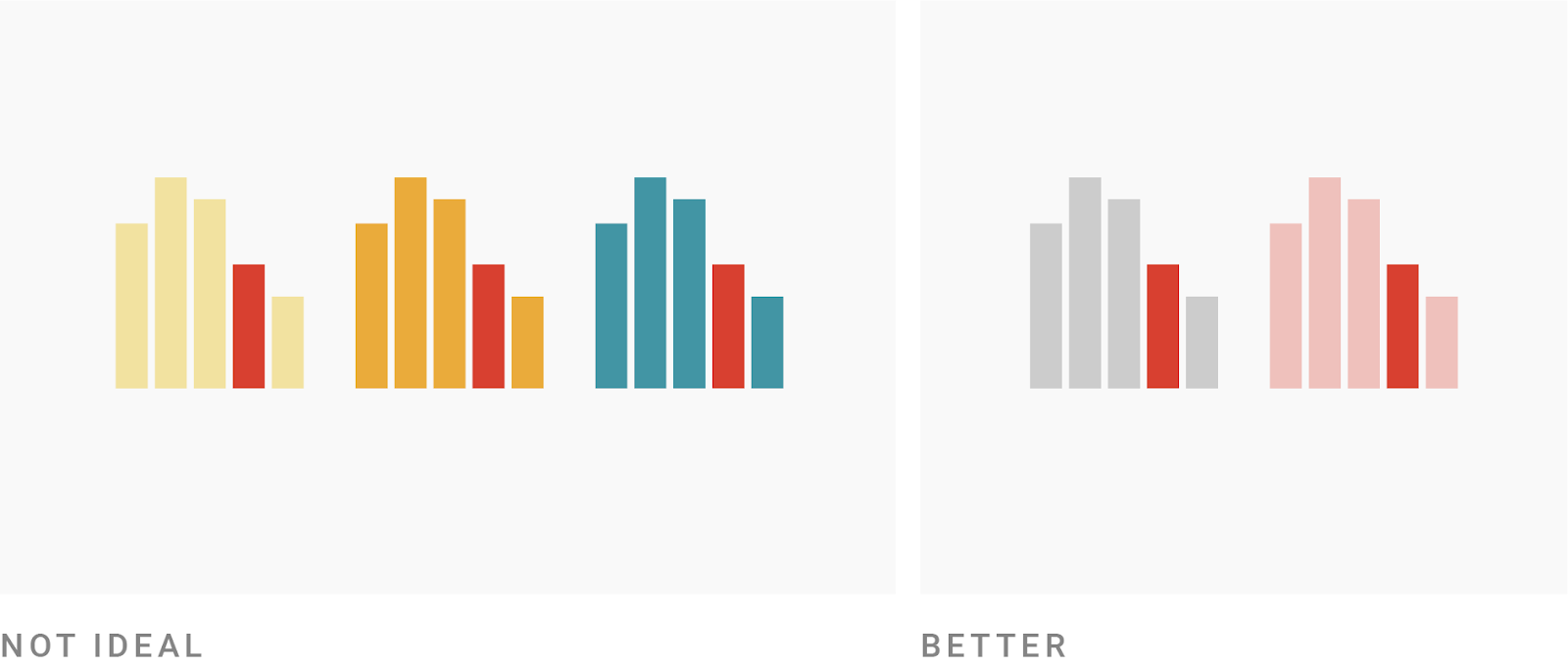
So far, we’ve only looked at gray as a color for unimportant data points. But there are other options: For example, you can use a less saturated version of the highlight color for all other categories.
Here, you basically switch gray for a bit more color:
Make sure it really is simply a less saturated version of the highlight color. Don’t do this:
To be on the safe side, stick to gray or desaturation for de-emphasized categories. Don’t get experimental here — another hue will communicate “this is a separate category,” not “these are all less important categories,”
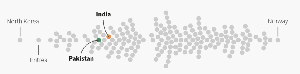
Sarah Leo, visual data journalist at The Economist, wrote about this in her great 2019 article, “Mistakes, we’ve drawn a few.” She showed a chart from 2017 which used a bright blue ⬤ to highlight the labeled countries and a dark blue ⬤ for the unlabeled ones:
“The visualiser (me!) ignored the fact that a change of colour often implies a categorical change,” Sarah writes. Her redesigned chart uses the same hue ⬤⬤ for the labeled and unlabeled countries, but makes the unlabeled ones less saturated ⬤.
Learn from Sarah’s mistakes: Don’t use a separate hue for de-emphasized data.
So far, we’ve looked at ways to highlight one or two categories by giving all the others the same (gray or desaturated) color.
But this comes with a disadvantage: All your not-highlighted categories will look the same. Your readers won’t be able to distinguish between them if they’re not directly labeled.
So when you have just a few categories (and not as many as Sarah in her scatter plot or the other The Economist designer in their line chart), consider using a distinctive hue for each category but making the less important ones less saturated:

Most hover effects in data vis do exactly that by reducing the opacity of everything that’s not selected. “I get it, you want to select this category here,” the visualization tells you as you hover.
You can use the same effect in your static visualizations. FiveThirtyEight and the Financial Times do so here:
A word about color technicalities: One easy way to make your colors less saturated is to make them less opaque (that is, more transparent). This will also make them brighter, which is often a better look than just reducing the saturation. For example, this red ⬤ becomes almost brownish ⬤ when we turn the saturation down, but looks like a nice pastel red ⬤ when it’s 80% opaque.
You can change the opacity of a color by adding a hex number between FF and 00 to the hexadecimal code in the color picker. This will make your color 1% to 100% opaque, and it will also work in Datawrapper. For example, at 80% opacity the red #cc0000 ⬤ becomes #cc0000cc ⬤. #cc00004d ⬤ is the same red at only 30% opacity. You can find a table with all the most important opacities in our Academy.
You can also highlight several categories with this approach. I did so in this Weekly Chart for Valentine’s Day in 2019:
The chart above uses eleven different pie slices. Which is crazy! Every data vis book will tell you not to do that. (I myself urged you to not do that!) In the chart above, I tried to make it work anyway.
With darker, more saturated colors and brighter, less saturated colors, I created two visual “subgroups” in each donut. The first subgroup consists of two slices: people who have said “I love you” to none and to one partner. The second subgroup is everyone else. We can easily compare the first and the second group across donuts — and we can still compare the none-sayers in each age group with each other, or the ones who said “I love you” to more than ten partners.
In the past few sections, we've mostly talked about binary design decisions: If you have one or two important and many unimportant categories, how can you draw attention to the important one(s)? But sometimes you don’t want to distinguish between “important” and “unimportant,” but between “a bit more important” and “a bit less important.” You want readers to pay the most attention to one category, a bit less to another, even less to a third, etc.
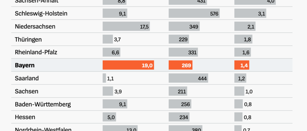
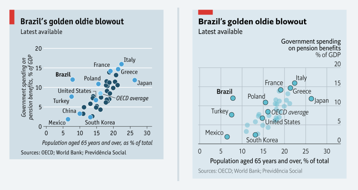
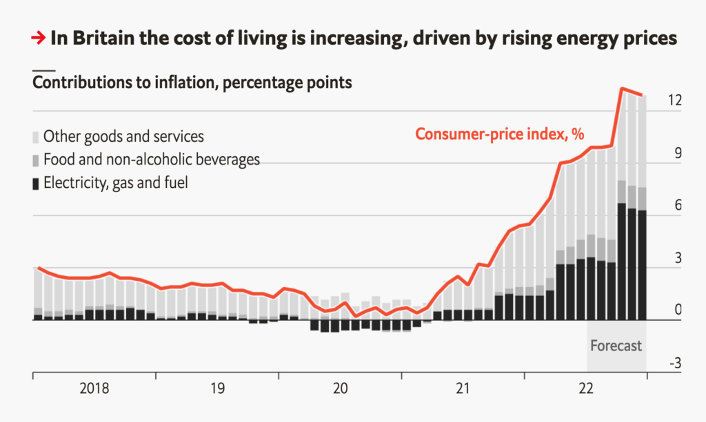
Achieving this with color is possible. Here's an example by The Wall Street Journal that creates four clear levels of hierarchy:
As you can see, the more saturated and darker (on a bright background) the colors, the more attention they'll get. Here's another chart from the same article demonstrating that:

Let’s look at a more complex example (and at the same time one of my favorite data visualizations out there): This 2015 chart by Derek Watkins for The New York Times. The visualization uses six different colors:
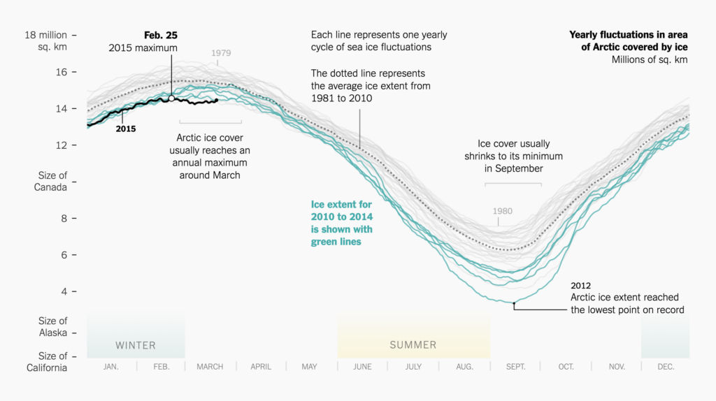
The chart does a few things we've talked about so far. It uses the low-contrast colors ⬤ and ⬤ to reduce the effect of the big WINTER and SUMMER rectangles at the bottom –— they’re not the most important parts of the chart, so Watkins tones them down with light, desaturated colors. More important to understand the chart are the teal 2010-2014 lines ⬤. And Waktkins reeeeally wants people to look at the 2015 line ⬤ , so he gives it the highest possible contrast (black on white) and makes it thicker.
Note that the darkest color — pure black — doesn’t always win the race for most attention-getting. When seen together with a crazy-saturated color like neon green ⬤ or red ⬤, we'll likely look at these lighter but more saturated colors first. Here are two charts where saturation wins over darkness:

Choosing good colors is hard when you're just starting out — and it can take a long time even when you're more experienced. If you're not sure which of two colors will subtly catch your reader's eye more, just go back to creating a strong distinction between important and unimportant chart elements using "important" (dark, saturated) and "unimportant" (light, pastel, gray) colors.
If you found this information helpful, you might also like:
I hope you enjoyed this article. Are you missing some kind of advice? Leave a suggestion in the comments or write to me at lisa@datawrapper.de. As always, I'm looking forward to hearing from you.
Edit July 25: The previous version of this article stated that you can change the opacity of colors by adding numbers between 00 to 99 to a hex code. That's wrong. Here's how it actually works.

Comments