This article is brought to you by Datawrapper, a data visualization tool for creating charts, maps, and tables. Learn more.
The COVID-19 chart I wish I didn’t have to make

Hi, this is Gregor, Co-founder and CTO of Datawrapper, with yet another coronavirus chart for you!
When I began thinking about what topic to pick for my Weekly Chart I ruled out charts about the coronavirus. I think we’ve seen too much of them already. We’ve seen the curves, the log scale growth, the doubling time tables, death tolls, etc. And now we’re ready to move on. After all, the crisis is pretty much over, 10,000 Germans are traveling to Mallorca, my kids are back in school, and life finally goes back towards normal.
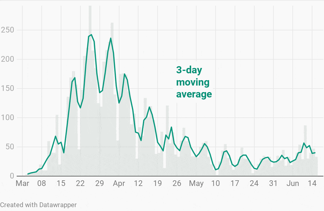
Then my colleague Jakub wrote a new scraper for Berlin COVID-19 cases, scraped fresh off the Berlin press releases. So I wrote a little R script to look at the data. Day after day, the curve looked more like it’s bending upwards again. I felt like I had no choice but to show it to you for this week’s Weekly Chart:
The curve is bending up again, but it’s important to not fall into the extrapolation trap. Just because a trend line ends in an upwards slope doesn’t mean it has to continue that way. Every day new numbers come in, and there’s nothing that can tell us how the future will look like.
New cases instead of total cases
Let’s take a closer look at what’s in the chart and why I put it there.
It all begins with the question of what data we want to show. Jakub’s dataset lists the total number of COVID–19 cases, deaths, and recoveries for each day. Now I could’ve made a chart of the total cases. But it’s pretty hard to see the growth rate just by looking at the slope or steepness of the line:
And while one could use a log scale to show the growth, I think that just plotting the new cases makes the chart somewhat easier to read.
A moving average
But plotting the new cases means we’re seeing a lot of fluctuations. The number of new cases depends on random events as well as weekly patterns (e.g. fewer tests on the weekends). This makes it harder to see the larger trend. So I decided to help the reader by adding a moving average.
There are two important parameters when computing moving averages: the first is the window size, which is the number of days that should be averaged, and the second is how this window is aligned. Here we see different window sizes:
The larger the window, the smoother the line becomes, but we’re also shrinking the line from both ends. That’s because in order to compute a 14-day average I actually need 14 days of measurements. When using a center-aligned moving average. that means 7 days ahead and 6 days behind. Which brings us to the second parameter.
The second parameter is the alignment with the three options right-, center- and left-alignment:
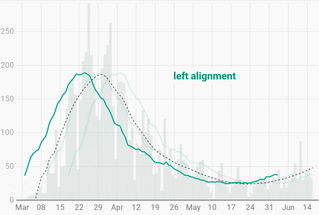
Right-alignment means that the average for a given day is computed by looking at the preceding two weeks, while a centered-moving average is computed from the the previous seven days, today and the six future days. The alignment does not change the shape of the curve. But it “shifts” it horizontally. There are good arguments for both alignments, but I decided to center.
An uncertain trend line
As mentioned before, we don’t get average values for the end of the line with a centered-moving average, so we can’t see the “trend” for the last few days. This might be confusing but it makes sense: We can’t show the trend because we can’t predict how the next 7 days are going to look like.
Good thing there are methods to compute a trend with some uncertainty, like Loess. Loess takes a bunch of x and y points and tries to find a curve through the data that minimizes the differences from each point to the curve.
And this is where the third layer of the chart comes in: the black dashed line is the Loess prediction that shows the overall trend. It matches pretty closely with the 14-day moving average, but it extends over the entire timespan.
How to make bar/line chart combinations in Datawrapper
While it’s not the first combination of bars and lines that you’ve seen on this blog, it’s worth talking about it really quick. It’s possible to bring bars into a line chart by adding custom area fills. They allow filling the area between two lines in the chart:
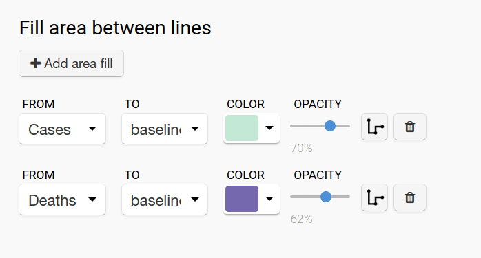
So that light green bar chart is actually just an area. However, before today, it wasn’t possible to give the custom area fill a different interpolation than the rest of the chart. We now added a little button that lets you change this.
As German states are lifting the Coronavirus lockdown measures, the big question remains when is it “safe enough” to go back to normal entirely. Unfortunately, that means we can’t stop looking at COVID-19 charts just yet. The charts here update once a day, so feel free to check in again in a few days. If you’re interested, you can also dive into R code I used to compute the moving average and Loess trend. Stay healthy – and we’ll see you next week!


Comments