This article is brought to you by Datawrapper, a data visualization tool for creating charts, maps, and tables. Learn more.
Data Vis Dispatch, August 17
The best of last week’s big and small data visualizations
Welcome back to the ninth edition of Data Vis Dispatch! Every week, we’ll be publishing a collection of the best small and large data visualizations we find, especially from news organizations — to celebrate data journalism, data visualization, simple charts, elaborate maps, and their creators.
Recurring topics this week include natural disaster, the US Census, and the swift advance of the Taliban.
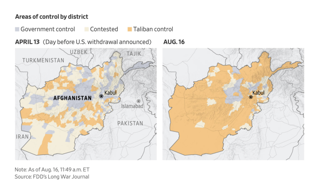
In the past few days, one visual story has overtaken all the others. Government control collapsed across Afghanistan as the Taliban took province after province:
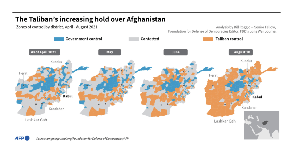
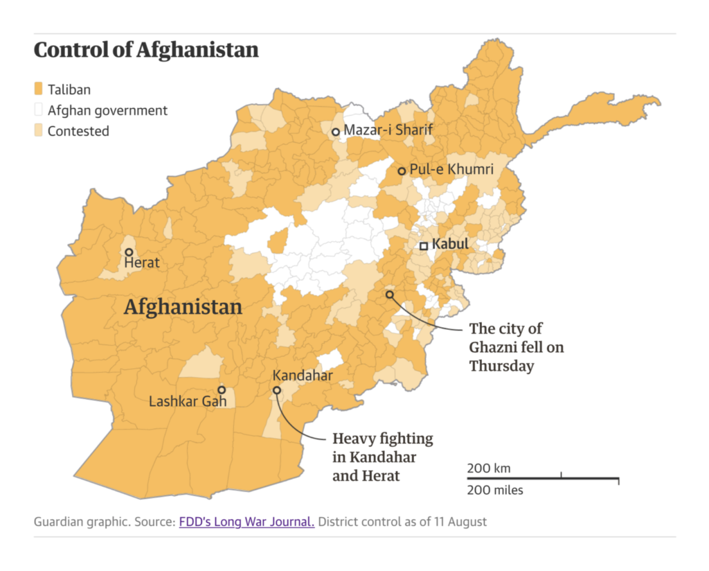
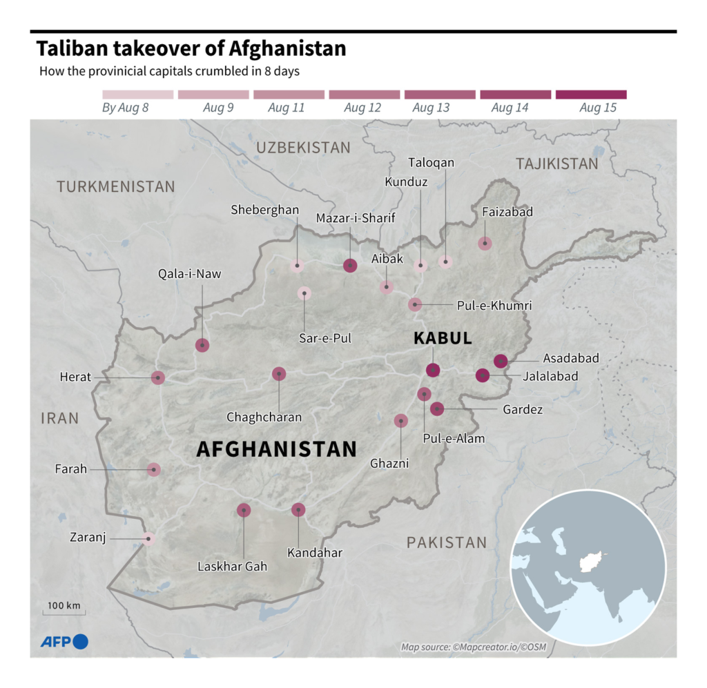
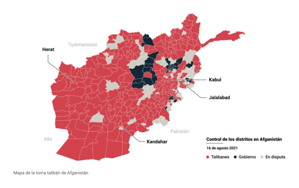

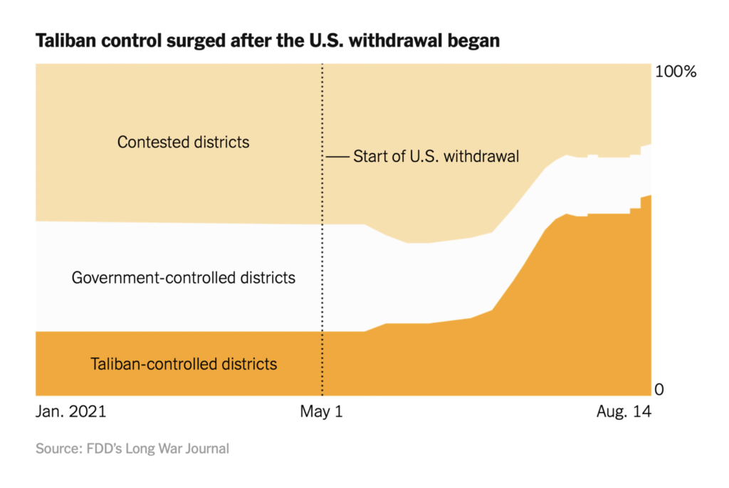
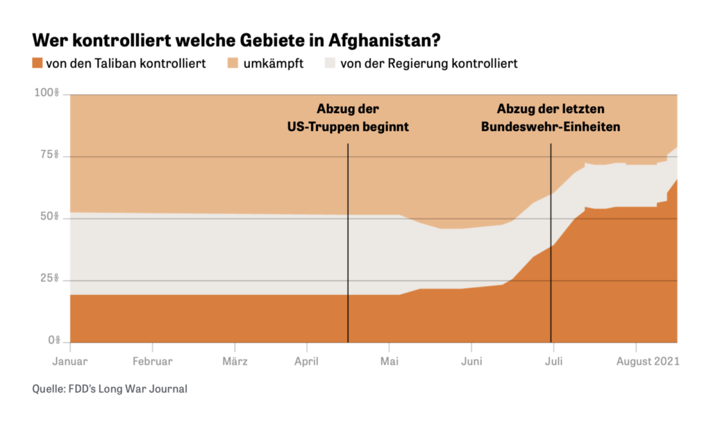
Although maps clearly dominated on this topic, some newsrooms showed us the captured territory in chart form:
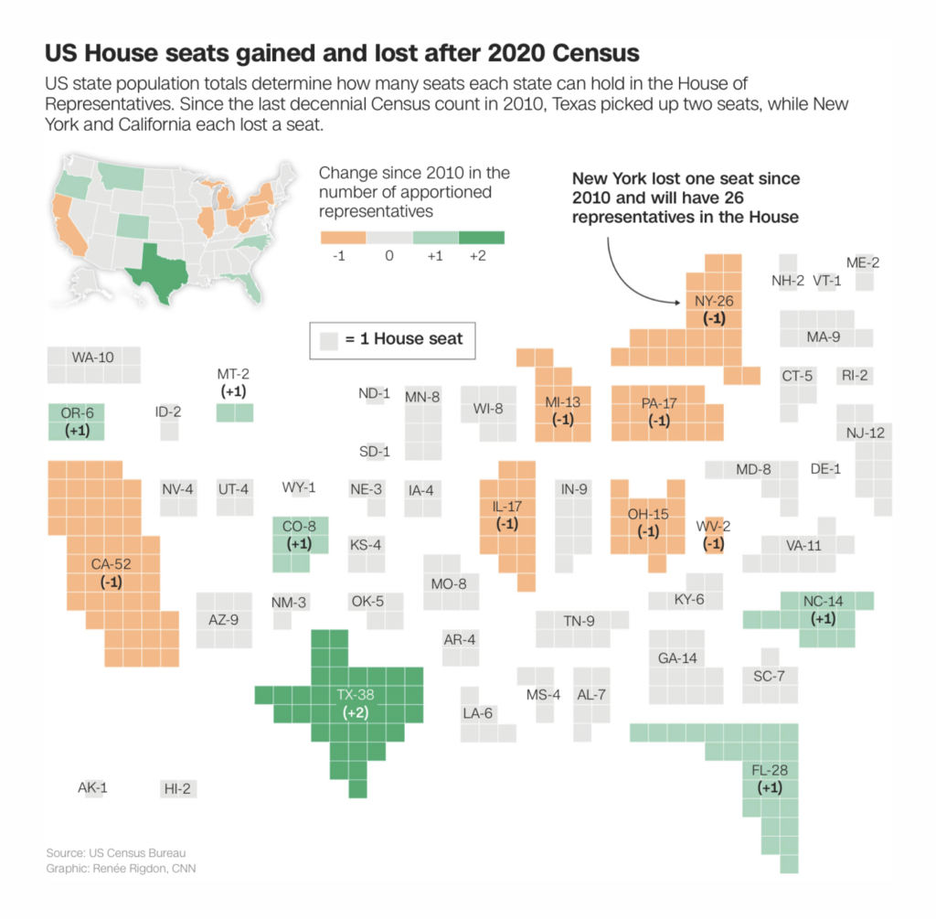
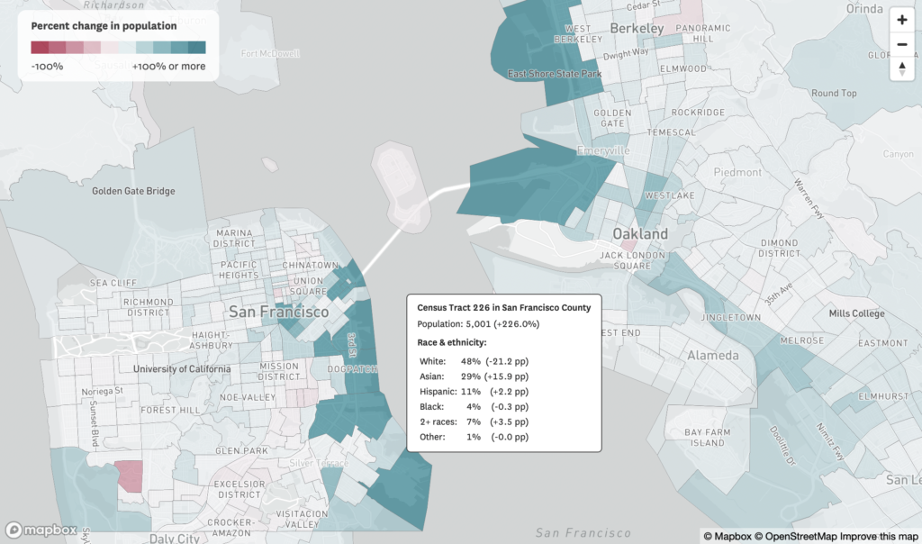
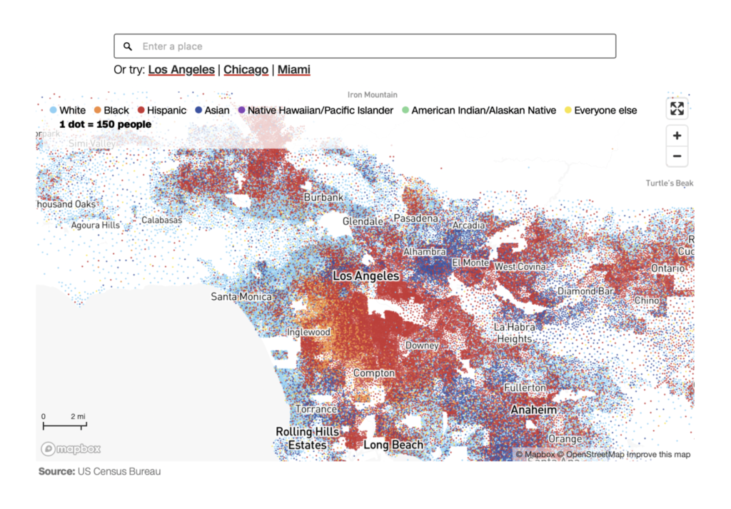
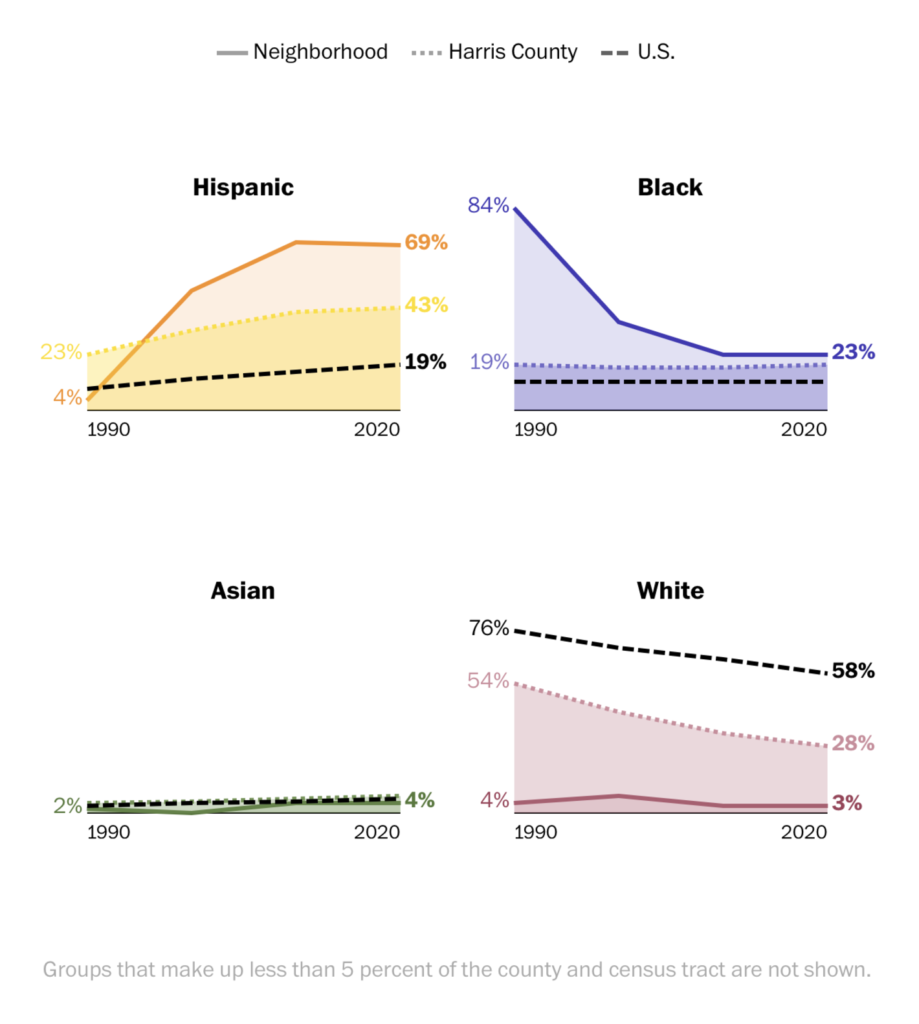
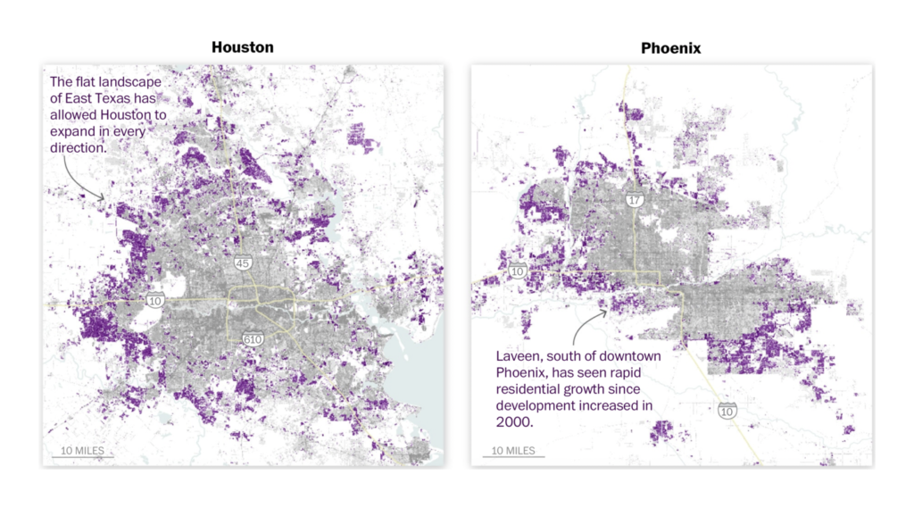
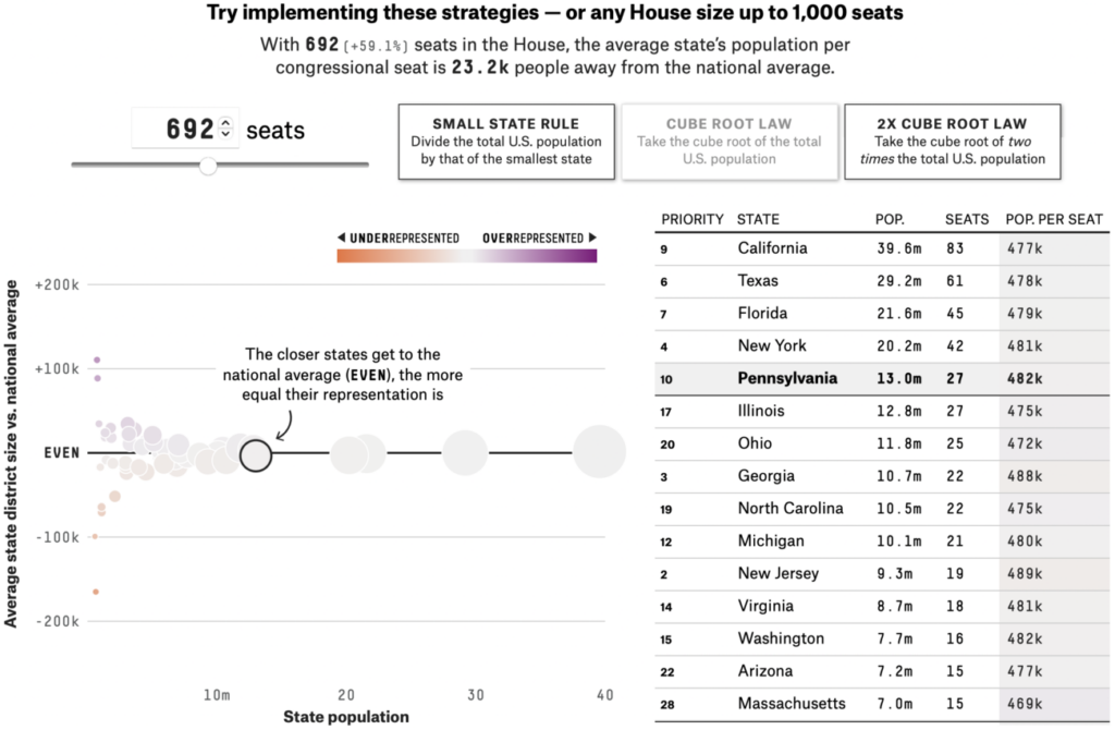
Most people might not consider the release of the 2020 US Census results a story to rival the Taliban rout — but in data visualization, it just about was. At stake is the reapportionment of congressional seats:
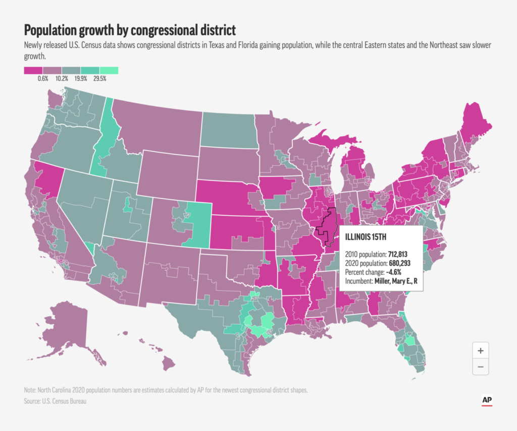
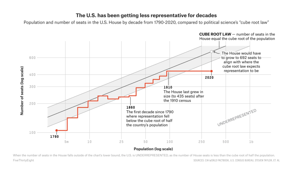
The nationwide trends were low population growth and increasing racial and ethnic diversity:
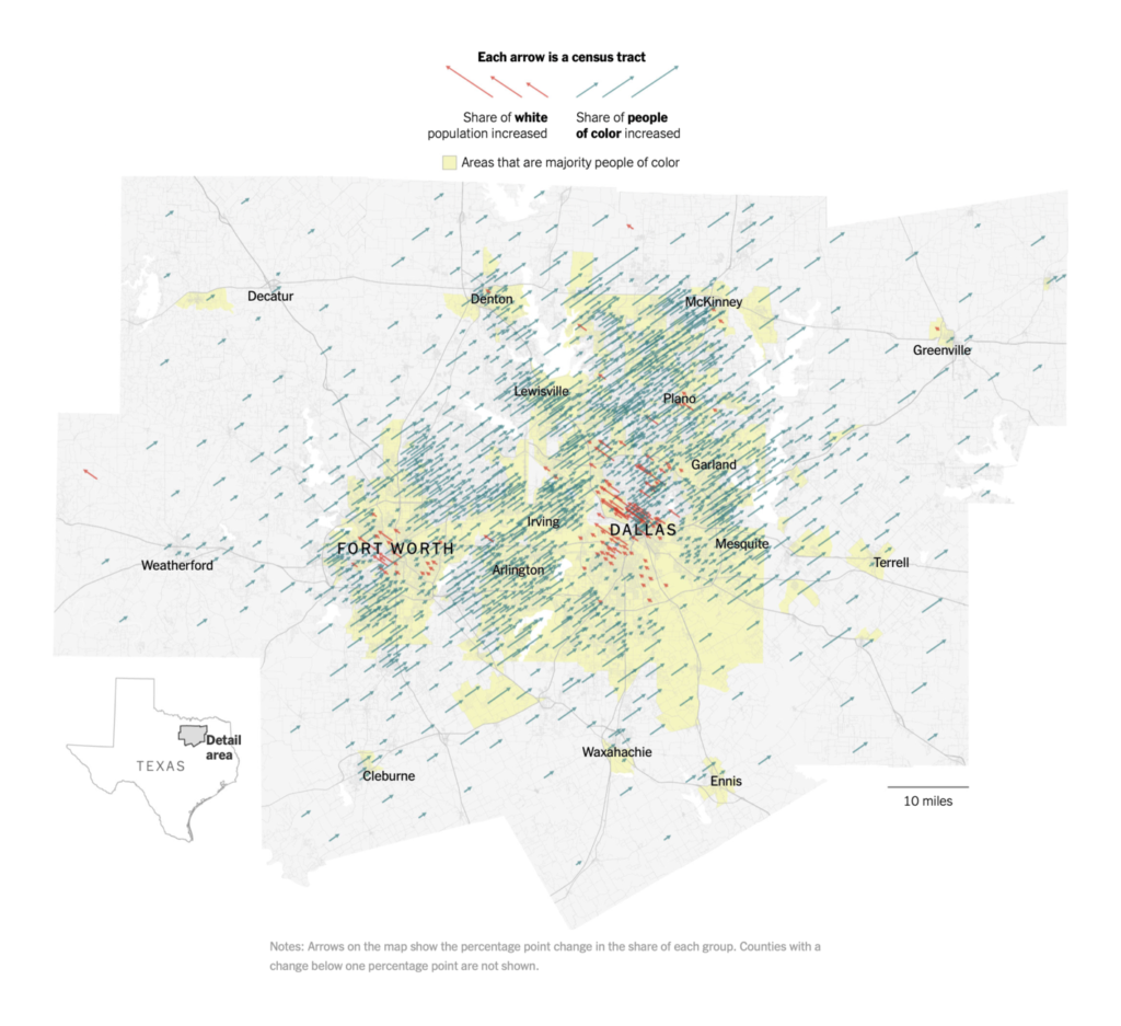
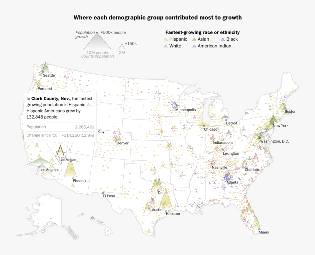
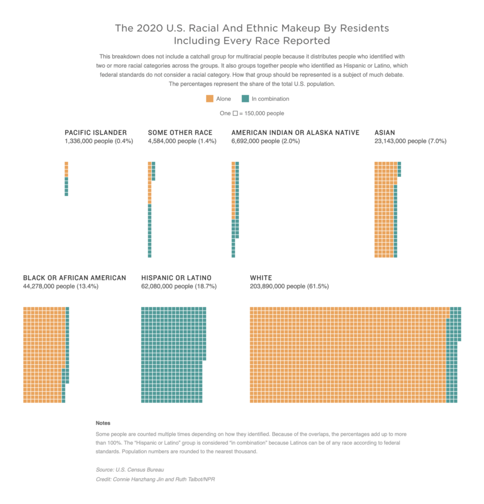
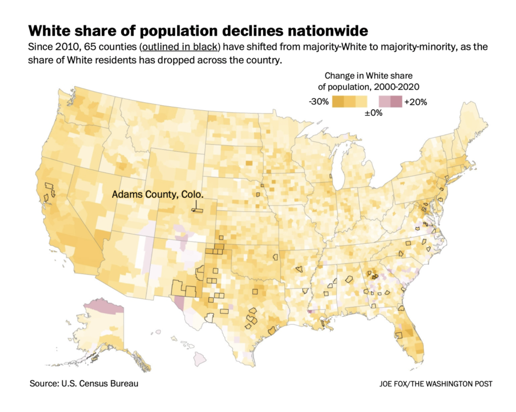
A number of interactive tools allowed readers to explore the changes in their own neighborhoods:
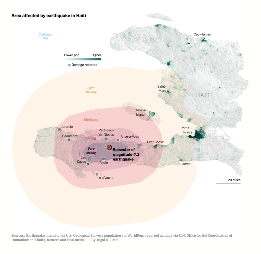
A major earthquake in Haiti was this week’s headline natural disaster:

And we continued a summer of devastating heat, drought, and wildfire (not to mention floods):
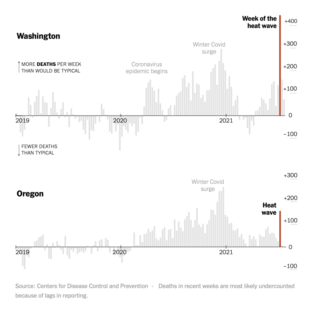
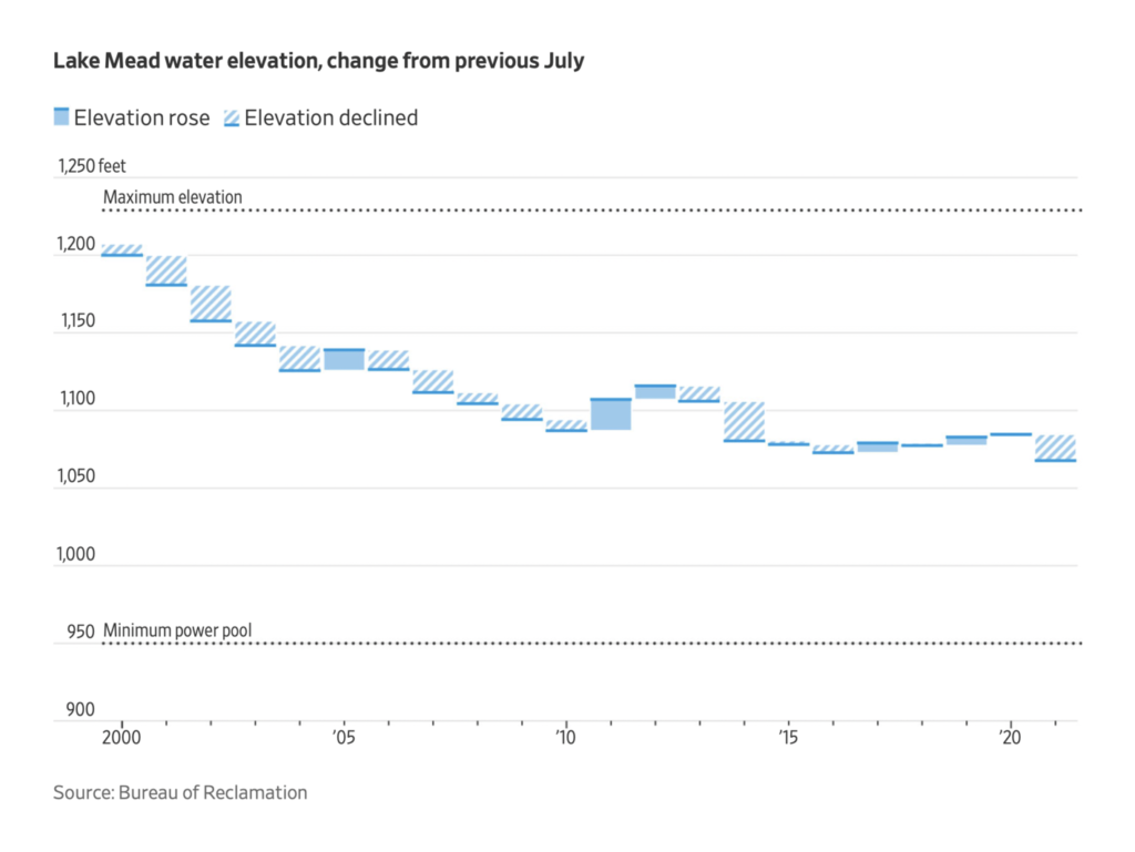

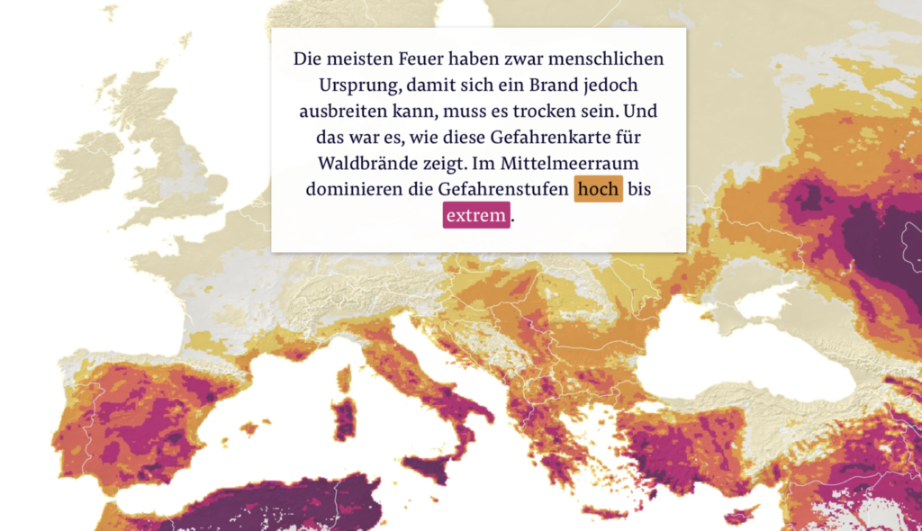
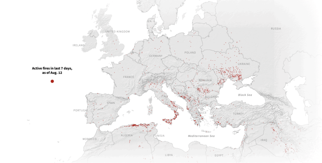
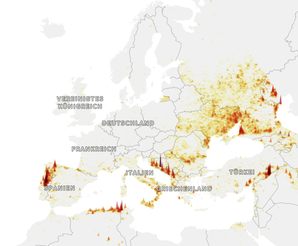
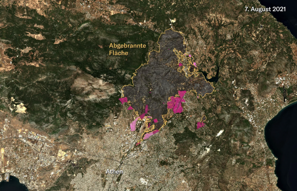
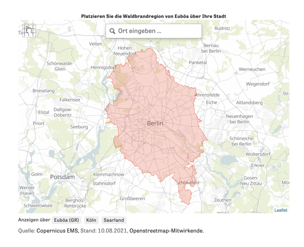
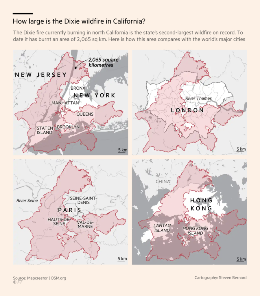
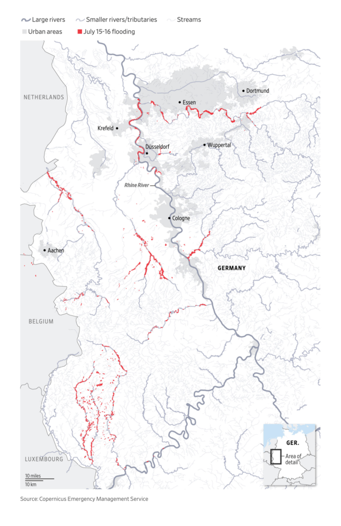
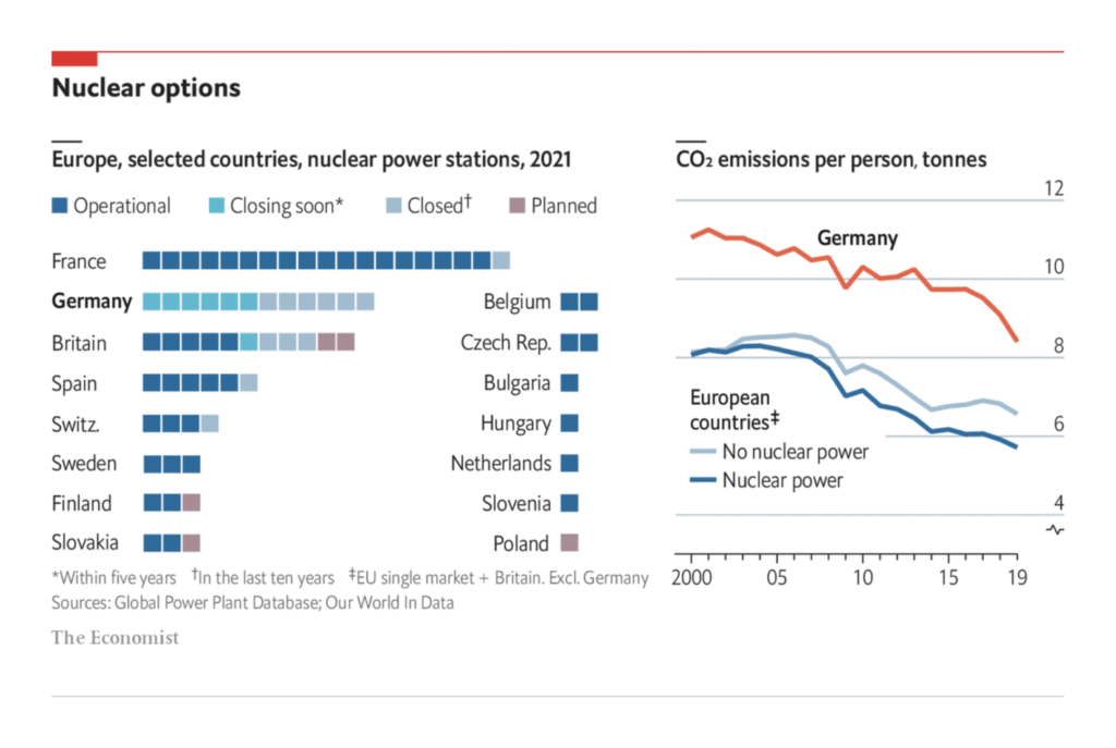
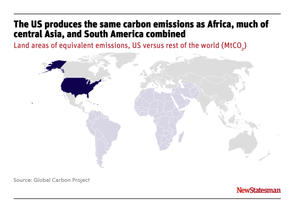
The underlying cause is warming caused by carbon emissions — but neither the risks nor the blame are equally shared:

Plus… there’s a pandemic. Vaccines are still effective:
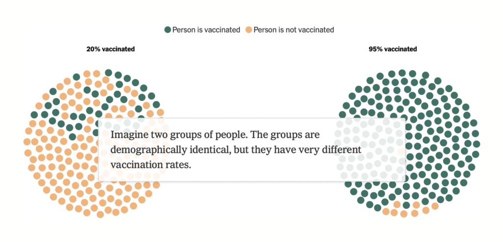
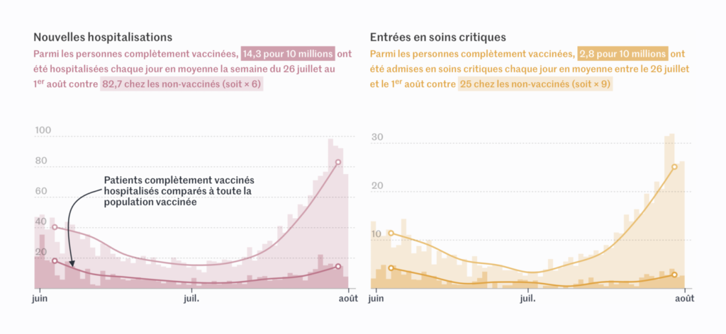
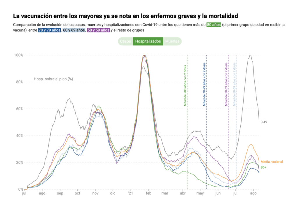


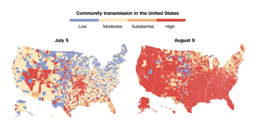
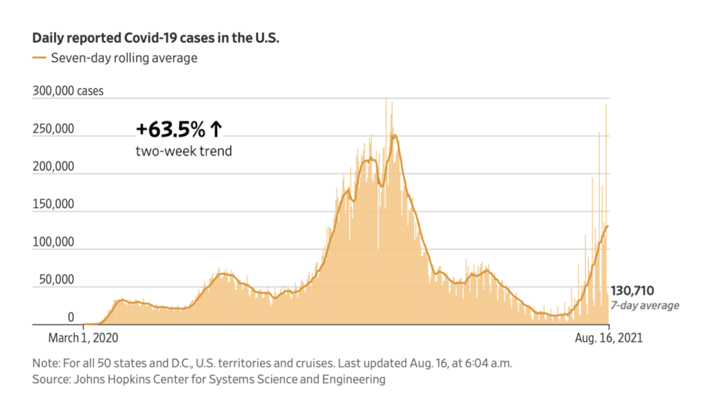
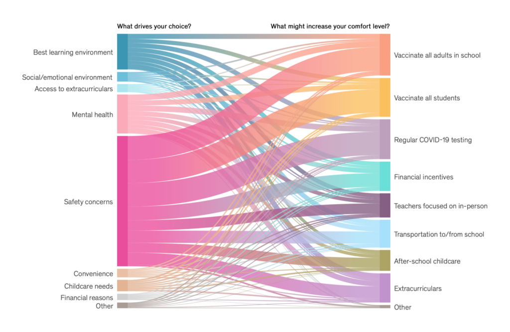
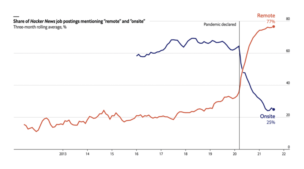
But they haven’t stopped a fresh wave of Delta variant cases, or returned things to normal at school or at work:
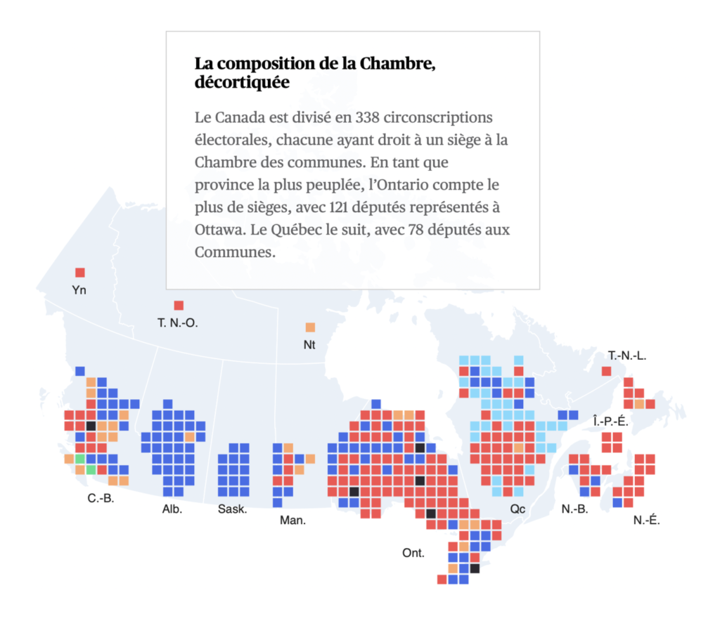
In politics, early elections have been called in Canada and the German campaign continues as well:

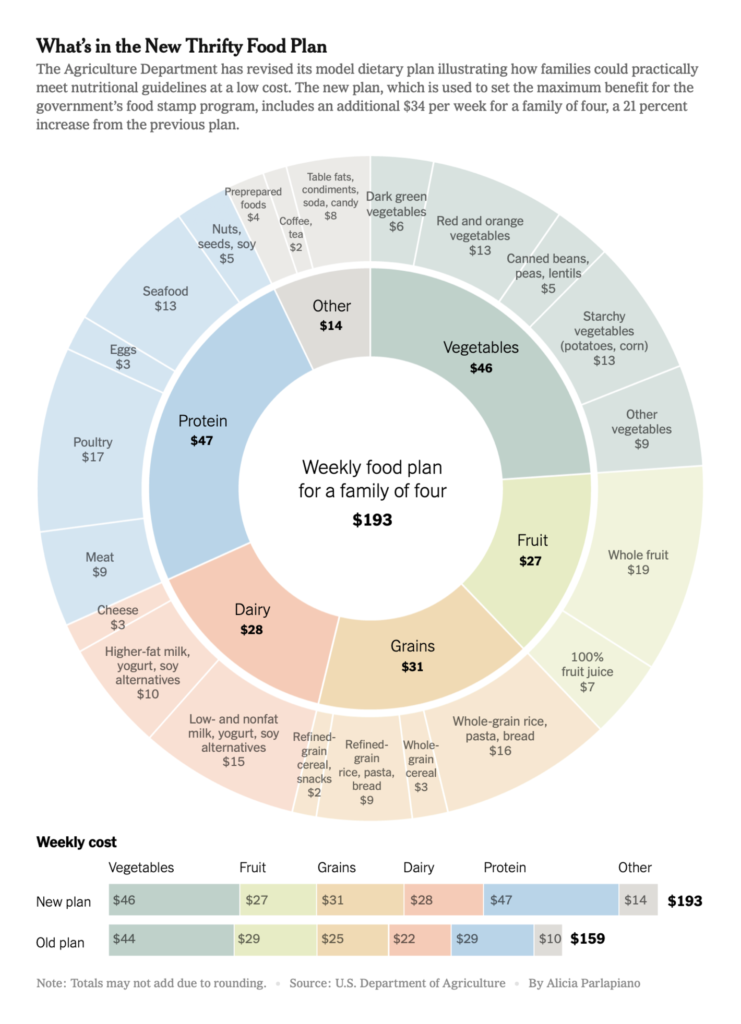
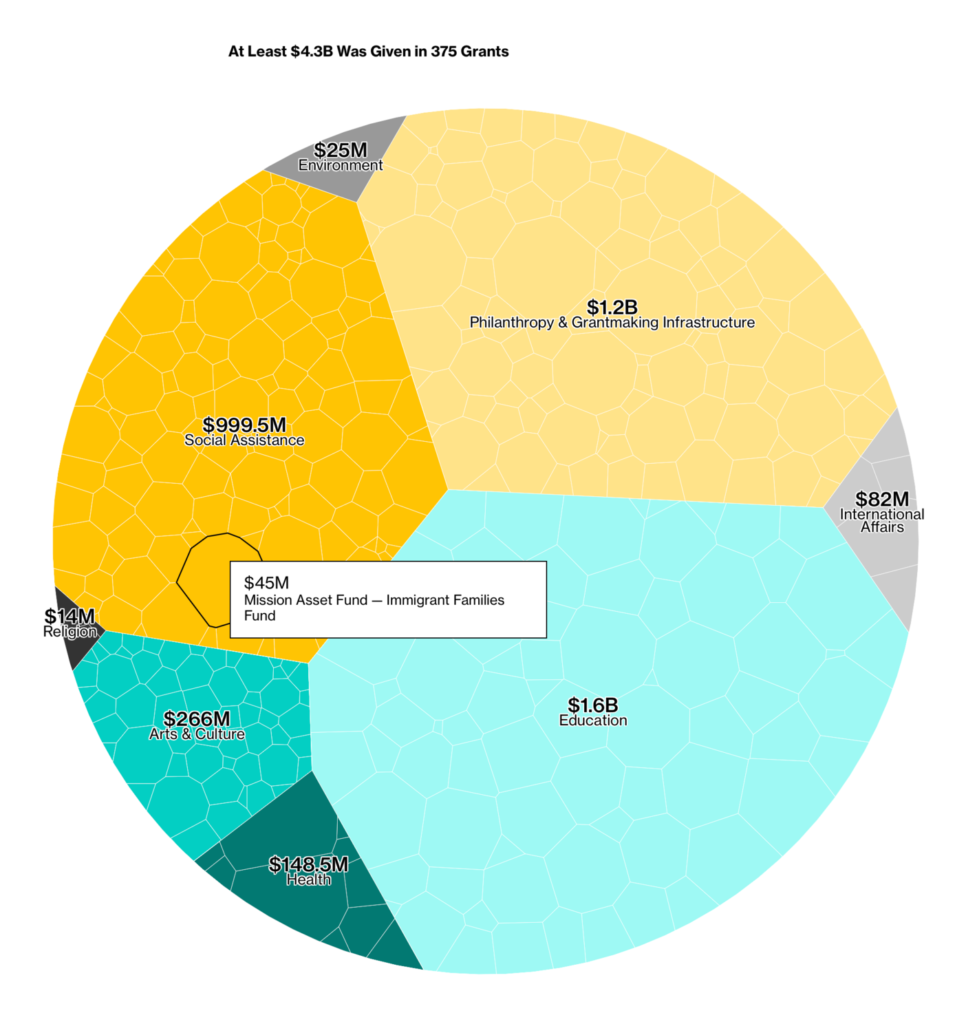
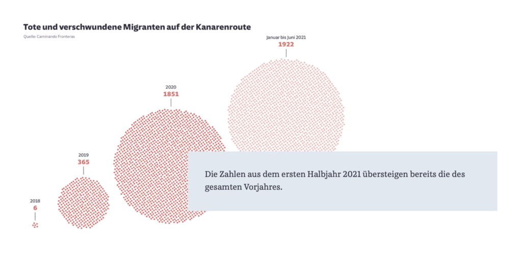
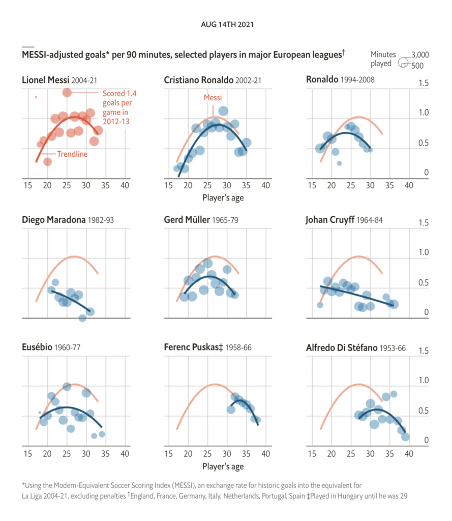
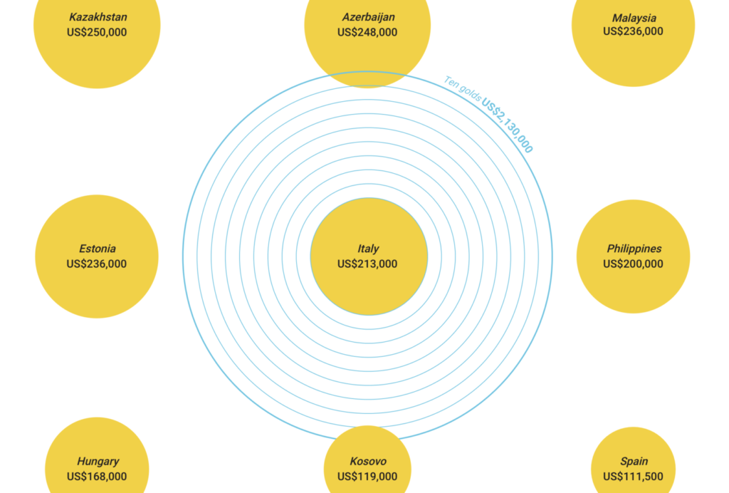
Finally, in general topics, it’s fair to say the theme of the week was “circles”:
What else we found interesting



Help us make this dispatch better! We’d love to hear which newsletters, blogs, or social media accounts we need to follow to learn about interesting projects, especially from less-covered parts of the world (Asia, South America, Africa). Write us at hello@datawrapper.de or leave a comment below.


Comments