

New: Stay organized with a more powerful, faster visualization archive
June 25th, 2024
3 min
This article is brought to you by Datawrapper, a data visualization tool for creating charts, maps, and tables. Learn more.

We know that many of you teach Datawrapper in your own or in other organizations, to introduce more people to the wonderful world of chart & map-making. We love that. And we want to support that. That’s why we’re releasing training slides today, which – hopefully – make it easier for you to prepare and give Datawrapper workshops:
You can find the 240 slides of exercises and other modules on Google Slides:
From there, you can download the slides as a Powerpoint file or PDF. And yes, you can use this material for all kinds of commercial and noncommercial workshops without attributing us. (You can also print these slides, but only in a workshop context.)
We prepared both talk slides (“modules”) and exercises for you. Each slide contains speaker notes (View > Show speaker notes) with suggestions on what to talk about while showing it.
The modules are the “talk” part of your workshop. Use them to explain what you can do with Datawrapper:
Introduction to Datawrapper (see the slides)
Introduces Datawrapper and its core features: Responsiveness, hover effects, themes, pricing, users.
Datawrapper vis types (charts, maps, tables) (see the slides)
Shows some chart types you can build, all map types (choropleth, symbol, and locator map), and table features.
Other Datawrapper features (see the slides)
Explains the colorblind check, live updates, PNG, SVG & PDF export and team features.
Datawrapper resources (see the slides)
Lists and explains where workshop attendees can get help or inspiration when working with Datawrapper in the future (Academy, blog, newsletter, changelog, support, River, Twitter). This will most likely be the last part of your workshop.
The exercises are the “do” part of your workshop. We prepared five of them with different difficulty levels. All of them work great for demos (= you show attendees how it’s done but they don’t follow along) and for workshops in which attendees build Datawrapper visualizations on their own laptops.
Go directly to the explanation of each exercise:
1 Let’s build a stacked bar chart (see the slides)
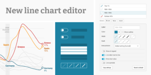
2 Let’s build a line chart with Worldbank data (see the slides)
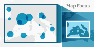
3 Let’s build a locator map of our city (see the slides)
4 Let’s build a choropleth map of the US election results 2016 (see the slides)
5 Let’s build a choropleth map with IMF data (see the slides)
These exercises are not set in stone. Adjust them to your needs: If your organization re-uses a certain dataset again and again, show your workshop participants how to use this one in Datawrapper. If you teach in a country/city with a great open data portal, use their data. If you teach people in a certain field, try to get data from that field.
You will find that every exercise comes with a lot of screenshot slides that show the whole process. We don’t recommend that you show these slides during your workshop. Instead, open Datawrapper in the browser and show everything your attendees are supposed to do, live. This way, you can react to spontaneous questions (“Can I do x, too?”).
Let’s go through the exercises:
Short exercise to show the different available Datawrapper chart types while talking about the essentials of chart making like reponsiveness, colors and chart titles.
Slides: Find them here.
Difficulty:
Dataset: The Datawrapper sample dataset “Trust in Media Reporting”.
Focus: Which chart types Datawrapper offers and when to use which one, how to use colors to make charts understandable, stacked bar chart settings.
Also touches on: Pie / Donut chart settings, why and how to use transpose, why and how to test for mobile readers, how to write a chart title, share & embed settings after publishing.
Time: 10-20 min when demoing / 30-60 min when attendees follow along
Covers the whole process from the data to a visualization with fancy annotations. Includes cleaning up the data, although Excel skills are not necessary. Prepare the data set beforehand and hand them out as Google Sheet link if you want to shorten the exercise and / or make it easier.
Slides: Find them here.
Difficulty:
Dataset: The Worldbank dataset about unemployment in all countries between 1991-2019. We prepared the exercise so that the resulting chart shows unemployment in European countries, but the exercise is built in a way that the resulting chart can compare the unemployment rates in any country.
Focus: Line chart settings, cleaning up data for use in Datawrapper, how to use colors, annotations and highlight ranges to make a strong statement with a chart.
Also touches on: How to navigate the Worldbank Data Portal, the difference between data file types (CSV, Excel, XML), why and how to use transpose, why and how to test for mobile readers, number formats, how to write a chart title, share & embed settings after publishing.
Time: 20-30 min when demoing / 40-90 min when attendees follow along
Choose this easy exercise if your attendees should have an good-looking map at the end without the need to tackle data first. Or make the exercise far more challenging and include a lesson on how to import GeoJSON markers / areas / lines.
Slides: Find them here.
Difficulty:
Dataset: None. The markers show the favorite places of your workshop attendees.
Focus: Creating & formatting markers and other locator map settings.
Also touches on: Why and how to test for mobile readers, share & embed settings after publishing.
Time: 5-20 min when demoing (depending on how many locator map settings you will show) / 15-40 min when attendees follow along
In this fairly easy exercise, attendees rebuild the famous election map they’ve probably seen many times before. The map shows the election results on a county-level, making it impressively detailed.
Slides: Find them here.
Difficulty:
Dataset: A prepared data set of the results of the US election 2016 for each US county, handed out as a Google Sheets link.
Focus: Choropleth map settings, how to use colors to create a useful and truthful map.
Also touches on: How to encode two values in one map (results for Democrats and for Republicans) and the disadvantages that comes with it, how maps are great for showing patterns, how hard it is to “read” values out of maps, how to show multiple values in tooltips, (if wanted: how to write a chart title), share & embed settings after publishing.
Time: 10-15 min when demoing / 30-50 min when attendees follow along
This exercise uses data that comes directly from the IMF data portal “World Economic Outlook Database”. There’s no need to clean the numbers up in spreadsheet software before importing them to Datawrapper. That makes it fairly easy to experience the whole process from data to map (although you’ll need to make extra sure every attendee follows along in the IMF data portal, otherwise they’ll easily get stuck).
Slides: Find them here.
Difficulty:
Dataset: Unemployment data by the International Monetary Fund (IMF) in all countries for the current or last year. We prepared the exercise so that the resulting map shows unemployment in European countries, but the exercise is built in a way that the resulting map can show unemployment on any continent.
Focus: Choropleth map settings, how to use colors to best point out the difference between central / northern European nations & southern European nations.
Also touches on: How to navigate the IMF Data Portal, how maps are great for showing patterns, how hard it is to “read” values out of maps, how to show multiple values in tooltips, how to write a chart title, share & embed settings after publishing.
Time: 10-20 min when demoing / 40-70 min when attendees follow along
Here are some ideas on how to make the most of these modules and exercises in the next Datawrapper training you’re giving:
1. Define a goal Before you put together a presentation, be clear about the goal of your workshop. What should your attendees remember after your workshop? Do they just need an overview of the features, or should they be able to create Datawrapper charts on their own afterwards? Do they have knowledge gaps in certain areas like data preparation that need to be filled?
2. Pick modules & exercises Now, go through our modules and exercises and see which ones could be helpful to your workshop attendees. We dont’t recommend that you go through all the exercises in one workshop. There’s simply not enough time and too much repetition. Instead, stitch them together as you need. To copy the slides, go to File > Copy. Or make use of File > Download to download them as a PPTX or PDF.
For example, imagine you want to give three workshops to three audiences: “Overview of Datawrapper features”, “Creating data vis – from data to final chart / map” and “Building maps with Datawrapper”. Your slides could contain the following modules and exercises:
Consider combining these workshop modules with ones that you created yourself and that cover the questions and needs of your attendees even better. For example, the workshop that focuses on data preparation could include an introduction to spreadsheet & data analysis software, an extra explanation of data cleanup & analysis, and/or a walkthrough of the data resources your attendees might find useful.
3. Practice
Before you give a Datawrapper training, try to rebuild the charts and maps from the exercises and notice problems or questions that could come up. Keep in mind your audience: Which software are they already familiar with? How slow/quick can/must you explain certain parts?
4. Give the workshop
Finally, the day has come. Have fun giving the workshop! If you learn anything during the workshops that might be helpful to us to improve Datawrapper – like what most attendees had problems with – we’d be thrilled if you could let us know. Write to us at support@datawrapper.de.
You can find more information on what to consider when preparing and giving a Datawrapper workshop, and what to keep in mind when helping individuals during these workshops on the first few slides of the training materials.
If you have any other ideas on how to support you best in teaching Datawrapper, please let me know! Please also get in touch if there’s any feature you miss that was not covered in the training slides. You can reach me at lisa@datawrapper.de. Like always, I’m looking forward to hearing from you.
Comments