Radish to romanesco: A year in vegetables
February 20th, 2025
4 min
This article is brought to you by Datawrapper, a data visualization tool for creating charts, maps, and tables. Learn more.

Last Thursday, 11th of February, was the International Day of Women and Girls in Science, one of the UN days. I like the idea of celebrating something on a particular day – it allows me to pause and think for a moment about a specific topic. So for the past week, I’ve done just that.
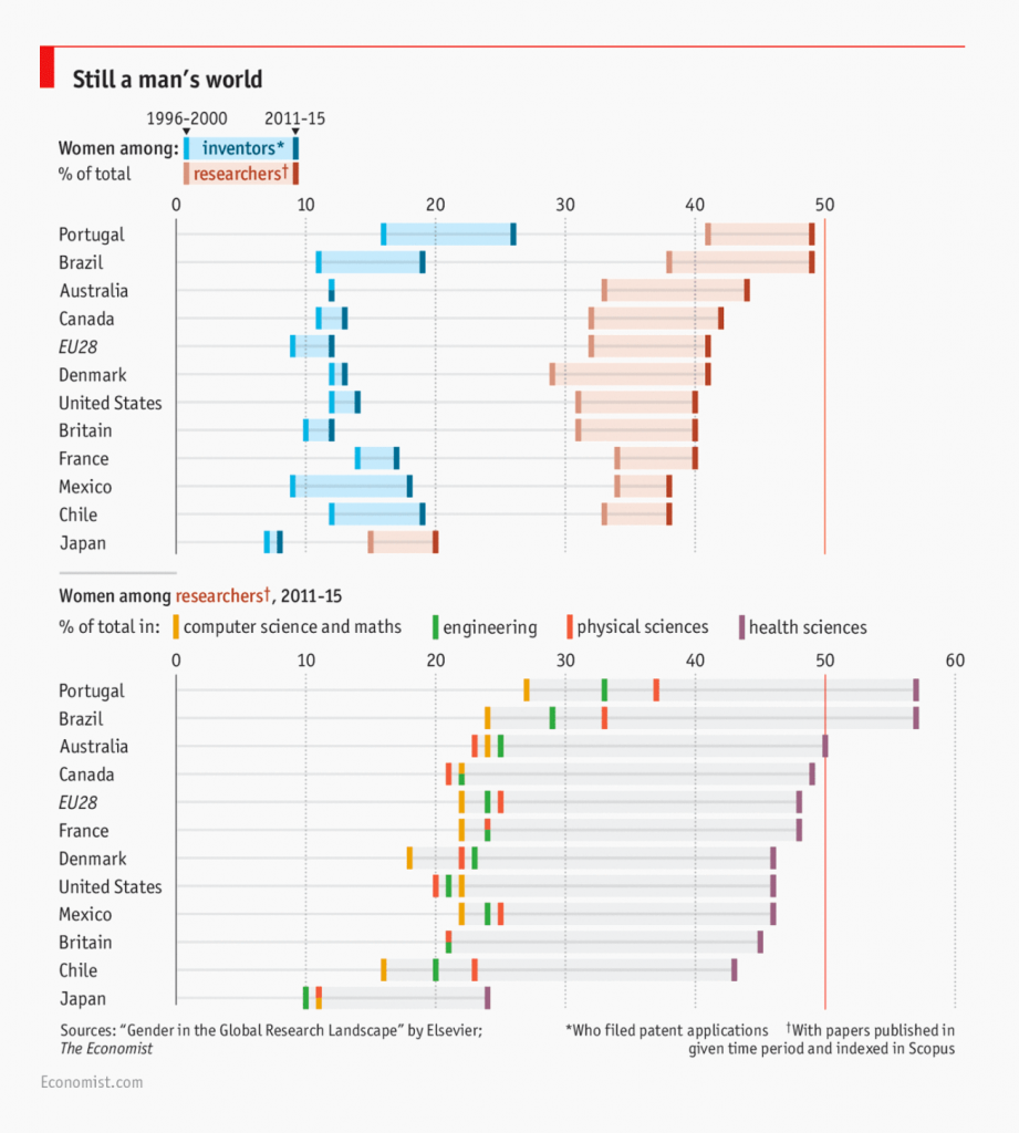
While I read up on the topic, I found an article from four years ago titled the gender gap in science by the Economist that intrigued me. Below is the chart from the article, based on the Dutch academic publisher Elsevier’s gender reports:

What initially drew my attention was the comparatively low percentage of female inventors and researchers in Japan, which is where I’m from. I wanted to see the underlying numbers that made up this chart.
I found out that Elsevier had more recently published another gender report (gender report 2020). I decided to pick a few charts that intrigued me and recreate them with Datawrapper.
Since I couldn’t find a link that allowed me to download raw data, I extracted the data from the report’s appendix tables using Tabula. (Update: You can find the raw data made available through Mendeley from this link here.) From both charts below, you can download the underlying data by clicking on the “Get the data” link below the chart.
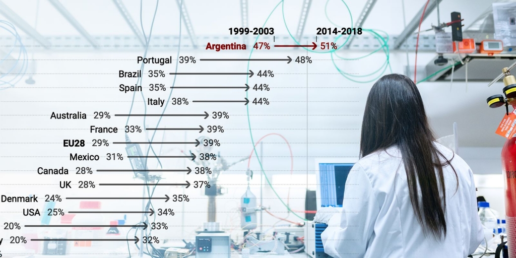
Elsevier uses “active authorship” to quantify the share of women in scientific research, which is just one of many ways. I was personally curious (but not very surprised) to find Japan still at the very bottom of the list with only 15% of active female authors, also with the smallest increase in the percentage over the past ten years.
The only country that Elsevier researched to cross the 50% mark was Argentina, which had one of the highest shares of women in research and apparently has been for years. We also see that countries like Portugal, Brazil, and Mexico have better levels of female participation in science compared to countries with more established science & research scenes like the UK and the US.
Another interesting fact I read is that East Europe has a higher percentage of women in science compared to its western counterparts, which may explain why the EU28 average is higher than countries like Germany, Denmark, and the Netherlands.
But does a high percentage of women in science mean greater gender equality?
In a WIRED article, Sarah Zhang zooms in on female astronomers in Argentina to ask those exact questions. “At the lowest level of research, the proportion of men and women in Argentinian astronomy is roughly 50/50. The highest level has only two women”, she writes.
This is what’s commonly called the “Leaky Pipeline” problem; a metaphor used to describe the phenomenon where women (and other underrepresented minorities) disappear from higher career levels, in this case, science.
Zhang also explains that
Fewer women end up in elite positions, but also, as Urry [president of the American Astronomical Society] explains, fewer women end up in elite specialties: Plenty of women are physicians; few are heart surgeons. The number of women in astronomy is bad; the number in cosmology is worse.
This may be one of the many explanations why Argentina ranks much lower in other gender gap rankings. According to the Global Gender Gap Report 2020 (PDF) from the World Economic Forum, Argentina ranks 30th with a Gender Gap Index of 0.746 while Germany ranks much higher in 10th with an index of 0.877.
Overall, things are looking up nevertheless. Here are all researched subject areas and how much the share of female researchers has increased between the periods of 1999-2003 and 2014-2018:
– I used an arrow plot to emphasize the change between the two time periods (1999-2003 and 2014-2018). If you’re interested to see another example for this chart type, you might find this blogpost “How good is your English” interesting!
– I used the sorting & grouping feature to categorize them by subject categories.
– To add colors to the subject names, I used simple HTML & CSS to style them.
– Some tips on footnotes can be found here.
It’s interesting to see that in most subject fields with an already higher share of female authors in 1999-2003 show even more increase in 2014-2018, while most subject fields with a lower share of women remain low with less increase.
For example, Health Sciences saw particular growth. In Nursing and Psychology, women even make up the majority of their fields.
On the other hand, Physics and Astronomy, Computer Science and Mathematics are fields with the smallest share of women still and show the least increases in the past decade.
Even though most subjects still don’t reach the 50% mark, the share of female authors is increasing in ALL subject areas. That’s got to be good news, right?
These numbers show a part of a much bigger complex topic I don’t know enough about. But visualizing the numbers made me curious. It made me ask questions. I hope they made you curious about the topic, too. For details, do read the full report here.
We have a few more articles on the topic of gender.
If you have recommendations for further reading, do let me know in the comments below! You can also email me at aya@datawarpper.de or write me a message on Twitter (@ayatnkw). We’ll see you next week!
Comments