This article is brought to you by Datawrapper, a data visualization tool for creating charts, maps, and tables. Learn more.
What to consider when creating small multiple line charts

Line charts are maybe the most commonly used chart type there is. They’re easy to read and great for showing how data developed over time. Small multiple line charts (also called trellis plots, facets, grid plots, or panel charts) do the same — but because they separate each line into its own panel, they’re often a better choice for your data then a normal line chart. So when should you use line charts and when small multiple line charts?
When to use small multiple line charts
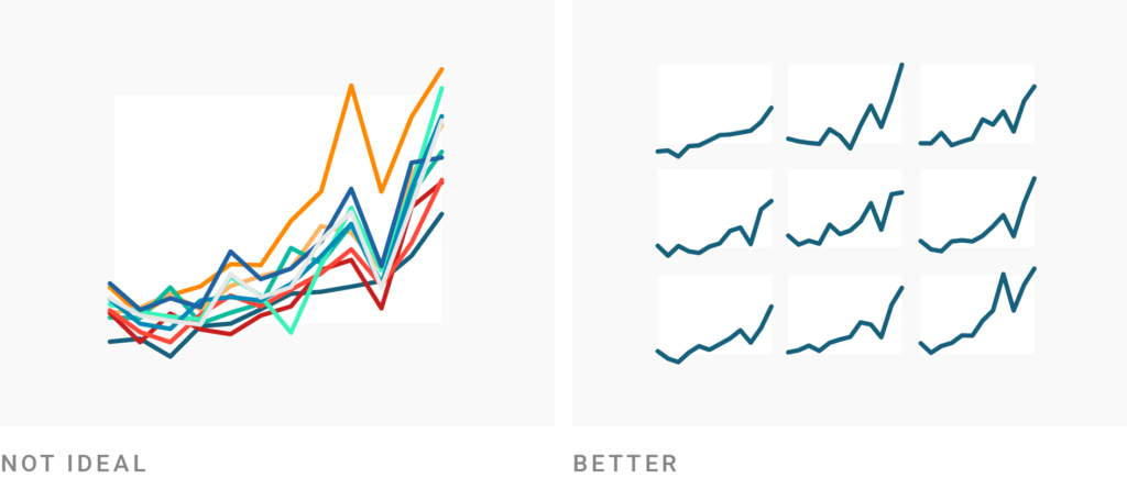
Use small multiple line charts to untangle overlapping lines. Even when you have only a handful of lines, if they overlap a lot, you might want to consider giving each one space to breathe in its own panel. It overwhelms readers less and makes it easier for them to parse each line:
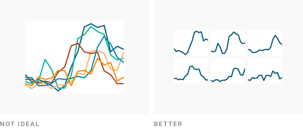
Use small multiple line charts to let readers see the trends in each individual category. What’s the shape of the lines? How quickly and how much do they go up and down? Multiple lines charts are great at answering that:
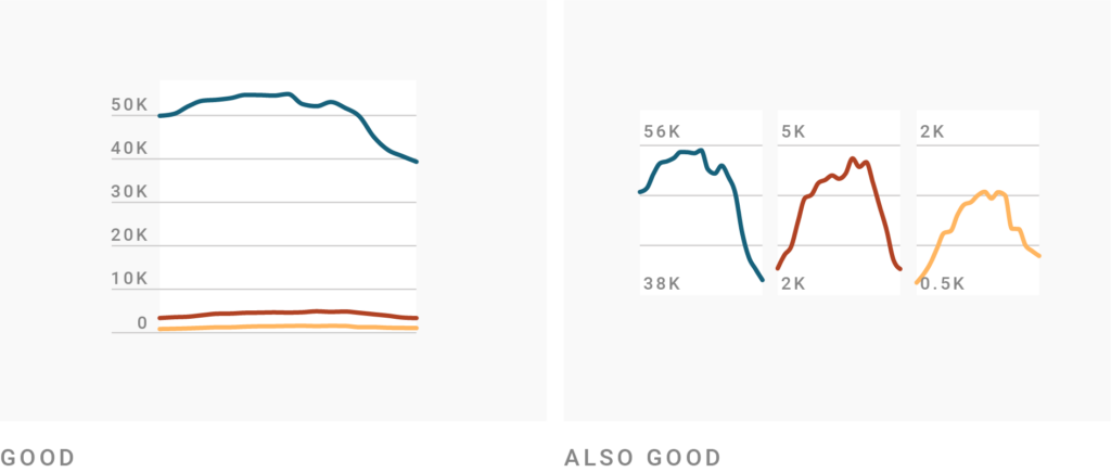
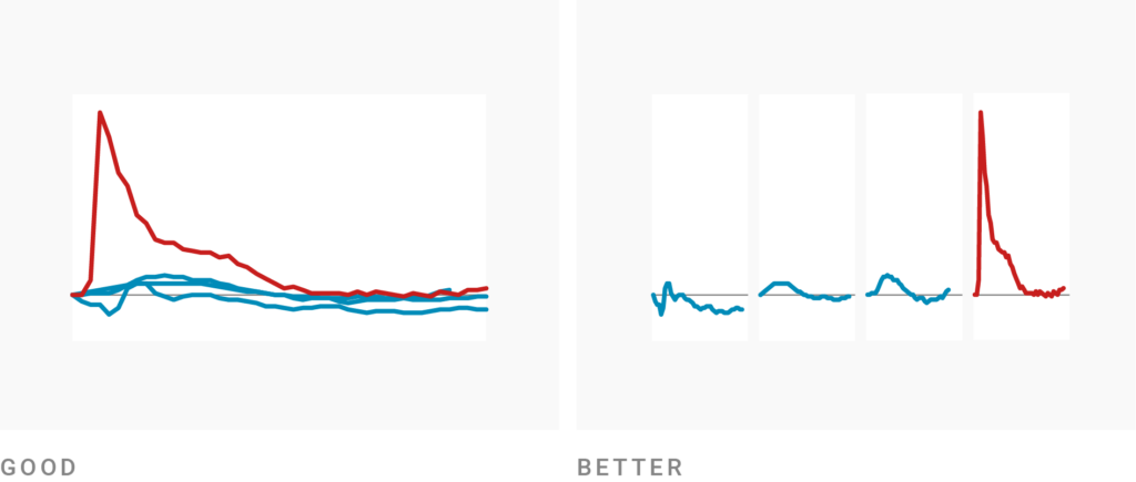
You can even go one step further and use small multiple lines charts to compare trends whose magnitudes are vastly different. That’s because this chart type can show the lines on different y-axes, giving each line the same visual height. In the example below, the strong downwards trend of the red and orange lines is invisible in the normal line chart but becomes apparent in the small multiple:
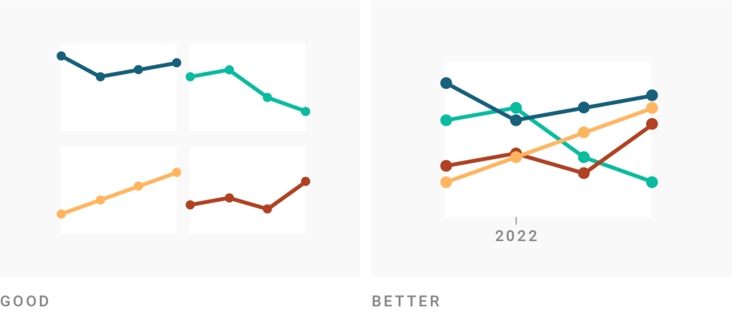
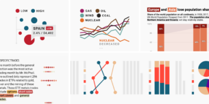
Use normal line charts if you want readers to compare lines with each other at specific points in time. In the following small multiple line chart, it’s impossible to answer the question, “Which was higher in 2022, the orange line or the red?” — but it’s easy to see that in a normal line chart:
Use small multiple line charts to tell a story. Multiple lines have lots of panels alongside or below one other, like a comic strip. And, like in a comic, you can use the order of panels to tell a story, build suspense, and surprise the reader. In the example below, the first three panels establish a “this is normal” for left-to-right readers, before showing them an outlier: “Woah, that red line is so much higher than the blue lines before!”
How to create better small multiple line charts
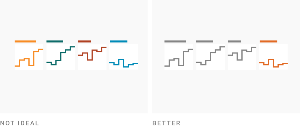
Go small. “Do not be afraid to shrink your charts. The eye can detect, with great efficiency even at small resolution, variation in size, position, colour and pattern,” Andy Kirk explains in his book. When creating small multiple line charts, try to play around with the size. How narrow can your panels go; how tall should they be? A good rule of thumb: The fewer data points you have, the smaller your panels can be.
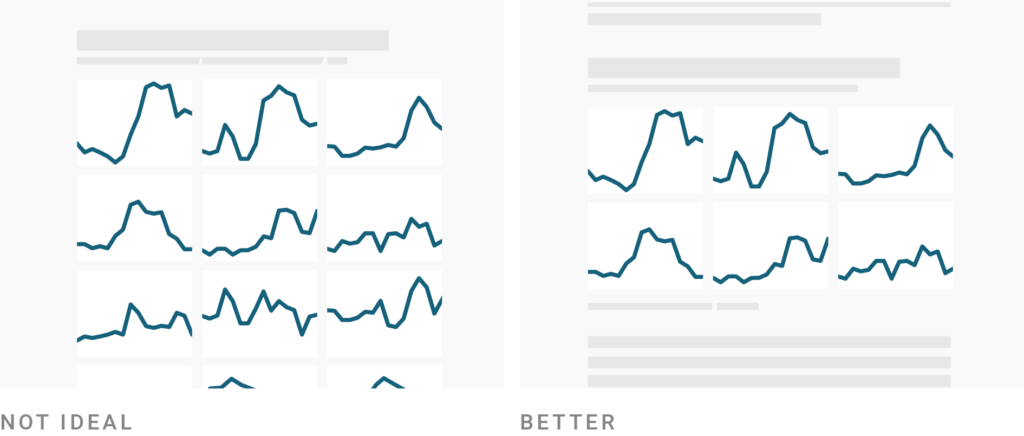
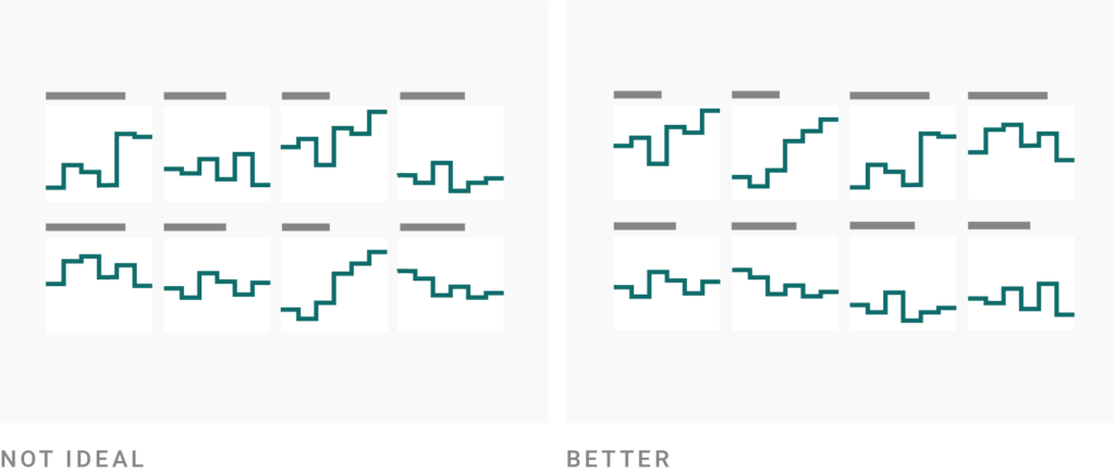
Carefully select your panels. You can now add lots of categories to your line chart without overlapping — but how many should you add? Probably fewer than you initially plan. Don’t give your readers dozens of panels to let them figure out the interesting bits themselves; instead, be aware of the points you want readers to take away and keep the panels that support them (while giving a truthful picture of the situation!). Also check your chart on mobile screens: Does it take long to scroll through all the panels? Then you might still have too many. If you do want to show all the data points, consider using sparklines in a searchable table.
Use annotations to explain and point out (but keep them short!). Charts with annotations are almost always better than charts without annotations. Use them to lead the reader’s eye and give context to your data. In small multiple line charts, you don’t have much space, so keep your annotations short. Consider abbreviations your readers understand and drop unnecessary verbs (“U.S. highest in Q3”). As a last resort, try a smaller font size. We wrote more about using text in data visualizations here.
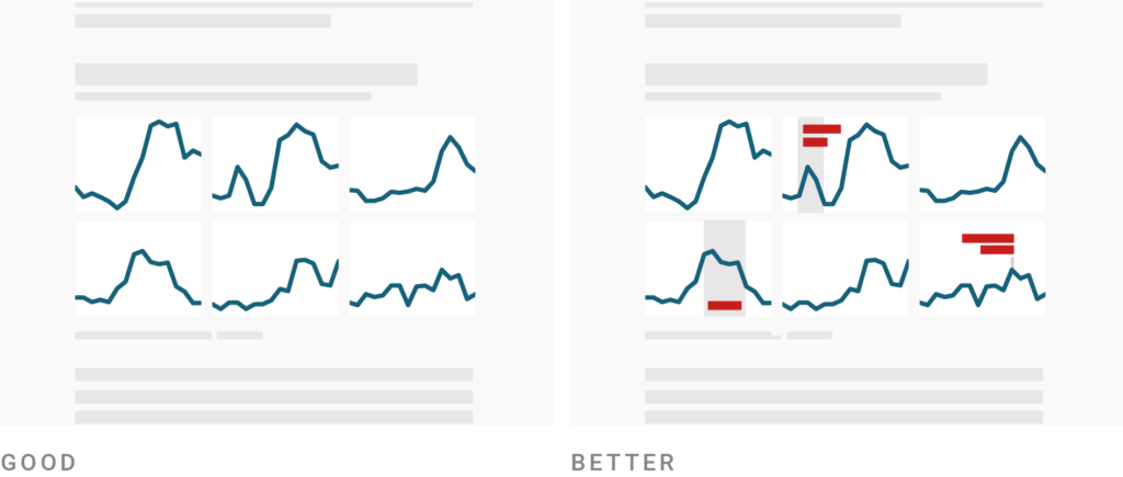
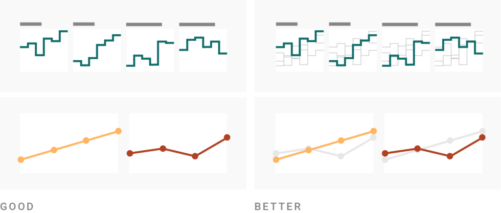
Use colors to make a point. In small multiple line charts, each line gets its own panel and panel title. That comes with a big advantage: Your lines don’t need different colors to help readers distinguish between them (and you don’t need a color key anymore). That means you can let colors do another job. Use them to categorize your lines into groups like downwards trending and upwards trending, or to highlight certain panels:
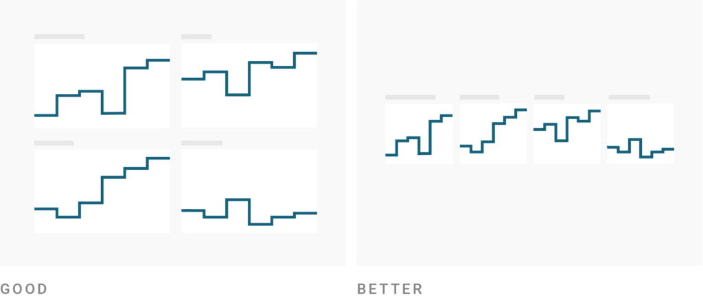
Sort your panels in a meaningful way. Sort your panels to decide what readers should see first and help them navigate the data. Which category had the highest value at the start of your time period? Or at the end? Which one improved the most? Sort your panels by start value, end value (as in the example below), range, % change, or difference to help answer these questions, and consider writing your sort order in the chart description. If you have lots of panels or there’s no obvious logic to them, an alphabetical order is better than none at all.
Repeat all your lines in all panels to let readers compare. As said above, small multiple line charts are not great for comparing data points at certain points of time. But there’s a way to still enable at least a bit of comparison: Repeat all your lines in the “background” of all your panels. This enables readers to see which categories ranked higher or lower than others on the same date. By doing so, repeating lines can also make it more obvious that you’re sorting by start or end value:
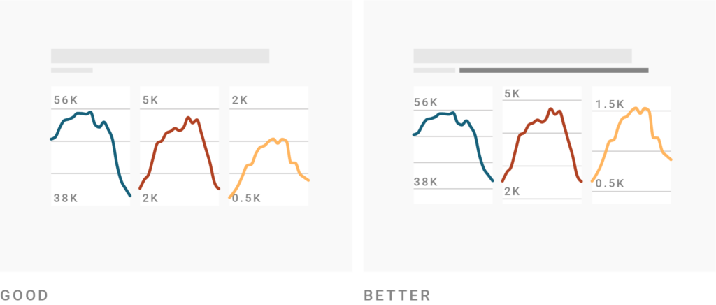
Make different y-axis scales obvious. Small multiple line charts can show your lines on different y-axes. While this is very useful, it’s also dangerous: Readers might not check the y-axes of the different panels and assume they all share one, giving them false insights about your data. If possible, avoid independent scales for your panels. If you really want to use them, find ways to make them obvious, like writing in the chart description that readers should pay special attention to the y-axes. (Claus O. Wilke recommends adding a sentence like “Notice that the y-axis scalings differ among the different panels of this figure.”) Gridlines that “don’t look normal” can also make readers realize that something’s different about your axes. Learn how to do this in Datawrapper.
Example of a good small multiple line chart
Go right into the editing process of this chart by clicking on “Edit this chart” in the top right corner (available on desktop devices):
Find more examples in our Academy article Examples of Datawrapper Multiple Lines charts.
Want to know more?
- Edward Tufte: Envisioning Information (1990). Tufte first popularized the term "small multiples" in a chapter of this book — and he's a fan ("For a wide range of problems in data presentation, small multiples are the best design solution.", p.67)
- Claus O. Wilke: Fundamentals of Data Visualization (2019). Good chapter on creating small multiple charts, with a focus on independent axes.
- New: Small multiple line charts in Datawrapper (2024): Blog post explaining what's possible in Datawrapper's Multiple Lines charts.
- How to create a Multiple Lines chart: Academy article explaining how to build a small multiple line chart in Datawrapper


Comments