
This article is brought to you by Datawrapper, a data visualization tool for creating charts, maps, and tables. Learn more.
How we at n-tv used HTML to add custom color keys to Datawrapper charts & tables


Hi! This is Christoph Wolf, editor for the website of n-tv, a German TV news channel. I’m responsible for data stuff & infographics and also cover sports. Since we’re using a lot of Datawrapper charts & tables and are always trying to push them to the limits, Lisa from Datawrapper asked me to write the very first guest post on this blog. Here I’ll explain how we used HTML styling to add custom color keys above and within Datawrapper’s new tables.
How we added a custom color key
When recently browsing through the Datawrapper Academy, I stumbled across a great post on “How to turn your title into a color key”.
This Academy article explains how to use HTML code to add colors to chart titles – but we can also add the code snippets to chart descriptions. As we will see, this allows us to customize the (default) legends and add legends to charts where there aren’t any default ones.
Generally, such a custom color key is built with HTML code (see below). The basic code structure consists of three parts:
<tag with definition of styles>text to be styled</closing tag>and looks like this:
<b style="border-bottom: 4px solid #F02E31;">text to be styled</b>The final chart
We used the custom color legend in a table that displays short descriptions of all 96 German MEPs after the recent European elections. (Find our German news article with the following table here.)
For our purposes, instead of writing the names of the parliamentary groups directly into the table we decided to save space by using a custom legend that refers to a colored column. This column works as a color key inside the table. To make that happen, we used one of the new table features called “style cells based on categories” (explained in this article). In our case, the categories are the parliamentary group.
How we did it
We added the code for the color legend in the text box for the description. The style commands simply included the definition of the background color, the font color, and the padding:
<b style="background:#0b7432; color:white; padding:1px 4px">Grüne/EFA</b>The style commands for every parliamentary group were complemented with some basic tags like (line breaks) and (bold fonts) to add a legend title and some space between description and color legend.
The complete text and code in the description field looks like this:
Die 96 deutschen Abgeordneten im neuen Europaparlament samt Partei, Geburtsjahr,
Wohnort, Ausbildung/Beruf und EU-Fraktion im Überblick.
<br><br><b>Fraktionen im Europaparlament:</b><br>
<b style="background:#0b7432; color:white; padding:1px 4px">Grüne/EFA</b>
<b style="background:#c31618; color:white; padding:1px 4px">S&D</b>
<b style="background:#0099ff; color:white; padding:1px 4px">Renew Europe</b>
<b style="background:#2c4b8e; color:white; padding:1px 4px">EVP</b>
<b style="background:#8c1612; color:white; padding:1px 4px">GUE/NGL</b>
<b style="background:#aaaaaa; color:white; padding:1px 4px">fraktionslos</b>
<b style="background:#0c6eb5; color:white; padding:1px 4px">ID</b>
In case you want more space between the parliamentary groups, you might add some (non-breaking spaces ” “) in between.
Inspiration for further styling options with different background colors, colored symbols, different font sizes/font families or underlined legend titles can be found at the end of this original Datawrapper article or at w3schools. Some quick experiments showed quite a few features work, even curved borders.
How we built updating color keys for live tables
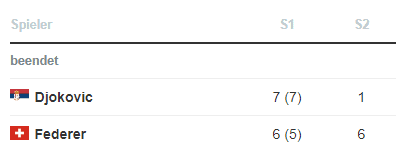
Besides creating customized legends, the HTML style commands can also be used directly inside the tables. We did so when building a Datawrapper table functioning as a live scoreboard of the epic Wimbledon final on Sunday:
We used the live data from our official sports data supplier Opta retrieved via the Optacore API. After some background processing, we fed the data to a Google Sheet. We then linked the Datawrapper table to this automatically updating Google Sheet (this article describes how that works).
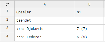
Depending on the status of the game (“Fixture”, “Playing”, “Played”), different code was written into the second table row by using Google Sheets if-statements:
=IF(Status = "Playing"; "live"; IF(Status="Fixture"; ""; "beendet"))We then copy & pasted the link to the Google Sheet in Datawrapper’s step 1: Upload data. That’s how the table looked in step 2 & the final table for all three states:
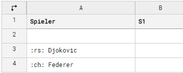
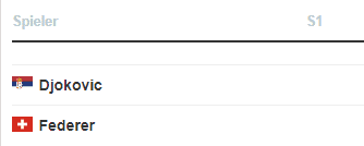
Before the match (“Fixture”):
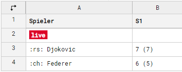
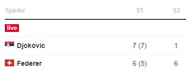
During the match (“Playing”):
After the match (“Played”):
We built several of these charts during Wimbledon 2019 to present highlight games to our readers (e.g. this one). They really seemed to like this tennis livescore feature on our website. We liked it too – and already have some ideas for refinements in mind.
I hope you found this insight into how Christoph uses Datawrapper tables at n-tv useful. Find more information about the infographics work at n-tv on this site.
Do you have an interesting workflow? Have you found unusual use-cases for Datawrapper charts, or did you push the limits of what Datawrapper is capable of? We want to feature more articles written by our users on our blog. If that sounds interesting to you, get in touch with Lisa at lisa@datawrapper.de and she’ll be happy to discuss the process with you further.
Liked this article? Maybe your friends will too:
NEWSLETTER
Sign up to our newsletters to get notified about everything new on our blog.


Comments