

How to match data with VLOOKUP in Excel & Google Sheets
October 20th, 2021
6 min
This article is brought to you by Datawrapper, a data visualization tool for creating charts, maps, and tables. Learn more.
…in 5 minutes. Without code.
Today we’re bringing you a guest post from German data journalist Simon Haas, who recently wrote about how to use live-updating JSON data in Google Sheets and Datawrapper – without any code. We were intrigued. Here’s Simon article in an extended version:
There are tons of APIs out there that provide near real-time data that you can use to create automated charts and maps with free tools like Datawrapper, like coronavirus case data or stock market data.
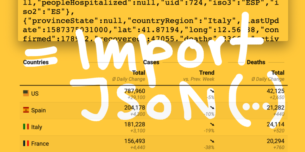
Those APIs usually provide data in JSON format, like in this API by Muhammad Mustadi that provides data about coronavirus cases, collected by the Johns Hopkins University:

This article explains how you can import this JSON data into a Google Sheets table and make sure that it gets updated automatically. There’s no coding or web server required, plus people can collaborate in your spreadsheet and collect data from other sources.
The table I created for the German public-service TV broadcaster ZDF. Find it in its natural habitat here.
Eventually, we create a nice-looking Datawrapper table (the one above) showing the worst-hit countries by the novel coronavirus based on data by Johns Hopkins, including:
Let’s start:
The spreadsheet should become available in your Google Drive. Thanks to the ImportJSON script, it’s now possible to populate your Google Spreadsheet with JSON data from the API.
Just replace the URL in the corresponding sheet with your API of choice.
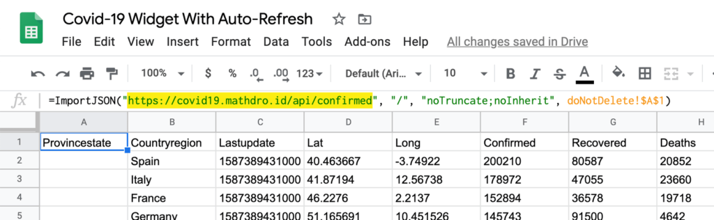
In the sample spreadsheet you find these in cell A1 of the allCountriesCases sheet:
=ImportJSON("https://covid19.mathdro.id/api/confirmed",
"/", "noTruncate;noInherit", doNotDelete!$A$1)
and in cell J2 in topCountriesTimeline:
=TRANSPOSE(ImportJSON(
"https://pomber.github.io/covid19/timeseries.json"; "/US";
"noInherit,noTruncate,noHeaders"; doNotDelete!$A$1))
The last formula imports the pomber/covid19 API and automatically switches its rows with columns (= “transposes”).
Brad Jasper, the developer behind ImportJSON, explains its option parameter here.
Almost done! Next step: Set up a script that generates a random number every x minutes, thus triggering an auto-refresh in your Google sheet.
triggerAutoRefreshTime-drivenMinutes timerThe first sheet datawrapper will be used for your visualization. I recommend to import the JSONs in other sheets, do calculations there, then pull them from the first sheet.
If you’re wondering where the arrows in the Trend column come from: Those are calculated in the sheet topCountriesTimeline starting at cell I3.
=IF(AND(H3>=-0.0449, H3<=0.0449), "➙",
IF(AND(H3>=0.045),"➚", "➘"))
Just change the numbers if you prefer other thresholds.
The Cases column gets calculated like so:
=IFERROR(CONCATENATE(TEXT(topCountriesSorted!D7,"#,##0"),"
^",TEXT(topCountriesSorted!F7,"+#,##0;-
#,##0"),"^"),"Server-Fehler")
This results in 760,520 ^+29,110^ (probably a higher number by the time you’re reading this), which is the total number of confirmed coronavirus cases in the United States and how many new cases got reported since yesterday. Datawrapper will notice the two ^‘s and make two lines out of it.
What does the formula do? First of all, if there’s an error (IFERROR – e.g. if the JSON is broken), the text in the cell will become “server error”. But if everything is ok, Google Sheets will pull the case numbers from two different columns in the topCountriesSorted sheet.
Because you will show two numbers per cell in your final Datawrapper table, Datawrapper recognizes them as text instead of numbers. Adjusting the number format in Datawrapper won’t be possible anymore. You can transform the numbers to text in the right number format with TEXT(D7, "#,##0") before importing them to Datawrapper.
That’s it! You can now visualize your data with Datawrapper and embed the result on your website. To do so, create a new chart, then select Link external data source (not Import Google Spreadsheet) in step 1: Upload data.
Now paste the Google Sheets URL. Make sure your Google sheet is set to Anyone with the link can view when you click the green Share button. You can find a detailed explanation in this Datawrapper Academy article.
Once that’s done, go to step 2: Check & Describe and select English (en-US) as your Output locale. In step 3: Visualize, tick Parse markdown, Merge with emtpy cells and Add first row to header to properly display the table.
Flags can be displayed with Replace country codes with flags. The Countries column is for desktop, Country for mobile only.
This is how your final table looks like:
Two scripts in your Google spreadsheet are doing all the work for you: ImportJSON.gs and triggerAutoRefresh.gs. The latter one generates a random number in cell A1 of your sheet doNotDelete each time it gets triggered. If you change the sheet’s name, you’ll need to change the function in triggerAutoRefresh.gs, too. You can access both scripts in Google Sheets in Tools → Script Editor.
This article is based on a tutorial by Vadorequest. The table is inspired by spiegel.de & sueddeutsche.de. The APIs used in the sample sheet come from pomber/covid19 & mathdroid/covid-19-api.
This article is based on a tutorial by Vadorequest. The table is inspired by spiegel.de & sueddeutsche.de. The APIs used in the sample sheet come from pomber/covid19 & mathdroid/covid-19-api.
Thanks for this great guest post, Simon! Make sure to follow Simon on Twitter (@simondhaas) and find other projects he worked on over at simonhaas.de. If you’re learning something and would like to teach it to others, get in touch with Lisa at lisa@datawrapper.de – we’re always looking for data- and Datawrapper-related guest posts.


Comments