This article is brought to you by Datawrapper, a data visualization tool for creating charts, maps, and tables. Learn more.
MariLINE Monroe: More line chart art

Hi, Marten here. I’m a software engineer at Datawrapper working on all things “app,” from the chart editor to how teams organize their charts and maps. This week I took my coding in a more creative direction.
Since starting at Datawrapper, I’ve been wanting to join the ranks of our chARTists. From reincarnating Audrey Hepburn as a split bar chart to recreating a famous album cover as an area chart, Datawrapper can be used in unintuitive ways to create visualizations that go a little beyond its main use case of presenting information and insights from data.
So when my Weekly Chart duty came around this time, I decided to give it go myself.
And to keep up the tradition of famous women immortalized as Datawrapper charts,[1] I present to you: Mariline Monroe.
Inspiration for this chart came from so-called “string” or “thread” art. The idea is to place various anchor points (like nails or tacks) on the borders of a canvas and then use a continuous thread of wool to connect the various anchors creating some kind of pattern or image in the process.

To recreate images or photos as string art, the idea is simple: the darker an area is in the original, the more threads should pass through it. On the other hand, bright parts of the image should remain largely untouched. The difficulty lies in distributing the various lines along the anchor points so that the whole canvas stays as close to the original image as possible.
How I created the chart
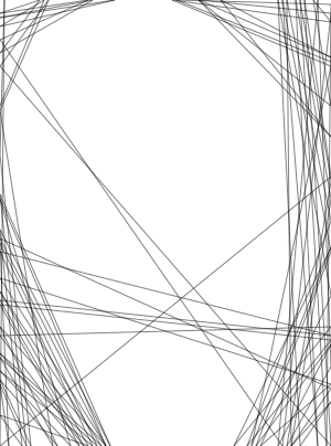
How closely string art will resemble the original image depends on a few factors: the number of lines, the number of anchor points, and the intensity (or “thread darkness”) used for drawing each line on the canvas.
Draw too few lines, and the resulting image will hardly resemble the original at all. Draw too many, and the resulting image will be so saturated with lines that the whole canvas looks black.
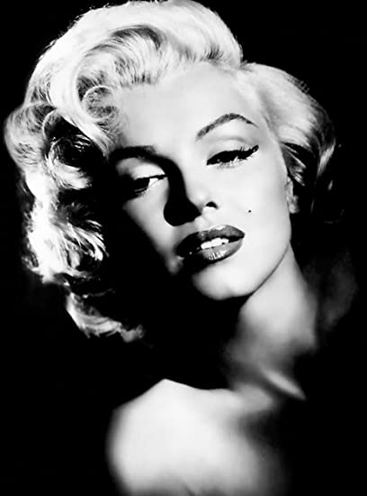

Original 

100 lines 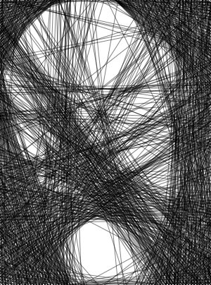
1000 lines 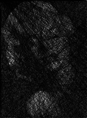
10,000 lines

Similarly, the number of anchor points placed around the canvas also limits the image’s detail. The more anchor points we have, the more detail of the original we are able to capture.

50 anchor points 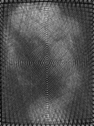
100 anchor points 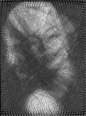
150 anchor points 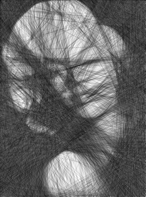
1000 anchor points

Finally, we can adjust the darkness, or “intensity level,” of the lines. Eight different intensity levels essentially means we’d need to draw over a given point eight times for it to become a fully opaque black.

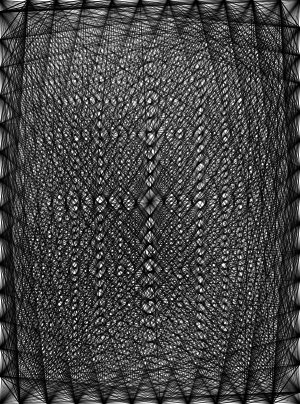
1 intensity level 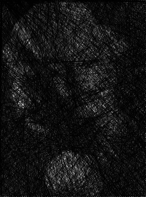
2 intensity levels 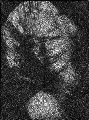
4 intensity levels 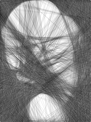
8 intensity levels

My final result has around 3000 lines with 350 anchor points and uses 8 different intensity levels.
A string art algorithm
Luckily I didn’t have to calculate these lines from scratch; I found this excellent article online that gives a detailed explanation of the right algorithm. Here’s how it works:
- Choose a number of fixed anchor points (the “nails”) to place around the edges of your “canvas.”
- Choose a random anchor as start point.
- Select another anchor as end point.
- For the line between the start and the end point, calculate the mean pixel brightness (or intensity) of the original image along this line.
- Repeat steps 3 and 4 for all possible end points.[2]
- Choose the line with lowest average intensity.
- On your "canvas," draw that line from its start point to its endpoint. Luckily, I didn’t have to use nails and a wool string — I just recorded the line’s points in a dataset.
- In the original image, increase the brightness of the pixels that lie under the line by a certain amount.
- Now start again, using that end point as a new start point, and repeat steps 3–8 until the resulting image resembles the original as closely as possible.[3]
With all the lines calculated it was now a question of how to bring them into Datawrapper.
At first I was planning to use custom lines in a scatterplot, but soon realized that my chart’s data would essentially be empty — a little bit boring. Using a line chart instead meant that I needed to put some more effort into calculating the dataset,[4] but then I had a “proper” chart with actual data.
Once I had imported the dataset into Datawrapper, I customized the colors for each line using the Datawrapper API. And that’s it — another fascinating woman immortalized as Datawrapper chart. I think I might just watch the movie Blonde tonight 🤔
I hope you enjoyed this week’s chART. Also if you haven’t discovered my co-worker Elana’s Chartify tool, which turns any picture into Datawrapper chart art, go check it out — it’s seriously amazing! Until next time!
- Also check out “Girl with a Pearl Earring” as a scatterplot and Natalie Portman as a line chart. ↩︎
- Since my anchors were distributed along the borders of a rectangle, I didn’t consider lines with endpoints on the same side. ↩︎
- In theory, it’s possible to calculate the optimal string art drawing by minimizing a cost function that decreases as the drawing begins to resemble the original image. In practice, however, I just played around with the parameters until I got result that I liked and that stayed within Datawrapper’s limitations. ↩︎
- Taking each pair of start and end points, I figured out the function of the line that passes through them and then calculated the appropriate y-value for each x between them in my dataset. ↩︎


Comments