This article is brought to you by Datawrapper, a data visualization tool for creating charts, maps, and tables. Learn more.
What to consider when creating pie charts

Pie charts are great to show how 100% divide up into a few shares. Although it can be tempting to use them often, pie charts are only rarely the best option for your data. Here we have a closer look to understand when and when not to use this chart type. If you feel inspired after the read, you can create pie charts for free with our charting tool Datawrapper.
When to use pie charts
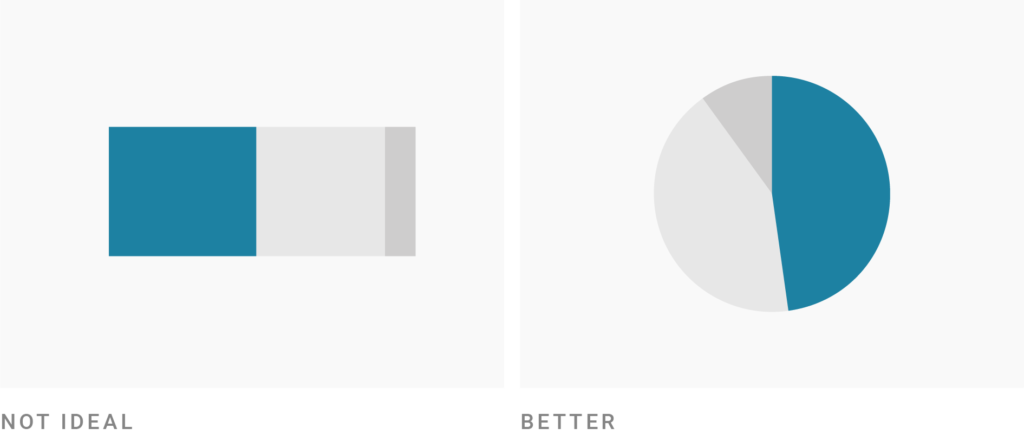
Pie charts work best for values around 25%, 50% or 75%. It’s easier for readers to spot these percentages in a pie chart than in a stacked bar or column chart.
Pie charts are not the best choice if you want readers to compare the size of shares. That’s especially true if the differences between the shares are small. If you want readers to compare the different shares of a total, consider a bar or column chart instead.

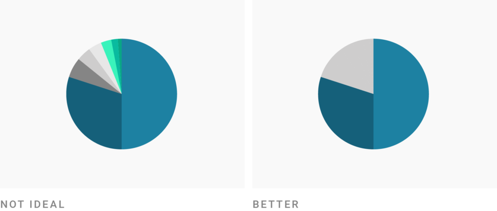
Pie charts work best if you only have a few values – five max. If you have more than five shares, consider a stacked column or stacked bar chart. The labeling will be tidier.
Pie charts might be unnecessary if you only want to show two values. Since that’s effectively one value (your value and the difference between this value and 100%), consider just mentioning this one number in your article instead of showing a chart at all.

One pie chart can only show one total and its shares. If you want to e.g. compare two polls with each other, consider a stacked bar chart instead.

How to create better pie charts
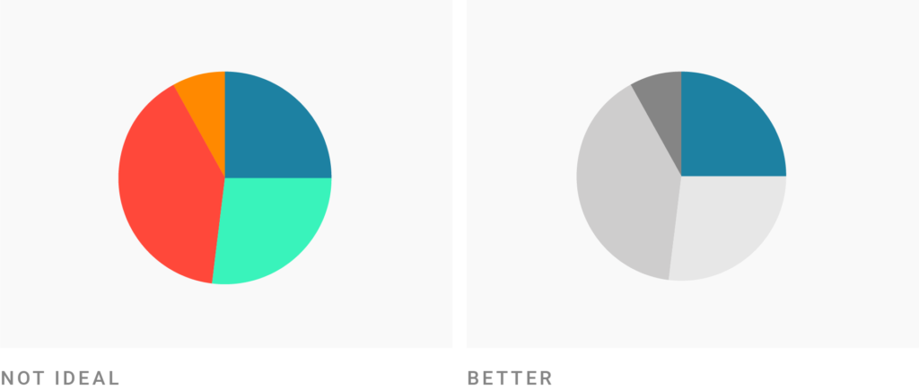
Use colors to make your most important value stand out. For the rest of the value, use shades of one color – rainbow colors will distract readers from comparing the pie shares.
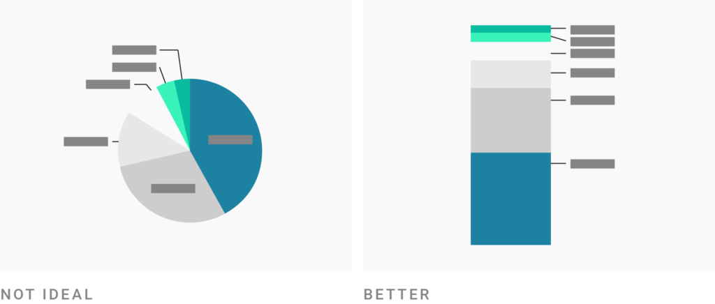
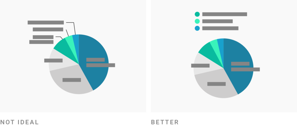
Consider labeling smaller pie slices outside of the chart, since pie charts are hard to label. That’s especially helpful when you have long labels.
Consider grouping slices together in one bigger slice (e.g. “others”) to clean up the overall look of the chart. The bigger the slices, the easier they are to read (and the fewer labels you need).
Consider placing the pie chart in a margin column or sidebar. Pie charts are not as flexible in width as e.g. bar charts. Meaning, they will have lots of unused white space around them when given the full width of the text.

Example of a good pie chart
To play around with this chart, hover over it and click on “Edit this chart” in its top right corner.
Want to know more?
- Understanding Pie Charts by Robert Kosara. Great research-based explanation of how people read pie charts, as well as common mistakes when creating pie charts.
- Wann Kuchendiagramme sinnvoll sind – und wann nicht (German) by the NZZ Storytelling team. Quick explainer with examples for when and when not to use pie charts.
This article is also available in the Datawrapper Academy.


Comments