How to match data with VLOOKUP in Excel & Google Sheets
October 20th, 2021
6 min
This article is brought to you by Datawrapper, a data visualization tool for creating charts, maps, and tables. Learn more.
Clean up data to prepare it for further analysis
So you want to build a chart. And you downloaded some data. And you uploaded it to our charting & mapping tool Datawrapper to create a chart like this one:
But Datawrapper showed you some errors or didn’t even display the data as you wanted. Argh!
If that’s the case, you likely need to clean up the data first in spreadsheet software like Excel or Google Sheets. This article tries to explain the methods and Excel formulas you’ll need most often to get your data ready to analyze or plug into Datawrapper.
Note that tidying up your data as described here is not the same as making your numbers as readable or as beautiful-looking as possible. That will come later. We need to make our data readable for software like Excel or Datawrapper before we can bother making it readable for humans.
This is a lengthy article. “All to simply clean up the data!” you might think. “Without analyzing it, without visualizing it!”
But don’t sweat. How much work you need to put in to clean up the data depends on the data. Yes, sometimes you’ll sit for days to clean up a single data set. But sometimes you’ll just plug the data in Datawrapper without changing anything. (Ok, let’s be honest: In most cases, you will need to do something.)
You won’t need to go through all of the following steps every single time. For example, if you don’t have dates, the part “Correct dates” won’t be relevant. Just decide individually which methods makes sense to consider. You can use this index to jump to individual parts of the article:
Data stuff is best explained with data. We’ll go through many methods with a dataset from The World Bank that tells us how many people lived in cities (i.e. urban population) in which year in which country. I found a download option on the site and clicked on “Excel” to download the Excel file. I then uploaded this file to Google Sheets.
These little help boxes explain to you how to get something done. It explains formulas and methods in Google Sheets. But everything I’ll explain in the following article should work with LibreOffice Calc, Excel or any other spreadsheet software.
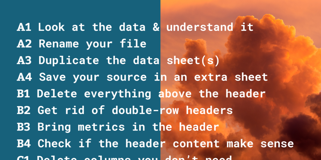
Alright, let’s start! We’ll make sure the file is well prepared before we actually touch the data:
The first thing you should do before changing anything in the data is to look at it. Let’s do that:
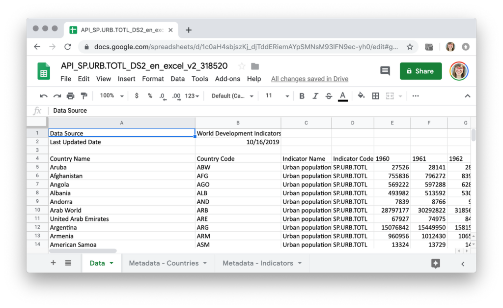
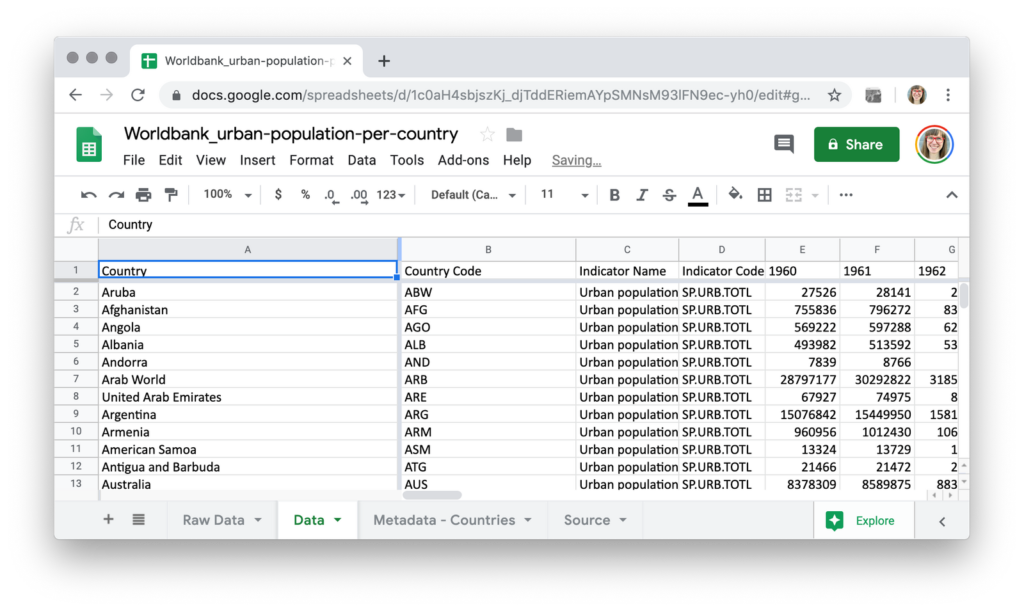
When you download an Excel file, it often has multiple sheets. Our data set has three of them, as seen on the bottom: “Data”, “Metadata – Countries” and “Metadata – Indicators”. Look through all of your sheets and make sure you understand what you’re seeing there. Do the headers, file name and/or data itself indicates that you downloaded the right file? Are there footnotes? What do they tell you? Maybe that you’re dealing with lots of estimates? (Does that maybe mean that you need to look for other data?) If you don’t find notes in the data, make sure you look for them on the website of your source.
Our example data seems fine. There are no estimates we need to worry about. And we get a nice explanation of “Urban population” in the “Metadata – Indicators”, beginning with “Urban population refers to people living in urban areas as defined by national statistical offices…” Awesome! That’s something we can mention in our chart later on.
Now that we know what we’re dealing with, let’s make sure that we still do so in half a year. “API_SP.URB.TOTL_DS2_en_excel_v2_318520! Yes! I know exactly what that data was about!” said no one ever. (Except three employees at The World Bank.) So let’s call it something memorizable and precise: Worldbank_urban-population-per-country, for example.
To rename a Google Sheet file, click on its name at the top and start typing.
This is one of the most important parts of the whole process: Before you change anything in the data, duplicate your data sheet in the same file.
To duplicate a Google Sheets sheet, click on the little triangle next to the sheet name and then click “Duplicate” in the opening menu.
Consider renaming your two datasheets, e.g. in “Raw data” and “Data” or in “Data – original” and “Data – edited”. If you have a massive Excel file with lots of sheets, you can also duplicate the whole file instead.
Why should you do this? Because you will heavily edit the data. I’ve learned the hard way that I’ll always change the data more than participated. “I don’t need to copy the data this time.” I think. “I only want to clean it up a bit; I won’t delete anything important.” Two hours pass…and I need to download the data again from its original source because oh, yeah, I did delete this now-important column an hour ago. Learn from my mistakes, save yourself a lot of time and never edit the original data.
This trick, too, will make your future self want to pat your present self on the shoulder and say “Thank you”: Create a new sheet, name it “Source” and add links to all the data sources you’re using in your document. (And yes, you get bonus points for adding the date when you downloaded the file – just in case.)
To create a new sheet, click on the big + in the bottom left of the browser window. Click on the little triangle next to the new sheet and then choose “Rename” in the opening menu to change its name.
Awesome! Our file looks like this now. Nothing changed but the title & sheets:

So there’s still lots to tidy up in the actual datasheet. Let’s start at the top, with the header:
Excel files often come with information in extra rows above the actual data. In our case, nice World Bank employees want us to know that the data source is the “World Development Indicators”, and that the data was last updated in October 2019. That’s both good to know and something we can put in the chart. But these extra lines hinder us to sort or filter the data, and Datawrapper won’t be happy about them either when we upload our data there.
So simply get rid of all empty rows and all information above the header. Delete it (you can always check your “raw data” sheet when you need that information) or copy & paste the information to your “Source” sheet.
To delete rows, click on the first row index (1), hold Shift and click on the row index before your actual header. Now right-click and select “Delete rows 1-x” in the menu that opens:

Sometimes, you will encounter headers that have two rows, not one. Especially when the table is created to communicate, not analyze, double-row headers can help make sense out of the information. But they will get in your way when you want to delete rows or columns eventually. And data visualization tools like Datawrapper won’t accept them: Charting tools need your data sets to come with one header row, and one header row only.


The same is true for merged cell: No matter where they are in your data set, get rid of them:
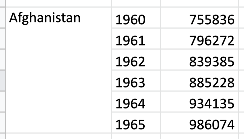
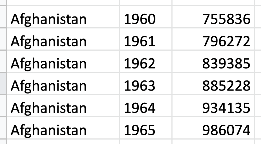
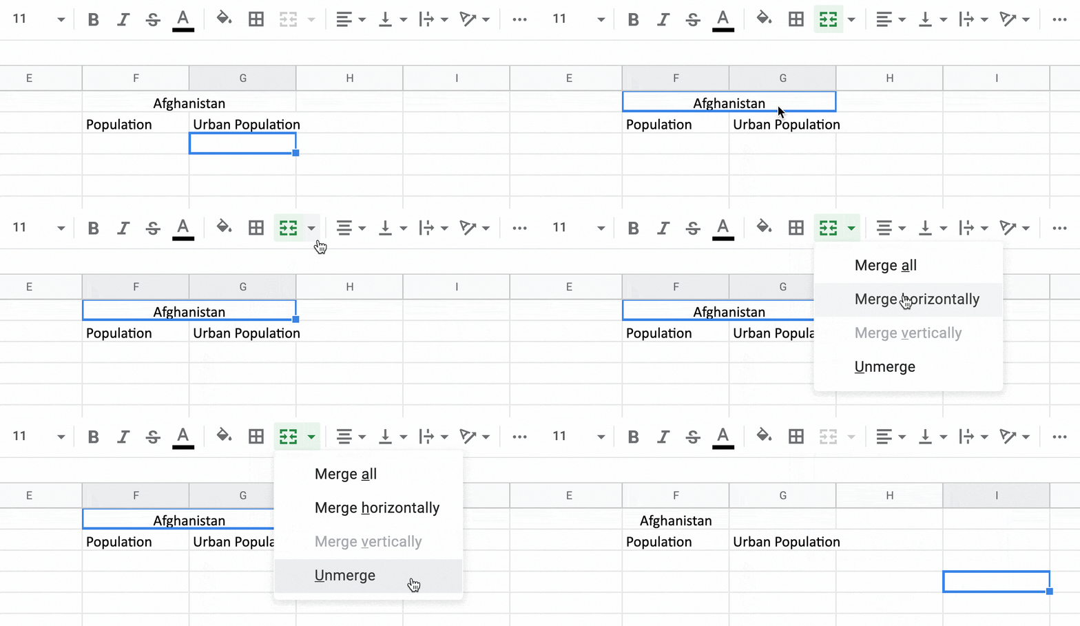
So the alternative to double-row headers and merged cells is to copy and paste text (e.g. “Afghanistan” in both examples above). Yes, writing down the same word(s) multiple times doesn’t look as tidy as merged cells. But it is tidier in the long run.
To unmerge cells, selected the merged cell and click on the little [><] symbol in the menu bar:
To make sure that data tools like Datawrapper and Excel recognize numbers, ensure you have undisturbed numbers in our data cells. Undisturbed by thousands separators – but we’ll take care of that later – and undisturbed by metrics. So free your data cells of all €, $, kg, %, km/h, etc. Instead, put them in the headers. And don’t worry: You can add back metrics, %-signs and any other kind of prefix and suffix when creating a chart in Datawrapper.
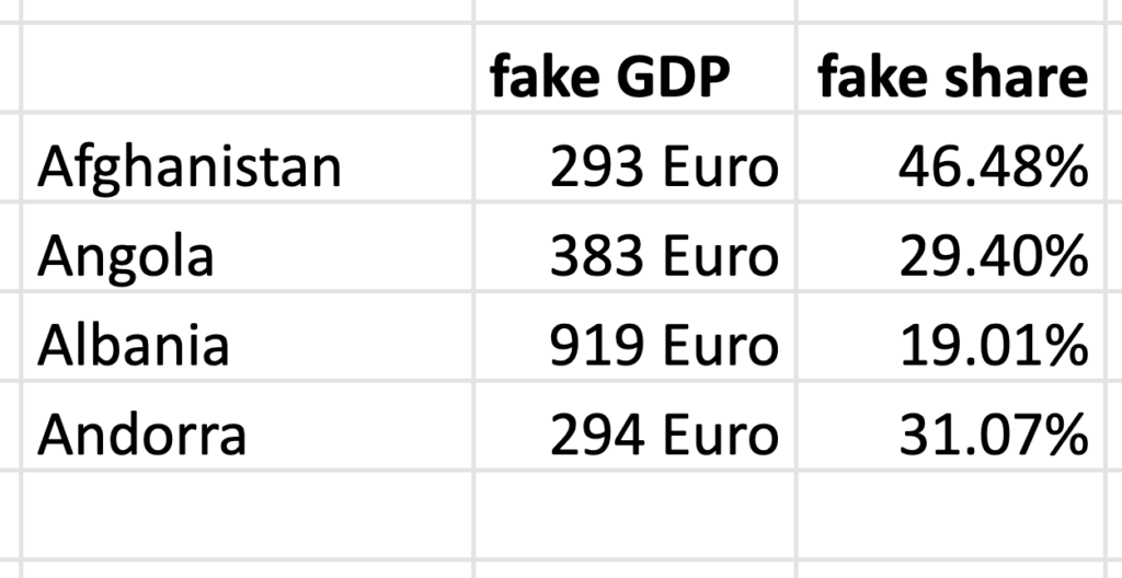
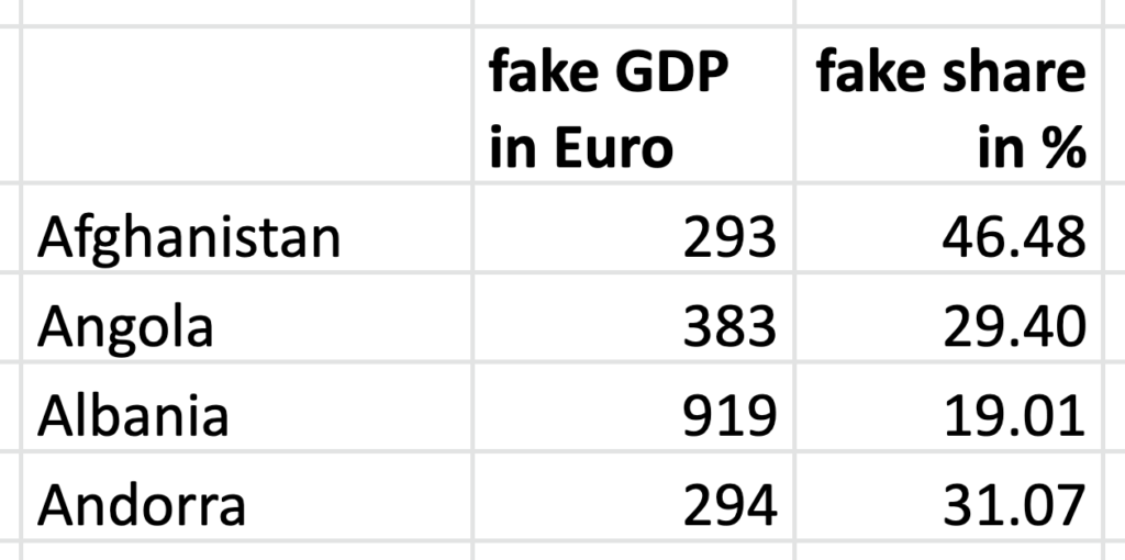
The same is true for footnotes. Values like 28.394† or 1.39[1] won’t be recognized as numbers by Datawrapper. But footnotes are also important! Before you delete them, make sure you understand the pattern in the data: Are all 2019 data points estimates? (Should you maybe exclude that year then?) Or is the data from a certain country measured differently? In all these cases, make sure to let the reader of your final chart know. Footnotes in the data you’re using should always translate to footnotes in the chart you’re creating.
You can delete metrics & footnotes in a column quickly with Find and Replace:
Cmd + F to open the Search.Replace with field blank.Search dropdown.Replace all, and your metrics should be gone.After doing these technical tasks, let’s see if the header’s names you haven’t touched yet actually make sense. Maybe they’re just code gibberish like SP.URB.TOTL? If that’s the case, go back to your source and find out what the codes mean. Or maybe they’re too long? For example, Country Name can easily be reduced to Country. Rename the headers so that it would be easy for outsiders to make sense of them: short, but precise and unique. (Well, if you see columns that you plan to delete, don’t bother with the renaming.)
Now you should be at a point where your headers look top-notch. Congrats! Let’s make sure you always have these beauties in sight and freeze the header:
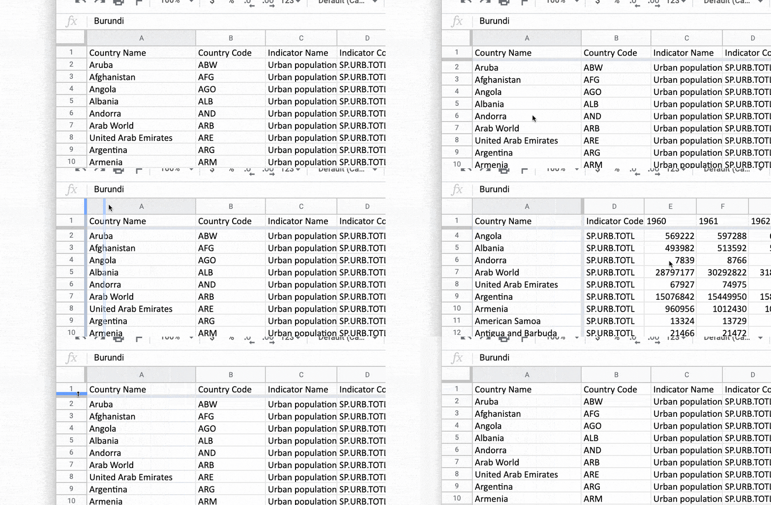
To freeze the header row, hover over the grey bars in the top left corner of your spreadsheet until your mouse pointer turns into a little hand. Then drag the bars down. Or go to View > Freeze and choose how many rows you want to freeze. You can do the same with the first column – not a bad idea in our example data set and its many columns.
That’s how our data looks like now. It’s a bit cleaner already:
But we haven’t even touched the values below the header yet. So let’s go ahead and do that:
Now we’ll tidy up properly! Let’s start with the columns. In our example data, we have two columns with the same content in every single cell: Indicator Name and Indicator Code. That’s only helpful if we have multiple indicators. We just have one, though: Urban population. So let’s get rid of them.
To delete columns, hover over the column indices (like A, B, C etc) until a little triangle appears. Click on it and then on Delete column. You can also select multiple columns with clicking on first one column, then holding Shift or Command, and then clicking on another column before clicking on the triangle:

Now let’s move on to the rows. The World Bank provided us not just with countries in our sample data, but also regions like “World” or “Arab World”. Do we need them? Maybe later – good thing we saved our original data! But to just show how the Urban population of countries developed, we can remove these regions.
To delete rows, click on one of the row indices (like 1, 2, 3 etc), hold Shift or Command and click on another row. When you have multiple rows selected, right-click. Select “Delete row” in the menu that opens.
Thousands separators are characters (, in English, . in German, sometimes it’s just a space) that make it easy to recognize the magnitude of a number. For example, 38.394.105 rounds faster to 38 million in our minds than 38394105.
But while they’re great and helpful for humans, they’re hard to parse for charting tools like Datawrapper – especially because they’re so different in all countries. You can change the number format and bring back thousands separators when creating a chart in Datawrapper, to make the numbers more readable again. But for now, let’s get rid of any kind of thousand separators.
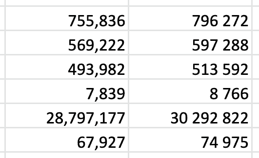
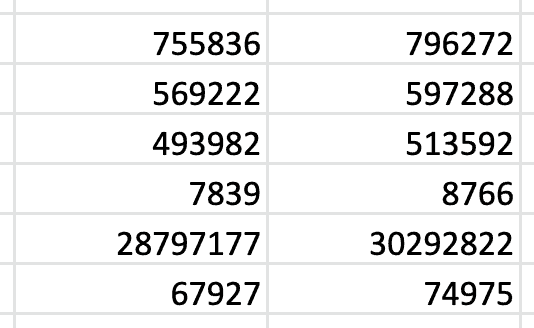
To remove all thousands separator, you can again use Find & Replace (Cmd+Shift+H), as we did when we deleted metrics & footnotes. You can just type a space, comma or dot in the Find text field. Leave the Replace with field empty again and select a range (to not delete spaces from your country names, for example!). Then click Replace all.
If Excel/Google Sheets already recognizes your number as such, you can also change the number format. This method is a bit more complicated but will prove helpful in the future. There’s no number format with removed thousands separators yet, so go to Format > Number > More formats > Custom number format to create a new one. A pop-up will open. Type in # – that makes sure that only the number without any special characters turn up:

Now you can select data cells or entire columns and apply that new number format. To do so, go to Format > Number > #. You can also click on the little 123 format symbol in the menu bar:

Our new number format # will hide all decimal places (like the 22 in 1.22). To make them visible again, click on the .00 symbol next to the 123 symbol in the menu bar, as shown in the GIF above.
You can change the format of numbers and add metrics or percentage signs (%) to them in Datawrapper, and you can do so easily for entire number columns. But we should make sure that the text looks good in our spreadsheet before copying & pasting the data into Datawrapper, because changing individual text cells is tedious there.
So go through your columns of countries, poll questions, etc. and see if you can shorten them while still being precise. Maybe you want to reduce Iran, Islamic Rep. to Iran, and European Union to EU. Or maybe you want to take a long explanation out of a text cell and put it in the “Notes” section of your chart instead.
Dates are tricky to work with. There are so many different date formats (“Nov 1, 2019”, “1/11/19”, etc.). And Excel, Google Sheets, etc. don’t save them in any of them, but as a “serial number”. The 1st of November 2019 becomes 43770 if you change the cell format to a number.
If you ever encounter such a strange number where you expected dates, simply change the cell format to dates. To do so, click through Format > Number > Date.
Datawrapper recognizes many different date formats like “Q4 2019”, “2019-11-01” or “11-2019”, so you can simply copy & paste columns with dates in step 1 of the app. If you’re not sure, check our list of “Date formats that Datawrapper recognizes”.
Sometimes, you’ll see multiple variables in a column. Like a column with US states in the format US-TX. Or a column with companies and the product they sell: Datawrapper (Software). You might not care. But when you want to analyze or visualize the data based on company products, you start to care. Good thing they are easy ways to separate the country from its states and the company from its product into two columns:
To make two (or more) columns out of one column, you can use the formula =SPLIT(B1,"-") or the formulas =LEFT(), =RIGHT() and =MID(). I’ll show you how to do so in our article “How to split and extract text from data columns in Excel & Google Sheets”.
Sometimes, you have data in two different Excel documents. Or in two different sheets of the same Excel file. Sometimes, this information is necessary to visualize the data – e.g. when you need the correct geographical IDs to create a choropleth map, but they’re not in your original data source.
In our sample dataset, we have some extra information, too. In the “Metadata – Countries” sheet, The World Bank data explains which region and which income group all listed countries are in. Both could be used to color our lines in a line chart or our bubbles in a scatterplot. If we want to do so, we’ll need to bring the information from this “Metadata” sheet into the “Data” sheet.
To bring the region and/or income group into our actual “Data” sheet…
a) …we can sort the country column alphabetically in both sheets and then copy and paste the region and income group column from their sheet to the “Data” sheet. This approach only works when we have unique values (otherwise sorting becomes unreliable), and if we are 100% certain that the values are the same. As soon as the two columns differ in lengths, we need to choose the next method:
b) …we can use the formula =VLOOKUP(B1,A1:A100,2,FALSE). This formula is not super easy-peasy to use, but Microsoft itself does a fairly good job at explaining it here.
One can arrange the same data in rows and columns in different formats. Our sample data from The World Bank is in a so-called “wide” format: The values of each year are in a new column, so one row comes with many values. Datawrapper will understand this format well, so we can just copy and paste it into our step 1, transpose the data and create e.g. a line chart out of it.
But sometimes, your data will be in a different layout: The “long” format. In the long format, each value has its own row. Datawrapper won’t be able to handle the long format, so you’ll need to convert it to the wide format first.
To transform data from the long format to the wide format, you can use a feature called “pivot tables” in Excel or Google Sheets. You can learn how to use them in our article “How to get data in the right format with pivot tables”.
That’s it! We went through the whole process. Phew. Now your data should be ready to be analyzed and visualized. You might want to delete some more rows and columns (or add them back in). For now, our spreadsheet looks like this:
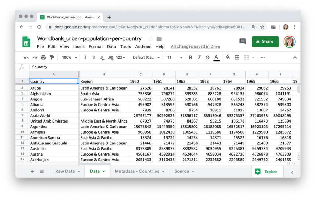
We changed the title, tidied the header and data, made sure everything is in the right format and written as concise as possible and even added an extra column. Yeah!
If you’re ready now to create beautiful, interactive & responsive charts or maps out of this data, head over to our Academy with its more than 100 Datawrapper tutorials. Learn how to create basic visualizations like column, bar or line charts, and more fancy ones like the scatterplot, symbol maps or arrow plots. Or simply go to datawrapper.de, click on “Start creating” and copy & paste the data in step 1: Upload data. And if you have any questions, please leave a comment or write to me at lisa@datawapper.de!
Comments