Watch the recordings of Unwrapped, our conference
August 12th, 2024
5 min
Datawrapper lets you show your data as beautiful charts, maps or tables with a few clicks. Find out more about all the available visualization types.
Our mission is to help everyone communicate with data - from newsrooms to global enterprises, non-profits or public service.
We want to enable everyone to create beautiful charts, maps, and tables. New to data visualization? Or do you have specific questions about us? You'll find all the answers here.
Data vis best practices, news, and examples
250+ articles that explain how to use Datawrapper
Answers to common questions
An exchange place for Datawrapper visualizations
Attend and watch how to use Datawrapper best
Learn about available positions on our team
Our latest small and big improvements
Build your integration with Datawrapper's API
Get in touch with us – we're happy to help

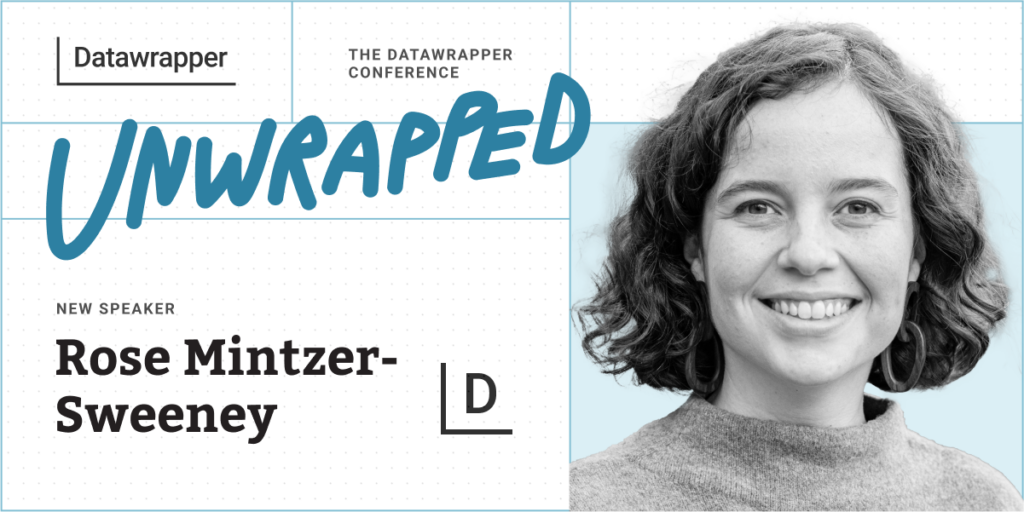
We’re excited to announce that our data vis writer Rose Mintzer-Sweeney will speak at the Unwrapped conference about “Three years of trends in news visualizations.”
Rose has been with Datawrapper for three years, creating, editing, and writing about data visualization. She publishes new Datawrapper charts every Thursday in the Weekly Chart column and edits a weekly roundup of the best new data and visual journalism in the Data Vis Dispatch.
Time to ask her some questions:
What’s happening in the world of visual and data journalism? What formats, techniques, and topics are having a moment and which ones have proven their staying power? We’ll take a look at some visual and organizational trends of the past three years through the eyes of reporters, editors, and observers of the data vis scene.
Everyone working on the tool is really interested in what great data visualization can be. A huge part of my job is drawing inspiration from the world of data vis outside our company, noticing what’s beautiful and interesting no matter how it was made. I think it makes the tool better in the long run and it definitely means I see a lot of amazing projects from all kinds of creators.
Talk to your reader. A chart is just another form of communication, and a good one can speak as plainly and convincingly as a good paragraph — provided you know what you’re saying!
I have a lot of fun with the freeform tooltips in choropleth maps and scatterplots. Some extra color coding, emoji data scales, miniature charts… And then looking at other people’s designs and realizing I still haven’t explored all the possibilities.
We're looking forward to Rose's talk at Unwrapped! Until then, you can learn more about her on X. To sign up for Unwrapped and hear Rose and other great speakers, visit our conference website.
Comments