
This article is brought to you by Datawrapper, a data visualization tool for creating charts, maps, and tables. Learn more.
The Philadelphia Inquirer: “With Datawrapper, I bet on the right horse.”
How the Philadelphia Inquirer uses Datawrapper for their digital transition.

When John Duchneskie started designing print graphics at the Philadelphia Inquirer 35 years ago, his work revolved around a nightly printing schedule. “This big machinery of a large newsroom hummed and built to a crescendo late in the evening. Then we sent our files to the printer. Especially big projects had us worrying sometimes — you couldn’t recall that missile once it was published!”

But around 2015, his role flipped 180 degrees. “We said, ‘Ok, we are going to focus on our digital audience first,’” John remembers. “Exactly the opposite of what it used to be before.” When the Philadelphia Inquirer, like so many newsrooms, focused more on digital than print subscriptions, it had to learn to continuously deliver in a new medium — and do it all with fewer staff members than ever before.
Datawrapper helped John with the switch to digital-first. According to him, the more than 850 visualizations he’s built with this tool since 2015 have five advantages: they’re adaptive, responsive, interactive, quick, and simple.
Adaptive
Charts first for the web, then for print
When digital became more important than print, John and his team had to adapt. “We now focus primarily on digital and worry about our print product later in the day, when the print team makes their picks and we adapt the charts in Datawrapper.”
Here’s an example — a Datawrapper symbol map that John created and embedded in a web article, and how that same map appeared in print:
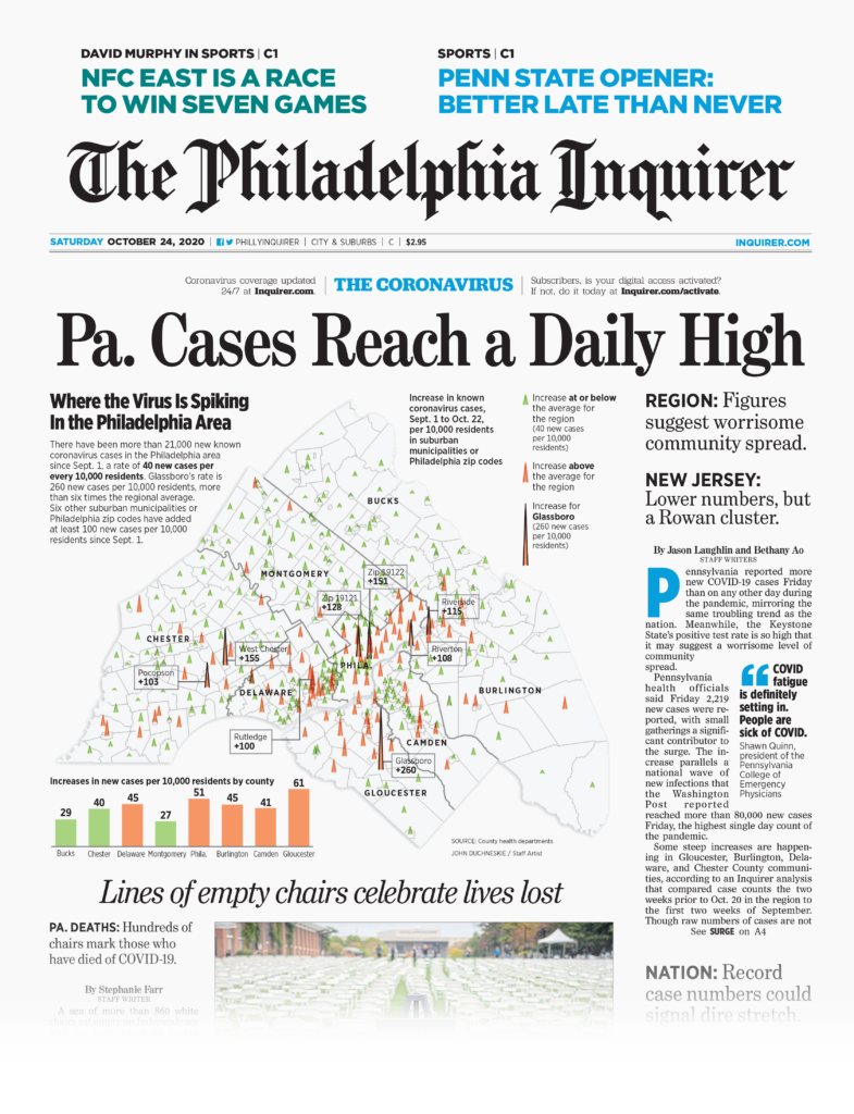
Two Datawrapper features help them to bring their web into print: the PDF/SVG export and the custom design themes. The Philadelphia Inquirer has two of them, for web and print — both with the right fonts, colors, and margins. If the graphics team wants to repurpose a web chart, they switch to the print design theme and choose the right column width directly in Datawrapper. Then they export it as an Adobe-Illustrator-editable PDF with the pre-defined, printable CMYK colors.
Responsive
Visualizations for mobile readers
John is aware that digital-first means mobile-first, because most readers will see his charts on mobile devices. "When you're writing a story, the text is like water: it flows into the shape of whatever vessel contains it. But a data vis doesn’t flow so easily into another shape. You have to think about how 66% of our audience reads our stuff on a mobile device. It’s a challenge."
"One of the things Datawrapper solves for us is responsiveness,” he explains. “You don't have to build multiple versions of a chart, and that cuts down on time. All I have to do is copy and paste the embed code into whatever content management system (CMS) we're using at the time."
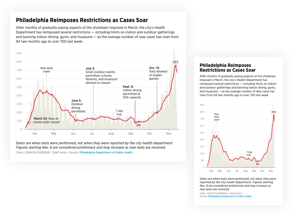
A chart by John Duchneskie, as seen on desktop devices (left) and mobile screens (right): The font size stays readable on mobile, and John decided to show fewer annotations so that they don't overlap. It's also possible to show these annotations as a key below the chart — learn more here.
John has several strategies to optimize the experience on different devices. He starts by making a chart on the smallest size and then moves to bigger formats. "If it doesn't work on mobile, it's pointless," he says.
For tables, he uses the feature to hide certain columns on the mobile view. "That's a fantastic thing because it gives you the ability to say, 'On mobile, you aren't going to get seven fields of info, but three or four.' You'll get a better, and different, experience."
Interactive
Exploring underlying data points
While Datawrapper is great for creating static charts, a big gain for John compared to his previous workflow in Illustrator is the option to have dynamic charts. "You trade the big print canvas for interactivity," he explains. "People can play with the data; they can explore it. In Datawrapper visualizations, people can hover over data points to get the underlying data."
However, to make sure his readers get the whole picture even if they decide not to interact with the chart, John uses Datawrapper annotations to point out the most important insights. "You want people to read this very quickly and be able to get the information that they otherwise wouldn't get if they didn’t hover over anything," he explains.
Quick
Making stories better even when in a rush
With deadlines happening earlier in the day, there is also the need to create visualizations faster. "Now we're here earlier and earlier because our audience peaks around noon. There's a big rush to get things out when most of our audience is on our site during the week." These days, he publishes three charts per week on average.
John remembers how Datawrapper helped him out in one of the many stressful situations. "A reporter of ours wanted to do a very detailed examination of Pennsylvania's economy during the Trump presidency. I think that was the most charts that I ever did for one story, and they all served the purpose of the story. Without Datawrapper it would have taken too long, it wouldn't have been interactive, and it wouldn't have worked on mobile. We can do these stories more easily than we could have done without Datawrapper."
Simple
Being in the game
With newsrooms around the world getting smaller and smaller, John had to find a way to make fewer people more powerful and data-vis-literate.
And that process started with himself. As a journalist without programming skills, he had thought online charts could only be created by the two or three developers in the newsroom. "And then Datawrapper came along and suddenly it was like, ‘Hey, I'm in the game now.’ Now even I can produce a chart. All I have to do is arrange the data in a spreadsheet and copy and paste it into the tool."
He then passed on this newfound power to others, training other reporters on how to use the tool. "You don't expect 200 journalists to start using it, but if you get a committed group of 15-20 people and you give them feedback, you can let them go and do things." And that has a ripple effect: "When people see that these things are being done by their colleagues, not by the graphics staff, they want to learn how to do it too."
A chart by one of John's coworkers.
And with the pledge to keep all charts online regardless of any future changes to Datawrapper's business model or pricing, the more code-savvy people at the Philadelphia Inquirer were also convinced. "Even the developers who can write code to create charts use Datawrapper — because it's easy and produces great results with minimal effort. There's no shame in that at all."
“I bet on the right horse”
Looking back at the moment when he committed to Datawrapper, John feels he "bet on the right horse." "Six years ago, when I chose a charting tool, I looked at Datawrapper and thought to myself: ‘This one is going to be the best for us.’ Now I feel like, in a sense, I can pat myself on the back for that. Datawrapper has really empowered reporters, even those who really don't consider themselves data-savvy, to do their own charts. It's great," John concludes.
Over the last 2 weeks, cases have risen by 84% in states that don't require wearing masks in public. In states where mask wearing is mandatory, cases have fallen by 25%. https://t.co/VJkKe7yEQ3 pic.twitter.com/2iXgg3ZwZ8
— John Duchneskie (@jduchneskie) June 24, 2020
A popular Datawrapper map created and shared by John Duchneskie for the Philadelphia Inquirer (link). It was retweeted more than 10k times on Twitter alone.
Big thanks to John for taking the time to talk to us! If you want to learn more about the Philadelphia Inquirer, visit inquirer.com or follow John on Twitter (@jduchneskie).
Liked this article? Maybe your friends will too:
NEWSLETTER
Sign up to our newsletters to get notified about everything new on our blog.


Comments