Muna Alebri, UCL, will speak about right-to-left data visualizations

We’re excited to announce that Muna Alebri, PhD candidate at the University College London Interaction Centre, will speak at our Unwrapped conference about “Inclusivity in Visualization Design: Are we leaving right-to-left readers out?“
In her PhD project, Muna focuses on visualization design for the general public. In particular, she investigates the usefulness of icons, pictographs, and other visual elements in engaging the general public — for example, how non-experts in visualization and design perceive embellishments like icons and backgrounds in news visualizations (PDF).
Time to ask her some questions:
Muna, what will you talk about?
There has been a growing concern over generalizing our knowledge of human behavior and cognition, as most research is based on Western-educated, industrialized, rich, and democratic (WEIRD) samples. Languages of these communities are read and written from left to right (LTR). Reading direction is essential for design, influencing where people unconsciously direct their attention and make decisions. So most of our visualization knowledge is mainly based on LTR readers.
In contrast, right-to-left (RTL) readers constitute over 500 million people worldwide, but are left out of empirical investigations in the visualization community. In practice, there is a lack of consistency in visualization design for RTL readers. While there are no clear guidelines for RTL readers, we could borrow findings from cognitive perception research. By the end of my talk, I hope the audience will consider the reading and writing direction in visualization design.
Where does your interest in data visualization come from? Why keeps you interested in it?
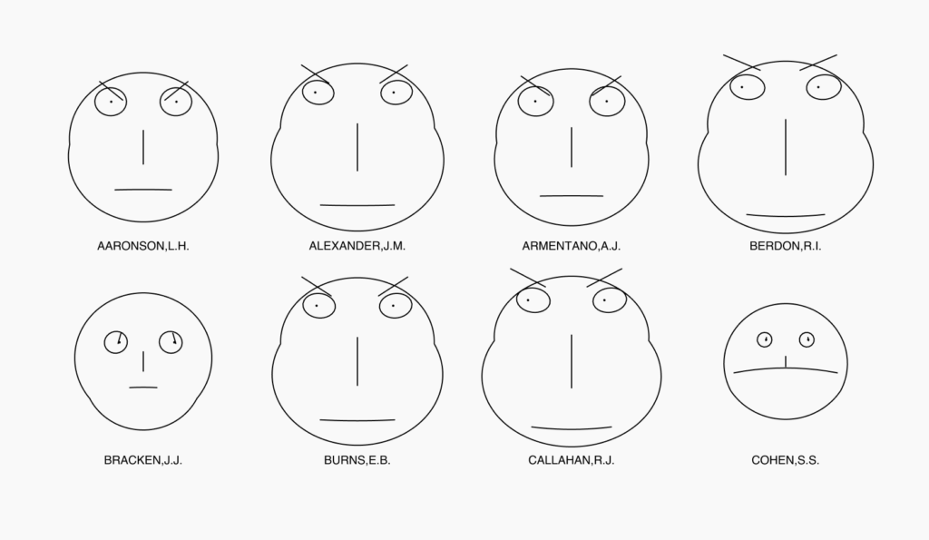
I have always been a visual person. I have always had hobbies related to visuals, whether photography, doodling, or simply admiring art. But I honestly was first fascinated by visualizations when I saw the Chernoff faces visualization while I was working on my master's thesis. It's a visualization that uses human features to depict multivariate data:
What keeps me interested in visualizations is empirical research and that it is an area that requires revisiting our assumptions.
What aspects of data visualisation design would you like to explore more?
I want to explore design for RTL readers because I am part of that community and feel we are underrepresented in the visualization industry. I want to give my community a voice and understand our differences to improve everyone's knowledge of data visualization.
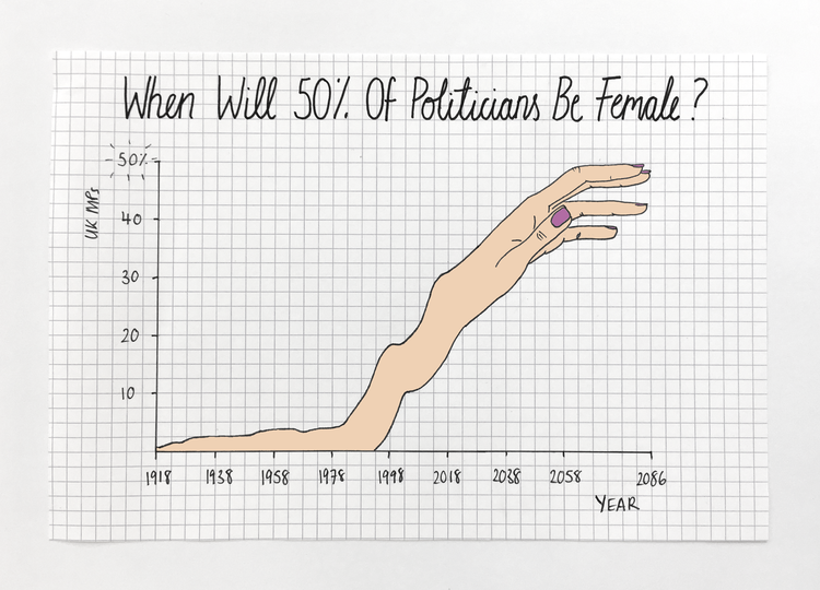
I also want to explore trust in visualizations. There is a historical assumption that visualizations need to be objective by showing the data only. With the spread of false information, I wonder if we want people to see all visualizations as trustworthy and factual. I think it is important to encourage readers to be skeptical and invest time in reading and exploring the chart. In particular, I am keen on investigating how the combination of visual metaphors and sketchiness (e.g., in Mona Chalabi's work) would be suitable to achieve that goal.
What advice would you give to data visualization designers?
From a researcher's perspective, I would suggest talking to their audiences to get feedback and understand their requirements. Also, the research community is making tremendous efforts to elicit design guidelines, so it might be worth frequently checking what the community has to offer.
We're looking forward to Muna's talk at Unwrapped! Until then, you can find her on LinkedIn, X, and Google Scholar. To learn more about Datawrapper's support for right-to-left visualizations, head to this feature announcement. And to sign up for Unwrapped and hear Muna and other great speakers, visit our conference website.
Liked this article? Maybe your friends will too:
NEWSLETTER
Sign up to our newsletters to get notified about everything new on our blog.


Comments