This article is brought to you by Datawrapper, a data visualization tool for creating charts, maps, and tables. Learn more.
Election results in pink & blue

Today, everything comes together. A few weeks ago, I wrote a blog post exploring alternatives to the stereotypical colors pink and blue that are used in charts about women and men. In that article I talked about rebranding pink and blue for non-gender data. And two days ago, I published an article explaining party colors in Germany, US and UK.
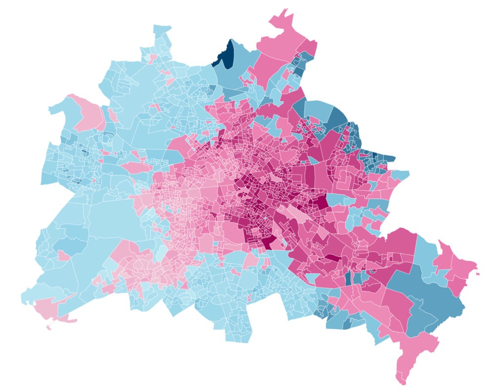
So this Weekly Chart is a map with election results – in pink and blue. It’s a map that compares which election district in Berlin had more votes for the left party “Die Linke” (pink) than the right-wing populist “Alternative für Deutschland” (“AfD”, in blue), during the German federal election in September 2017:
What can we see? A strong local pattern: At the last federal election, there was a preference for the left party over the right-wing populist party in the center of Berlin. There’s still a slight preference towards the left in the eastern parts of Berlin; while in the west, AfD got more votes than the left.
Map Choices
The map above clearly shows us the ratio between AfD voters and Linke voters. But there are other ways to show election results on a map:
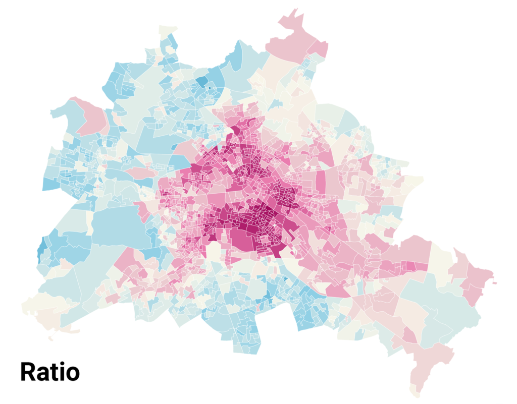
We could show the actual vote shares. To create a map like that, for each election district we would check if the left or the right party got more votes and then just show the share of voters for this dominant party:
This map shows us that both parties received a higher vote share in the east than in the west. But it also artificially increases the polarisation: If the AfD gets just one more vote than the Linke, the whole district flips from pink to blue. And we would need to create a third category, “tied”, for the nine election districts in which there were exactly as many AfD voters as Linke voters. (The New York Times created that category for their “Extremely Detailed Map of the 2016 Election”.)
There is another option: We could show the percentage point difference between the two shares. To do so, we subtract the AfD votes from the Linke votes. If the result is positive, we show the district in blue. If it’s negative, we show it in pink.
What I decided on in the map above is to show the ratio between AfD and Linke voters. To do so, we divide the number of AfD voters by Linke voters. And again, if the result is positive, we show the district in blue; if it’s negative, we show it in pink:
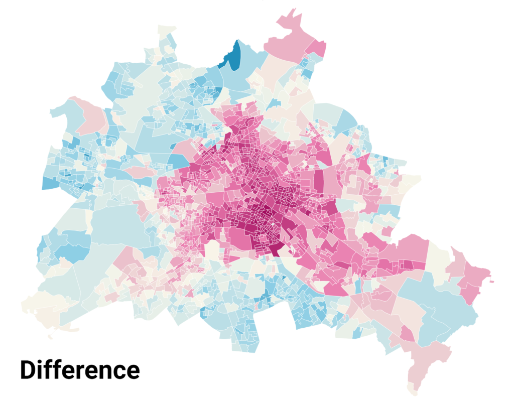
I see you tilting your head, looking at these maps. I hear you thinking: “Sooo…doesn’t look that different, does it”. And yes, there’s not a huge difference between the map showing the ratios and the map showing the percentage point difference between AfD and Linke voters.
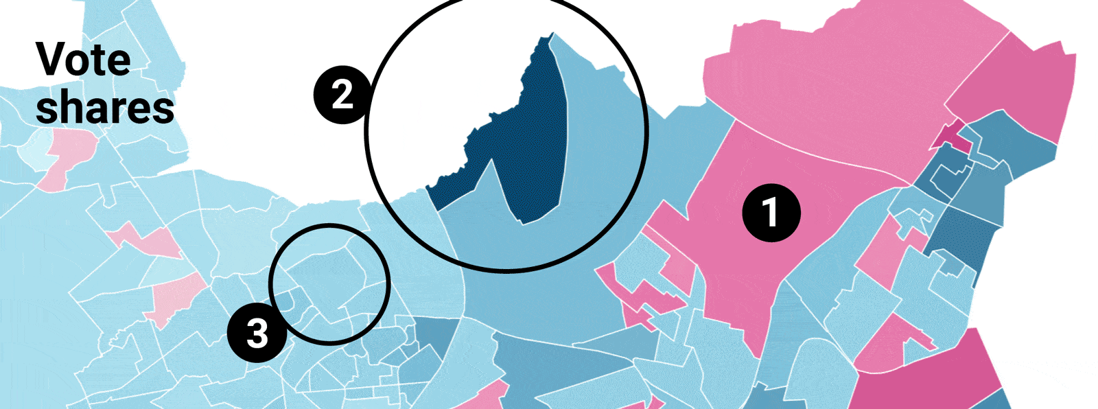
Here you can see the northern part of Berlin. Let’s use three districts there to compare all three maps closely:
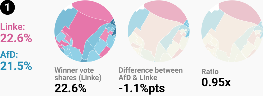
Almost 23% voted for Linke in the election district I labeled with the number 1. Which makes it an ok-ish colorful area on the map with the actual vote shares. But this map doesn’t show the other 22% who voted for the AfD in this district. The small difference between 23% and 22% voters leads to a toned down color for this area in the other two maps.
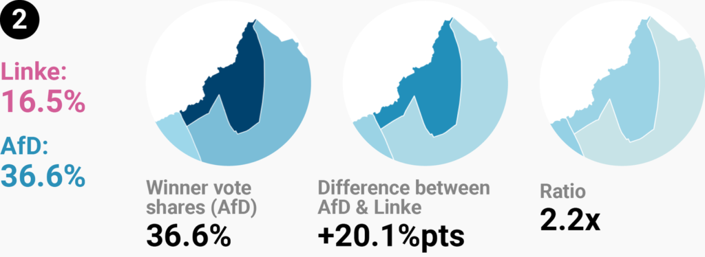
District number 2 has a high share of AfD voters and a low share of Linke voters, with a difference of 20 percentage points. But the same 20%pt-difference would exist if there were 20% AfD voters and 0% Linke voters. Or 60% AfD voters and 40% Linke voters. The color fill of this district would be exactly the same, no matter the absolute values.
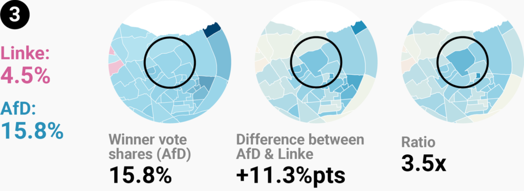
That’s something our ratio map fixes. District number 3 is darker on the ratio map than district number 2. Which is surprising: The difference between AfD voters and Linke voters in district 3 is small. But in this district, there were three times more AfD voters than Linke voters, while in our second district, there were only 2.2 times more AfD voters.
The ratio map tries to take both into account, the difference and the absolute values. Small absolute values with a medium difference between them result in election districts with a dark color fill. But for big absolute values, the difference needs to be much higher to result in the same dark color.
For example, an area with the numbers 5% and 20% would result in the same colorfill as an area with the numbers 20% and 80%. Both have a ratio of 4, although the absolute values and the percentage point differences (15% and 60%) vary a lot.
If you want to dig deeper into this topic, I recommend the Weekly Chart article “How to read a log scale: What Mike Bostock means” and Mike Bostock’s explanation “Method of Comparison, Compared”; both from June. And if you’re interested in the election results of all German parties in Berlin, not just from the AfD and Linke, have a look at this map by Berliner Morgenpost. I’ll see you next week, with a smaller Weekly Chart again!


Comments