

The world could be your oyster, but it depends on your passport
October 10th, 2024
4 min
This article is brought to you by Datawrapper, a data visualization tool for creating charts, maps, and tables. Learn more.
52 weeks ago, I wrote the first Weekly Chart. Each Thursday since then, I published a new chart. This definitely keeps me grounded: 52 charts in 52 weeks can’t be all perfect (I also have other things to do). But that’s ok. The Weekly Chart reminds me that it’s better to have something imperfect published than nothing at all.
So which ones are the more perfect and less perfect Weekly Charts? I went through all of them and rated them in two categories: the quality of explanation and the quality of the Weekly Chart itself:
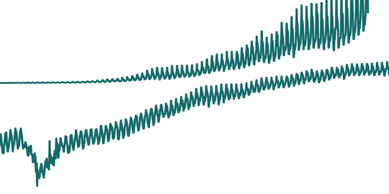
The two categories are not related at all. I’ve written articles with boring charts but (hopefully) helpful explanations, like the one about log scales or about the difference between the mean and the median. And I’ve shown great charts, but with far less exciting explanations, like this loooong one from three weeks ago.
…you might ask. For the Best Of Datawrapper Blog article two weeks ago, I collected my favorite Weekly Charts in general. They’re a good entry point into the world of our Weekly Charts:
3-part-series on How to read a log scale in week 28, 29 and 30:
Part 1: Same distance, same growth rate
Part 2: The chart that can’t start at zero
Part 3: What Mike Bostock means
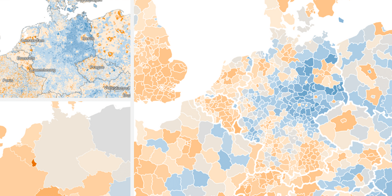
Different units, different patterns, week 19: The same data tells a different story depending on the level of detail you choose.
What the difference between mean and median tells us about income inequality, week 9: What’s a mean and what’s a median, and what it means when the mean is higher than a median.
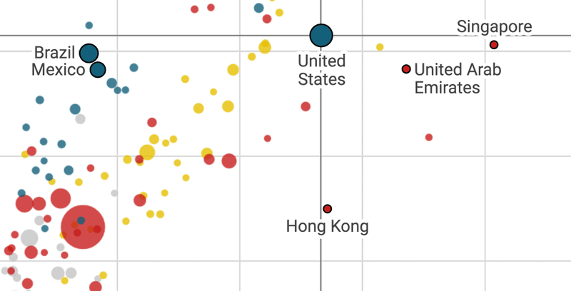
Five ways to read a scatterplot, week 13: There’s more to read out of a scatterplot than you think.
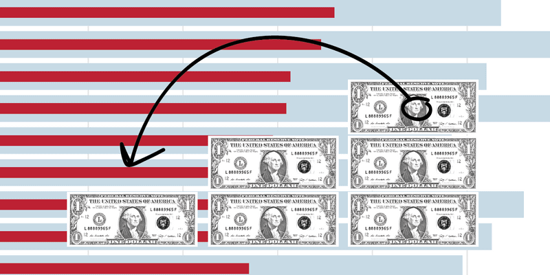
Dollars for College (or TV🤔), week 47: A chart never shows us the whole picture. We should always ask ourselves: “What don’t we see in this chart?”
Also, I want you to know that the Datawrapper team has been amazing in supporting me. Both Gregor & Elana wrote two of the best Weekly Charts of the past year while I was on vacation. And my articles would be so much worse without our frontend developer Ivan. Every Thursday afternoon, he goes through my Weekly Chart draft and makes it sound like it’s coming from a person with proper English skills. Thank you Ivan!
What kind of Weekly Chart do you enjoy more: the one with the better chart or with the better explanation? And is there anything you’d like me to change in general? Let me know, e.g. in the comments below or at lisa@datawrapper.de. Thank you!


Comments