This article is brought to you by Datawrapper, a data visualization tool for creating charts, maps, and tables. Learn more.
What we wrote about in the last year
The best of Chartable (so far)

Welcome! You’re on Chartable, a blog written by a bunch of people who work at Datawrapper, an online charting tool. Almost exactly one year ago, we created this place to talk about charts. Here we explore how to make them better, with you.
This article is written for you as an entry point to our blog. Maybe you’ve never been here before. Maybe you’ve discovered us through the Information is Beautiful Awards. Or maybe you’re just looking to rediscover your favorite article. In any case, we hope you find what you’re looking for. Here are the best articles this blog has to offer:
Our three finest articles
If you don’t have time and just want to see what we consider the best we’ve written in the last year, here it is:

What to consider when creating choropleth maps: Explains when maps are useful and when not, and how to design them well.
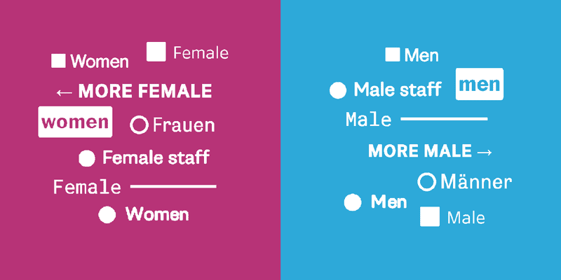
An alternative to pink & blue: Colors for gender data: Makes a case for using less pink & blue and shows what newsrooms out there use instead.
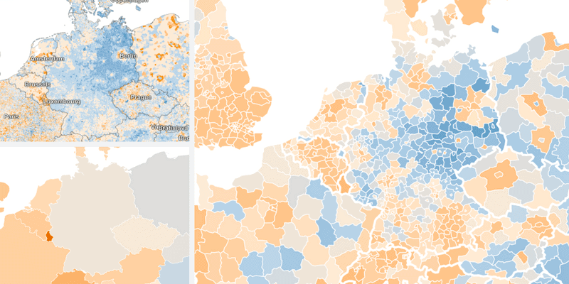
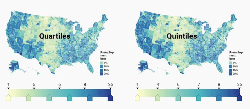
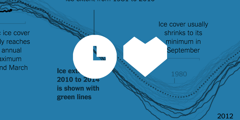
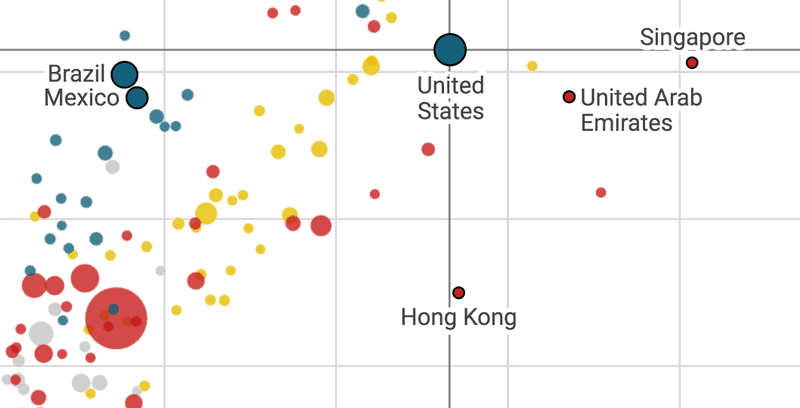
Different units, different patterns: The same data tells a different story depending on the level of detail you choose.
You’re curious to learn more? Excellent! Let’s look at our best articles when it comes to chart design principles, color choices, opinions & our Weekly Charts. (You’ll get to see these three articles again.)
“What to consider” series
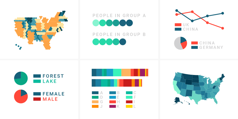
In our “What to consider”-series, we explain principles that can improve your chart design – fully aware that rigid rules only apply in 95% of the cases. So far, we’ve looked at four chart types, one map type and one general topic.
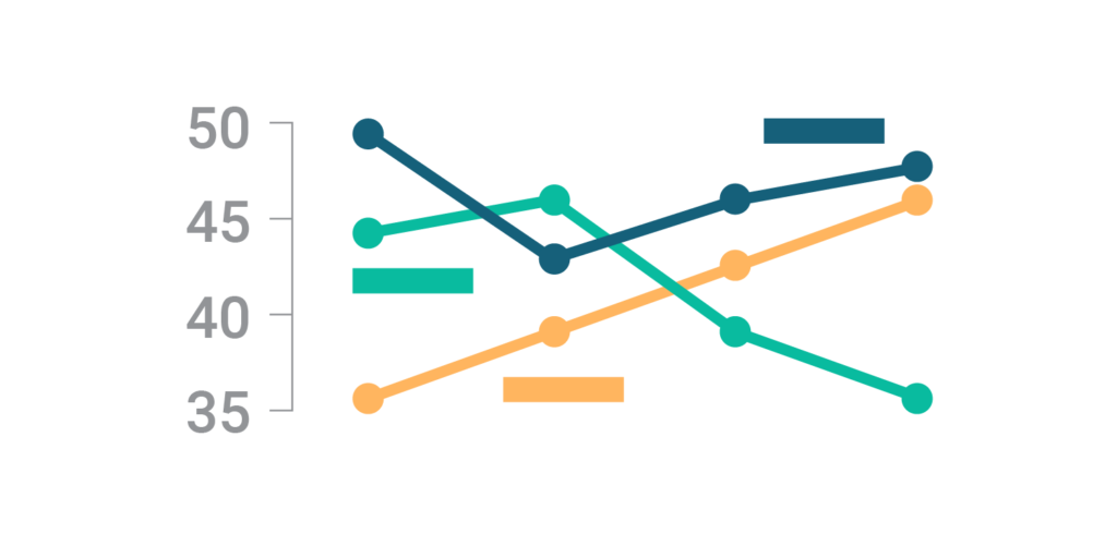
→ What to consider when creating line charts
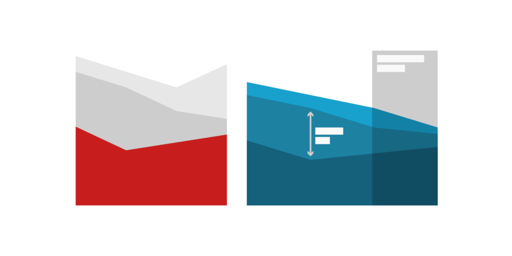
→ What to consider when creating area charts
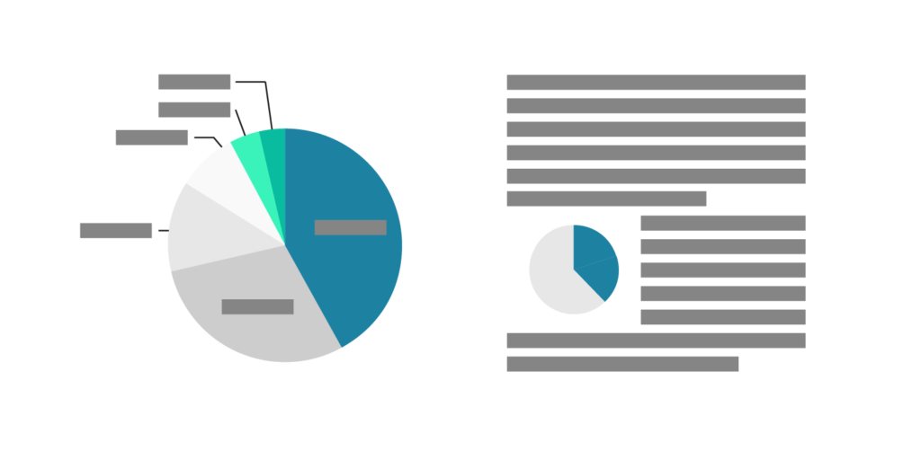
→ What to consider when creating pie charts
→ What to consider when creating choropleth maps
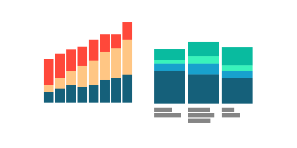
→ What to consider when creating stacked column charts
→ What to consider when choosing colors for data visualization
For each principle, we show a “not ideal” and a “better” version of a chart. You can see for yourself if you think one version is better than the other.
Our four best blog posts on color
Color is an important design element in data vis. Here are four articles that explore how to deal with them.
What to consider when choosing colors for data visualization: Talks about general Do’s & Don’ts when it comes to the use of color in data vis. What you’ll learn: Grey is your friend.
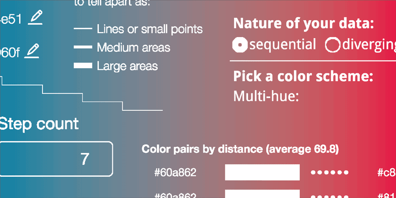
Your Friendly Guide to Colors in Data Visualisation: A general introduction to color and an overview of online tools to create color gradients & palettes for your charts. What you’ll learn: Picking colors is hard. Luckily, other people think so too and are here to help.
An alternative to pink & blue: Colors for gender data: Makes a case for using less pink & blue and shows what newsrooms out there use instead. What you’ll learn: In the best case, you’ll be more open to choosing crazy colors for gender data.
How to choose a color palette for choropleth maps: Explains how to choose colors on choropleth maps. What you’ll learn: How (not) to lie with maps.
Our three most opinionated long reads
Three more provocative articles. We talk about our dislike for two chart types and our fondness for stating clearly what a chart is about.
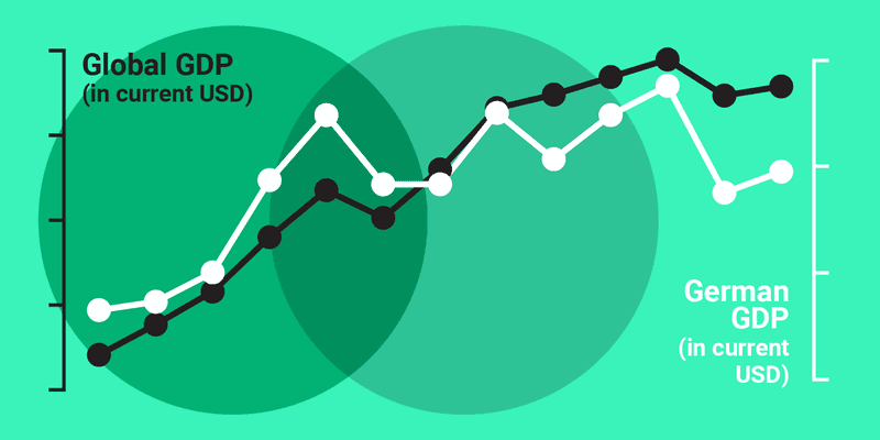
Why not to use two axes, and what to use instead: Explains why charts with two y-axes are hard to read and suggests alternatives. What you’ll learn: How (not) to mislead readers about the relationship between two data series.
Respect your readers’ time: Lisa explains what she likes about her favorite chart out there. What you’ll learn: How telling your readers what they see decreases confusion.
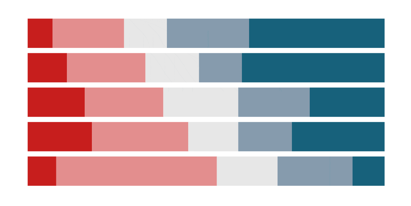
The case against diverging stacked bars: Explains why stacked bar charts that align bars on a center baseline are harder to decipher than 100% stacked bar charts. What you’ll learn: Why it’s important to prioritize which values readers should be able to compare.
The top 5 of 50 Weekly Charts
Every Thursday since November last year, we show you a chart. Sometimes, we use it to explain economic, statistical or chart-related terms: the Consumer Price Index, Interpolation, the Gini Index, indices in general, jittering or the Marimekko chart. Sometimes, we play around with chart types and create line charts out of scatter plots or column charts out of area charts. And sometimes, we share general data vis principles or chart design tricks. Here are the best five Weekly Charts:
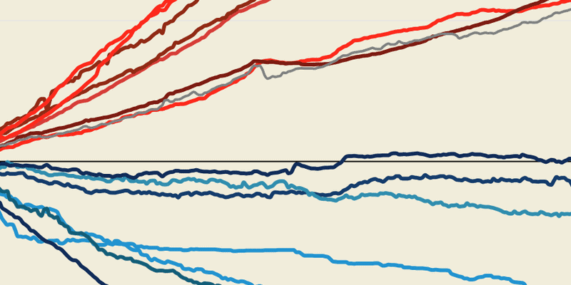
3-part-series on How to read a log scale in week 28, 29 and 30:
Part 1: Same distance, same growth rate
Part 2: The chart that can’t start at zero
Part 3: What Mike Bostock means
Different units, different patterns, week 19: The same data tells a different story depending on the level of detail you choose.
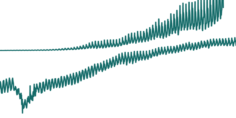
What the difference between mean and median tells us about income inequality, week 9: What’s a mean and what’s a median, and what it means when the mean is higher than a median.
Five ways to read a scatterplot, week 13: There’s more to read out of a scatterplot than you think.
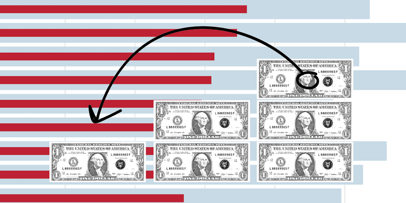
Dollars for College (or TV 🤔), week 47: A chart never shows us the whole picture. We should always ask ourselves: “What don’t we see in this chart?”
WEEKLY CHART NEWSLETTER
Data Vis Book Club
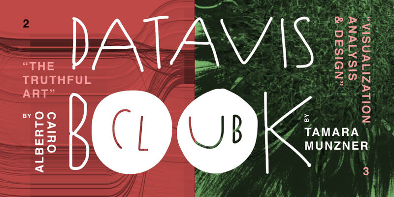
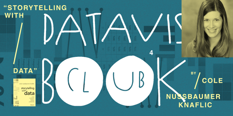
For a deeper understanding of data vis than our articles can offer, we organize a digital book club for data vis books. So far, we’ve read four books:
- Edward Tufte’s “The Visual Display of Quantitative Information”:
→ Announcement blog post & notes
→ Review of the book club - Tamara Munzner’s “Visualization Analysis & Design”:
→ Announcement blog post
→ Notes for chapter 1-6, including Q&A with the author
→ Notes for chapter 7-15, will happen on Oct 16 with a Q&A - Alberto Cairo’s “The Truthful Art”:
→ Announcement blog post & notes - Cole Nussbaumer Knaflic’s “Storytelling with Data”:
→ Announcement blog post & notes, will happen on Oct 30 with a Q&A with the author
The book club happens in a notepad (click on “notes” behind an author to go there). The whole discussion is documented, including Questions & Answers with the authors. To keep up to date, follow @datavisclub on Twitter.
Like what you see? Consider voting for us in the Information is Beautiful Award 2018. You can still do so until this Friday the 19th of October. No need to sign in; just click “Vote”. Thank you!
This is just the crème de la crème; the fine selection. You can find all Weekly Charts here. If you’re interested in more blog posts about color or long reads in general, head to the “Thoughts & How To’s” section. We also publish “Datawrapper News”, in which we introduce ourselves & talk about features.
If you have a question or feedback about the blog, we’d love to hear it! Leave a comment below, find us on Twitter or write directly to Lisa at lisa@datawrapper.de.


Comments