How to find & create good color palettes
December 11th, 2024
20 min
This article is brought to you by Datawrapper, a data visualization tool for creating charts, maps, and tables. Learn more.

This is part 1 of a series on “Which color scale to use when visualizing data” (Part 2 / Part 3 / Part 4). If you already have a good understanding of color scales, skip to the end of this article, “It’s not as clear-cut as it seems”.
When visualizing data, you’re almost always working with color – e.g., with different hues (red, yellow, blue) for categories or color gradients (light blue, medium blue, dark blue) for maps.
If you use them to visualize data, hue palettes and gradients become “color scales.” That’s because they all “map” to some data: For example, every one of your hues stands for a certain category and every color in your gradient stands for a certain value (range).
This article gives you an overview of the different color scales. Let’s start:
1 What to color by
2 Hues: Categorical color scales
3 Color gradients in one direction: Sequential color scales
4 Color gradients in two directions: Diverging color scales
5 Highlighting or de-emphasizing
6 It’s not as clear-cut as it seems
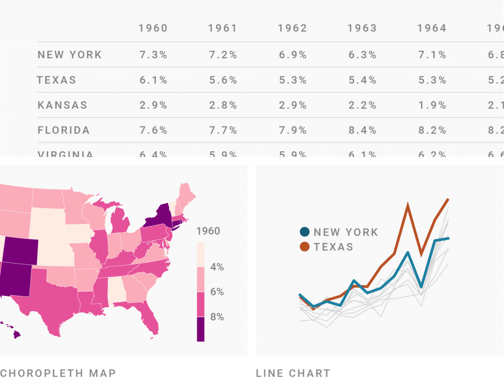
Imagine you have a data set with the unemployment rate for each U.S. state for the last sixty years. What do you color by?
That depends on what type of visualization you’re using (and which visualization type you need depends on what you want to communicate). Certain chart types nudge you to color by certain variables.
A choropleth map, for example, already encodes the states by position: Florida is in the bottom right, Texas in the bottom center, etc. There’s no need to encode the states again with color. So you can encode the unemployment rate by color instead – for example, by making the fill color darker when the unemployment rate is higher.

If you show the same data in a line chart, the opposite is the case. The unemployment rate is now encoded by position: The higher the line, the higher the unemployment rate. But to tell readers which line represents which state, you’ll need colors.
So when you read about “encode categories with colors”, “color quantitative values,” etc. in the following minutes, then this applies to the part of your data set that you want to encode by color.
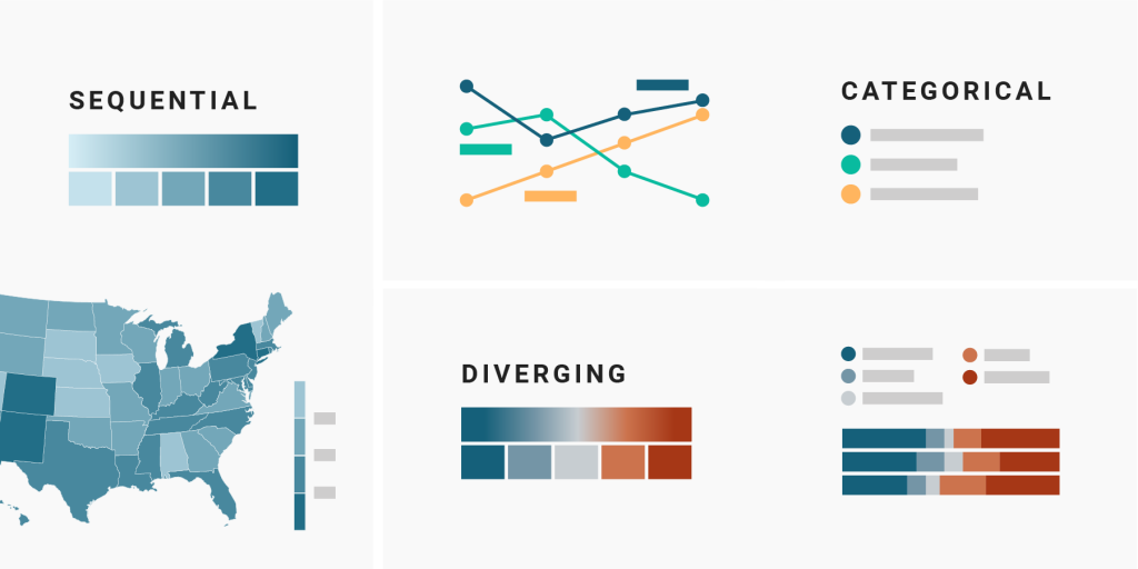
Hues are what a five year old would understand under “different colors”: red, yellow, blue, etc. They’re perfect to distinguish between categories that don’t have an intrinsic order, like countries or ethnicities, genders or industries – that’s why these categorical color scales are sometimes called unordered color scales. In such a color scale, colors say “I’m not worth more or less than these other colors here!”


The most important things to keep in mind when using hues:
Sequential color scales are gradients that go from bright to dark or the other way round. They’re great for visualizing numbers that go from low to high, like income, temperature, or age. A medium blue on a white background, for example, lets your readers know: “My value is a bit higher than the light blue and a bit lower than the dark blue.”
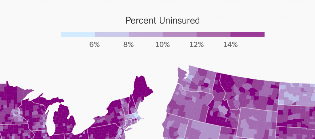
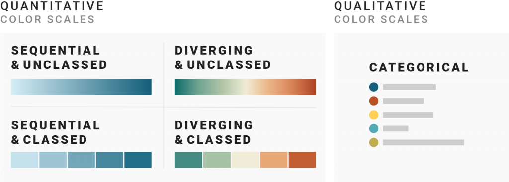
Gradients can be classed (=split into brackets, also called classified, stepped, quantized, graduated, binned or discrete) or unclassed (=one continuous gradient):


The most important things to keep in mind when using sequential color scales:
The same advice is true for diverging color scales:
Diverging (also called bipolar or double-ended) color scales are the same as sequential color scales – but instead of just going from low to high, they have a bright middle value and then go darker to both ends of the scale in different hues. Diverging color scales are often used to visualize negative and positive values, election results, or Likert scales (“strongly agree, agree, neutral, disagree, strongly disagree”).
Like sequential color scales, diverging ones can be classed or unclassed:


Both sequential and diverging color scales are called quantitative color scales.
In any color scale, be it categorical, sequential, or diverging, you can highlight certain categories or value ranges that you consider especially important to your audience or story:


Besides highlighting, you can also de-emphasize categories, like “misc.”, “others”, or “no data”. They’re often greyed out:

For the rest of this series of articles, we’ll leave the highlighting and de-emphasizing aside. Instead, we focus on the question: When should you use which color scale?
The overview I gave you so far is what most data vis books will tell you. We can categorize these color scales like so:

But when looking at data visualizations, I noticed that the decision of which color scale to use is often not as obvious as many of these data vis books make us believe. Some data visualizations are using sequential color palettes, although they’re visualizing categories. Or the same data is visualized with a diverging color scale in one publication and with a sequential one in the next. And sometimes with classed and other times with unclassed gradients.
What are the rules, the challenges, and the trade-offs?
Let’s find out.
The next three parts of this series provide you with a “decision tree” – a Choose Your Own Adventure of data vis – by asking three questions:
Let’s start with the most basic question: When should you use hues (a qualitative color scale) and when gradients (a quantitative color scale)? Click here to go to part 2.
References
Comments