This article is brought to you by Datawrapper, a data visualization tool for creating charts, maps, and tables. Learn more.
The case for choosing clarity over complexity in data visualizations


Hi. This is Zara from Datawrapper. I work as a marketing and customer support intern at Datawrapper and am interested in data visualizations. This is my first blogpost for Chartable after writing the Weekly Chart a few weeks ago. Without further ado, let’s dive in!
“The purpose of infographics and data visualizations is to enlighten people—not to entertain them, not to sell them products, services, or ideas, but to inform them. It’s as simple—and as complicated—as that.”
– Alberto Cairo, The Truthful Art
Type in ‘’data visualization’’ on Pinterest on a random day and I guarantee you, you will be swept away in an onslaught of stunning data visualizations. Nothing is off-limits here, both in terms of scope of topics and the arsenal of design techniques employed. And let’s be real, we are aesthetic creatures. We admire beauty and like proportions in things around us (this includes data visualizations). With all that being said, the question is, when someone seeks out visualization on a certain topic, is the goal ultimately to be dazzled or to leave the site with a better understanding of the topic before they visited it?
To illustrate my point, I am going to focus on three climate data visualizations that demonstrate the rise in atmospheric CO2 levels over time. All of these visualizations make certain data trends stand out at first glance but also come with some minor flaws.
Up first is a data visualization I found on the River, an in-house data visualization repository on Datawrapper. It’s created by my colleague Gregor Aisch. The visualization depicts the persistent increase in global CO2 emissions over six decades (1958-2019). What you see, at first glance, is a line chart with a bunch of year labels. Look more closely and you will notice that the gaps in the decade lines show the difference between decades at any given time. What I especially like about this chart is that the stacked data helps to compare the slopes easily with each other. The one thing I wish was part of the original chart was a bit of border around the whole chart as the numbering on the y-axis looks cramped.
(I know what you’re thinking about the y-axis. No, the axis not starting at zero is not misleading because the atmospheric CO2 concentration levels have never really been zero in history (and also to save up on space in the graph). You can read up more on seasonal variation in CO2 levels in the northern hemisphere here.)
Let’s focus on another visualization created by Giuseppe Vettigli on the same topic. It shows the rise in global CO2 concentration from 1975-2018. While the visualization is beautiful (if the word could be used for such a grim development) and very eye-catching, it does have a potentially confusing element: In my opinion, the graph would be easier to read if the x-axis and y-axis were switched since many people tend to read a chart from left-to-right:
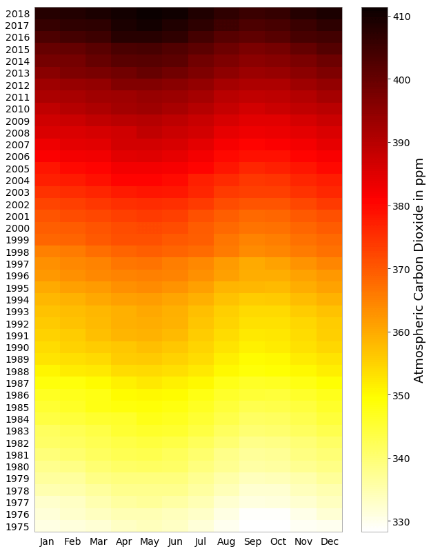
“Visualizing Atmospheric Carbon Dioxide” by Giuseppe Vettigli, 2019. Learn how he created the visualization in Python here.
Now, let’s go ahead and look at another visualization, this one created by Neil Kaye. What immediately stands out for this visualization is the use of an animated bar chart which makes the numbers even more striking. Each box corresponds to 10 tonnes of CO2 with approximately 1200 tonnes of CO2 released per second in 2018.
The visualization also highlights some nuances, such as the largest jump in CO2 concentration between 1950-1975. Plus the simplicity of the visualization helps emphasize the data it is showing and does not distract – be it in terms of aesthetic features, unnecessary annotations or too much data. With that being said, people will have to do some quick math to calculate the average tonnes of CO2 released per second per billion people to assess how much of this could be attributed to factors like population increase.
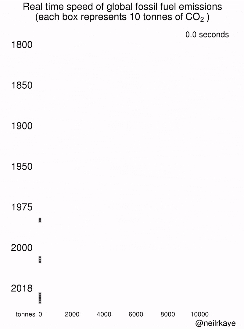
“Real-time speed of global fossil fuel CO₂ emissions” by Neil Kaye, 2019. Source.
All three visualizations have the potential to spark a dialogue and even drive activism because of the way they are visualized. If I had to choose a chart that allows me to figure out subtle details, I’d go with Gregor’s. If, on the other hand, my goal was to convince 80 year old Aunt Karen who is also a climate change denier, I’d probably opt for Vettigli’s chart. And I’d go with Kaye’s chart if my aim was to highlight which decade had the highest spike in CO2 emissions. You can judge different visualizations based on different goals. It’s not always logical to judge them using the same criteria.
Ultimately when it comes down to complexity vs clarity debate in data visualizations, it boils down to this:
Is a clear yet comparatively simple visualization better than a fancy one when comprehending what I’m trying to convey?
If your answer to this question is a resounding “yes!”, then you’ve just become an ally in effective communication for your reader. Too often, we get bogged down by complicating our messages. There are many reasons beyond clarity that have precedence for some such as providing as many perspectives as possible on a single issue. Sometimes the aim is to grab attention with the shape or unusual/ high contrast choice of colors for a chart (case-in-point: Vettigli’s chart vs Gregor’s chart in the examples above). Perhaps we think that the more details we add to a visualization, the more information we can provide in one glance to the reader and, by extension, the more knowledgeable or authoritative we would seem.
Edward Tufte counters this idea in his celebrated book “The Visual Display of Quantitative Information”: “Graphical elegance is found in the simplicity of design and the complexity of data.” So the next time you are questioning whether to prioritize clarity or complexity when crafting visualizations, remind yourself that information is everywhere but time and attention spans are limited.
One way to help your audience is to decrease their cognitive load. Keeping things simple but not overly simplified is easier said than done but will certainly go a long way when it comes to creating something memorable. After all, the end goal of visualizations should be to highlight the complexity of information in a cogent manner and not necessarily knock someone’s socks away with the brilliance of visuals.


Comments