This article is brought to you by Datawrapper, a data visualization tool for creating charts, maps, and tables. Learn more.
How to get started with data visualization

Sometimes, I get emails asking me “how to get started in data visualization.” Maybe you’re one of the people wondering about that. Maybe you found a book full of data vis in a bookstore, followed somebody who makes data vis on social media, noticed that you love playing with the “charts” feature in Excel, or just really like these data visualizations that newsrooms are creating.
And now you want to create them yourself but don’t know where to get started.
This article tries to give some very practical advice on your next steps. If you ask ten people for that advice, you’ll likely get ten different answers. This is mine:
1 Find out what you like about data visualizations
2 Don’t worry too much about data or tools
3 Start to visualize data
4 Get better at visualizing data
It’s based on the experiences I’ve had and what’s worked for me. I hope some of these ideas will help you to find your own path.
1 Find out what you like about data visualizations
If you just have a blurry feeling that “data vis is great!”, I recommend spending an afternoon figuring out what you like about data visualizations. You’ll likely want to create visualizations similar to what you already admire, so this exercise can help you find out what exactly that is:
✏️ Exercise: My data vis fanzine
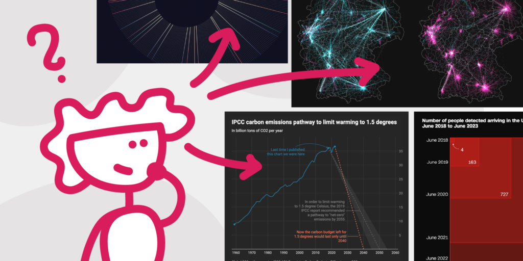
- Go through our Data Vis Dispatch and the Information is Beautiful award winners and save your five or ten favorite data visualizations — the ones that you would have loved to create yourself.
- Then ask yourself: What do you like about them? What’s a common trait? Are many of them about sports? Or focused on storytelling and readability, with lots of annotations and highlights? Do they all show the data in an unusual visualization type? Did you only pick maps? Or do they all feature beautiful typography and colors?
- Write down what you notice. If you like, you can use graphics software like Excalidraw to upload your picked visualizations and annotate them.
Do you know roughly what you want to create? Awesome, let’s start. But before we do, let’s get some potential blockers out of the way:
2 Don’t worry too much about data or tools
Here’s what used to hold me back (and still does sometimes!) when attempting to visualize data:
“What data should I visualize?”
It’s easy to get lost in the sea of data (“Too much to choose from…”), or to get discouraged by searching for it (“The data I want to visualize is so hard to come by!”) As everyone who’s worked on Datawrapper’s Weekly Chart blog series can tell you: You can spend hours and days searching the web for data, trying to find that one perfect CSV about your favorite topic. Don’t fall into that trap if you want to get better at data vis design. (Feel free to fall into it if you want to get better at data analysis or data research!) Your topic and data don’t need to be original. It’s totally fine to visualize what others have visualized before. Here’s how:
Start with the data, not with the topic
It’s unlikely you’ll get to work with data about that one exact thing you’ve always wanted to see visualized…because the data probably just doesn’t exist. Surprisingly many data sets, you will find, don’t exist. Or aren’t free for you to use. Or are just very well hidden on the internet. So instead of starting with a chosen topic, it’s way easier to look at what data sources exist and use them.
Use simple data sources
Simple data sources are ones that you can use right away, without much cleaning up. They’re simple CSVs and not bigger than a few megabytes. Here are some good sources for simple data:
- Kaggle Datasets: Data about movies, clothing, and much more. You can filter to show only CSVs.
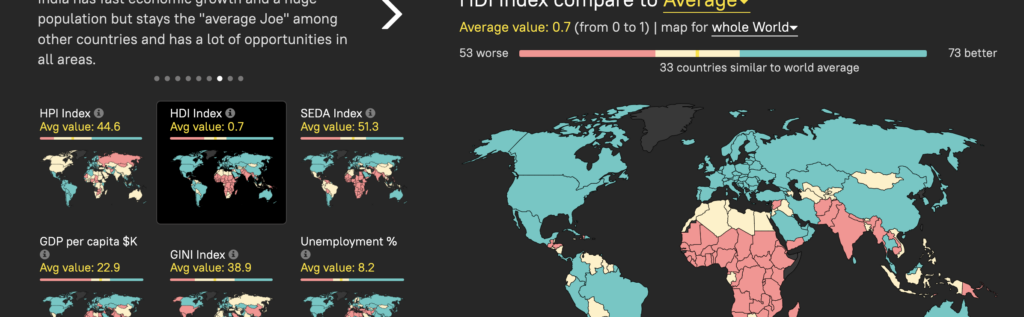
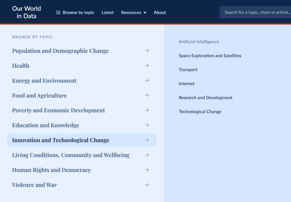
- Our World in Data: Click on “Browse by Topic” at the top, then see what’s interesting to you. The articles are very well-written and feature many charts. Below each chart is a download button to get its full data as a CSV.
- Datawrapper River: You can duplicate any chart and go to step 2 to see its data.
- Your digital life. Lots of apps can track your behavior: The number of steps taken, hours slept or spent in front of your phone, messages sent, songs listened.
A bit more overwhelming, but also maybe helpful: the structured archive of the Data is Plural newsletter, Storytelling with Data’s list of public data sources, and the Awesome Public Datasets collection (although the data they link to is often big — think millions of entries). Browse around until you find a data set that looks interesting, then stick with it.
Get rid of data points liberally
Data sets can be overwhelming: So many rows and columns! Many data sets have lots of more or less interesting stories in them. You don’t need to tell them all. Try to find and visualize just one, and keep only the data that’s relevant to your story. If you still have space to show more context, you can add more data to your visualization little by little — as long as your main point is still the main point.
✏️ Exercise: What could have been?
Look at your favorite visualizations. What data did the designer probably have, but decided not to include? How did they probably simplify the data? If you want to go one step further: Find the source for the visualization and actually check what the designer left out.
Use data about a topic you understand
This could be a subject close to your heart (a TV show you know, or data about your life), one you read a lot about in the news, or one that’s just easy to understand for most people. This way, you don’t need to read three papers and decipher five acronyms before starting to visualize.
Stick with your data (more often than not)
One trap I often encounter is the fear of missing out on better data. “My data isn’t that interesting,” you might think. “There must be more interesting data out there.” There probably is — but it would also take a long time to find it. If you constantly fall for that thinking and keep looking for new data without actually visualizing it, then I recommend working with data that’s already been visualized by others. Somebody else has decided that it’s interesting, so you don’t need to doubt that anymore.
“What tool should I use?”
To create good visualizations, you will need to learn how to use some tools well. These could be pen and paper — but more likely will be something like Datawrapper, Observable, d3.js, ggplot2, RAWGraphs, or others. When I started with data vis, I pondered a lot about which tools to learn. R or Python? Adobe Illustrator with RAWGraphs? Am I missing out if I don’t look into Figma? What would be the easiest? What would make me a better data visualization designer?
Based on these questions, I wrote a lot about data vis tools. And as somebody who did that, let me tell you: Tools really don’t matter that much.
If you spend a year creating visualizations in Datawrapper, you’ll become a better data visualization designer. If you only use Excel during that year, the same will happen. You’ll learn about colors, phrasing, data framing, and chart types no matter which tool you’re using — and you will easily transfer these skills to other tools if needed, and they’ll stay with you longer than just the time spent using your first (or any) tool.
So just start using what you know and feel comfortable with. Or research what tools people are using who create the kind of data visualizations you want to create — and then stick with them.
3 Start to visualize data
With two potential blockers out of the way, let’s focus on how to actually visualize data.
You can admire all the amazing data vis out there, follow data vis designers, read all the books — but this all doesn’t make you a data visualization designer. To become a data visualization designer, you need to design data visualizations.
Well, ok, the result is more the following:
Here’s how to do that.
Don’t plan, do.
You’re one of those dreamers who have grand ideas but never actually sit down and work on them? Just start with 10 minutes. Sit down and tell yourself: “I will work on this data visualization for 10 minutes.” If you stop after that, you did exactly what you planned on doing. If you continue: Well, that’s also good!
Or give yourself an hour to create a visualization. Just one hour. Here’s a concrete idea:
✏️ Exercise: Visualizing “How I spent my time”
- Download the data of the chart “Who Americans spend their time with, by age” from the Time use article on Our World in Data, and put it in a tool like Datawrapper.
- Try different chart types and play around with showing only certain columns: What stories can you emphasize when you show the data as a line chart versus as an area chart? What happens if you hide the “Time spent alone” column? Or if you only keep the “With friends” and “With partner” columns?
- Try aggregating columns and rows: What happens if you sum up (or just use similar colors for) time spent with family (parents, partner, children) versus friends and coworkers? Or compare “time spent alone” against “time spent with others”? Or do the math on how many days people spent on average with the different groups of people in their twenties? Or compare 15–20 year olds with 40–45 year olds and show them as a simple bar chart?
- Try adding your own story as annotations on top of the visualization. Maybe you find yourself in the data? “When I was this age, I moved to another city for a job and didn’t make many friends for a year.” Or, “This is the year I moved back near my parents/had kids/worked so much.”
You’re disappointed with what you got after 10 minutes or an hour? Read on, we’ll get there.
Make visualizing data a routine (with others!)
“I’ll create one small chart a day/week.” “Every Monday night, I sit down and try to create a data vis.” “I’ll create 20 new charts in the next year”. Routines and goals like this can help you to actually visualize data, and making it public can increase the pressure (in a good way!). No wonder that quite a few people have set themselves routines with a clear goal or end:
- Dear Data by Giorgia Lupi and Stefanie Posavec, who sent each other data vis postcards every week for a year
- Data Sketches by Shirley Wu and Nadieh Bremer, who created a big data visualization about an agreed topic every month for a year
- Day Doh Viz by Amy Cesal, who tasked herself with creating 100 visualizations made of PlayDoh, one per day, each in 60 minutes or less, captured and annotated with her phone.
- 1 dataset, 100 visualizations by the data vis agency Ferdio (check out their self-imposed limitations). A good kind of project if you tend to get stuck in data research and preparation.
There are also community initiatives that you can try. Because everybody is visualizing a certain data set or working on the same prompt, it’s fun to compare results. And many people are happy to give feedback:
- Storytelling with Data challenges: Monthly challenges like: “have fun with fonts,” “remake a famous graph,” or “rebrand it.” Bring or research your own data.
- #30DayChartChallenge: Every day of April, create a chart based on a prompt like “slope,” “family,” or “new tool.” You like maps, too? Try the #30DayMapChallenge, happening each November.
- Makeover Monday: Weekly challenge where you visualize a provided data set. Like the monthly happening Sports Viz Sunday and Iron Quest, it’s fairly Tableau-centric.
- Viz for Social Good Help nonprofit charities by creating visualizations.
Recreate a data visualization you admire.
Good data vis design is made of so, so many little details that you probably don’t pay attention to when looking at it. That’s why copying great data visualizations is one of the best ways to get better yourself.
✏️ Exercise: Copycat
- Choose a visualization you really like.
- Try to replicate it. It doesn’t matter which tool you use, as long as the result looks like the original.
Not convinced by this exercise? UI/UX designer Erik Kennedy makes a great case for copywork in the interface design field in his article “Copy If You Can: Improving Your UI Design Skills With Copywork” — a lot of this is applicable to data visualizations too.
Copy the style of a visualization you admire.
A similar exercise with more creative freedom is to design a new visualization with your own topic and data, but copying the design of a visualization you like. Ask yourself: “What would the creator of this visualization do? What design choices would they make? What vis type, fonts, colors, title, annotations would they use?”

Copy the style of an art or design movement you admire.
This exercise goes even further: You don’t have a visualization as a reference anymore, but just an art or graphic design style (here are nine classic and 12 new ones). Browse Pinterest (possible starting point), Instagram (possible starting point), or collections like but does it float and Designspiration until you find something that makes you think, “Hey, let’s try to translate that into a data vis.” Then try it.
Have fun!
All of these little exercises should be fun. You might need a few minutes to get into the flow, but you should get there eventually. If they’re not fun after 30 minutes, stop doing them. Data visualization should be a satisfying activity, and you want to finish feeling like “this was time well spent,” not “urgh.”
4 Get better at visualizing data
This is sorted by how effective I believe these exercises are at getting you better at data visualization:
Create more visualizations
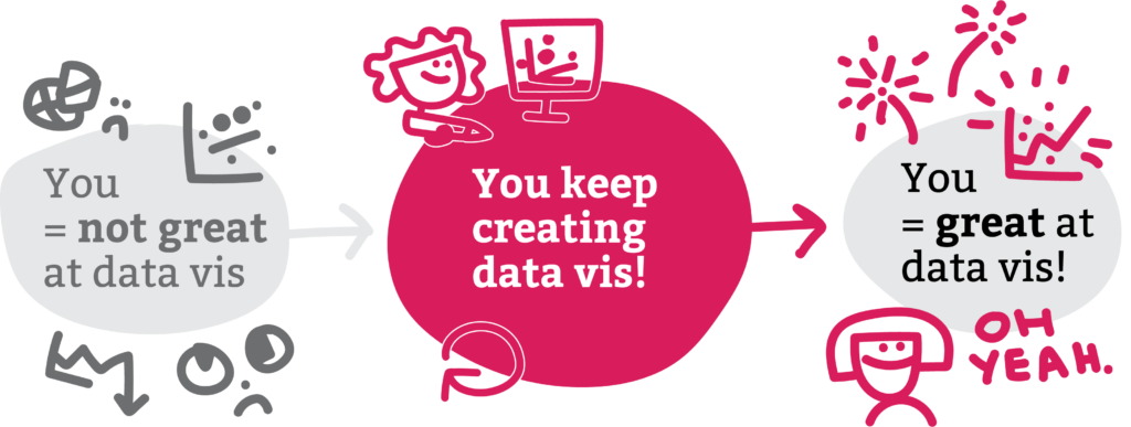
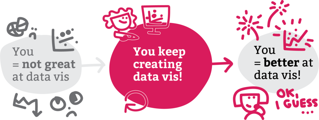
Have I mentioned that, to get better at data vis, you’ll need to create more data vis? I think I have, but in case I haven’t, let me just state that again: To get better at data vis, you’ll need to create more data vis. It is truly the most effective way I know to get better at something: Just keep doing it.
Not every chart or map you build will turn out awesome. Even if you build an awesome data visualization one day — the next one might not be awesome again.
Personally, that dynamic held me back quite a bit over the years. Every time I created a data visualization I was really proud of, I was either disappointed the next time I visualized data (”that looks only meh compared to last time!”), or I didn’t dare to do so in the first place (”it won’t turn out that great again.”)
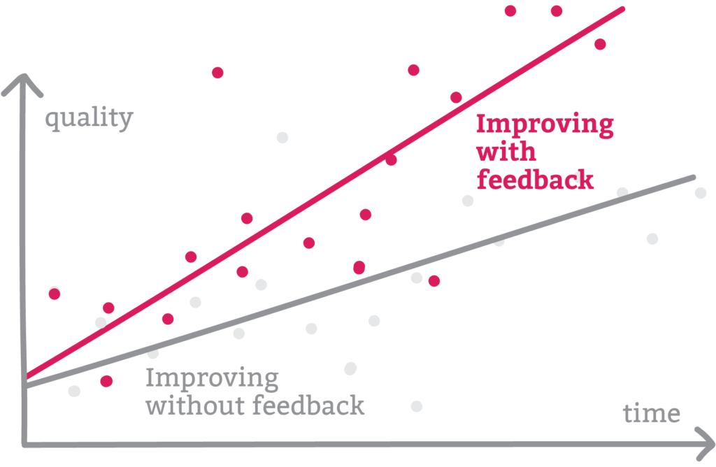
But keep going. Keep creating, and keep sharing. Because over time, the average quality of your visualizations will become better:
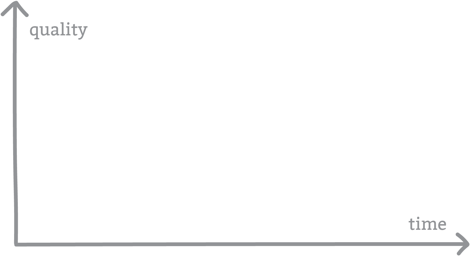
Don’t compare your latest visualization with one from last week. Compare it with one you created six or twelve months ago.
Seeing yourself improve can be a huge boost in motivation to keep going. And to improve more quickly, it’s crucial to know what’s not working in your visualization and how to make it better — either by asking others, or by training your critical eye.
Ask your coworkers for feedback
One of the biggest reasons I wanted to work at Datawrapper in 2017 was that Gregor Aisch was working there. And Gregor, I knew, is an excellent chart designer. I believed that whatever visualizations I created, he would be able to improve them. And he did. I would create a chart, put my best effort into it, then show it to Gregor. And Gregor would make it so much better, every single time. I might have learned more about data visualizations by watching him (and others) improve my charts than by any other method.
If you have a great data visualization designer sitting next to you, make use of them: Show them your work, and ask what they would improve. If you don’t happen to share desks with such a person, consider applying to jobs or internships where you will.
Not an option, either? You can always email data vis professionals for feedback, too:
Ask data vis pros for feedback
They might give you feedback during their free time, so the more concrete your feedback questions are, the better. Not: “Can you please give me feedback on this chart?” (If that’s what you want, consider paying the person you’re asking: ”What’s your hourly rate? Can I pay for in-depth feedback?”) It’s better to ask for the part you’re the least sure about, like:
- “I wonder if these colors work — what do you say?” or “I wasn’t sure about this headline — how would you improve it?”You could just as well ask about the annotations, writing, data selection, visualization type, or general ease of understanding.
- “What’s the first thing you’d change in this chart?”
Consider not asking the designers with tens of thousands of followers, busy jobs, teaching/speaker side gigs, and book deals. You’re more likely to get replies from somebody who gets an email asking for feedback once a year instead of once a week.
✏️ Exercise: Ask an expert
- Work on a visualization until you’re at a point where you don’t know how to improve any further.
- Find a data visualization person whose work you admire. Try to click around on social media, or find the person who created the last data vis you liked in your newspaper or online.
- Find out their email address. Send them a link to your visualization, or an image. Ask them for feedback.
- Reach out again on another channel (e.g. social media) after a week or two if they don’t reply.
- If they do reply with feedback: Update your visualization according to their feedback and send it back to them, thanking them for their time. People love to see that their work (in this case, their feedback) shows results.
Asking strangers feels weird to you? Consider going to local meetups or international conferences to get to know people before you email them a few days later: “Hi X, it was great meeting you the other day! (I was the one with the dinosaur sweater who couldn’t figure out how to use that fancy bottle opener.) I was wondering if you have five minutes to give me feedback on…”
Ask a community for feedback
Some organizations out there do amazing work for people who want to start or get better at visualizing data. Joining a community can be a great way to keep you accountable and get inspired… and, yes, you can ask them for feedback:
- Data Visualization Society: Become a (free) member to join their Slack. People like you discuss in channels like #share-critique and #help-code, but also #connect-early-career and #topic-career-advice.
- Elevate: Pay a membership fee to get four really experienced (and friendly!) people to mentor and coach you and give you freelance and career advice.
- Storytelling with Data community: Sign up for free to discuss in the forum, attend challenges, and ask for feedback.
Whatever community you join: Give, not just get. It’s more likely that people will help you out when you help them somehow too. And please don’t spam with three posts about your work, but post one and see how it goes.
✏️ Exercise: Ask the community
- Work on a visualization until you’re at a point where you don’t know how to improve any further.
- Sign up for a community and post it there. Make sure to follow the rules. E.g., the Data Vis Society #share-critique channel has a description explaining that you should state your project goals, audience, project stage, and what you’re looking for feedback on
- Reply to the comments and post updated versions of your visualization.
Look at your visualizations with fresh eyes
You’ll improve at visualizing data by understanding what could be improved about a visualization you created. But it’s not necessary to always ask people for feedback to get there. It’s also helpful to train yourself to look at your work like you’ve never seen it before. To do so, here are two ideas:
✏️ Exercise: Fresh eyes
- Work on a visualization until you’re at a point where you don’t know how to improve any further.
- Look at it again the next day. How did your perception change? Consider writing down everything you notice.
Experiment with how long to set aside your visualization (two hours? Two days? Two weeks?), and with what you’re doing while you wait. Do you find more things to improve after looking at lots of other great data visualizations in between?
✏️ Exercise: Compare with the pros
- Work on a visualization until you’re at a point where you don’t know how to improve any further.
- Put it next to a visualization (or two, or ten) from designers you admire who have created something similar — like “simple news graphics,” “complex BI dashboards,” or “beautiful data art.” You can use the visualizations from the fanzine exercise above.
- What’s different between your and their work? What does their visualization feel like? How do they create that impression? Look at the typeface, line height, font size, axis labels, colors (and don’t forget elements like the grid or annotation text), how easy it is to understand the text, etc.
Criticise visualizations
By training your critical eye on visualizations from others, you’ll get better at turning it on your own visualizations too.
✏️ Exercise: What to improve?
- Look at a chart in your everyday life. This could be in the news, on posters, on flyers, in reports, or in your utility bill.
- Ask yourself: How could this be improved? What would need to change for this visualization to be better?
Optionally, think about how the chart was designed. What were the likely constraints? How does the visualization deal with them?
Get inspiration
While getting inspiration alone won’t make you a better data vis designer, it can help to motivate you: Every time I come back from a great conference, I get at least three ideas for new data visualizations I could create and can’t wait to do so. Here’s what works best for me:
- Conferences. A good talk at 11 am after a great breakfast in another country. The room is dark, the stage is bright, the speaker is nervous, and I’m in focused sponge mode (soaking up all their ideas and lessons) and idea firing mode (”ooh, one could even go one step further and do…”, “I wonder if that data exists for my city as well”). Some I like: Outlier, Information+, S-H-O-W, Visualizing Knowledge.
- Conversations with other people who like to create. The ones where at some point, somebody says: “I wonder if anyone has visualized that before.”
- Exhibitions. Art exhibitions work great: ”Wow, that turquoise and orange combination is beautiful! Maybe it’ll work for my next data vis?” Exhibitions about random topics work too: ”Fascinating topic, and I’m glad they chose a chart to show that dataset here! Should probably be a scatter plot, though? I’ll take a photo of the source and try this at home…”
Also useful to get inspired:
- Data vis coffee table books. You know, the ones bigger than your head that you can sink into your armchair and vanish completely behind. Sandra Rendgen has created some beautiful ones.
- Data-heavy books about topics you find interesting, e.g. Rutger Bregman’s Humankind.
- Other data visualizations, like those in our weekly Data Vis Dispatch, or in the entry showcase of the Informations is Beautiful awards.
- Podcasts about data vis (like Data Stories, SWD podcast, Data Viz Today, PolicyViz) or about a topic that interests you.
- Data vis books and blog posts. (Join our next Data Vis Book Club session!)
If you’re reading this with a bit more experience, I wonder: What worked well for you? Let me and future readers know in the comments below, or write to me at lisa@datawrapper.de. I’m looking forward to hearing from you.


Comments