This article is brought to you by Datawrapper, a data visualization tool for creating charts, maps, and tables. Learn more.
It’s time for a more sophisticated color contrast check for data visualizations
The WCAG contrast requirements are flawed. Here’s what a new approach could mean for data visualizations.

A few days ago on the internet, I stumbled upon a person who criticized what I took for granted: The W3C Accessibility Guidelines (WCAG) for color contrast.
If you’ve been choosing colors and you or your organization cares about accessibility, you’ve seen the infinite number of color contrast checkers — 1, 2, 3, 4, 5, 6, 7, 8, 9, 10, etc. They all answer the question: “Which color should your text be to be readable on your background color?” And they all give your color pairs a red FAIL ❌ or a green PASS for AA (minimum contrast) or AAA (enhanced contrast) requirements. Sometimes, they also give you a ratio: 4.5:1 is good. 3:1 is still ok for large text. 2:1? FAIL. The higher the first number, the better.
WCAG is the gold standard. Organizations check with them to create style guides. Some governments make them a legal requirement.
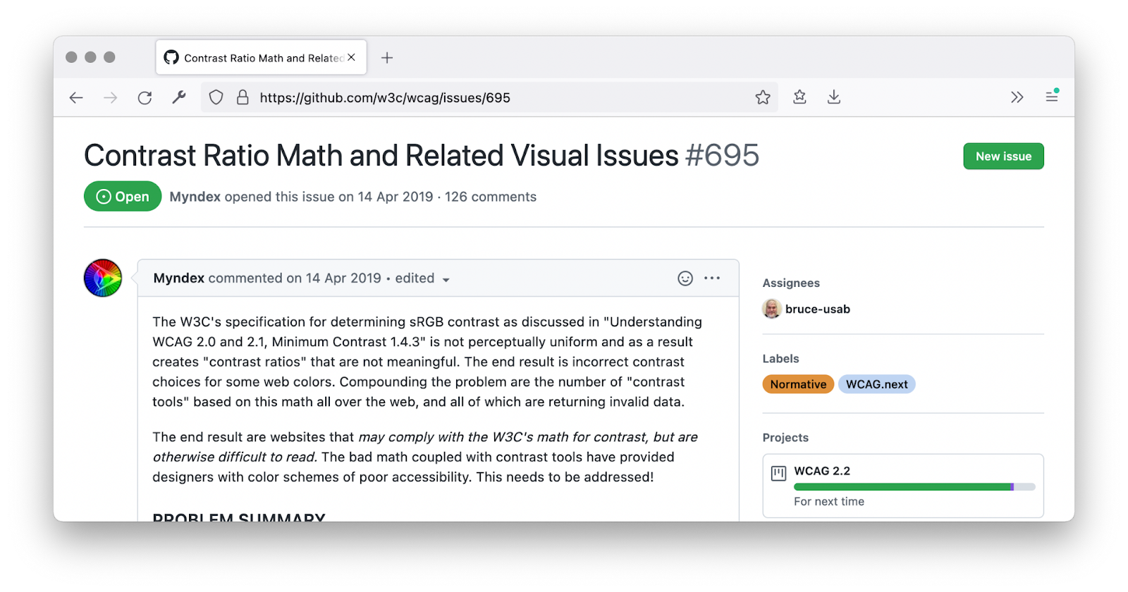
But there’s one person who doesn’t approve: Andrew Somers, Hollywood-based filmmaker and vision-impaired himself. In April 2019, he opened issue #695 in the GitHub WCAG repo under his internet name Myndex. The WCAG contrast check was, according to Somers, “not meaningful.” The result is a “ton of apps that now incorrectly present colors as ‘accessible’ when in fact they are not.”
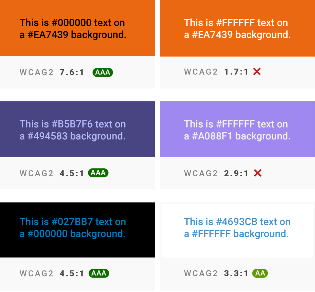
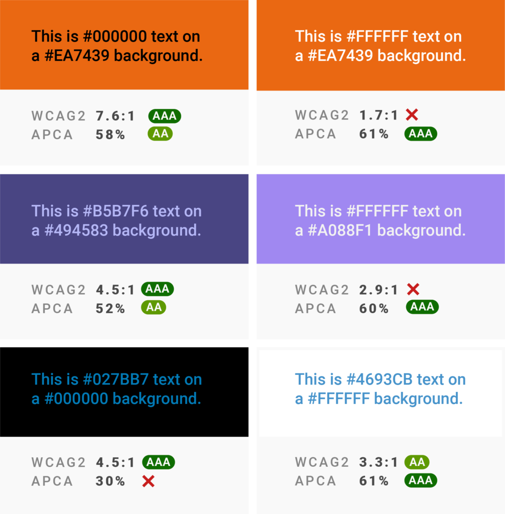
Somers had an easily provable point. If you play around with text and background color a bit, you can get some weird results: Color pairs that are better readable than other ones but get worse WCAG ratios:
You can find more examples here.
Somers wasn’t the first one who found issues with the WCAG guidelines (the “orange button problem” is a thing), but he was the first one who pressed on the issue, kept writing about it, and became part of the Accessibility Guidelines Working group. He’s now developing an “Advanced Perceptual Contrast Algorithm,” or APCA.
If the WCAG 3.0 guidelines include APCA — right now, the draft mentions it and the “significant updates” it would come with — this will have consequences for style guides, website designs, and, yes, data visualizations.
We’ll have a look at that in a minute. First, let’s understand the problem Somers complains about.
Maths versus our perception
The current WCAG contrast is calculated as the luminance of the foreground color divided by the luminance of the background. It’s that simple. Too simple, says Somers.
The key lies in using luminance as the basis of the calculation. Luminance is “a linear measure of light, which is spectrally weighted for human vision, but not perceptually weighted in terms of lightness to darkness,” as Mozilla explains.
The “not perceptually weighted” part is important here. Our sense of how light a color is doesn’t track perfectly with its luminance value. If a color’s luminance is decreased by X%, we don’t perceive it as being X% darker. What we do perceive depends on:
- the size of the colored element; something vision scientists call “spatial frequency” (are you using a thin, small font or small symbols — or a big, bold, headline font?)
- the brightness of the background (are you using a darker color on a brighter background or the other way round?)
- factors like your screen quality, the hue of your element and background, your vision impairments, the lightness of your environment, the padding between your colored element and the edges of the background, and more.
The WCAG 2.0 contrast calculation doesn’t take these things into account. Somer’s new algorithm, APCA, is an attempt to do so more[1]. Somers tested 500 randomly chosen color pairs. Of the 154 color pairs that the WCAG contrast calculation thought of as accessible, 50% were not. And of the other 346 color pairs that WCAG said are not accessible, 22% were. These are a lot of false FAILS and PASSES.
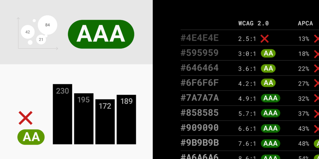
What does that mean for gray text in data visualization?
In data visualization, we use a lot of grays — not just for graphical elements like axis grids, ticks, and context data, but also for text like axis labels, descriptions, footnotes, source links, and annotations. Let’s see what WCAG 3.0 standards that include the APCA could mean for data visualization:


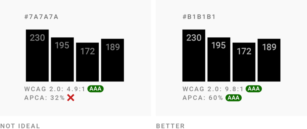
This overview shows how different grey text colors perform on white and black backgrounds in both WCAG 2.0 contrast checks and in the APCA contrast calculator. The differences are interesting. I’ve often felt that the current WCAG wanted me to go far darker with my grays on a white background than I deemed necessary to be readable. APCA allows data visualization designers to use lighter grays without feeling bad about accessibility:

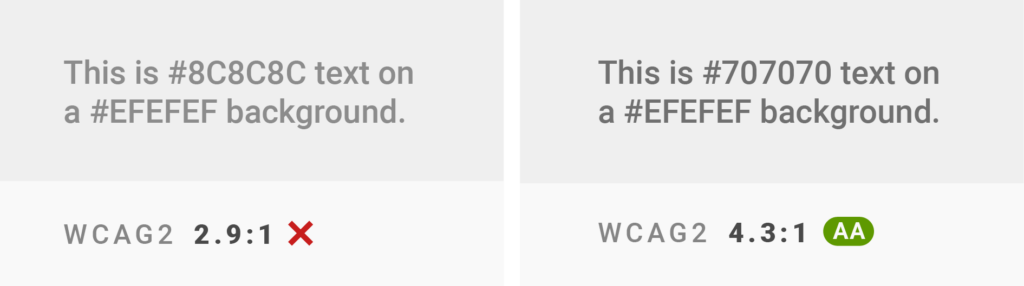
We at Datawrapper, for example, use a #888888 gray on white in our visualization footers for information like source, byline, or the Datawrapper attribution. (Open any chart in the Datawrapper River to see for yourself.) This color pair gets a lousy 3.5:1 in WCAG color checkers. APCA gives it a 63%, which is “‘sort of’ like the old 4.5:1 in WCAG2,” according to Somers.
On the other hand, the WCAG are ok with darker grays on black than APCA is. Somers points out that the current WCAG “fails to predict contrast appropriately if the background is darker than about #aaa”.
If you’re designing visualizations with dark backgrounds, your text will need to be brighter in the future. The consequence will be better readable data visualizations.
How to test your own colors
You can try your own color contrasts with the APCA Contrast Calculator. Somers started building it himself in 2019:
It’s a crazy-looking tool and the algorithm is still a work in progress, but it’s usable. It took me some time to understand what was going on there, though. To get you started immediately, here’s an explanation:
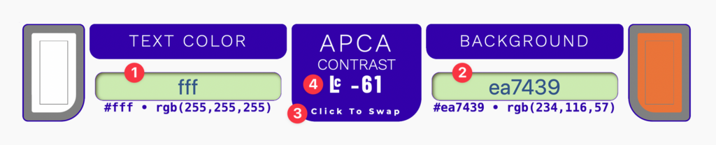
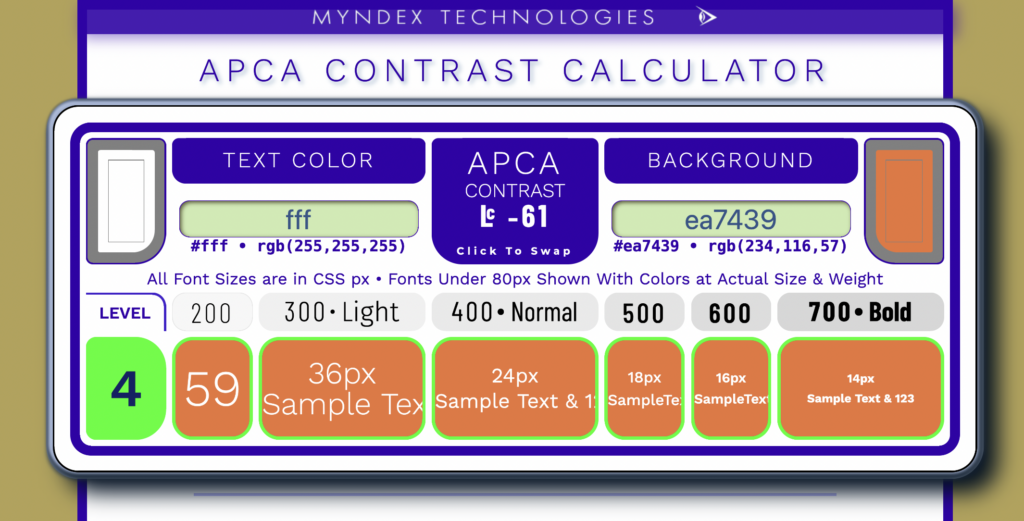
This is the most important part of the tool. Insert your text color in 1 and your background color in 2. Different from the WCAG color check, APCA takes into account which of your colors is the text and which one is the background color. You can try it out yourself with 3 “Click To Swap”.
Inserting a text and background color will give you a number, the 4 “APCA contrast.” It doesn’t matter if the contrast is positive or negative; the absolute number is what’s important. You can think of these numbers as shares: 0% is no contrast, 100% is the highest contrast possible. The -61% in the screenshot means the contrast is fairly good.
Scroll down to “General guidelines on Levels” for a good explanation of the numbers. As a rule of thumb:
- 45% is sort of like 3:1 in the current WCAG: Ok for large text, but not for normal-sized text.
- 60% is sort of like 4.5:1: The minimum for any normal-sized text.
- 75% is sort of like 7:1: The minimum for long text, like articles.
But how large is “large text” and “normal text”? The APCA calculator tells you. It shows you not just which color pairs are accessible and which ones are not, but also for which font sizes and weights that applies. That’s what the row below the actual contrast check is about:
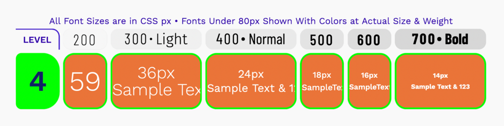
What’s a “level 4,” you wonder? Well, in an early version of the tool, Somers came up with different “accessibility scores” you can meet. They might disappear from the tool eventually. For now, “level 4” is still a relic from that time. It will meet “readability best practices, and [is] intended to accommodate sighted users including those with impairments that do not otherwise need assistive technology” (source).
Thanks to the rest of the row, you can either check
- which font size you want (24px, 18px, 14px, etc.), and then see at the top which kind of font weight you need.
- which font weight you need (300, 400, 500, etc.), and then check what your font size needs to be to make this happen.
In our example, we should use a bold font weight 700 when using 14px text — but if we show our text in the bigger 36px, the thinner font weight 300 is enough.
What does this mean for now?
The WCAG 3.0 don’t have a release date yet. (WCAG 2.2 — which doesn’t include APCA — was supposed to be published in summer 2021, but is still only a draft with some to-do’s.) It might take one, two, or three more years until it’s out and organizations and governments will need to adapt. Until then, I recommend taking the current WCAG contrast calculations with a grain of salt. Comply with them if you must — but for ensured accessibility, test your color combinations with APCA, too.
As mentioned (and Somers would want me to emphasize that), the tool and the algorithm are still being developed. The contrast numbers you get with APCA might not be the ones you get in a year from now. I’ll update the numbers in this blog post as soon as I notice that they change.
Learn more
I expect there will be many articles published about APCA in the following months and years to come. Here are a few starting points:
- The last few paragraphs of the article “Accessible Palette: stop using HSL for color systems” by Product Designer Eugene Fedorenko was a big inspiration in writing this blog post. (The whole post is wonderfully written and worth reading.)
- There are a few color tools that let you check APCA contrast besides Somer’s tool, like Huetone by product designer Alexey Ardov, Contrast Checker by Richard Bruskowski, Colour Contrast Tool by C. Liam Brown, or Fedorenko’s Accessible Palette tool (APCA is called WCAG 3 in there). You can find a list of them here. That said, only Somer’s tool will have the latest algorithm.
- You can enable an APCA contrast check in the dev tools of Chrome and Microsoft Edge.
- For a reminder that APCA is still work in progress, read Eric Eggert‘s “WCAG 3 is not ready yet”.
- For an exploration of what supporting both WCAG 2 and APCA, read Roger Atrill‘s “Why color contrast is not as black and white as it seems”.
- If you want to spend a few hours reading through one single GitHub issue, the one Somers started is a good one: github.com/w3c/wcag/issues/695. He also wrote a few articles explaining APCA, like this three-part series, and is currently working on a white paper.
- Somers is very responsive — if you have a question, ask him on Twitter or in the Discussions of the SAPC-APCA GitHub repo.
- You can find the math in the APCA GitHub repo. ↩︎


Comments