

The world could be your oyster, but it depends on your passport
October 10th, 2024
4 min
This article is brought to you by Datawrapper, a data visualization tool for creating charts, maps, and tables. Learn more.
Hi, this is Hendrik (or “exo” in most digital spaces). My daily work here at Datawrapper is administering its AWS resources. But I’ve also been the one setting up and running the fleet of computing instances that created the map data for our locator maps, so I have a special connection to those maps.
The last big feature of Datawrapper locator maps where I took part in creating it was the shaded relief dataset, or hillshading as we call it internally. Most of the work for that feature – like creating the polygons – was done by our map expert Anna (she wrote about it here). My job was to transform those into a form that is usable in our locator maps.
Another way to show the shape of a mountain on a map are contour lines. These lines appear after equal elevation gains, so after e.g. 1100m, 1200m, etc. Since the last few Weekly Charts were more private and less connected to daily news or politics (example 1, 2, 3), I thought I might do just the same and play around with Datawrapper. So I decided to draw some contour lines on a locator map:
It shows the area around the Zugspitze, Germany’s highest point in the alps close to the border to Austria.
When I showed this map to Lisa, I mentioned that we could probably go down as far as several tens of meters with that dataset. She asked me to demonstrate that in a smaller region, so here we go:
This map is only showing the northwestern part of that horseshoe-like region with the Zugspitze as its highest summit. I went for the white map style, as I expect that region to be covered with snow all of the year. As you can see, it’s such a zoomed-in view that there are no hillshading features shown anymore.
What follows is a fairly detailed how-to of my process:
The first thing I needed to do was to verify that the dataset we used for the hillshading (the ASTERv3 DEM) was good enough for that purpose. I was uncertain about how detailed it is. Looking at a raw DEM (Digital Elevation Model) kinda fools the human eye because the height is encoded into intensity. We see light and shadow where there is none of it and it gets really hard to identify a mountain as such. Estimating the quality of that mountain representation becomes even harder.
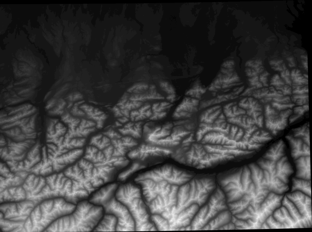
2° by 1° of the ASTER Digital Elevation Model.
So I started by creating a visualization of that dataset that is easier to interpret by the human brain. I transformed every data point of a certain slice of that dataset into a 3D vector representing a point in space.
But since our screens are usually not 3D, some of that information would get lost again when projected for a 2D screen. Without depth, everything would turn into a single colored slightly bumpy plane. To somehow get around that limitation I derived normals for each point from their neighborhood and encoded these normals into RGB color.
The result looks like something the 3D artists among the readers might recognize as a normal map – to others, it will just look like being strangely illuminated in red, green and blue (I could use virtual illumination, but then it doesn’t have that cool 80’s look and feel):
Compared to the intensity encoded height, the human brain seems to be much more comfortable to interpret this representation as mountain shapes, although it’s not really a lit landscape.
I was amazed how much detail there is in that dataset, so the answer was: Yes, there is enough detail in that dataset to extract contour lines! The next step was to do exactly that.
I started to extract contour lines for the alps with GDAL, which left me with an enormous Shapefile – something that is not suitable to be used with Datawrapper locator maps. What I needed was a GeoJSON, as explained here.
And here comes the fun part. I’m not that deep into mapping tools as some of my coworkers, but during the time accumulating the backend data for our locator maps I became quite skilled in PostGIS, as all of our locator maps data was transformed using PostGIS.
So when you’re the admin type of guy, how could you not love solving cartographer problems with SQL statements?
Most PostGIS installations come with a tool called shp2pgsql that helped me to get in the shapefile data in no time. I’ll spare you most of the details but there was the && operator involved, to query for contour lines that intersect my maps bounding box. Then I had to chop off the parts that still stuck out of the box with ST_Intersection(). Who would have guessed that there’ll be contour lines (regions with equal elevation) running all over the alps?
Finally, I had a subset of features suitable to be loaded into my map. Exporting everything as a GeoJSON is as easy as ST_AsGeoJSON() – well, almost. You need to use ST_Union() to group the features, otherwise, you’ll get an independent GeoJSON for each and every feature as output.
With my exported GeoJSON I was ready to now import the GeoJSON in step one of the Datawrapper locator maps. I had to fiddle a bit with the distance between the contour lines to not overload the map. 200m for the bigger area and 50m for the smaller area seemed to be a good compromise between detail and map size.
That’s it for my Weekly Chart! I hope you enjoyed reading it. Leave any comments or questions you might have about the general process and I’m happy to answer them. We’ll see you next week!


Comments