

What to consider when choosing colors for race, ethnicity, and world regions
October 9th, 2024
11 min
This article is brought to you by Datawrapper, a data visualization tool for creating charts, maps, and tables. Learn more.
On Sunday, September 26, 2021, Germans will vote for who they want to see in their parliament for the next four years, and, indirectly, for Angela Merkel’s successors.
(To learn how the German election system works in detail, visit my casual, visual explanation from 2017, the shorter, also visual Bloomberg explanation from 2017, or this explainer from the Economist from a few weeks ago.)
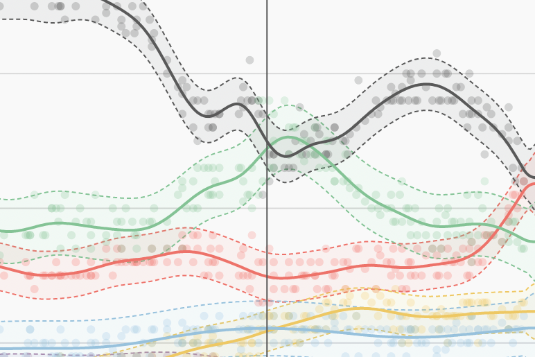
The last few months have been interesting. Polls show lots of undecided people: Almost 40% of German voters said they’d vote for the CDU in July last year, but now that’s down to less than 25%:
👉 The combination of highlight lines and annotations can help readers to interpret the data. You can find the option to add vertical and horizontal lines and ranges to your chart in step 3: Visualize > Annotate > Add range highlight.
👉 It's easier for readers to understand that your lines are averages of different polls when you show them — for example, with dots. To do so, upload the individual poll results as extra columns, set the line width to 0px and turn on line symbols. Choose Shape > multiple and click on the invisible lines. You can find all these options in step 3: Visualize > Refine.
👉 It can be nicer-looking to use annotations for line labels. Just make sure to move them when the chart updates, otherwise they become entangled with the lines.
Here are a few ways to visualize the polls and results of the election with Datawrapper.
Similar to the U.S. elections last year, we won’t offer any live-updating charts on election night. However, the friendly people from wahlrecht.de gather polls from eight different institutions, and we'll use them in most of the following charts. They will check for new polls multiple times each day. Feel free to re-use all of the following visualizations, no matter if they come with live-updating wahlrecht.de data or the old 2017 data: Hover over the visualization of your choice, click on “Edit this chart,” change the data if necessary, and then publish and embed it on your own website.
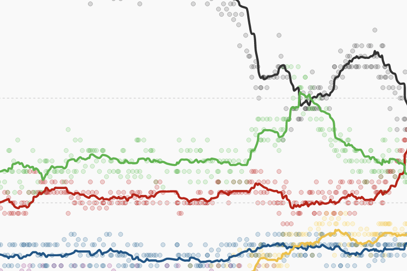
There are a few ways to show the latest polls. The one that leads most articles (e.g., from ZEIT, NZZ, Tagesspiegel, The Guardian, or Politico) is the line chart that shows polls over time — sometimes just for the year 2021, sometimes since 2017.
Newsrooms can choose between different ways of averaging polls (e.g., moving average or Loess) and different levels of smoothing — the more polls are averaged, the less ragged the lines become. Compare the smooth Economist lines with the ragged Guardian lines:
Another common visualization is to show a bar or column chart with the latest poll (ZDF), an average of the latest polls (SPIEGEL), or a forecast (The Economist). Showing confidence intervals when choosing this view helps to communicate the data's uncertainty and the fact that these are not the final results:
👉 Confidence intervals – the shaded area in the chart above – depend on how many people are polled (sample size), the vote share of each party, and how likely it's supposed to be that the actual values fall into the range (I chose a 95% confidence interval). The chart above calculates the confidence interval for each party in each incoming poll and updates automatically. You can learn how to calculate the confidence intervals on wahlrecht.de (German) or statisticshowto.com (English).
👉 To learn how to create confidence intervals and value overlays in Datawrapper bar charts, visit our announcement blog post.
To govern, parties need a majority in the German parliament. There's no party that can convince 50% of German voters to vote for them these days, so the only way to achieve this is to play buddies with other parties and form a coalition. This chart visualizes which coalitions are possible, based on the latest poll. (I didn't come up with the weird coalition names; they're commonly used!)
Like polls, we can also show the possible coalitions over time. Here's my experimental attempt, inspired by SPIEGEL:
There are a few ways to create lines with multiple colors. First, duplicate the column that you want to see visualized as a two-colored line — you can do so in step 2: Check & Describe in the Datawrapper app by adding a new column and copying over your already existing column. Then give your new column the second color in step 3: Visualize. They should be 100% overlapping. I can think of these three options to create a two-colored line:
👉 Make one of the lines dashed. Make sure to dash the brighter line — otherwise, the darker line will overlay the brighter one. Refresh the page to make sure you got it right.
👉 Change the widths of both lines: Make the brighter one very thin and the darker one very thick, so that they are visible on top of each other.
👉 Set one of the lines to 0px width and then turn on line symbols. Choose multiple in Shape, select every point and click on your now-invisible line to show the line symbols. Adjust the size of your symbols.
Next, let's zoom a bit out and look at recent decades:
We can compare the latest poll(s) with the results from the past few elections to recognize trends. Here's a chart showing the rise of traditionally small parties — led by the Greens — and the loss of trust in the two big parties, CDU/CSU and SPD:
For an even broader view, we can go back to the '50s (when the CDU still got >50% of the votes all by itself!):
When it comes to visualizing the results, we can show not just the normal bar/column chart with the party vote shares, but also their regional distribution. The following map shows the vote shares of the Green party in 2017. The second map shows which party got the most new voters in each election district compared with the 2013 election:
Each district in a choropleth map can only show the vote share of one party at a time (like for the Greens in the map above), but you can always place a few maps next to each other to show the vote shares of multiple parties and to reveal interesting patterns. They're especially apparent for smaller parties, as The Berliner Morgenpost showed in 2017.
You can also compare two parties in one choropleth map. I wrote about it in-depth a few years ago in this Weekly Chart that visualizes votes of both the Left and the AfD on a map of Berlin’s Walbezirke districts.
Last and least: The "first vote" ("Erststimme"). It sounds important – but while the party vote ("Zweitstimme") decides the crucial share of parties in the parliament, the first vote "only" decides which party representative in your election district will be part of that parliament.
The first vote works as a winner-take-all system: The person with the most votes will get in, the others won't.
Most newsrooms show the regional distributions of the first vote with a choropleth map. Here's one with the data for 2017:
👉 To show different colors for different parties within tooltips, you can nest if-else statements, like so: {{ party == 'SPD' ? '#E53A10' : party == 'FDP' ? '#FFBC00' : '#82BD54'}}. You can also use if-else statements within styles, like so: <div style="background-color: {{ party == 'SPD' ? '#E53A10' : '#82BD54' }}; padding: 1px;">{{party}}</div>. Hover over the map and click on Edit this chart in the top-right corner to see how this is done in Datawrapper; go to the Annotate tab and scroll down to the Customize tooltip button to play around with the settings.
👉 To learn how to create bar charts in tooltips, head over to this Academy article.
👉 I decided not to show a dark "in-your-face" black for all CDU/CSU districts, but this is a matter of taste and how consistent you want to be with your chosen party colors. Not sure which color to assign to which party? Visit our article "Election reporting: Which color for which party?"
One of the more interesting aspects to explore is the margin for the unlucky candidate who got second place. I decided to put that information into the tooltip. The vote shares of the winner and 2nd-place parties are fairly close in some areas — try to hover over the blue-colored Görlitz, the easternmost election district in Germany, where the AfD candidate won with only 1,578 more votes than the CDU candidate.
We hope that these visualizations provide a good starting point for your election visualizations. To use any of the ones above, hover over them and click on “Edit this chart.” This will lead you right to step 3: Visualize in the Datawrapper app. From there, you can edit the chart (by changing tehe data source, title, labels, colors, etc.) or just publish it directly to get an embed code for your site. Any questions? Let us know at support@datawrapper.de.


Comments