New: Small multiple column charts in Datawrapper
February 18th, 2025
6 min
Datawrapper lets you show your data as beautiful charts, maps or tables with a few clicks. Find out more about all the available visualization types.
Our mission is to help everyone communicate with data - from newsrooms to global enterprises, non-profits or public service.
We want to enable everyone to create beautiful charts, maps, and tables. New to data visualization? Or do you have specific questions about us? You'll find all the answers here.
Data vis best practices, news, and examples
250+ articles that explain how to use Datawrapper
Answers to common questions
An exchange place for Datawrapper visualizations
Attend and watch how to use Datawrapper best
Learn about available positions on our team
Our latest small and big improvements
Build your integration with Datawrapper's API
Get in touch with us – we're happy to help
This article is brought to you by Datawrapper, a data visualization tool for creating charts, maps, and tables. Learn more.
Create charts, maps, and tables in a language you understand
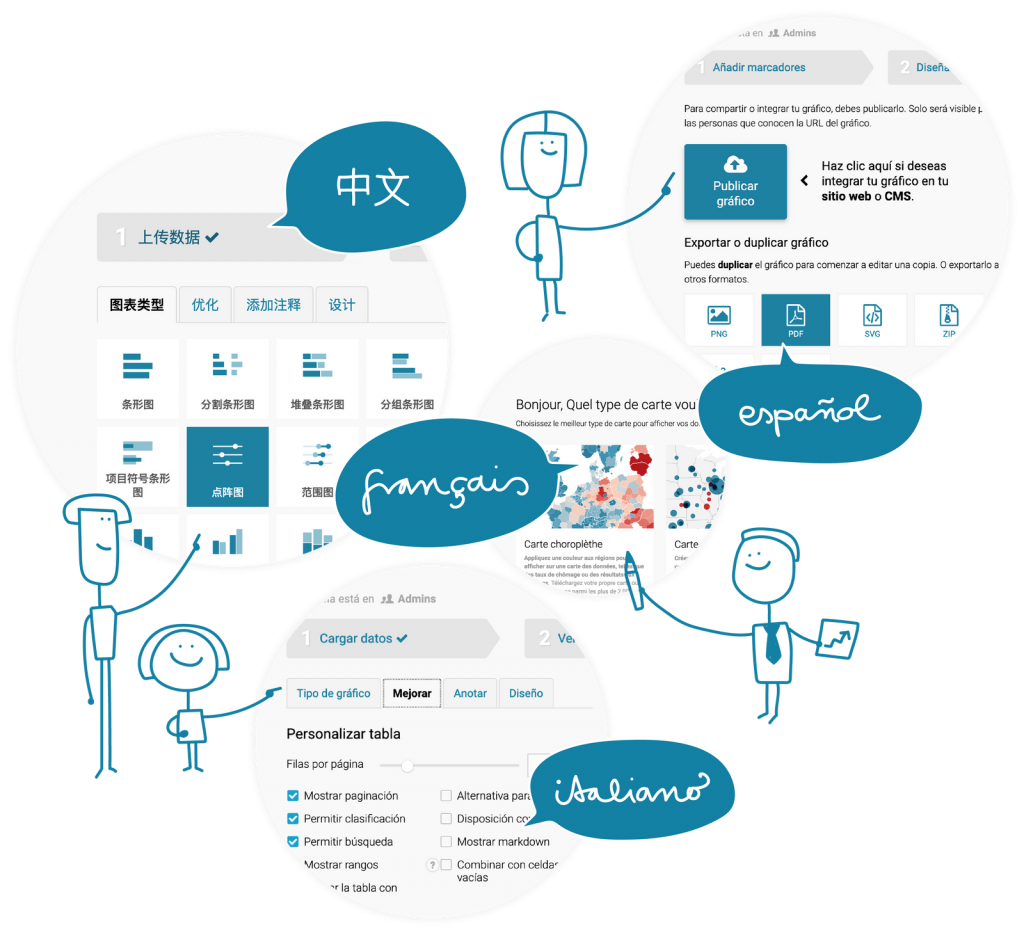
So far, you could create charts, maps, and tables with Datawrapper in English and German. That’s because German is the native language of many people on the Datawrapper team, and translating our tool into English enabled lots of people globally to use it.
But not everybody can read English well. Even if: using a tool in your native language is often easier than using it in a learned language. And Datawrapper is all about making it easier to create data visualization.
Today, we’re pleased to announce that you can use Datawrapper in not just English and German, but also in Chinese, French, Spanish and Italian.
Here are a few impressions:
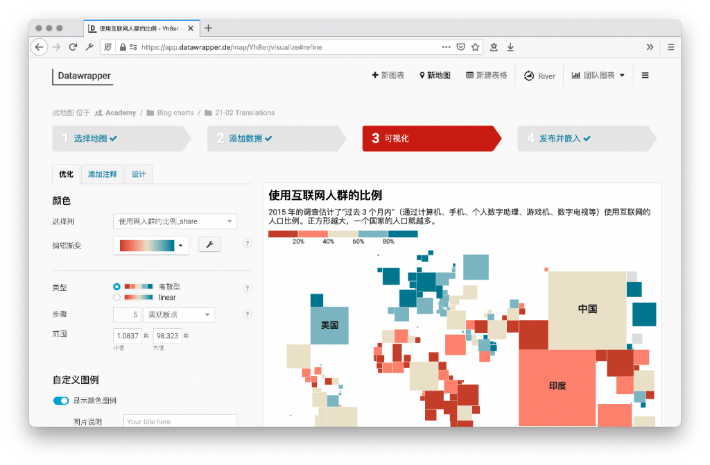
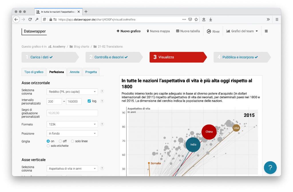
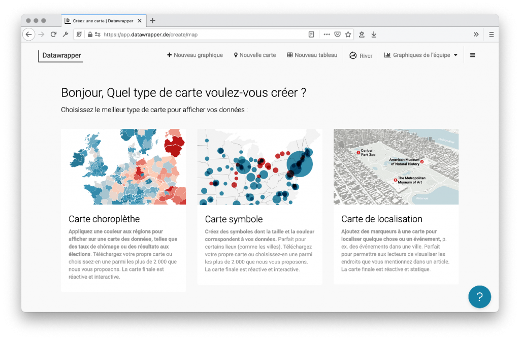
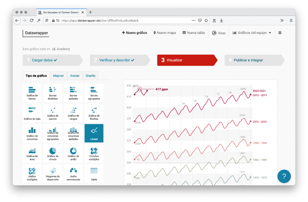
Visualizing data with Datawrapper is free, and you can try it out without signing up. Go to datawrapper.de and click on “Start creating”. Then open the menu ☰ in the top-right corner, select “Language” and choose any of our six available languages.

Also look out for the Output locale setting in step 2: Check & Describe or in step 3: Visualize, and change it to your language. This will translate elements within your chart (e.g., so that your source shows up as a Spanish “Fuente” instead of the English “Source”) and brings your numbers and dates in the correct format and language.
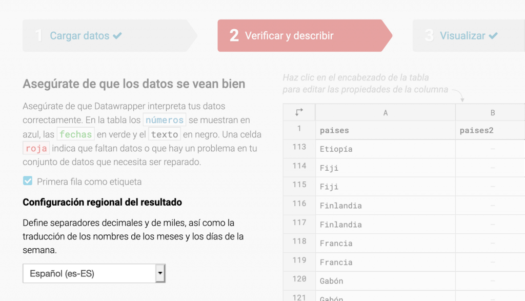
We worked together with professional translation agencies to translate our app into four new languages. We tried our best to communicate to them what Datawrapper is all about – but of course, they’re not data vis designers. So if you find a mistake in one of our translations, please let us know at support@datawrapper.de. We’ll fix it as soon as possible.
This is just the start – we’ll also translate our website soon, and, depending on interest, how-to articles in our Academy. If you have any questions about our tool, write to us at support@datawrapper.de. We offer support in English, German, French, Spanish, Japanese, and Swedish, but we also happily use translation tools.
Comments