

How to find & create good color palettes
December 11th, 2024
20 min
This article is brought to you by Datawrapper, a data visualization tool for creating charts, maps, and tables. Learn more.
This is part 3 of a series on “Which color scale to use when visualizing data”. Part 1 / Part 2 / Part 4
If you decided that you should use a quantitative color scale (e.g., light blue, medium blue, dark blue) instead of a categorical color scale (e.g., red, yellow, blue), there are two more questions. First, should you use a sequential or a diverging color scale? And should you use a classed or unclassed data scale? This article focuses on the first question.

1 Use a diverging color scale if there’s a meaningful middle point
2 Use a diverging color scale to emphasize the extremes
3 Use a diverging color scale to let readers see more differences in the data
4 Use a sequential color scale for a more intuitive reading
If there’s a meaningful middle value, use diverging colors. That could be
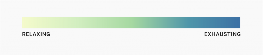
That sounds easy enough. But it’s not always clear what the middle value is – or if there is one at all. Let’s take this example:
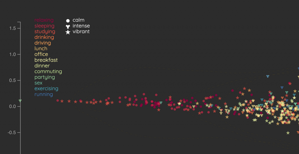
The creators of this project decided not to encode these activities with hues, but to sort them by exhaustion level and go for quantitative color scale instead:
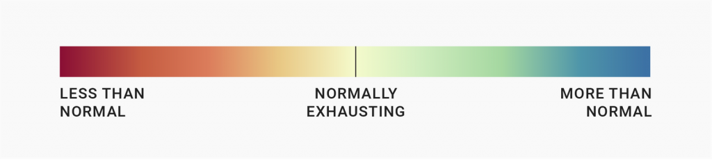
They then decided that their color scale is diverging, meaning it has a middle point: the “normal/average” kind of exhaustion (office, breakfast, dinner). They could have agreed as well that there is no middle value – that sleeping is zero exhausting and running is very exhausting and that their gradient should go from light to dark.
But there are two big advantages to using diverging scales: They emphasize the extremes, and they let readers see more differences in the data:
“I’d say sequential vs. diverging scale is an editorial choice,” my coworker Gregor Aisch said in 2012, when I wasn’t even aware that something like a color scale is a thing. “Sequential tells a different story.”
If your story emphasizes the highest (=darkest) values, go for a sequential color scale. If your story is about the lowest and highest values, go for a diverging scale.
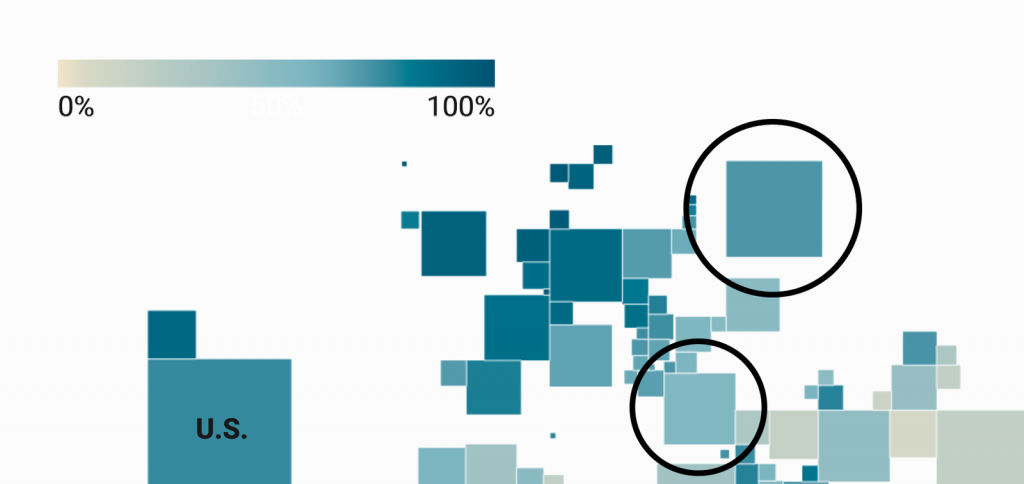
Imagine you write a story about how the internet is mainly populated by and benefitting Europe, the U.S., Japan, Australia, and other Western countries. To make your point, the following map with a sequential color scale is a good one to embed. It emphasizes the countries with the highest values:
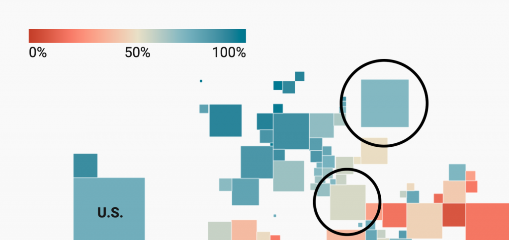
If, however, your story is about how few people use the internet in Africa and Asia, then you might want to show your data with a diverging color scale:
See how it brings the low values into focus – which is what you want to make your point.
Diverging shades let you see more differences in the data than sequential scales. That’s because the number range you show with one gradient is half the number range of a sequential gradient.
You can see this on the map above. The light-to-blue gradient covers 0 to 100% in the sequential map, but only 50% to 100% in the diverging map. A 10% or 20%-point difference becomes more pronounced in the diverging map.
Compare Russia with Turkey. Turkey looks only slightly lighter than Russia on the map with the sequential color scale, although they’re 16%-points apart.
In the diverging scale, the difference is bigger – Russia still has a similar blue, while Turkey looks far lighter and more beige, indicating it’s closer to the middle point.
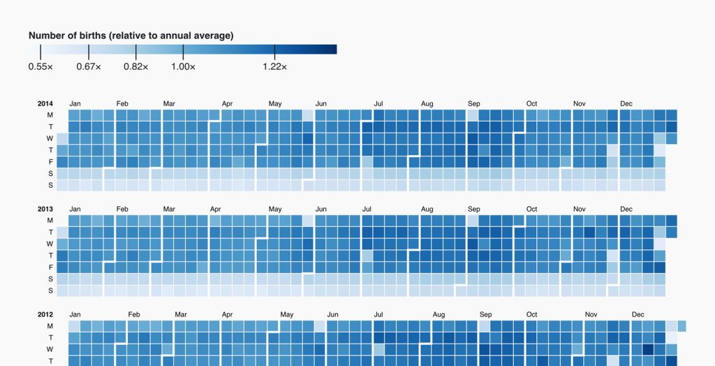
A while ago, D3 creator Mike Bostock created a calendar heatmap that makes the same point. Here’s the original, using a diverging color scale. It shows the number of births in the U.S.:
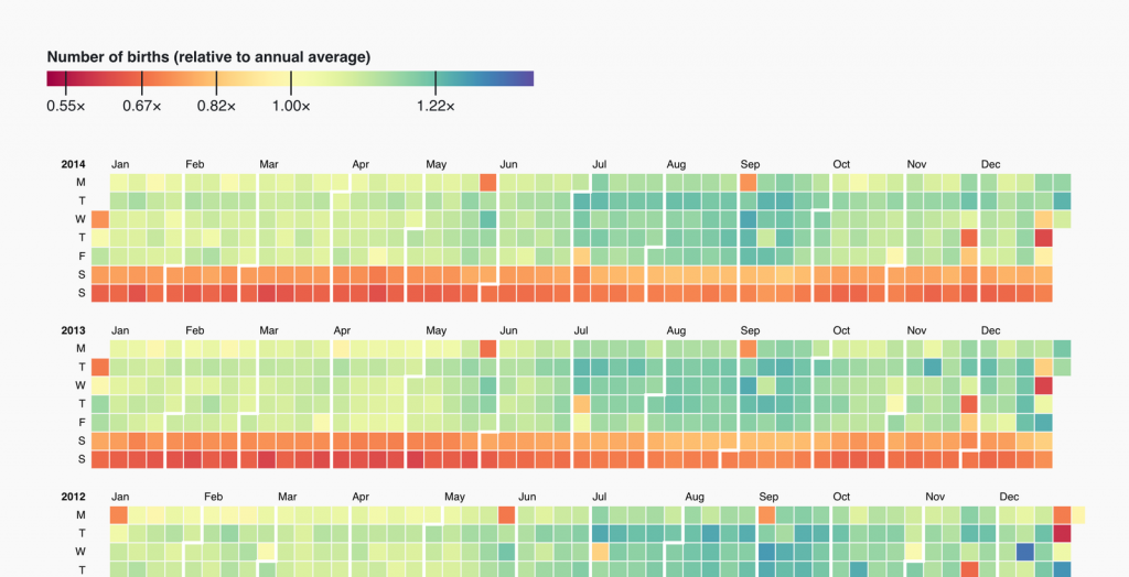
This visualization shows both the clear weekend & holiday effect (the red dates) and the subtle increase in births in late summers (the slightly bluer dates). With a sequential color scale, the weekend effect is still visible, but the late-summer phenomenon is not:
So far, I’ve made a strong argument for diverging color scales. But they come with a disadvantage: They’re not intuitive. A country map with the title “GDP per capita” showing a gradient going from bright to dark works without a color key. Most readers will understand that darker countries have a higher GDP and lighter ones have a lower one.
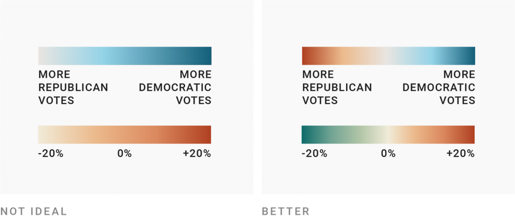
With a diverging color scale, your readers need a color key, otherwise they’re lost. Which color is “low” and which one is “high”? Which one is “better” and which one “worse”? Very often, that’s not clear.
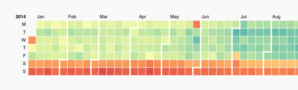
I bet that in Mike Bostock’s visualization, you had to study the color legend for a few seconds to understand that red doesn’t signify “more births”, but fewer.
So when using diverging color scales, take an extra minute to think about your color choices. Which ones would be the most intuitive colors for your readers (e.g. party colors, or red = bad)? And how can you make clear which color means which extreme? Label your color legend well and/or turn your title into a color key, and use annotations in the chart to remind readers what they see.
This was part 3 of a series on “Which color scale to use when visualizing data.” Do you know of any other reasons to use diverging instead of sequential color scales – or the other way round? Please leave them in the comments or let me know at lisa@datawrapper.de. Click here to go to the last part, where we’ll explore when you should use classed and unclassed color scales.

Comments