This article is brought to you by Datawrapper, a data visualization tool for creating charts, maps, and tables. Learn more.
The case against diverging stacked bars


tl;dr: We don’t recommend using diverging stacked bars for showing percentages. The 100% stacked bars are often the better option, especially when it’s important to compare the share of the outermost categories.
At Datawrapper, we sometimes get requests for additional chart types or variants. We take each suggestion seriously and we passionately debate the pros and cons in our office. Our most recent debate was about whether we should implement diverging stacked bar charts in Datawrapper. We decided to share our arguments and conclusion with you in this blog post.
In case this is the first time you hear about them, let us introduce this chart type. Diverging stacked bar charts are like stacked bar charts, except that they align the bars on a centre baseline instead of on the left and right:

In the examples that we can find, we see diverging stacked bar charts mostly used for percentage shares, and often for survey results using Likert scales. Likert scales, you ask? That’s when you have several categories, often four or five, for example Strongly Disagree, Disagree, (Neutral,) Agree and Strongly Agree:
We found two important sources advocating for diverging bar charts to show this kind of data. Stephen Few does so in “When Are 100% Stacked Bar Graphs Useful?” from 2016; and Naomi B. Robbins and Richard M. Heiberger recommened diverging bars in their paper “Plotting Likert and Other Rating Scales” from 2011. The first article including the conversation in the comment section is a data vis classic; the second one is the only recommendation and reference on how to plot Likert Scales in the Wikipedia article about them.
The problem?
We think diverging stacked bars are a bad idea.
In this article, we will try to convince you that 100% stacked bar charts have clear advantages over diverging stacked bar charts. We will demonstrate that using survey results, but our arguments work for all percentage data. We hope that we can explain clearly why we decided against adding diverging stacked bars to Datawrapper (for now).
But before we move on, let’s clarify the premises that our criticism is based on:
Our Premises
All charts are built with certain premises in mind, and it’s important to clarify which chart features are more important than others in our opinion. When it comes to charting Likert scales surveys, these are ours:
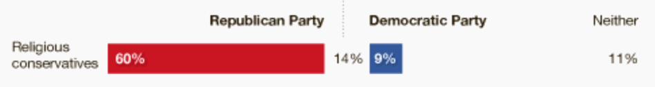
1. The total agree/disagree shares are more important than the individual values of “strongly agree” and “agree” etc. We mostly want to know how many people are in favor of (or opposed to) something. We don’t tell our spouses at night “I can’t believe that 22% of people strongly agree and 28% of people agree that chocolate ice cream is better than vanilla ice cream!” We will tell them: “Half the country likes chocolate ice cream more than vanilla ice cream? That’s bonkers!” In some poll charts, we see all favorable and unfavorable answers summed up or explicitly marked:

2. Opinions are more important than non-opinons. People who are undecided are kind of boring. They’re definitely not news. The interesting battle is between people who like peanut butter for dinner and the ones who don’t. That’s why in some charts, we see the neutral category greyed out, not labeled or just shown with numbers next to the chart:
3. Including neutral percentages in the final chart is important. These might be the least appreciated data points in our chart, but they are still data. We are ok with Neutrals being greyed out, but we’re not ok with them being not existent. We can’t explain it better than Philip Meyer:
Many journalists are disappointed when large numbers of respondents’ answers fall into the “don’t know” category, and argue for question protocols that force a respondent to decide. But all that such a practice does is contribute to self-delusion. Lots of people really don’t know, and as a journalist/researcher you should feel that it is as important to know and count them as it is to identify the people with firm intentions. Thus the rule: “Don’t know” is data.
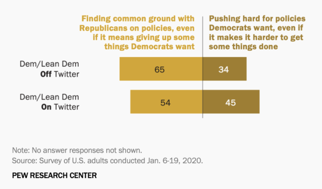
Including Neutrals makes the chart more honest. Almost all Pew Research charts have a “No answer responses not shown” note below their charts, but we periodically find ourselves doing mental math to find out how big the share of Neutrals is:
Knowing the Neutrals gives us a more complete picture of reality. Including Neutrals should be the rule, not the exception.
Why diverging bars are worse than 100% bars
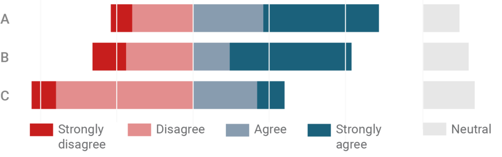
In his article, Stephen Few points out the advantages and disadvantages of stacked bar charts. He then goes on to explain that “variations on the design of 100% stacked bar graphs usually work better”. Few seems to be most convinced by the following chart type, which we will call diverging stacked bars with separate Neutrals:
This is a good chart. It is an accepted fact that we can compare the length of bars best if they have a common baseline, and in this chart, we have enough baselines to compare every answer with each other besides Strongly Disagrees and Strongly Agrees.
We recognize that this chart, of all of the ones we look at in this article, gives the best idea of a “competition” or “controversy”; between left and right, between red and blue. However, to do so, it sacrifices three features that 100% bars do have; two minor ones and one big one:
First, it loses the quick, intuitive understanding that the parts within the stacked bars are shares. Seeing three bars with exactly the same length tells us that the chart is about percentages, without us needing to read the axis.
Second, it’s a waste of space. Most charts these days are read on narrow, mobile devices. Having an extra part of the chart reserved for Neutrals means less width for the favorable and unfavorable shares, our most important data points. And if only one very uncontroversial topic sneaks into our chart, one of the bars will “overhang” on one side of the centre line and will steal space of all the other bars. The result is a lot of unused white space and narrow bars:
Labeling within the stack becomes harder the smaller the parts of the stack are. We can label more parts in the following 100% stacked bar chart directly than in the diverging bar chart up there.
We gain space when Neutrals are not included. However, it’s still less space than in a 100% stacked bar chart. And as stated in our premises, Neutrals are important. We don’t want to get rid of them to make our chart more readable if there’s a more readable alternative to the chart type anyway.
The main problem with diverging bars, however, is comparability. Let’s look at that in more detail:
Why diverging bars are worse than 100% bars: comparability
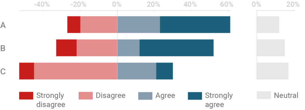
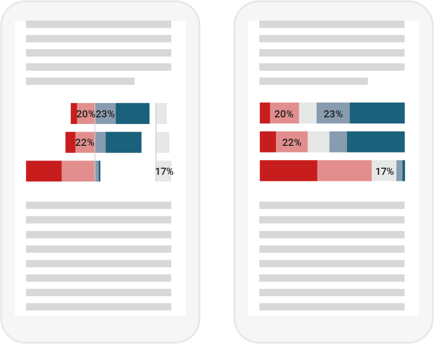
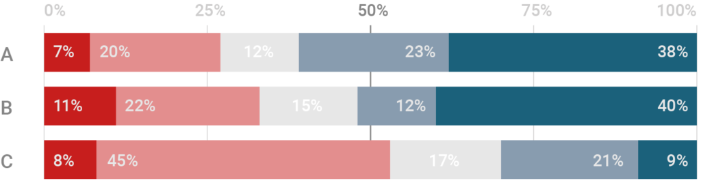
Diverging charts make it really hard to compare the length of the bars to either side of the middle line. To demonstrate that, let’s look at this chart:
Can you quickly say whether more than half of the survey participants agrees or strongly agrees with topic B? You can assume that, but the missing numbers above the chart definitely make it hard. You will need to do some mental stacking of all available bars and some estimating to be sure. So how about now:
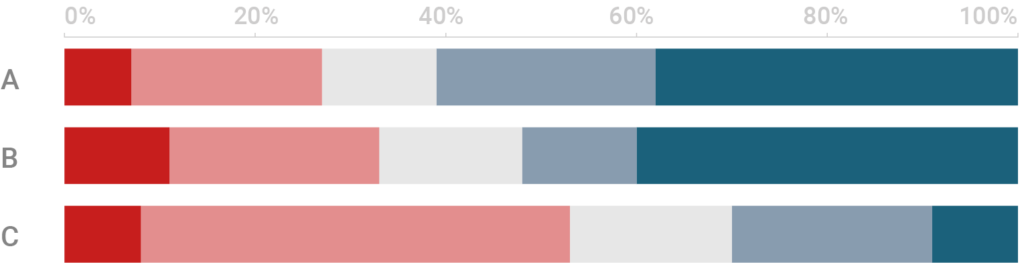
In a 100% stacked bar with a grid, we see immediately which opinion “half of the survey participants” or “a quarter of the survey participants” have. There is no need to read an axis.
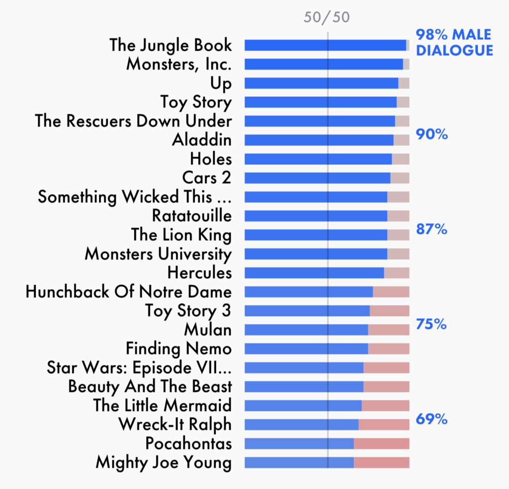
Let’s look at that phenomena in a real life example. Maybe you’ve seen the following chart by the BBC in the last couple of days (full version here):
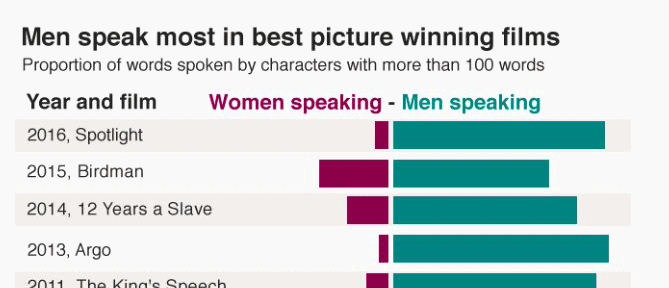
We prefer the original version by The Pudding. Not just because it’s sorted, but also because it shows well how far the bars representing female dialogue are away from where they should be (at the 50% mark). The chart lets you compare the male and the female bars with the 50% middle line they’re missing, better than the BBC chart:
That said, we’re not against diverging bars in all cases. They do make sense if the general distribution and the resulting shape is more important than comparing what’s on each side of the middle line. Population pyramids are a good example:
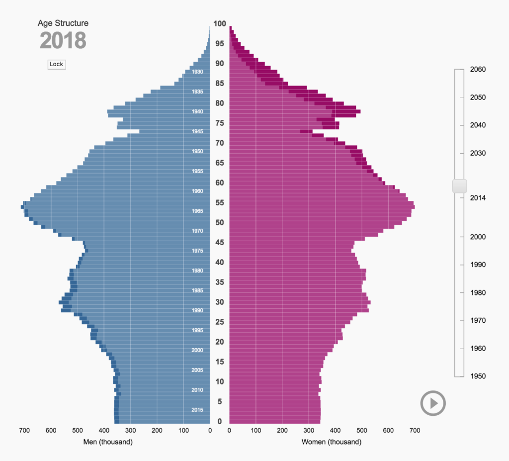
This is an interactive population pyramid that Michael Neutze created for the statistical office in Germany. The shape of the pyramid is the main story here. But Michael obviously understood that readers will have a hard time figuring out which bar is longer. To help them do that, the overhang on each side is filled with a darker shade of blue or red.
In this case, Michael chose the diverging bars because of the shape, even though it makes reading the length of the bars harder. But since in diverging stacked bars of survey results the bars sum up 100%, the outer shape is always less important than being able to compare the bar lengths on each side.
Why diverging bars including Neutrals are even worse
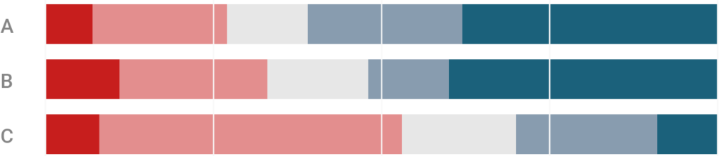
The diverging bar chart with separate Neutrals has a cousin: The one which includes Neutrals and then splits them in the middle. Few mentions this chart type, and Robbins & Heiberger strongly recommend it to present survey results:
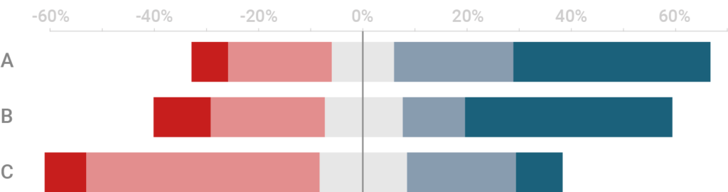
Clearly, this is not a good chart. None of the bars in that chart share a common baseline, so none of them are comparable – but maybe that depends on how you see the Neutrals. Robbins & Heiberger “are primarily interested in the total percent to the right or left of the zero line; the breakdown into strongly or not is of lesser interest so that the primary comparisons do have a common baseline of zero.”
We disagree that we can include half of the Neutrals into our “primary comparisons”. In the comment section of Few’s article, one commenter (Andrew Marritt) put it well:
When splitting the neutral across the center what you’re saying is that we can treat half of this central group as positive and the other half negative (because you’ve put half one side and half the other side of a central axis). You have no way of knowing that this is true.
Andrew Marritt
As we explained in our premises, we have a high opinion of Neutrals. It’s not correct to read out of the chart that 60% (strongly) agreed with topic C and 40% don’t agree. Such a reading would not be compatible with the fact that almost 20% didn’t have an opinion. This chart encourages such a reading. We find it dangerous. ⚠️
Defending the 100% stacked bar charts
When Few and Robbins & Heiberger wrote their article and paper, they didn’t just show alternative chart types, but also had some important criticism about the stacked bars. We’re happy to respond to that.
All three authors criticise that stacked bars make it harder to compare Disagree, Neutral and Agree percentages. This is true: Diverging bars with excluded Neutrals are better at comparing these three percentages. Then again, we think that making it possible to compare Neutrals is the least of our priorities (see our premises). And while diverging bars make the comparison of Agrees and Disagrees easier, they also make it harder to compare Strongly Agrees and Strongly Disagrees[1]:

In addition, Few states that it’s hard to read “percentage values of the individual segments Disagree, Neutral, Agree, or Strongly Agree” and “the percentage values for the sum of Agree and Strongly Agree, because mental math is required”. (With “mental math”, he means e.g. subtracting a percentage value of the 100%.)
We want to note again that 100% stacked bar charts make the best use of space, and direct labeling can solve the whole problem in most cases:
However, we do recognize that it’s harder in 100% stacked bars to read the sum of Agrees and Strongly Agrees than in diverging bars. In this case, a second axis might be a solution:
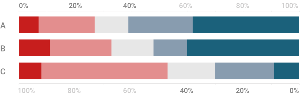
When including a double axis, the advantages of diverging bars become redundant:
Summary
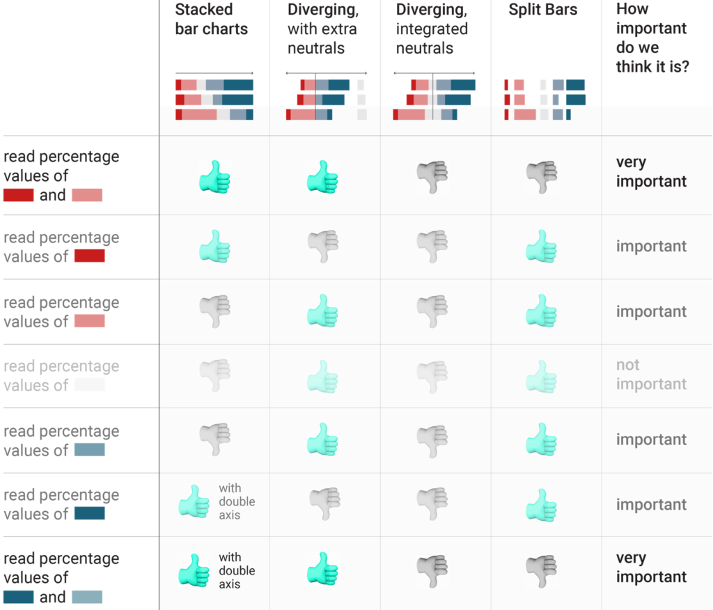
In our opinion, 100% stacked bars work best to show survey results. In contrast to diverging bars, 100% stacked bars immediately communicate that the data shows shares, their compact form makes better use of space, and for the outermost categories they let us see if a share is half or a quarter of the total.
And as we’ve just shown, we don’t see disadvantages of diverging stacked bars when it comes to comparing bars or reading percentage values.
We wrote this blog post to explain our decision against adding diverging stacked bars to the Datawrapper tool. It’s based on our premises and the best arguments we could find. But we’re happy to change our minds. If you have a good argument against a point we made or an example chart that will make us think that we’re wrong, please write to us; either directly as a reply to our tweet or as a comment to this blog post.
- What is more important, Agrees or Strongly Agrees? Personally, we think that the extrema are more important most of the time and should therefore be made more comparable. However, we can see how this depends based on the data. ↩︎


Comments