
Remind readers of the colors in your data visualization
October 11th, 2023
12 min
This article is brought to you by Datawrapper, a data visualization tool for creating charts, maps, and tables. Learn more.
Part of creating a choropleth map is to choose colors for our map. It seems simple. And it comes with simple tools like this one from Datawrapper:
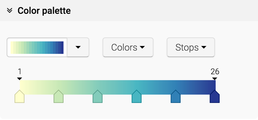
The Datawrapper color palette tool. You’ll encounter it in “step 3: Visualize” of the map making process.
But this tool is more powerful than it looks. The colors we choose have a massive impact on our map: How it is perceived, how well our statement is communicated and how honest we present the data. The following article explains how to use the color palette and what the different options mean for our map design.
Here you can find our example map. If you want to try the different color palette options for yourself, hover over the map and click on “Edit this chart” in the top-right corner to open Datawrapper and this map in a new browser tab. You need to be on your computer for this. The button won’t appear on your smartphone or tablet.
When creating a color palette, deciding on how many stops our color palette should have is the most confusing part. So what does Datawrapper mean with “Stops” and how do they work?

The number of stops is the number of (equally big) parts on our color palette which cover the same amount of our values. Let’s untangle that.
Maybe you’re saying “What’s the problem? I have a high value and a low value. Just give the high value a dark color and the low value a bright color, and fill all counties in between in a linear way.” That’s what we get when we click on “Stops” and then on “min/max”.
It’s a good option when the distribution of data between our high and low value is very even. Often, however, we have a distribution like the following. Here we plot the number of counties in the US with a certain unemployment rate. We see that most of the counties have a pretty low unemployment rate – but there are also some outliers with a very high unemployment rate of 15%-26%.
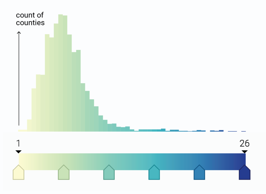
How many counties will have which fill color? This histogram shows the uneven distribution: Lots of counties will have a bright color. And only a few outlier counties will have a blue color.
The Min-Max-map takes every value between the minimum and the maximum value and assigns it a color between the brightest and the darkest color in a linear way. Because of our uneven distribution and the outliers, our map looks like this then. It’s a great map when we want to draw attention to the outlier counties in the US. They stand in high contrast to the rest of pretty-same-looking yellow-greenish counties. But besides that, we can’t see the geographical patterns here.
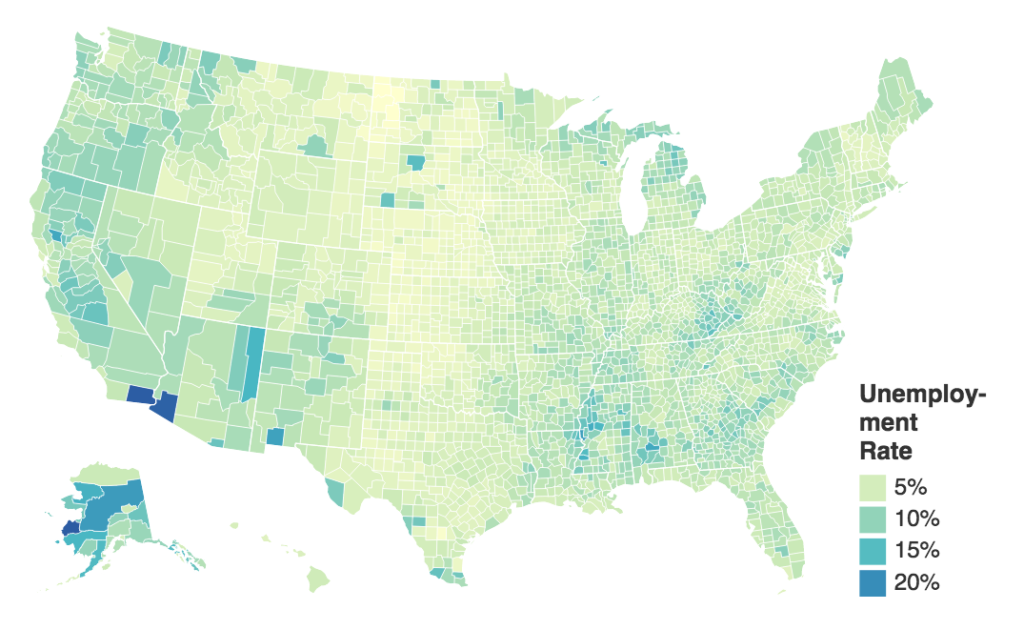
Our US map with the “Min/Max” option.
Our map would be better if more counties were filled with the turquoise-medium-blue colors that are almost not used yet. We can achieve that by increasing the number of stops. When we choose the “min/medium/max” option, we see that a new number appears in the middle of our scale:
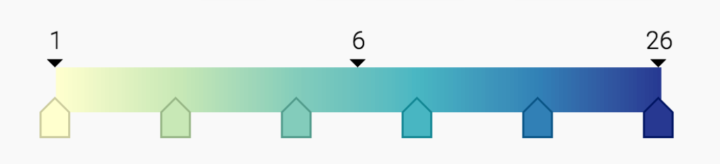
This “6” is the median of our values: Half of the counties have a higher unemployment rate than 6%, half of them have a lower unemployment rate. Here is the map we’ll see when we choose the “Min/Medium/Max” option:

Our US map with the “Min/Medium/Max” option.
Our map looks darker now than before. That’s because half of the counties are filled with a color that’s left of our median on the color scale, and half of the counties are filled with the colors in the right half of our color scale. In our Min/Max-map that we created earlier, only 3% of the counties had colors of the right half of our color scale. So with adding a stop, we “diversified” the colors we used for filling the counties.
The idea is the same when we increase the number of stops: In the option “Min/Medium/Max”, our color scale was divided into two parts, with each of them covering half of the data. When we choose “Quartiles”, we add two more stops, dividing the color scale and our data into four parts. “Quintiles” divides color palette and data into five parts, and “Deciles” into ten parts.
It’s a good idea to find a compromise between honesty and usefulness. The Min/Max-map is honest because it shows the values on a linear scale and draws immediate attention to the outliers. But maybe that’s not what our article is about. Maybe we actually want to talk about the geographical pattern: The low unemployment rate in states like Texas, Kansas, and Nebraska; the Black Belt in the south of the US. To show these pattern, we’ll need the Quartiles, Quintiles or Deciles map.
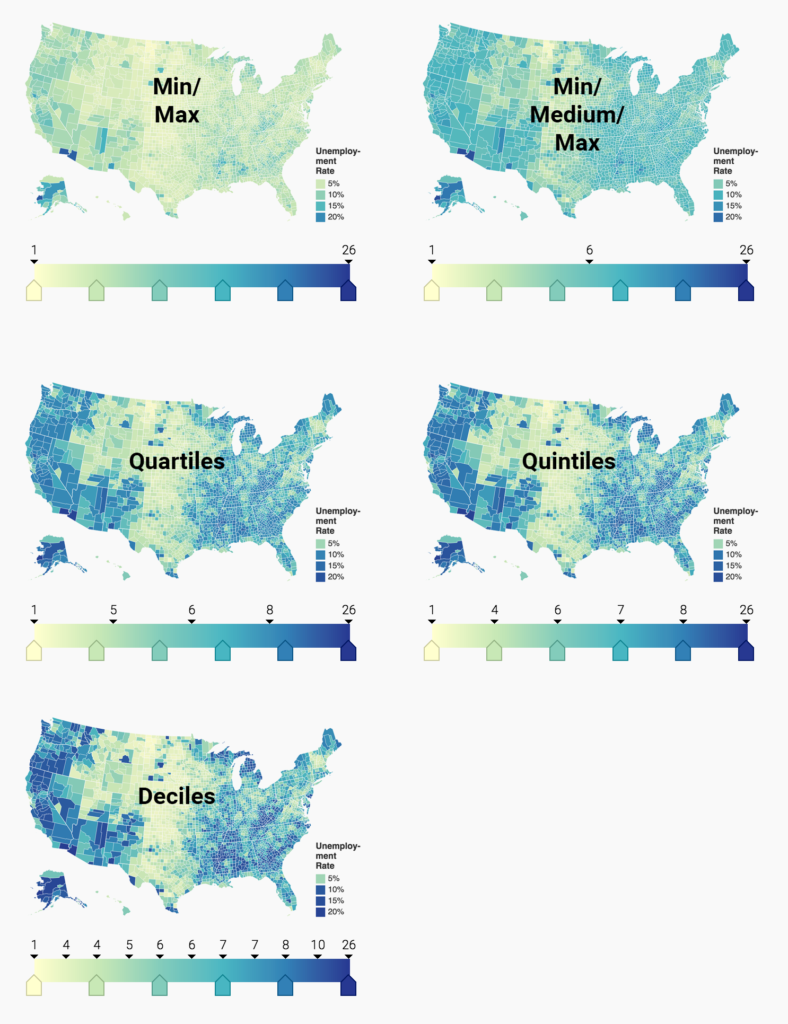
The more stops we add, the more our map will use very bright color and very dark colors; increasing the contrast of the overall map. That makes it appealing to always use the maps with the most stops: It just looks more dramatic.
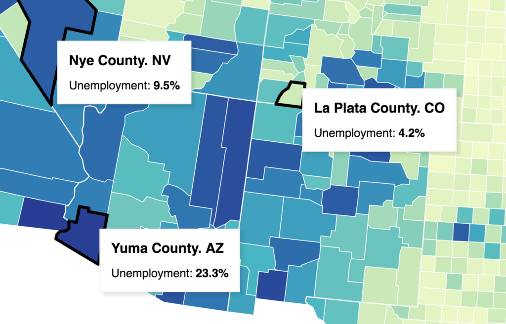
But it also makes our reader think that the differences are stark in areas where they’re actually not stark at all and less stark in areas where they are actually very stark. To illustrate that, let’s zoom into the Decile map. Nye County and Yuma County have both a similar dark blue color, but their Unemployment rates are vastly different. They are 13.8 percentage points apart. La Plata County, on the other hand, is filled with a light green, suggesting an unemployment rate that’s on a entirely different level than Nye County’s. But Nye County and La Plata County separate just 5.3 percentage points.
So if we have the goal to create a map on which we can point out the geographical pattern, and we try not to imply too stark differences that are not there, we would probably go with a Quartiles map as a compromise.
Choosing colors for choropleth maps is a great example that shows that “All map are wrong, but some are useful” (paraphrasing George Box). It’s important to find a good compromise between drawing attention to the facts that you want to draw attention to and using the data in an honest way.
This article appeared first on the Datawrapper Academy, in slightly different form: “How to choose a color palette for choropleth maps”.
Comments