This article is brought to you by Datawrapper, a data visualization tool for creating charts, maps, and tables. Learn more.
In defense of simple charts
Simple visualization types don’t need to be boring.

“There’s a strand of the data viz world that argues that everything could be a bar chart. That’s possibly true but also possibly a world without joy,” Amanda Cox, now editor of the New York Times Upshot, said in an interview in 2013. In his new book “Better Data Visualizations,” Jon Schwabish declares that “bar charts and line charts and pie charts […] are often boring,” and advises his readers that “our job is to encourage people to read and use […] graph[s], even if we ‘violate’ perceptual rules that we know will hamper someone’s ability to make the most accurate conclusions.”
I’m here to tell you that simple charts are great. That they’re underappreciated. Necessary. And that you should be proud of yourself if you create simple charts.
I believe, in short, that the debate “Are simple charts boring?” overlooks content and design and has an odd idea of “engaging.” But let me back up first:
What I mean by “simple charts”
Disagreements often result from badly defined terms. Five years after Amanda gave her interview, she stood on a stage in a Paris hotel close to the Seine with her co-worker Kevin Quealy, arguing at the OpenVisConf 2018 against the statement “Simple charts are the best.” A minute later, they discussed if “The NYT Needle/Forecast Dial/Gauge is a Simple Chart.”
Amanda said it is not. I agree.
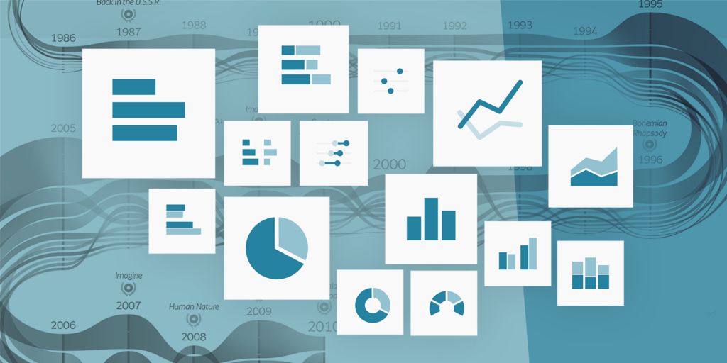
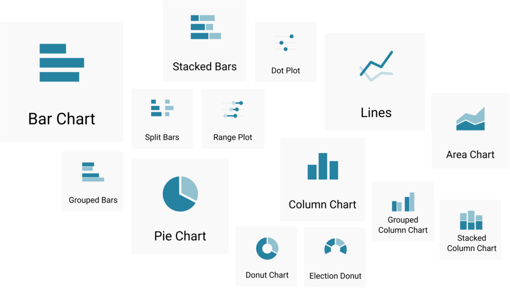
What are simple charts? In the following article, I define them as charts you can create with simple charting tools like Datawrapper: bar, column, line, area, pie, and donut charts, and others like them. They’re static, not animated. They might have hover effects to see the underlying data, but the data can’t be filtered.
Most of us (and our audience) have seen many of these simple charts in our lives. And because of that familiarity, they’re very easy to read.
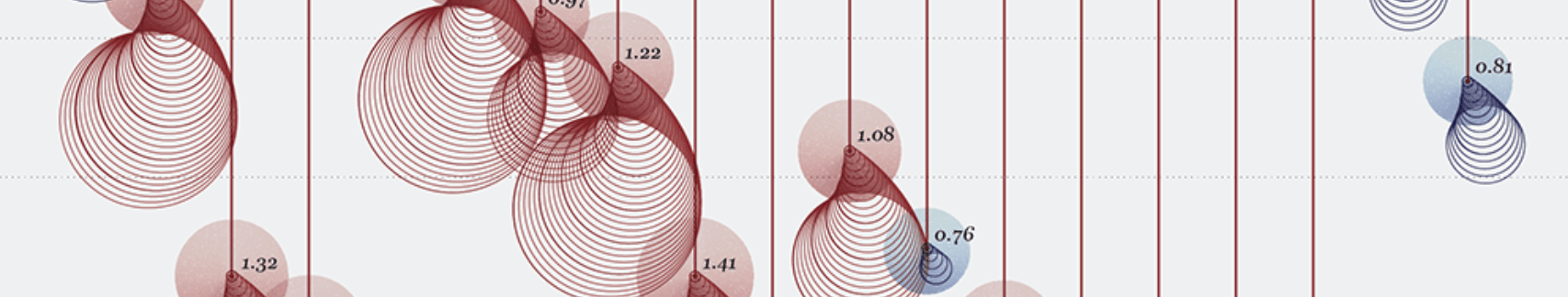
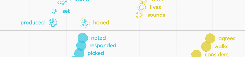
What are nonstandard charts? Nonstandard charts are charts that would fit well into the Information Is Beautiful award winner list. These are charts that can’t be built with a simple charting tool, but need to be built from scratch with Adobe Illustrator or a JavaScript library like D3.js.
Nonstandard charts take more effort (and often more time) to read than simple charts. They sometimes come with big-ish legends and encode lots of different variables. Here are four types of nonstandard visualizations:

But this categorization into simple versus nonstandard charts, like so many categorizations, doesn’t have clear borders. How about histograms and box plots; small multiples, scatter plots, or stream graphs? Depending on the audience you’re publishing for, they might be “standard” — but assuming we visualize data for a mainstream, lay audience, I exclude them from the “simple charts” category for now. I believe Jon Schwabish and Amanda Cox would agree. Let’s focus on pies, lines, bars, columns, and the like. They don’t necessarily need to be boring. But there are requirements:
We can solve the problem “Simple charts are boring” with “We need other chart types.”
Or we can solve it by using simple charts — with all their advantages — but letting them show more relevant and interesting data and making them look better.
Let’s talk about the data first:
Simple charts are not boring when they show interesting data.
When I look at a nonstandard chart, I might marvel at the beauty and ingenuity of its design. But often, I become skeptical. I often assume that its content can’t be extremely interesting — otherwise, it would be shown more simply.

There’s a reason why journalists show us the data we’re most interested in as simple charts. Take the line charts, bar charts, and tables in coronavirus dashboards, or the column charts informing us about election results. We wouldn’t want them differently. Sure, we happily look at nonstandard, animated visualization of the same data for an additional, different perspective. But first, give us a simple chart. To make decisions based on data — to actually use the data — we want it to be visualized in the most decipherable form.
We, and our audience, do read simple charts when they’re interesting. Our World in Data and the Chartr Instagram account with their simple charts have a huge following; tweets (1, 2) with simple charts and interesting content get thousands of retweets.
And then there’s the Data is beautiful subreddit with its millions of subscribers: Almost half of the 100 most upvoted posts of all time are simple chart types like line, area, pie, donut, column, or bar charts. (Only 30 are animated, by the way.)
All these charts are not interesting because they show off an interesting chart type. They’re interesting because they show interesting data.
Simple charts are not boring when they’re well-designed.
The criticism from, for example, Jon Schwabish, is that simple charts don’t attract attention and/or engage the reader.
And that might be true for lots of them (especially if they don’t show interesting data) — but that’s not the shortcoming of the chart type, but the shortcoming of the designer. Created by skilled designers like John Burn-Murdoch or Patrick Stotz, simple line and column charts get our attention:
Your whole charting experience got a lot faster! We turned our app into a single-page application, so there’s no wait for the page to reload when moving between steps in the editor (e.g., from “Check & Describe” to “Visualize”) ⚡️ pic.twitter.com/sivqswJBr5
— Datawrapper (@Datawrapper) November 30, 2022
Comparison of the 1st and 2nd coronavirus wave in Germany (7-day rolling average of reported deaths).
— Patrick Stotz (@PatrickStotz) December 8, 2020
Germany used to be a role model in the pandemic, but carelessness, reluctance and a lack of solidarity led to where we are now. pic.twitter.com/WjHZmeYCAM
These charts are based on good-looking style guides and make great use of colors, arrows, lines, extra explanations on the chart, and engaging title texts. The design makes them look more interesting and easier to decipher.
Combining interesting data with good design is powerful. Take this simple chart:
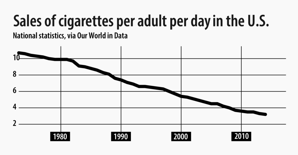
Here’s the same chart again with more data (both in terms of years and other countries) and better design:
Note how different these two charts are — and that the second one is more interesting and nicer to look at.
Simple charts are not boring when they're mixed up.
But there's another argument against simple chart types: Repetitive chart types, even when they're nicely designed, don't attract readers' attention. People are drawn to anything that looks new, not to the third bar chart in a row.
I agree. Here's the solution: Don't repeat the same chart type over and over again (except in small multiples). It's not just a matter of visual diversity. In many cases, another chart type actually shows the data better.
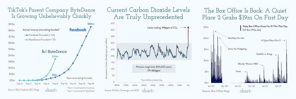
Let's look at an example. A few months ago, our PDF expert Jakub showed three developments over time in his Weekly Chart. And he could have used three line charts to do so:
But the first chart showed seasonal data and showed its insight better with a grouped column chart. And in the last chart, Jakub wanted to highlight the last three values — a column chart was the best choice to do so:
The different shapes — narrow columns, lines, wide columns — make the article look interesting and show the data better. Often, diverse chart types are not a tradeoff between aesthetics and readability, but a gain for both.
Many Datawrapper users know that. Here are some of their articles with more than three charts: Vox/Recode (14 charts, 6 chart types), The New York Times (4 charts, 3 chart types), WIRED (5 charts, 4 chart types), California Healthline (4 charts, 4 chart types), De Tijd (10 charts, 5 chart types), and The World Bank (14 charts, 8 chart types).
Simple charts are attractive because they're easy to understand
Simple texts are easier to understand than nonsimple texts, and simple charts are easier to understand than nonsimple charts. But research has shown that this comes at a cost: When we understand something quickly, we don't remember it well. Less coherent texts and difficult-to-interpret charts increase active processing — which is important for learning.
This is something we should be aware of. But it's not an argument against simple chart types. Because often, readers would rather understand something quickly than remember it for a long time.
For hard-to-understand-but-great-to-remember data vis, they need to be in the right mood — for example, in a "reading my Sunday newspaper over breakfast in the sun" mood. Or in an "I know I should remember that data in three months from now, so I'll take some extra time to understand it" mood.
When I'm just skimming news between two meetings or trying to quickly prepare for one, I don't care about learning; I care about understanding.
Every time I'm in that busy mood and I'm confronted with an article, I'm subconsciously making a decision: "Should I have a look at this? Is this relevant for me? Is it worth the effort?" While I'm trying to find that out, I'm grateful for any pointers. Like good section headings. Or paragraphs that start with a summary sentence. Or, yes, easy-to-understand charts.
In such situations, I'm attracted to a chart because it is simple. Because I know I'll quickly figure out what this will be about. (And if it's relevant to my life — like coronavirus incidence numbers — I'll probably remember it anyway.)
And there's a worse option than "just understanding, not remembering": not understanding the chart at all. That's exactly what can happen if readers are in a busy mood and they decide that a nonstandard chart is not worth their effort.
Nonstandard charts have their place — but so do simple charts.
I'm not against nonstandard charts. There are lots of places for less readable visualizations of data. They have the power to transport emotions better and fill somebody with wonder and awe, be more beautiful or be better metaphors, show us a different perspective or the complexity of the world better, and make us remember something better than simple charts.
This Washington Post chart is something I'd call a nonstandard chart. It's about COVID-19 cases:
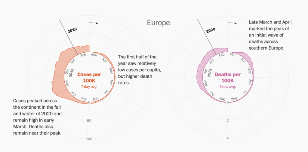
And while I'm glad that not every single COVID-19 visualization looks like this — that, instead, there are lots of simple line charts showing the cases — I'm also glad that this Washington Post graphic exists. It shows us the known data in a different view thanks to the "the year is a circle" metaphor. And that, by itself, is already a win.
So please, everyone, continue to create amazing, nonstandard charts for that "world of joy," as Amanda Cox called it.
A craft to be mastered
But also: be proud of yourself and your work even when you're creating "only" simple charts. Finding interesting data to chart is a challenge. Choosing the best visualization type is a challenge. And that design and annotation layer I mentioned? Maybe that's the biggest challenge of all. It takes time to be mastered.
If your chart shows relevant, important data in a good design, then kudos — no matter if it's a simple or a nonstandard chart.
A big thanks to Kevin Quealy and Jon Schwabish for helping me figure out what to think about simple vs. nonstandard charts! Leave your comments below or write to me at lisa@datawrapper.de if you disagree or have feedback.


Comments