This article is brought to you by Datawrapper, a data visualization tool for creating charts, maps, and tables. Learn more.
“The key to a good data story is the story itself”
Interview with FT Data Journalist John Burn-Murdoch


You’re about to read an interview with John Burn-Murdoch, a data journalist who works for the Financial Times in London. The interview was conducted for a German “Workshop” paper called “Datenjournalismus II Werkstatt” – you can buy it here if you want to read the German translation. The journal kindly allowed us to publish John’s original English answers on this blog, and we interluded them with some of his graphics. Enjoy!
Mirko: You went through a development from journalist to coding data journalist. What were the main steps to get there?
John: First of all, for me this is very much an ongoing journey: my technical skill-set today is far broader and deeper than it was a year ago, and I would expect the same to be true a year from now. One of the great things about quantitative or programmatic journalism is that there is no such thing as being “finished” with learning. There’s always a new technique or approach that would make you better at your job.
On the question of how I got to where I am today, I owe an enormous amount to Martin Stabe and my other bosses at the FT, who have not only allowed but actively encouraged my colleagues and I to pursue continuous technical skill-development as part of our roles.
I’m also indebted to creators of open source software like d3 and RStudio, and to my peers at other news organisations and elsewhere who constantly push the boundaries of what can be achieved using those tools.
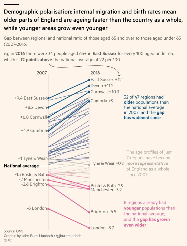
See the chart “Demographic polarisation” in its natural habitat on ft.com
I first started to develop coding skills in earnest when I moved from the Guardian to the FT in late 2013. I had tinkered with bits of HTML and Javascript before then to fix bugs in or make tweaks to interactive pieces built by my colleagues at the Guardian, but it was at the FT that I first began writing code from scratch.
It’s funny looking back at my staggeringly amateurish early attempts, where I would do things like build SVG graphics in Excel using the concatenate function![1] As crazy as that sounds now, I think it demonstrates a couple of traits that have held true throughout my journey: first, a preference for self-directed learning, and second,
…a desire to fully understand how and why a piece of code does what it does, rather than simply learning a function by rote.
Going back to my preference for self-directed learning, I should emphasise a couple of things: one is that this is exactly that — a personal preference. It works for me, but I know other people fare much better with interactive tutorials, one-to-one practical training, semi-structured workshops or other methods entirely. And two, self-directed doesn’t mean self-sufficient. I’m still constantly standing on the shoulders of giants, be they in the form of the Stack Overflow users who provide project-saving answers, the selfless heroes who write online tutorials, or the brilliant quantitative and visual journalists at other news organisations whose groundbreaking work I’ll sometimes try to reverse-engineer in order to see just how they did what they did.
In terms of some specific resources that have proved invaluable along the way, I can’t fail to mention Scott Murray’s d3 tutorials. That’s just the most prominent of dozens of other online resources and books on data visualisation, design and statistics that are never far from my grasp — or Pinboard account.
How do you get ideas yourself or, in other words: What makes a good data story from your point of view?
John: My ideas come from reading, listening, watching and chatting. In other words, every one of my best ideas has ultimately come from somewhere or someone else! The key here is that while it can be easy to get hung up on the quantitative or visual side of data journalism, for me the key to a good data story is the story itself.
No matter how clever the math, or how innovative the graphic, it’s all worthless if the reader is left thinking “so what?”.
For that reason I try — with increasing difficulty — to stay abreast of every subject area to which I apply statistical or visual journalism.
Over a representative year, this might mean staying up-to-date with the latest stories — and broader thinking — on British and American politics, sociology and demographics; global climate change; and European football.
To that end, I listen regularly to twenty or so podcasts, follow and engage with hundreds of incredibly smart people on Twitter, and bounce ideas around with contacts, colleagues, friends and family at a probably irritating rate for those on the receiving end!
What is your advice to journalists thinking that both math and coding is not for them?
John: Coding? There’s every chance that they’re correct. Math? They’re almost certainly wrong, and dangerously so. And of course the specifics of each vary enormously depending on who is asking the question.
Coding is now essential for data journalists. It’s the same for most visual journalists, and certainly a huge advantage even where it may not be vital. The ability to put together a web scraper or carry out a statistical analysis can provide a huge advantage to many reporters even if it doesn’t appear anywhere on their job description. But I would struggle to explain why a features journalist or breaking news reporter should spend their evenings learning Python or Javascript.
In terms of math, a journalist who can’t calculate their own means, medians and percentage changes is a danger to themselves, their publisher and their readers.
The ability to fact-check a statistic, or simply to grasp and communicate the context of a number in the news, is just as fundamental to the nature of being a journalist as is the ability to fact-check a claim or to evaluate the significance of a new development within the wider context of the patch in which it takes place.
How is data journalism viewed at the FT? Is it gaining importance or do you still have to convince people?
John: The FT is a great place to do data journalism. First of all, there can’t be many other places where trained statisticians are scattered across the newsroom in reporting roles completely detached from the data journalism team. The FT’s economics desk alone includes three staff who published regression analyses as part of their reporting, using software including Stata and R.
Those kinds of organisational idiosyncrasies — coupled with the fact that many FT journalists have previously worked for financial organisations and quantitative think tanks — probably shield us from the numero-skepticism that seems to plague many other news organisations.
In addition, we as a team within the FT have had some real success stories over the last couple of years in our use of quantitative and visual journalism, with the result that we’re seen as an increasingly important part of the newsroom.
That’s not to say the battle is won or that these things now take care of themselves. As we undertake increasingly deep and ambitious statistical analysis work in particular, it is an ever greater challenge to ensure the story itself remains clear and prominent above the caveats and methodological discussion that are essential to that kind of work.
On that latter front, we have benefited enormously from the arrival in 2015 of Alan Smith, the FT’s first data visualisation editor. Alan’s unique combination of creative genius, infectious enthusiasm and UN-level diplomacy skills have ensured that the FT’s data visualisation is not only excellent, but is seen as such internally.
Do you have any tips for other newsrooms to get going with data?
John: Step one: hire brilliant technical and creative people who live to learn about and explain the world around them. Step two: give them more editorial and creative agency than you think you should. Step three: watch as their ingenuity, ambition and productivity help deliver your organisation’s journalism to new and wider audiences.
What is the data story which should be told, but isn’t so far?
John: I’m reluctant to go down the route of separating “data stories” from other stories, but in terms of data-rich subject areas with great and important stories yet to be told,
…I think there remains a huge amount of uncovered ground on the issue of societal polarisation.
The Brexit vote and Trump’s victory both highlighted the extent to which many Western societies are splitting into ever more deeply divided camps, be that along geographical, social or demographic lines.
There have been some excellent academic and journalistic efforts to measure and explore these shifts, especially in the US, but I think there’s still an enormous amount of untouched data — and some untested theories to go with it — that could further illuminate what might become one of the most important themes of the next decade or more.
Thanks to John for the interview! If you enjoyed that, check out Andy Kirk’s interview with John two years ago. Also, make sure to follow John on Twitter: @jburnmurdoch. (There’s a reason for his high number of followers.)
-
The CONCATENATE function in Excel lets you join two or more cell contents into one string. E.g., if your cell A1 has the words “John” and your cell B1 has the words “awesome”, you can write
=CONCATENATE(A1, "is", B1)in a cell to get to “John is awesome”. (Note by Lisa.)↩︎


Comments