This article is brought to you by Datawrapper, a data visualization tool for creating charts, maps, and tables. Learn more.
“The reward of interacting is understanding”
Interview with Maarten Lambrechts


Two weeks ago, the data vis scene in Berlin got really excited: Maarten Lambrechts, Data Journalist, came all the way from Belgium to give an introduction about explorable explanations at the Data Vis Meetup Berlin (that I co-organize). I took the opportunity to interview him in the kitchen of the Datawrapper office the next day. We talked about explorable explanations, why not more newsrooms use them and how one can lure non-experts into getting curious about a topic.
I recorded our conversation. It was not intended to be published, I’m not a podcast expert, my English isn’t perfect, this was my first interview and it’s recorded on my laptop. It doesn’t even have a “Hi Maarten” or a “Thank you, Maarten”. We decided to make you listen anyway:
Here is a slightly revised transcript of that interview. Enjoy, and let us know what you think!
Lisa: Can you define explorable explanations? How you see them?
Maarten: Explorable explanations (you could also call them dynamic texts or dynamic documents) are documents users can interact with. They educate people not by just combining text and static graphics, but by integrating interactives. So people can really play with what they’re learning; with what they’re seeing. People can learn something without realizing they are learning something.
How are explorable explanations different from the term “news game”? Is “news game” a subcategory of explorable explanations?
All these terms are not really well defined. Explorable explanations are not games, and are not gamification. That’s how I see it: The reward of interacting with an explorable explanations is knowledge, is insight, is understanding; while the reward in a game is gaining points or winning coins. So the motivation of people playing games is different from the motivation of people playing with an explorable explanation. The motivation comes from curiosity.
This is a distinction in my head – but in reality, it’s all a grey area. There are explorable explanations with lots of gamifications in them. For instance, there are explorable explanations which are gated: You can’t proceed unless you complete a certain task. This is something that a lot of games are doing as well.
I guess a lot of explorable explanations are also getting inspirations from games.
Yeah, definitely.
So how do you see explorable explanation in relation to data visualization?
I think a lot of explorable explanations are trying to explain a system with feedback loops. A lot of different things are influencing one another, and a lot of these systems don’t really have numbers in them. Nicky Case built an explorable explanation about trust. There is a not a lot of hard data, there are not numbers in there. Data Visualisations can only come into the picture when you have quantitative information. But sometimes you are trying to explain something that’s really well captivated by numbers, and then can play with data vis.
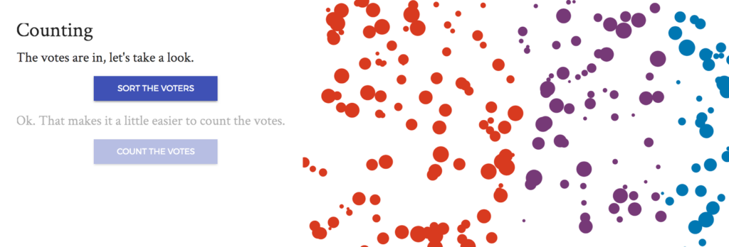
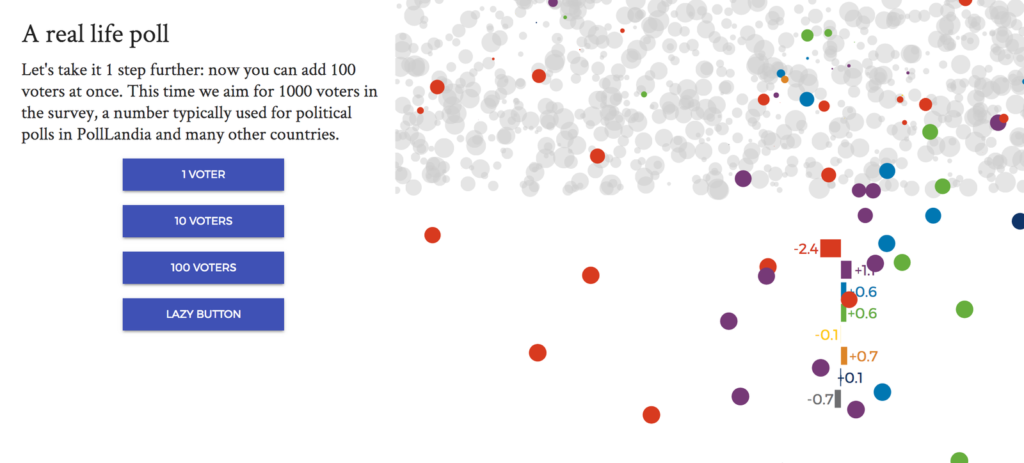
In my explorable explanation “Rock ‘n Poll”, I’m playing with election results and polling results. And of course there are numbers there, so I use visualizations. But for explorable explanation that try to explain concepts, you have to come up with another visual language, which is more illustrative, and not really data visualization.
In a journalistic context, explorable explanations will be small embeddable interactives and not really one big piece like Nicky is building most of the times. And then you could use a small dataset as your source for explaining. But I think you can also use numbers for explaining systems.
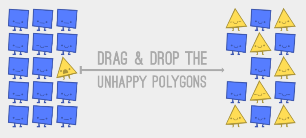
Why would you not see something like the “Parable of the Polygons” on a news site? I think journalists would have loved to come up with that, no?
I don’t know why, but I think one of the reasons… Well, when I was working at the newspaper, newly available data got into the paper quickly, but very superficially. I did some more analysis and one week later I could present an in-depth analysis of the numbers. And then I got responses like “We already published about this data set, why would we publish this topic again?” I think the response would be the same for a lot of explorable explanation: “Why would we publish that now? There is no real reason to publish it. Why would our readers be interested in that?”
In my view, some newsrooms should invest more in explorable explanations. It’s a unique way of explaining complex topics. And the world out there is a complex thing. But explorable explanations needs investment. Because building these things is expensive in time and in skills. (That is also one of the reasons that they not showing up more in the news context.)
I feel like journalists often pretend there is a basic knowledge in their readers head. Often, it’s actually missing – but journalists are still building on top of that knowledge. They say “Oh, we all know how taxes work, right? And now I give you that new piece of information about taxes.” But I think it’s really valuable that somebody explains “That’s how taxes work”.
Yeah. I think in every newsroom there is this discussion of “Where should we start? What is the basis of our readers? How much do they know?” and I think it’s a good idea to always aim low. Because as a journalist, you know a lot about many topics (or a certain topic), and you often forget that there are a lot of people out there who literally know nothing about certain subjects. You think that what you know is what everybody knows. But as a journalist, you are in your subjects all the time – while other people are just working and then in the morning or evening read the newspaper. And that’s it. That’s the only moment they come into contact with these other topics. So you really should aim low.
In every newsroom there is this discussion of “Where should we start? How much do our readers know?” and I think it’s a good idea to always aim low.”
Explorable explanations use some tricks to get non-experts into the topic they talk about. You start small with some very basic question or some very basic graphic or interactive, and then you build on top of that. You add another dimension, and then another one. Or you explain something different and then you explain the combination of these two things and how they interact. And you also avoid scientific formulas and translate those into visual things, which are easier to understand for a lot of people. Making the abstract concrete is a very important principle. When you combine all these things, the barrier for people to get into the topic becomes as low as possible.
And I think explorable explanation manage to get people get the gist of something. They will not completely understand what’s going on behind the scenes and all the models, but they will get a feeling of what is going on. And if they’re curious, they will be triggered to dive deeper into the subject.
Do you have some examples of projects that do that especially well; that are building knowledge piece by piece; bit by bit?
The “Parable of the Polygons” is one of those. But in my view, it’s not really about a complex topic. Once you get the basic principle, then all the rest follows out of it.
Maybe a good example is the one by Jack Schaedler about signal processing and Fourier transforms. It’s a very complicated thing to understand well. I struggled with it in school.

When I read Jacks’ explorable explanation, I got a feeling I mastered it for the first time. That I understood it. He uses very nice graphics and he’s also explaining the topic from the very simple to the very complicated; step by step. (Although he shows a lot of formulas as well.)
I feel like there might also be a danger. I guess that’s something that some people blame data visualizations to do, too: To give you the feeling that you have this complete view of what’s going on. “That is everything there is. You mastered the field now because you saw that one chart or explanation or how the system works.” I’m not sure how to avoid that.
Yeah, it’s a reaction I also got on my “Rock ‘n Poll” explorable explanation. I’m only highlighting a certain problem of political polls. I’m assuming random samples – while in reality, the samples are never random. So there are other angles to the topic that I don’t talk about, but which are also really important if you want to understand how polling works.
I think it’s a good idea to conclude your explorable explanation with some remarks about some further readings, or to be really explicit about what you didn’t touch.
“What you don’t know yet.” or “You’re not an expert yet.”
Yeah, something like that.
Interesting. Can you say something about the field of explorable explanations?
I would say if it wasn’t for Nicky, explorable explanations would be still a very, very niche thing. And I think Nicky is doing a very good job at spreading the word about explorable explanation. The rest of us are all people passionate about it and experimenting, and doing things in their free time. But there’s not really an established movement.
Personally, I try to follow what’s going on, I try to collect as many examples as I can and I share them. That’s a bit my role in that community. People always give me a lot of credit. Some people think that the Explorable Explanation website is my website, but it isn’t. So my role is actually quite small. In a small community, I play a small part.
Do you think we will see of explorable explanation in the future, especially in the news realm?
I don’t know. I think it will become easier to make these kinds of explorable explanations, because I know a lot of people are building some kind of tool or framework to make it easier (and there are already some tools). And if more and more people know that explorable explanations is something that exists, and that it’s something that is within their skills to build, I think they will see that certain topics, also in the news, lend themselves very well to be explained explorably.
It’s interesting that you mentioned tools. D3.js was just a breakthrough for the data vis scene; it’s been seen as the one tool you need to learn to get into data vis. There is not a tool like that for explorable explanations. Do you think there will ever be one?
I’m doubtful about that. I know some people are trying to do this, to build a framework. But you have a lot of degrees of freedom with every explorable explanation. You can go really visual, or still be text heavy; the story you’re building can be linear or non-linear; you have different ways of visualizing things and different ways of building the interaction. Do you interact directly with the graphic, or do you have controls on the site? I don’t think one tool can cover that all.
But maybe, if you have a user-friendly tool which has reasonable freedom in output, explorable explanations could be made a little more popular. And if more and more people are able to make them, they will see that for certain topics, explorable explanations can be really, really powerful.
A huge thanks to Maarten for this interview! Follow him on Twitter (@maartenzam), have a look at his website, hire him and invite him to give talks. Find his slides from the Data Vis Meetup Berlin here.
To stay updated with everything that happens in the world of explorable explanations, follow @explorables. Definitely have a look at explorabl.es, which is a great collection of projects, tools, tutorials & and an FAQ by Nicky Case.


Comments