New: Small multiple column charts in Datawrapper
February 18th, 2025
6 min
Datawrapper lets you show your data as beautiful charts, maps or tables with a few clicks. Find out more about all the available visualization types.
Our mission is to help everyone communicate with data - from newsrooms to global enterprises, non-profits or public service.
We want to enable everyone to create beautiful charts, maps, and tables. New to data visualization? Or do you have specific questions about us? You'll find all the answers here.
Data vis best practices, news, and examples
250+ articles that explain how to use Datawrapper
Answers to common questions
An exchange place for Datawrapper visualizations
Attend and watch how to use Datawrapper best
Learn about available positions on our team
Our latest small and big improvements
Build your integration with Datawrapper's API
Get in touch with us – we're happy to help
This article is brought to you by Datawrapper, a data visualization tool for creating charts, maps, and tables. Learn more.

Alright, alright. In October I promised to write a monthly series about small improvements in Datawrapper. What can I say, time flies, and a lot has happened at Datawrapper during that time (most notably, Fabian and Simon joined our team!).
But postponed is not abandoned, so here’s what happened after we launched the new pie and donut charts in December.
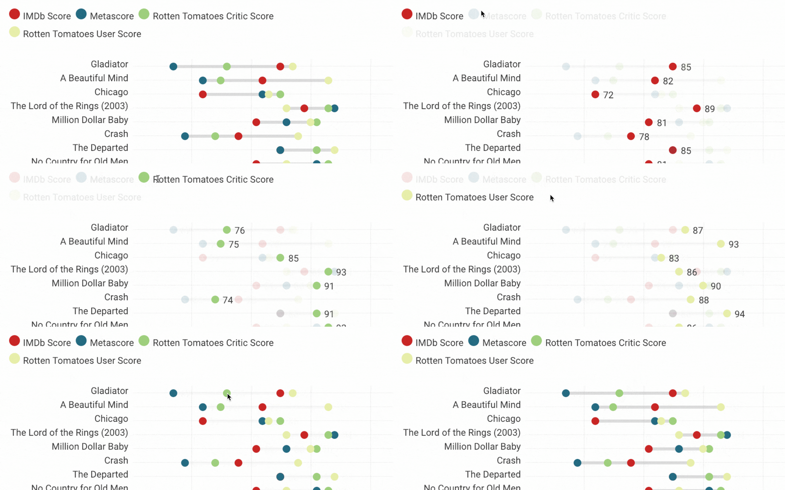
Our dot plots and bar charts now have interactive highlighting (hover) of chart items. Optionally the values for each dot and bar can now be displayed on hover.

In grouped column charts we added an option to position value labels above columns as well as an option to color labels according to the colors used in the chart.
In pie charts we added the ability to highlight slices in pie charts on mobile by tapping color key stops. We improved rendering of numbered labels in slices, added an option to disable color key in multiple pies and donuts, and made it possible to customize the text inside a single donut chart:

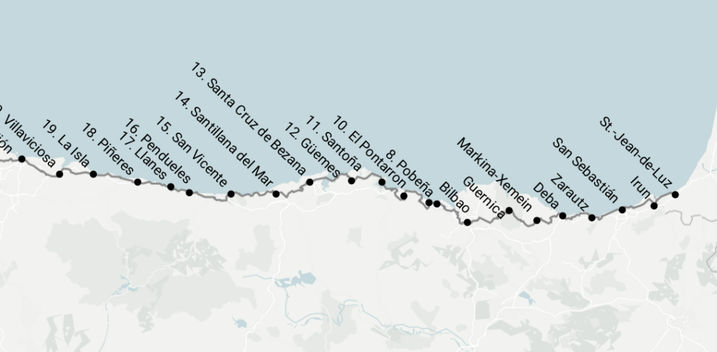
Of course, no month goes by without improvements to our locator maps. Markers can now be rotated even if they have symbols (symbols aren’t rotated). This is useful for squeezing labels into tight space.

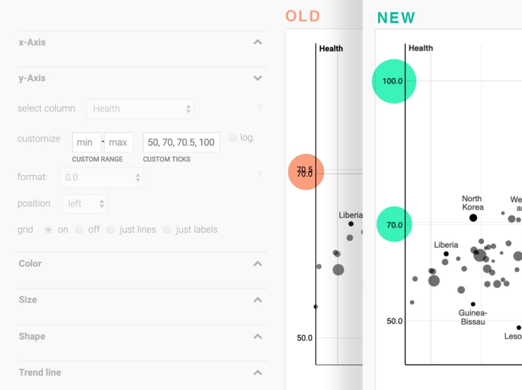
Our scatterplot axes got a major overhaul: custom axis ticks now can’t overlap anymore (grid lines remain in place though), and all custom axis ticks will show up (including the ones outside the default range)

When loading custom fonts, charts will now render again after the fonts have been loaded. This ensures that text on the edge of the charts won’t get cut off anymore when font loading took too long.
Also, Datawrapper chart embed iframes now include title and aria-describedby attributes to comply with current EU web accessibility requirements.
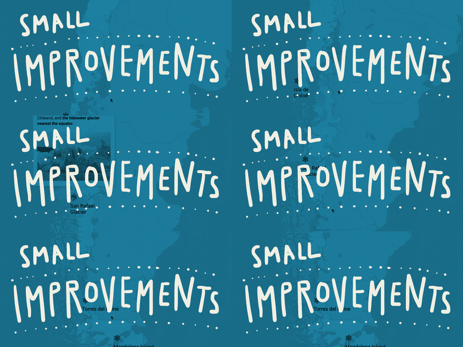
Last but not least, there also have been a lot of improvements to our basemap collection:
For more updates make sure to check out our changelog.
Comments