Radish to romanesco: A year in vegetables
February 20th, 2025
4 min
This article is brought to you by Datawrapper, a data visualization tool for creating charts, maps, and tables. Learn more.
Hey! I’m Julian, one of Datawrapper’s developers. In this edition of the Weekly Chart, I figure out how to use Datawrapper to create visualizations of networks.
I’ve always been a fan of graphs and networks. Although networks can be a type of data visualization, they’re a bit out of the ordinary and not included in Datawrapper’s vis type selection. But after my last two Weekly Charts featuring plain line charts, Luc’s connected scatterplot post inspired me to attempt one anyway. If the tool is powerful enough to build a connected scatterplot, you can probably also build a network, right?
My colleague Anna already did a great job at explaining the concept of a graph in her Map Story about Roman roads. I’ll just shamelessly copy her definition:
A graph is a mathematical object in which certain points, or vertices/nodes, are connected by lines, or edges. The nature of the graph is determined by the number of vertices and the particular way that the edges connect them. Everything else about it — where exactly we place the vertices, how long the edges are, whether they’re straight or curved or loopy — is irrelevant, mathematically speaking.
When we want not just an abstract mathematical object but a model of some real world thing, we usually use a network. You’ve heard of social networks (nodes = people, edges = knowing each other), but networks can be used to model and analyze a huge variety things. A network can have extra properties beyond those of a graph — for example, each edge of a social network might have a numerical weight representing how closely two people know each other.
And as with any sort of data, sometimes it’s really helpful to visualize these connections. However, even the question of how to properly draw a network is so complex that it’s spawned its very own branch of research.

Today, I’ll focus on smaller networks where we can pinpoint individual nodes and edges, which I believe is way more suitable for Datawrapper’s focus on explanatory data vis.
Let’s take a step back and look at our options.
We need to draw dots and lines, so anything bar, column, or area based doesn’t really make sense. The layout of dot and range plots is too limited to draw meaningful networks. Tables are out. This leaves us with line charts and scatterplots.
My gut instinct was to choose the line chart, so let’s start there. Edges are lines and we can use line symbols to visualize nodes. As you can see below, it is possible to visualize a simple network using a Datawrapper line chart.
It works, but this approach is quite limited in terms of the design options and we have to draw each edge using a new line, which means we’d need to come up with very weird data for networks with more than a few nodes. Let’s see if we can find a better option.
My colleague Elana once shared this Datawrapper secret: "If you can’t figure out what chart type it is, it’s a scatterplot." And it's true that the versatility this chart type offers is unmatched.
Scatterplots are obviously a great choice to visualize nodes as they offer a variety of options for customization, including custom tooltips. But what about edges? Fortunately, you can add custom lines to scatterplots, which are powerful enough even to draw edges of different types and weights.
A much smoother experience compared to line charts, and we also get more options to customize our network, for example by highlighting certain nodes. This is definitely the better option of the two.
There's an even more hacky approach: maps. Elana's scatterplot rule has a corollary: "If you know how to operate and abuse GIS software then a map is a close contender." Although you could probably use custom basemaps to make networks with symbol or choropleth maps, to me locator maps felt most natural for the job.
To build the graph we see below, I zoomed in very deep so we don’t see any borders and added and arranged some markers as nodes (as smooth as it gets with drag-and-drop positioning). I asked ChatGPT to create a geojson for the line markers, but it’s really just the coordinates of your nodes (copied from the chart data) that need to be inserted at the right place in a geojson structure.
If you know how to do it, this is definitely the fastest way to create a basic network and it’s still quite customizable. It feels wrong to use a map here though, and the result looks inferior and is less customizable compared to what could be achieved with a scatterplot, so overall it’s a clear second place for me.
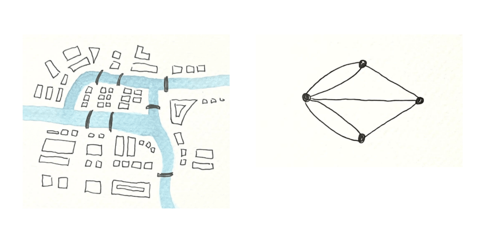
Now that we figured out which chart type is most suitable, let’s try to visualize a proper network. Arguably the best-known graph theory problem is the Seven Bridges of Königsberg, where the challenge is to cross seven bridges without using any of them twice. I highly recommend Anna’s map story on the topic to learn more about the problem and the actual history of Königsberg and its bridges.
Anna visualized the map of Königsberg — and its abstraction as a graph — like this:

I tried to recreate this graph using a scatterplot. In typical Datawrapper fashion, we can add additional annotations and information about the nodes and edges:
Creating a scatterplot network like the one above is quite a lot of work, since you have to figure out where to place the nodes and the edges all on your own. For larger networks, finding a good way to place the nodes is virtually impossible without algorithms.
If we got the machine to figure out node placement, perhaps we could free ourselves from this more tedious work?
Things might get a little technical now, but I’ll try to keep it from reading like source code.
In modern software development, many of the challenges we face have already been solved; we just need to combine existing solutions in the right way. These are the pieces I’m stitching together this time:
To build a tool that can spit out Datawrapper networks, we use networkX to read the edge list data and compute the layout. Then we extract the node positions it calculated and turn them into scatterplot points and lines that Datawrapper will understand (that’s the stitching part). We also set a bunch of metadata (e.g., turning off axis labels) so that our network doesn’t look like a scatterplot. Finally, we send it all to the API, which creates our chart and provides its URL:
For this demonstration, I used a social network of characters from the original Star Wars movie. The network above is what the API gets us initially. We can now dive into the chart editor and tailor the results just as we can for any regular scatterplot. For example, we could highlight whether a character is fighting for the Rebellion or the Empire or choose to label only important characters:
From a social network like this we can take a away quite a few things! For example:
I christened the tool with the name nx2dw (networkX to Datawrapper), and made it available on Github if you want to visualize some networks yourself. The functionality is still a bit limited, but it’s a great starting point if you want to create a network in Datawrapper. Make sure to shoot me a link if you do!
I hope this article has sparked some excitement about the fascinating world of graphs and networks. If that's enough for you, don’t worry — I bet next week's chart from Jona will feature something very different.
Comments