This article is brought to you by Datawrapper, a data visualization tool for creating charts, maps, and tables. Learn more.
Your Friendly Guide to Colors in Data Visualisation
An overview of color tools
Once upon a time, I tweeted on an urgent matter. “Can somebody tell me how to get better with color?” I wrote.” My color decisions are awful.” I got a lot of replies with links to tools. They were awesome, so I collected them in a blog post. I called it: “Your Friendly Guide to Colors in Data Visualisation” and hit publish.
That was more than two years ago. Since then, great people have released greater tools, and I can write more confidently about colors. It’s time for an update! This time on the Datawrapper blog instead of my personal blog. I tried to stay as close to the original post as possible and just update screenshots and improve explanations. Here we go.
Edit August 2019: I added some new tools and changed the structure slightly. I also added a table of contents, so you can just jump to interesting parts:
- Why color?
- Color gradients: Copy from others
- Color gradients: Create them yourself
- Distinctive colors: Copy from the masters
- Distinctive colors: Copy from movies
- Distinctive colors: Copy from others
- Distinctive colors: Create them yourself
- Make sure your colors work
- Fuuuuuuun with colors
Why color?
First, watch this video about why color decisions are important and how to mix colors. There are two main aspects to the importance of color: (a) Color lets you set the mood and (b) you can use color to guide the viewer’s eye and draw attention to particular features. Color enables you to tell a story.
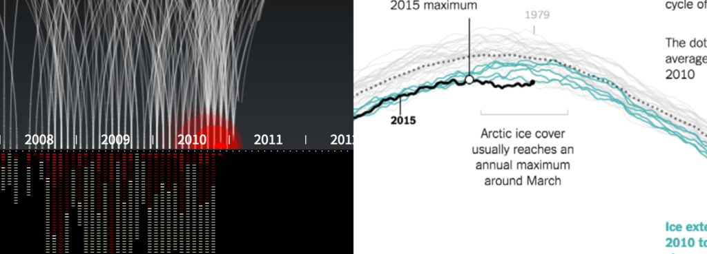
Both aspects are important for data visualizations. Pitch Interactive set the mood very effectively in their visualisation on drone strike victims in Pakistan “Out of Sight, Out of Mind”. The red drops make you almost see the blood spread. And color in data vis is often used to set highlights – a very important tool that one can use to guide the viewer’s eye. I like to remind everyone (whether they want to hear it or not) that “grey is the most important color in data vis” referring to this great article by Andy Kirk.
So how should you choose colors for your project? In data vis, the way you chose your colors depends on your data. There are two options: For continuous data you use color gradients, and for categorical data you use distinctive colors.
To explain that in a bit more depth: You would use color gradients if you have data that progresses from low to high, e.g unemployment rates on a map. Colors in a gradient should communicate: “I represent a value that’s a bit higher or lower than the color next to me.”
And you would use distinctive colors (e.g. green, yellow, blue – also called “color hues”) when your data has categories, e.g. political parties. They should scream: “I’m by myself and have nothing do to with all these other colors here!”
These two use cases both come with their own challenges. If you work with gradients, your main concern is making sure that the differences between your color steps are large enough. You want your reader to be able to clearly differentiate between a light green and a …lighter green. (Tools that create beautiful but subtle UI gradients like this one are not sufficient for the job.) In the next section of this post, I will introduce and outline some tools which help you solve this problem.
When working with distinctive colors, your mission is to find colors which go well together and attract the reader’s eye. This problem is typical in graphic design circles, so tools in this area are very popular. I will mention some of them in the second part, “Distinctive colors”.
Color gradients
Copy from others
ColorBrewer 2.0 needs to be mentioned first. It’s a classic. The color tool of color tools for every ambitious data vis designer. It’s not only a tool: While making your choices, it also teaches you about the best use of color in data vis. If you haven’t yet, click on the question marks and read those wonderful explanations.
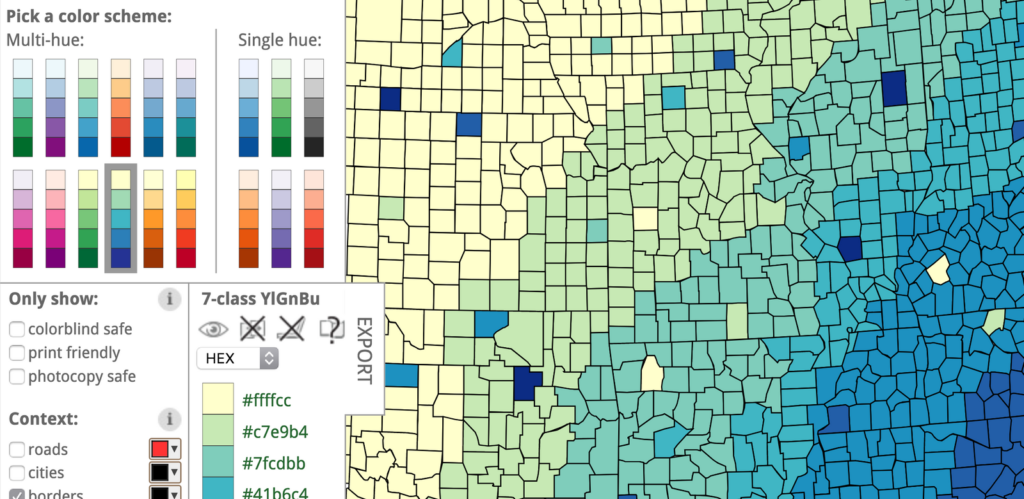
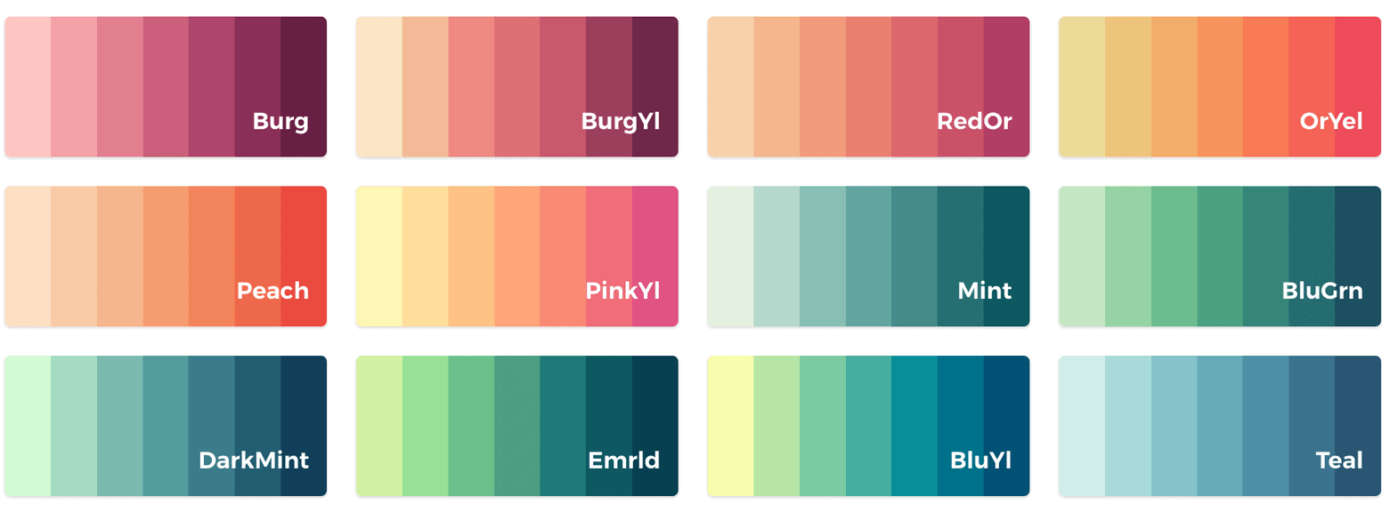
Lots of people use ColorBrewer, and therefore, well, lots of visualisations look similar when it comes to color. If you want suggestions for great color gradients that go beyond ColorBrewer, try CartoColor. Like in ColorBrewer, you can try your gradients on a “real” map & copy hex values. And these colors are beautiful! If you need an even longer list and especially if you’re working with R, you can also check out this “comprehensive list of color palettes in R”.
Color gradients
Create them yourself
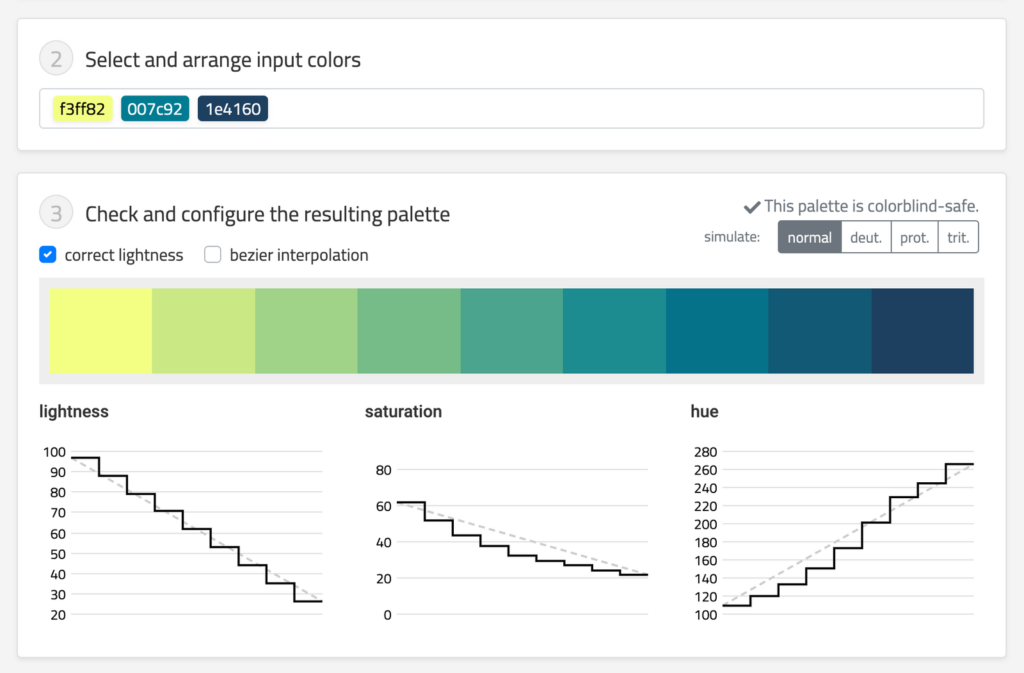
The Chroma.js Color Palette Helper by Gregor Aisch (now the CTO of Datawrapper) is the one I use most often. This little tool helps you to identify the differences between the steps – by showing you actual steps. If you’re interested in its background: Gregor also wrote a nice explanation of this tool. More advanced data vis people will appreciate the documentation for Gregor’s tool Chroma.js where you can explore the tool’s functionalities by changing the values directly in the sample code blocks.
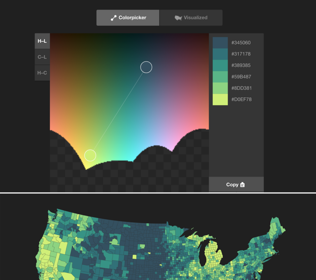
Another tool that’s not only extremely helpful, but also helps me to understand color better is Colorpicker for data by Tristen Brown. Here you can design your own gradients. Make sure to make use of the “Visualized” button at the top, which generates a choropleth map with your gradient so that you can see how it might look in use. It’s a shame that the map isn’t on the same page as the color picker, but hey, better than nothing.
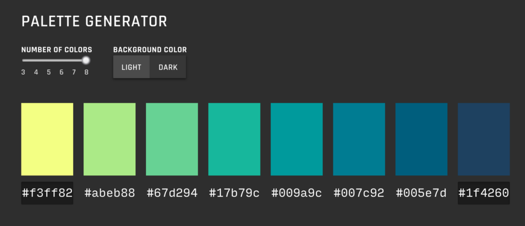
In case these two tool don’t help, the Data Color Picker by Erik Kennedy might help. You can just define the first and the last color, but it seems to do a good job in finding beautiful color gradients inbetween.
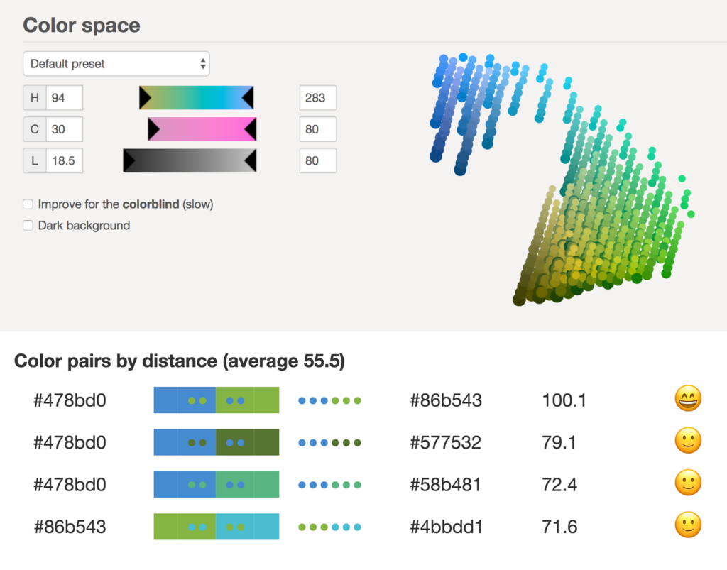
There are also some advanced tools that are overkill for me, but have their fans, e.g. Colorgorical by Connor Gramazio or the Palette Creator by HCL Wizard. Another one is I want hue. It promises “color for data scientists” and is actually so complicated that it even offers tutorials. Definitely not the most easily understandable tool for beginners. The use of emojis to rate the differentiation between colors is a nice touch, though:
Having covered gradients, let’s move on to distinctive color hues:
Distinctive colors
Copy from the masters
Of the millions of colors out there, how do you decide on a nice palette of distinctive color hues? When I asked my question on Twitter, three people recommended me painters, so I feel like there is some demand to cover them. To be honest: I appreciate the old masters, and as a Bauhaus University alumna I see the special something you can get from Albers, Itten, and Co. (As an ex Weimar resident I can also see the delight one can get from Goethe’s Theory of Color.) But…you know… the colors they had available back then were different from what we see on our computer screen these days.
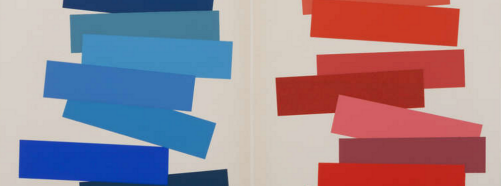
Let’s start with Josef Albers and his book “Interaction of Color”. He had things to say like: “In visual perception, a color is almost never seen as it really is — as it physically is.” His color compositions are beautiful indeed:
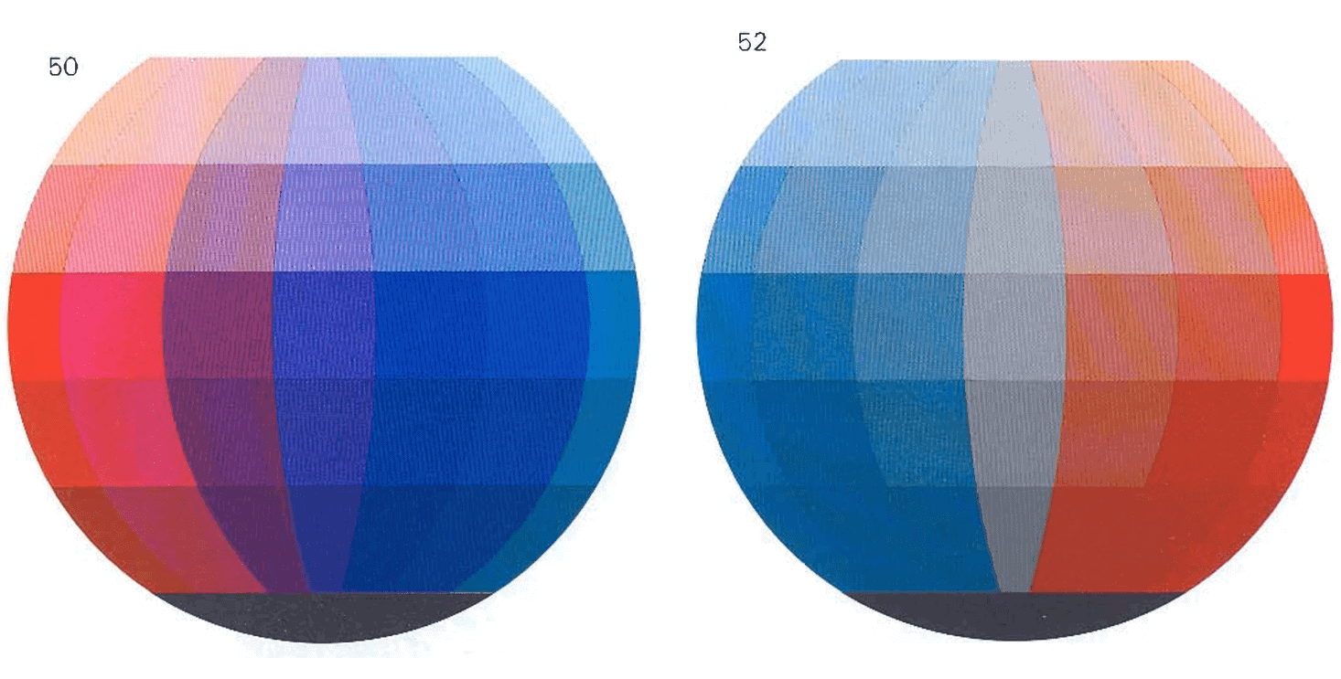
Another Bauhaus-Star (who was in fact one of Josef Albers’ teachers at the Bauhaus): The crazy Johannes Itten. He wrote the book “The Art of Color” (pdf). He’s most famous for his color spheres, in which he showed colors like this:
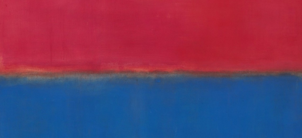
Of course, I need to mention the color hero: the American painter Mark Rothko, who is famous for his huge portraits of colors. Rothko said “If you are only moved by color relationships, you are missing the point. I am interested in expressing the big emotions”. Well, I’m definitely moved by his colors:
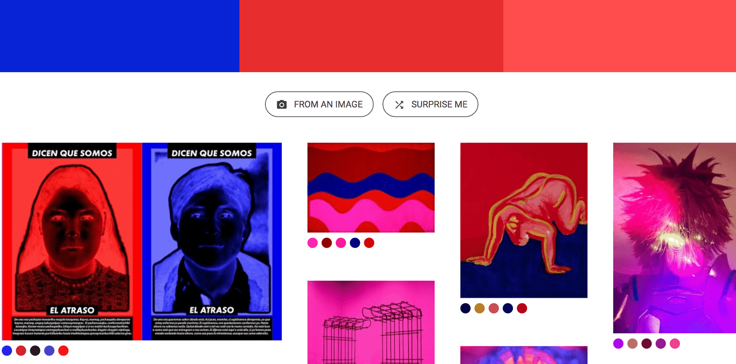
Coming slowly back to the present day: This Art Palette experiment by Google lets you choose up to five colors and shows you artworks with these colors. You can also upload an image and choose colors from within it. Works really well:
Distinctive colors
Copy from movies
Let’s move from art to movies. Shaped by masters of storytelling, this medium knows how to use color to set highlights and influence our mood, lead our eyes and delight us.
You can find color palettes of chosen movie stills on the Twitter account @cinemapalettes or in the blog Movies in Color. The project The Colors of Motion takes a more artistic approach and creates a visual representation of entire films by taking the average color of each frame and stacking them as lines. Not sure if that would ever actually be helpful, but it’s definitely interesting.
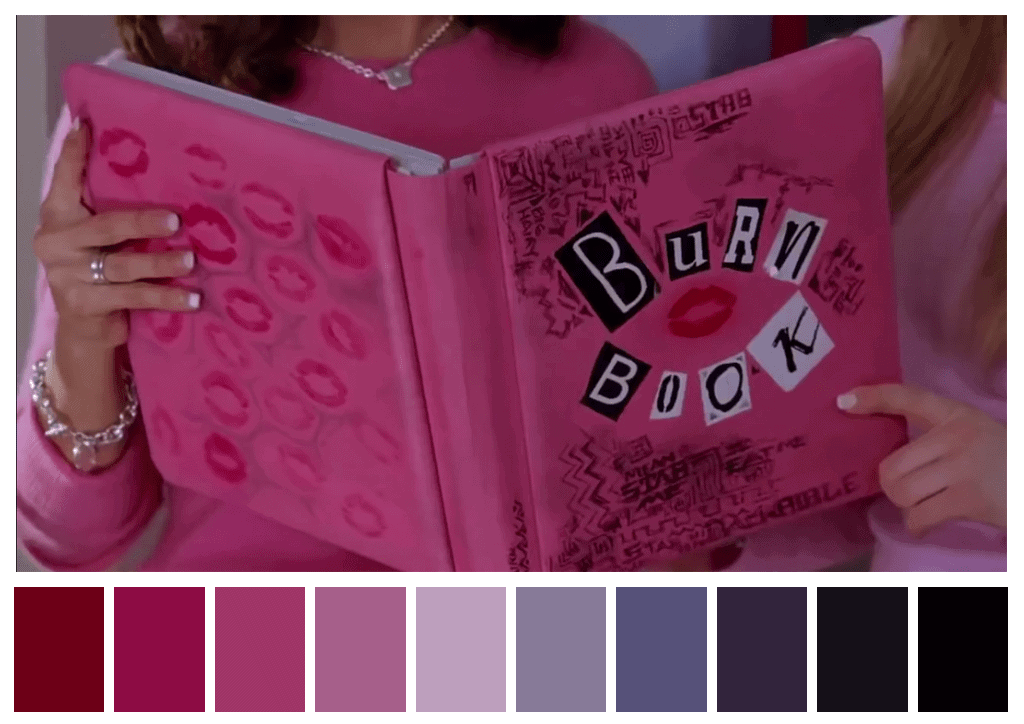
One dude who works especially well with colors is Wes Anderson. The blog Wes Anderson Palettes is kind of legendary. There is even an R library inspired by it.
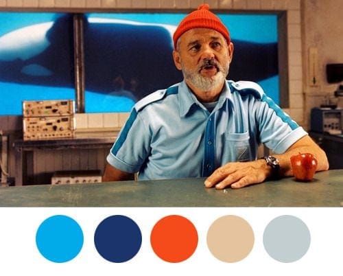
If you want to examine the colors of your own movie stills or other images you have, tools like the Color Palette Generator
by Steven DeGraeve can help. You can upload a photo and automatically create a color palette. As you can see, this palette will turn out far less saturated than you “see” the colors.

Because of that, it might be helpful to create a palette of the colors as you “see” them in photos or movie stills. An automated approach or color pickers won’t help you much with that; it will always look more greyish than the colors appear. Bill Hart-Davidson suggests using photos of tropical fish as a basis for color palettes, and I can see how this might work very well. That said, tools like DeGraeve’s palette generator are definitely still helpful for art or graphic design work.
Distinctive colors
Copy from nature
Nature can be a great inspiration: Every color you’ll pick will look natural by definition:
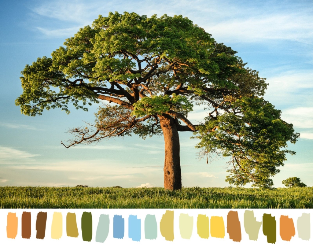
To pick colors, try a tool like image-color.com. It lets you choose your “color radius” so that you can pick an average color of a few pixels, or just pick the color of one single pixel.
To get more saturated colors, try the same with photos by exotic fish.
Distinctive colors
Copy from others
There are so, so many color palette collections.
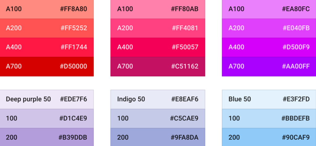
ColorHunt, ColorDrop, Coolors, LOLcolors, Pigment and Adobe Color CC are just some examples of the wide range of collections that color lovers around the globe have created to get their fix. If you want it especially digital and sleek, the color palette for the Material Design by Google will make you happy:
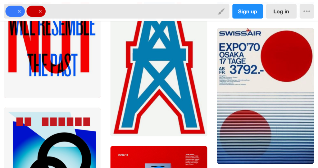
But how are all these color palettes used in practice? The ability to search artwork by color in Designspiration and Dribble can help you answer these questions. The biggest use case for me: Getting inpsiration for additional colors that would go well with your existing palette. Personally, I prefer Designspiration over Dribble, since it lets you not only search for one but multiple colors:
It’s also a great idea to get inspired in a bigger sense: Go to museums and galleries. Look at art. Look at other data visualizations (the winning entries of the “Kantar Information is Beautiful Awards” feature some beautiful colors). Or look at blogs by people who are enthusiastic about color, for example Plenty of Colour:

Distinctive colors
Create them yourself
Smashing Magazine provides a good introduction on how to create your very first color palette. I especially like the idea of “creating harmonious grays” by starting with pure grays as a base and then overlaying them with your main color. I’d never thought about it, but it makes a lot of sense as a way to make your color palette feel more harmonious.

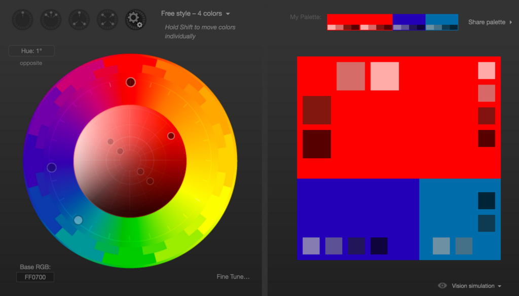
The Smashing Magazine introduction also makes use of Paletton, the more advanced version of Adobe Color CC. If you know what you’re doing, this tool can help a lot:
Make sure your colors work
Before I show you aaaaall the ways to get inspired for color palettes, let’s keep in mind that they need to deliver.
Viz Palette by Elijah Meeks & Susie Lu is a tool that does just that. It shows you how well your chosen colors work for tiny lines and big areas. It also warns you if any of your colors have the same name (“dark red” & “blue” in our case), which makes it harder to talk about your designs.
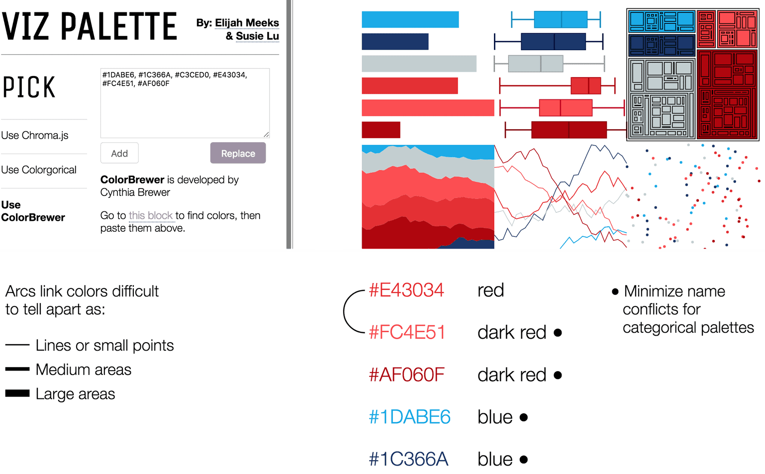
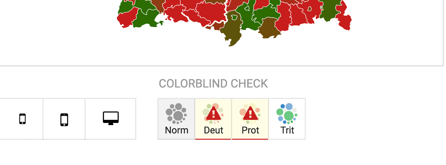
Viz Palette also makes it easy to check if your colors can be distinguished by colorblind people. A browser extension like Spectrum, an online tool like Coblis or an app like Sim Daltonism can simulate the colors as seen by people with different types of colorblindness, too. In Datawrapper, we integrated a color blindness simulator, so no external tool is necessary. To learn more, visit our three-part series on visualizing data for colorblind readers: part 1, part 2, part 3.
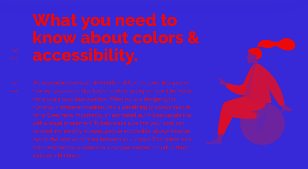
And in case you want to place text on your colors (e.g. to annotate maps), make sure you visit Color Review. It tells you if the contrast between a text color and background color is readable, and if so, for which text sizes. Red and blue, for example, don’t pass the test:
Fuuuuuuun with colors
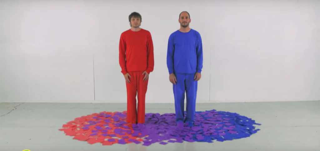
Ok, after all that work, let’s watch a Sesame Street Video by the fabulous OK GO peeps:
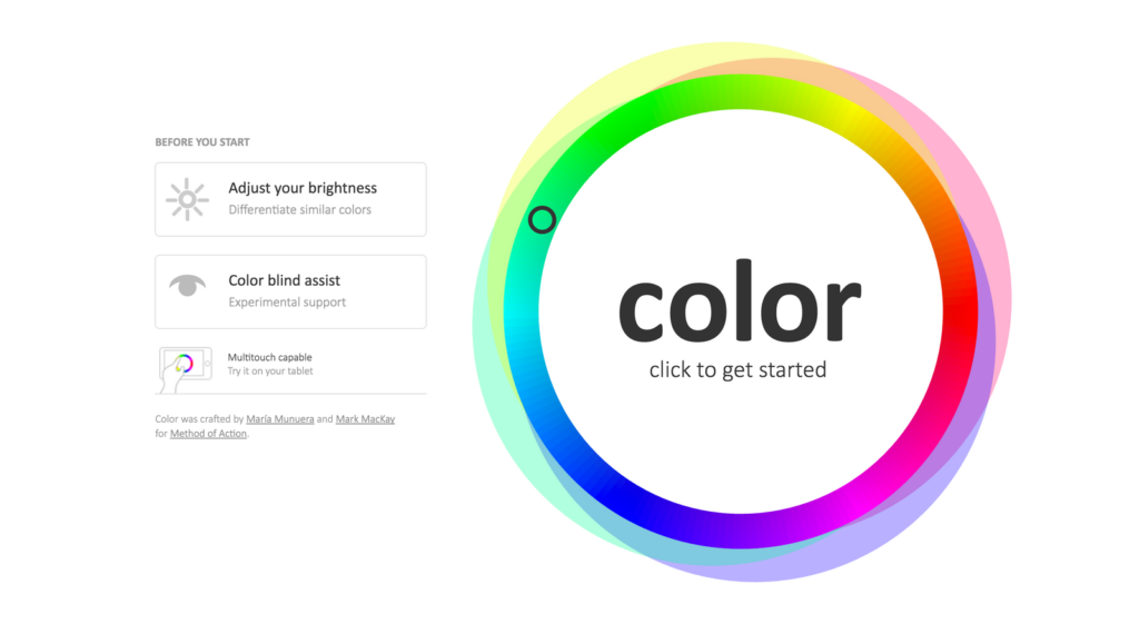
You’ve done that? Let’s play a game. Or two! One of them is called Color (good name) (do you know that feeling when you’ve heard a word for so many time that it loses its meaning…) and is quite a bit more addictive than I expected. Your goal is to match colors. Go:
And then there’s I love Hue, a smartphone game in which you need to “arrange mosaics of coloured tiles into perfectly ordered spectrums”. I enjoyed it a lot! It reminded me of how differently colors look like depending on which colors surround them.
More blog posts!
If you want to learn more about colors in the context of data visualisation, well, I wrote one or two more that could be of interest to you:
- What to consider when choosing colors for data visualization No matter what data visualisation looks like, it comes with color. Or multiple colors. Here’s a simple Do’s and Dont’s guide to using colors in charts and maps.
- Election reporting: Which color for which party? Which party colors do we choose when reporting election results? I explain three approaches.
- An alternative to pink & blue: Colors for gender data A reality check which colors newsrooms use to present gender data. Spoiler: Pink and bue are not dead, but there’s lots of hope.
Thanks to all the people who replied to my tweet and helped me discover these treats! Also, let me know about any tools or websites that can’t be missed in this blog post. Find me on Twitter or write me an email: lisa@datawrapper.de. You can also read comments about this article on Hacker News.


Comments