This article is brought to you by Datawrapper, a data visualization tool for creating charts, maps, and tables. Learn more.
What to consider when choosing colors for data visualization

Data Visualisation can be defined as representing numbers with shapes – and no matter what these shapes look like (areas, lines, dots), they need to have a color. Sometimes colors just make the shapes visible, sometimes they encode data or categories themselves. We’ll focus mostly on the latter in this article. But we’ll also take a general look at colors and what to consider when choosing them:
When to use colors in data visualization
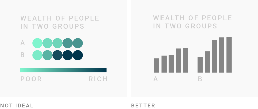
Consider if there is a better alternative to gradient colors when encoding your most important values. Gradient colors can be great to show a pattern, e.g. on a choropleth map, but it’s hard to decipher the actual values from them and to see differences between the values. Consider showing your most important values with bars, position (like in a dot plot) or even areas, and to use colors to only show categories. Readers will be able to decipher your values faster:
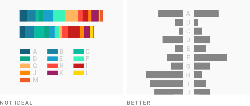
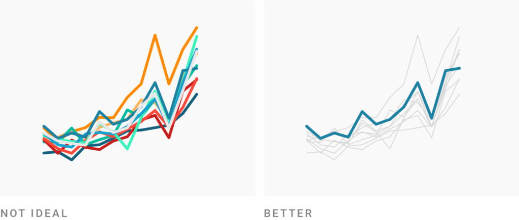
If you need more than seven colors in a chart, consider using another chart type or to group categories together. Colors make it easy to let readers distinguish between categories in your data, but try to avoid using more than seven of them. The more colors in a chart represent your data, the harder it becomes to read it quickly. Your readers will need to often consult the color key to understand what is shown in your chart. Consider using another chart type:
How to make better color choices
Consider using the same color for the same variables. If you just use one color for all your charts, using the same color is the best option to make your article not overly colorful. For example, it’s ok to show the unemployment rate in blue in the first chart and a few paragraphs later a GDP chart with the same color. However, if you use more than one color for your first chart, the colors in this chart will be “taken”. To not confuse readers and increase comparability, consider only using these colors again if you’re showing data about the same category/country/etc.:
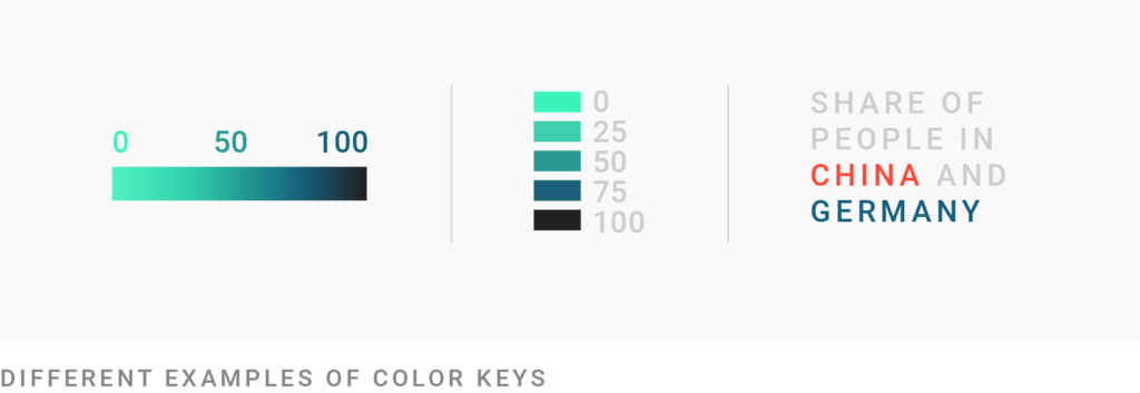
Make sure to explain to readers what your colors encode. Every visual mark that represents a value or variable should be explained: What does the height of your bar mean? What does the size of your circles on a symbol map represent? The same is true for colors. There are many ways to create a color key. Here are three of them:
Consider the color grey as the most important color in Data Vis. Using grey for less important elements in your chart makes your highlight colors (which should be reserved for your most important data points) stick out even more. Grey is also helpful for general context data, less important annotations, to show what’s unselected by the user, or to calm down the overall visual impression of your charts. Since grey can seem a bit cold, consider using it with a hint of color: Try a warm grey (grey+yellow/orange/red), or use another very light color as an alternative (e.g. super light yellow):
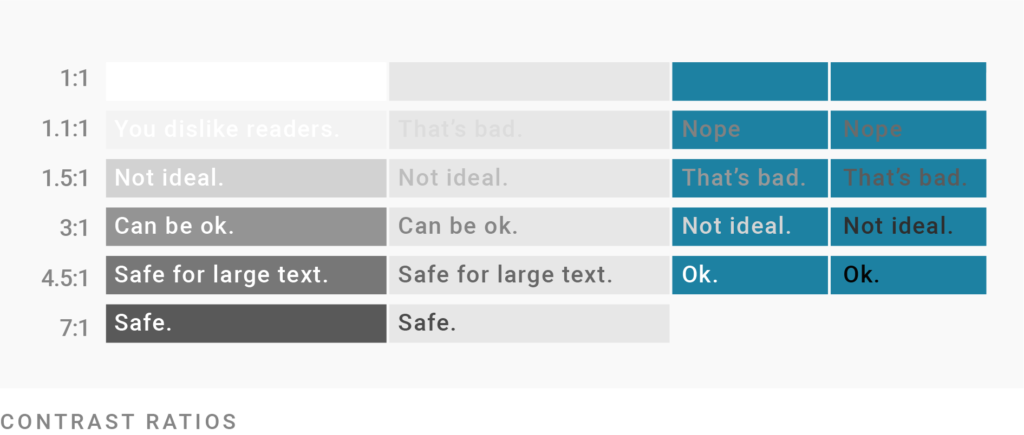
Make sure your contrasts are high enough. Caring about contrast means caring if your readers will be able to read your chart on their screen, even in low light, and even if you use light colors like grey. This is especially important for text: The smaller the text, the higher its contrast to the background needs to be for it to be readable. The contrast ratio between background and foreground should be at least 2.5 for big text and at least 4 for small text. In addition to having a high contrast ratio, avoid complementary hues (e.g. red and green, orange, and blue) and bright colors for backgrounds. Use this tool to test your color contrast, the brightness difference, and if colors are “compliant”.
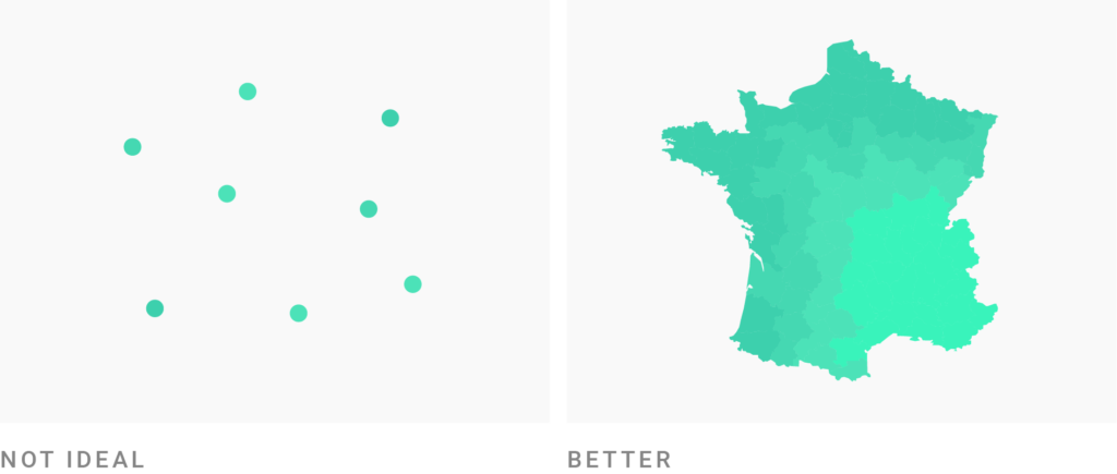
Consider where your colors appear in relation to each other. The smaller the areas on your chart and the bigger the distance between them, the harder it is to compare them. Consider giving small points or lines a high contrast in their hue or brightness, to make them easily distinguishable. However, big areas can handle toned-down colors with little contrast; especially if there is no other (background)color between these areas:
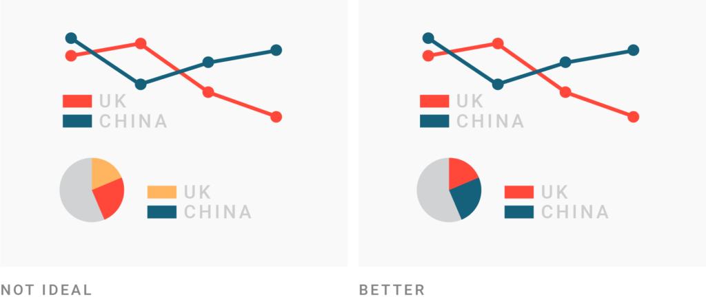
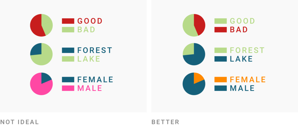
Use intuitive colors. When choosing a color palette, consider their meaning in the culture of your target audience. If possible, use colors that readers will associate with your data anyway, e.g. party colors: Republican = red, Democrats = blue; natural colors: forest = green, lake = blue; or learned colors: red = attention/stop/bad, green = good (to go). When it comes to color-encoding gender data, consider avoiding the stereotypical pink-blue combination. To not confuse your readers entirely, try a cold color for men (e.g. blue or purple) and a warmer color for women (e.g. yellow, orange or a warm green):
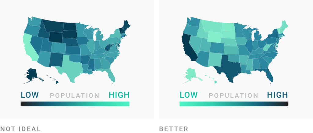
Use light colors for low values and dark colors for high values. When using color gradients, make sure that the bright colors represent low values, while the dark colors represent high values. This will be most intuitive for most readers:
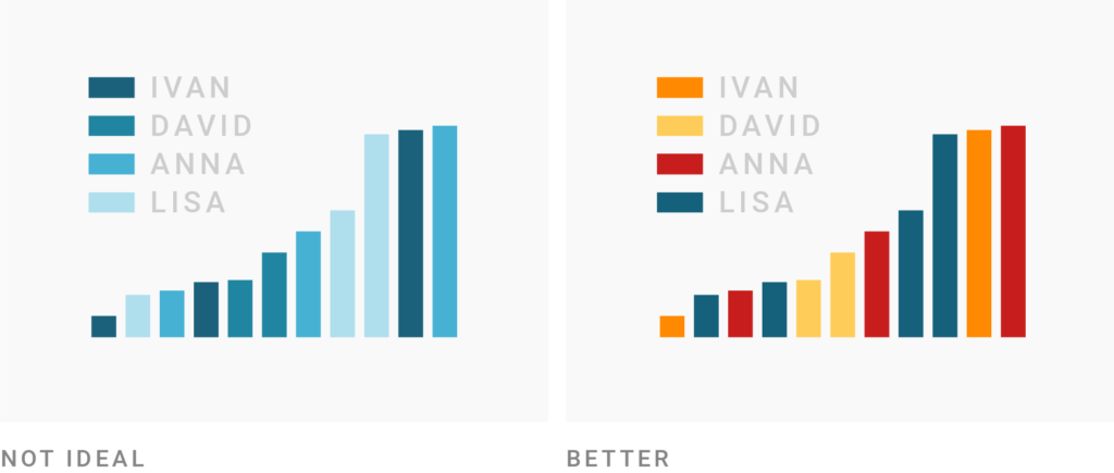
Don’t use a gradient color palette for categories and the other way round. It might be tempting to use shades of one hue (e.g. blue) even for categories, to make your chart look less colorful. However, since many readers will associate dark colors with “more/high” and bright colors with “less/low”, such a color palette will imply a ranking of your categories. Use different hues (green, yellow, pink, etc.) for your categories to avoid that, and to be able to talk about these colors. Readers might be quicker at finding specific categories if you make their colors stand out with a different lightness or saturation, but note that your chart should explain why these colors stand out. If you find your chart too colorful, consider another chart type for your data.
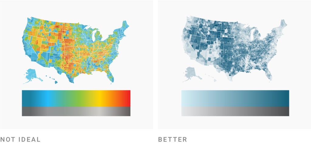
Use lightness to build gradients, not just hue. When designing color gradients, lots of consideration is needed. If you’re unsure, use the defaults of our data visualization tool Datawrapper, the ColorBrewer palettes or these Carto gradients. If you do want to try your hand at it: Don’t place more than two hues with the same lightness in your gradient, but design it from a bright color (e.g. white) to a dark color (e.g. dark blue) in a consistent way. Your gradient should work in black and white, too. Gradients with much variation in lightness (like rainbow scales) can confuse readers:
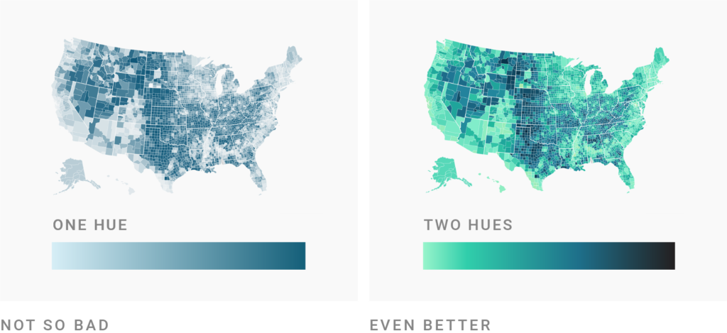
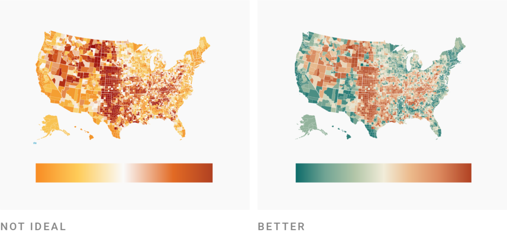
Consider using two hues for a gradient, not just one. This is the next step to make your map or chart even more decipherable. Readers will be able to distinguish the colors on the gradient better if they are encoded through lightness and (two or three carefully selected) hue:
Consider using diverging color gradients. If you want to emphasize how a variable diverts from a baseline (say the national average), you may want to consider using a diverging palette. It’s important to use clearly distinguishable hues for both sides of the gradient. The center color should ideally be a light grey, not white:
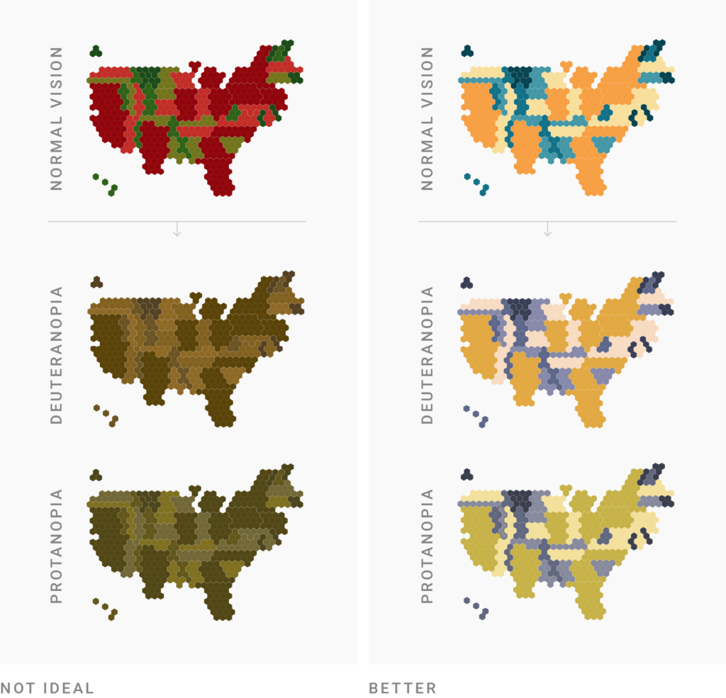
Consider color-blind people. Using different lightnesses in your gradients and color palettes has the big advantage that readers with a color vision deficiency will still be able to distinguish your colors. There are many different types of color blindness: Use an online tool or Datawrapper’s automatic colorblind-check to make sure that color-blind users can distinguish the colors on your chart. To learn more, visit our three-part series on visualizing data for colorblind readers: part 1, part 2, part 3.
Want to know more?
- The Power of The Palette: Why Color is Key in Data Visualization and How to Use It by Alan Wilson. Concise but still comprehensive introduction to sequential, diverging and categorial color palettes, with neat illustrations.
- Subtleties of Color by Robert Simmon. Exhaustive introduction to color theory in six parts.
- Viz Palette for Data Visualization Color by Elijah Meeks. Rules for color usage in data visualization that Elijah learned while he and Susie Lu created the tool Viz Palette, especially in the second part of the article.
- Make grey your best friend by Andy Kirk. Explains all the ways grey is important for data vis.
- How The Rainbow Color Map Misleads by Robert Kosara. Explains the shortcomings of the popular rainbow color scales.
- Data Stories: Color with Karen Schloss. Very recent podcast episode about general rules for color usage in data vis, and Karen’s research on the topic in particular.


Comments