
Remind readers of the colors in your data visualization
October 11th, 2023
12 min
This article is brought to you by Datawrapper, a data visualization tool for creating charts, maps, and tables. Learn more.
Your chart doesn’t need that many colors.

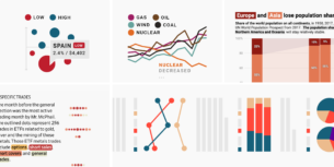
Sometimes, you want to visualize a lot of categories. Not just two or three. But twelve. Or fifteen. And soon, your chart looks like a confetti party… and is hard to decipher, not just for colorblind readers.
How can we avoid using that many colors in a data visualization? There are a few options. You can use this article as a checklist the next time you’re building a too-colorful chart:
01 Simply don’t show different colors Does your chart work without colors?
02 Show shades, not hues Can you make the chart less confetti-like?
03 Emphasize Can you only use color for your most important categories?
04 Label directly Can you use the same or similar colors but label them?
05 Merge categories Can you put categories together?
06 Group categories, but keep showing them Can strokes help to tell categories apart?
07 Change the chart type Will another chart type rely less on colors?
08 “Small multiply” it Can you split the categories into multiple charts?
09 Add other indicators Can you add symbols, patterns, line widths, or dashes?
10 Use tooltips and hover effects Can smaller categories be hidden with them?
Let’s start!
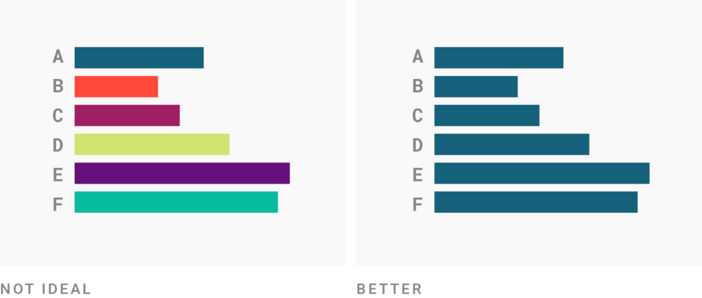
Sometimes, that’s a solution. Ask yourself: What is color for in your chart? What is it doing? What’s its job? Is it really needed?
For example: In simple bar charts, the bars are already separated by position (and with a gap) — you don’t need colors to do that job too.
Consider giving elements in your chart the same color if they’re already distinguished by another visual variable. If you’re not sure, just try it out and color your bars, symbols, lines, etc. the same. Then step back, and check if the chart would still be easy to understand for somebody who’s never seen it before.

Consider coloring categories in darker and lighter versions of the same hue instead of in different hues. It will make your chart look less like a confetti party, while still being easier to decipher than a chart where all categories have exactly the same color. The downside: Shaded categories are harder to tell apart than categories in different hues.
They also can change what people see in a chart. Let’s say you’re creating a stacked bar chart like in the graphic above. Using hues, as in the first example, puts the focus on the totals and their parts. Using shades changes the focus; the totals are now more important than the parts. Consider not using shades when the parts are as or more important than the totals. (I wrote at length about making this decision.)
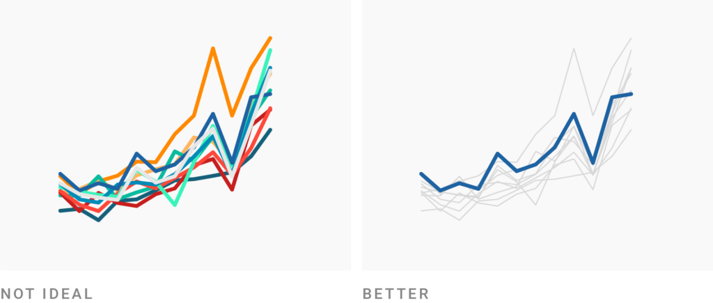
If your job is to communicate certain insights about the data (e.g., in an article, report, or presentation), there are always more and less important points you want to make — and therefore categories you can emphasize visually, while letting other categories recede into the background.
The following questions can help you figure out what the most important categories are in your data visualization:
Here are a few examples of charts that only highlight one or a few categories:
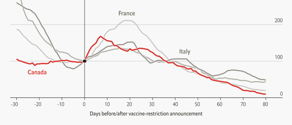
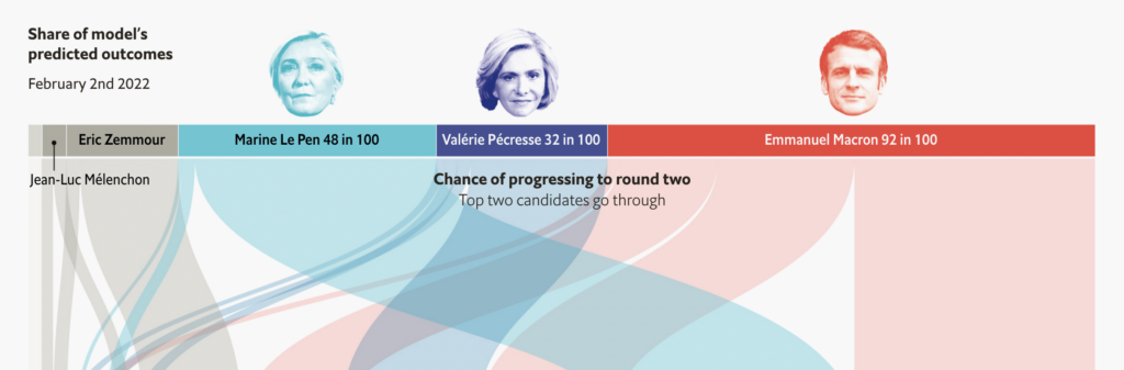
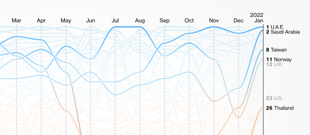
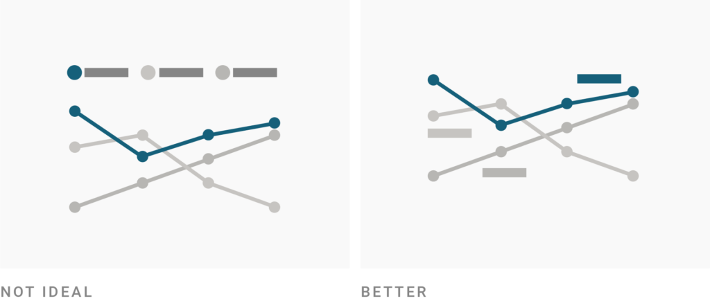
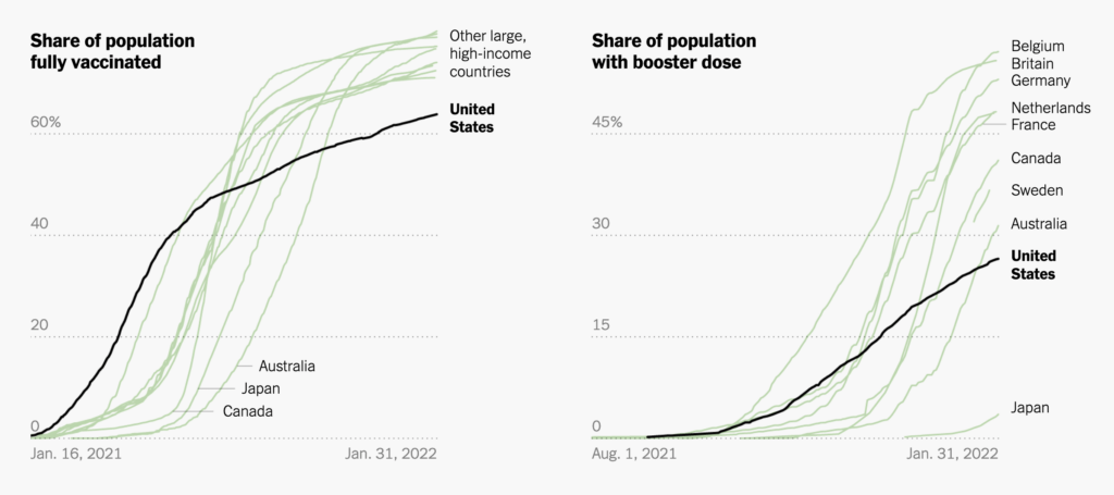
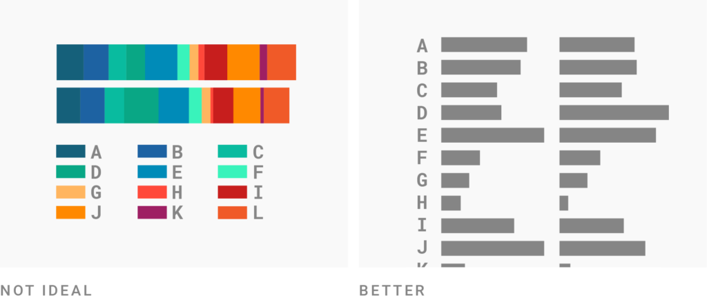
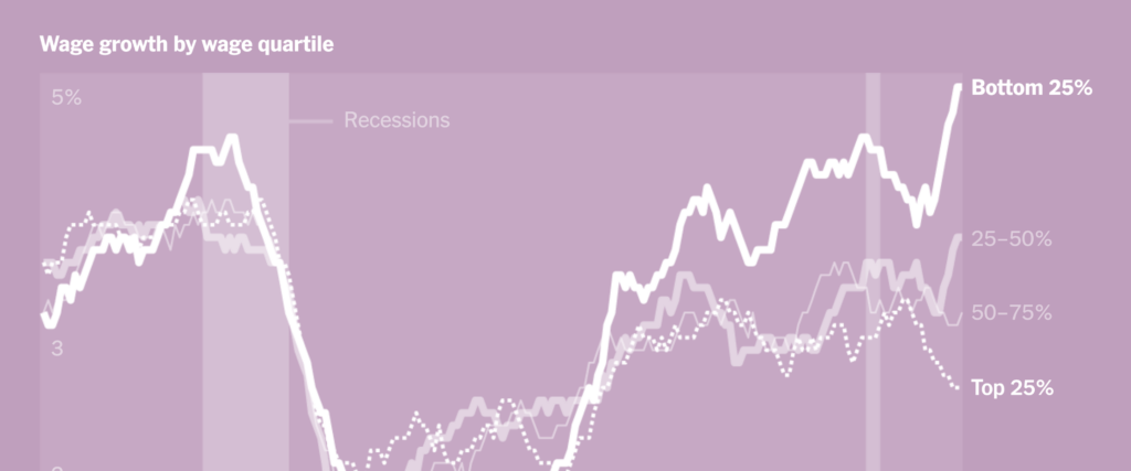
Direct labels allow you to color your categories in a similar or even same color and still let readers distinguish between them.
All of the examples from newsrooms above directly label the emphasized and (some of the) unemphasized categories. A color key explaining ⬤ U.A.E. / ⬤ Saudi Arabia / ⬤ Taiwain in the Bloomberg chart above wouldn’t work — direct labeling does.
The following New York Times chart makes heavy use of direct labeling for its same-colored lines:
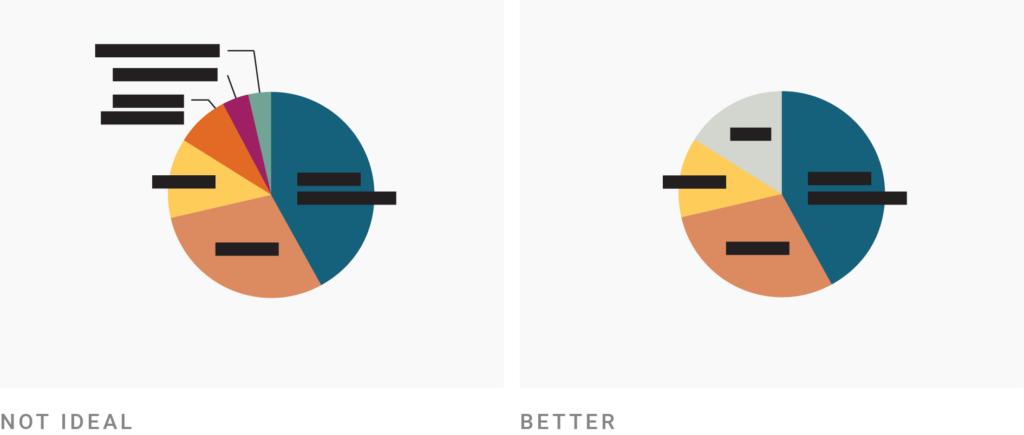
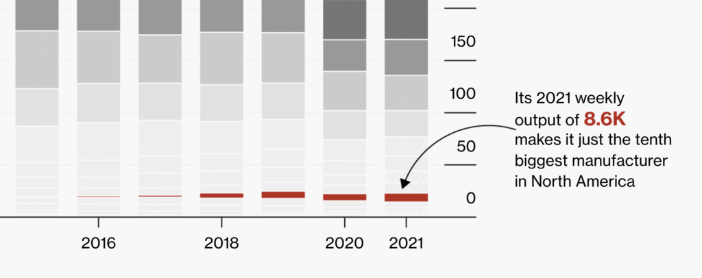
If you emphasize one or multiple categories, you’re basically placing them in two groups: “important” and “unimportant.” In some chart types, it can make sense to go one step further and group unimportant categories together into one. This will make it easier to place direct labels, and your readers won’t be overwhelmed by all the categories in your visualization. Sometimes, you can increase the chances that your chart gets read by decreasing the number of categories it shows.
You can group the smallest pieces together into an “Other” section, or find bigger categories — e.g. “Europe” for all European countries — in chart types like pie charts, stacked bar charts, or area charts.
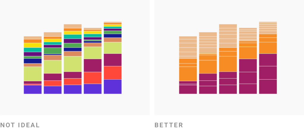
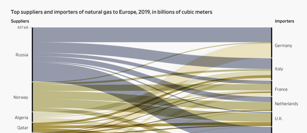
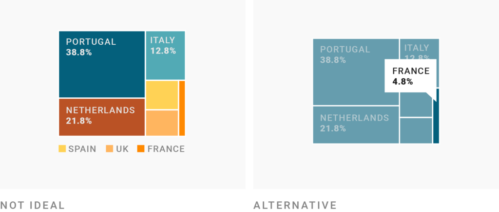
In some chart types, you can group categories into totals by giving them the same color — but still leave the original categories visible, e.g. by separating them with a stroke. This way, you reduce the number of colors and still communicate the size of the shares your totals are made of.
Here are two charts by the New York Times that both use white strokes around same-colored categories:

Changing the chart type might be your best bet in reducing colors when you can’t group or emphasize any categories. Instead of using color for your categories, another chart type might use position. That’s the case when you’re choosing a split bar chart instead of a stacked bar chart, like in the graphic above.
Here’s another example that “transposes” the rows and columns and therefore switches the categories that are encoded by color (A, B, C, etc. in the first example) and by position (US, UK, FR, IT, CH):
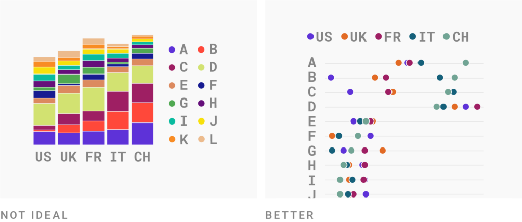
Whether a certain chart type works for your project really depends on what your readers should be able to see and compare in your visualizations. Play around with different visualization types to see which ones let your readers achieve these goals best. (Sometimes, two or three charts instead of one do the trick best.)
There’s one visualization type — some would call it a visualization technique? — that’s especially useful for reducing colors:
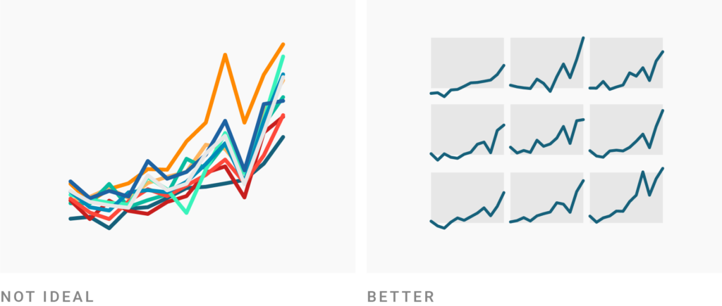
You can make a line chart, area chart, scatterplot, or stacked bar chart with many categories more readable by making small multiples out of them. Small multiples (also called panel charts or lattice charts) give each category their own little space instead of throwing them together in one chart.
Again: Whether that’s a good idea for your visualization depends on what your reader should be able to see. Small multiples make it easier to see trends or patterns in each individual category (“Iran’s GDP per capita had its peak in 2017”). But they make it harder to compare data points across categories (“Iran had a higher GDP per capita than China in 2017”). Whether they work for your data depends on what’s more important.
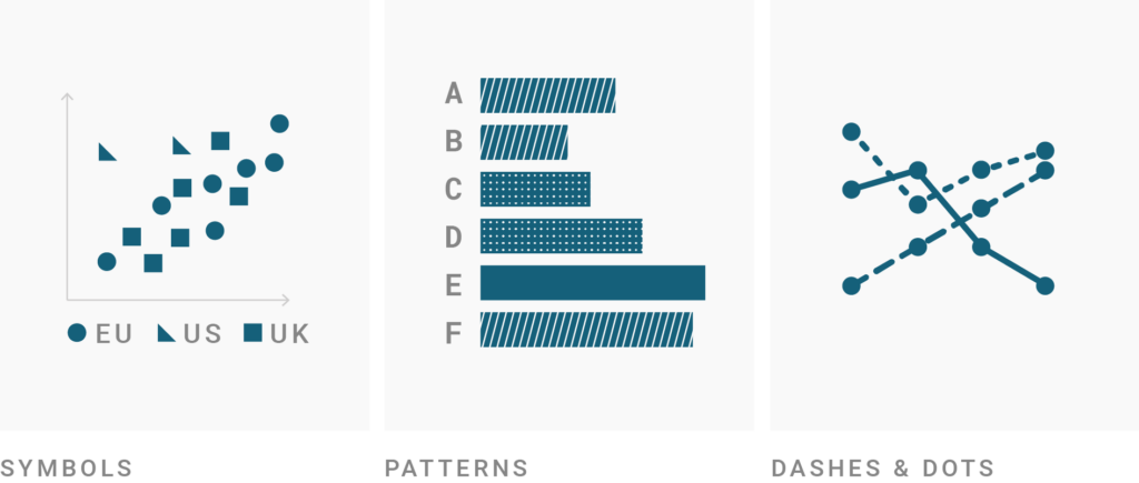
Consider changing the symbol shape in symbol maps or scatterplots, overlaying patterns in bar or column charts, or changing the line width and dashes in line charts. You could also tweak the opacity of your chart elements to better tell them apart.
Unfortunately, all of these extra visual indicators are fairly limited: Don’t use more than three or four different ones or your chart will likely be hard to decipher. In combination with colors, though, they can work quite well.
To see more examples and considerations about extra indicators, visit Frank Elavsky’s series on “No Use of Color Alone.” I also wrote more about symbols, patterns, and line widths and dashes in an article on colorblindness.
Tooltips can show your readers the label of a category once they hover over it. Unlike direct labels, tooltips allow readers to only see one label at a time. That makes it hard to search the chart quickly for one specific category, or to compare different categories with each other. Direct labels are more useful than tooltips.
Tooltips and hover effects (e.g. that elements get less opaque) are still a great addition that can help readers make sense of your visualization. If you simply don’t have the space for direct labels — or just have space for a few of them — definitely consider adding tooltips. In the Datawrapper app, tooltips and hover effects are on by default.
Don’t use tooltips for your most important categories, though. Always label them directly. (There’s a reason why this idea is the last one in this list.)
I hope some of these ideas help you reduce the colors in your visualizations. Does another trick work for you? Let me know! Leave a comment, get in touch at lisa@datawrapper.de, or write me on Twitter (@lisacmuth).
Comments