This article is brought to you by Datawrapper, a data visualization tool for creating charts, maps, and tables. Learn more.
That Frustrating Thing about Creating Data Vis in Newsrooms
or: Why I started to work at Datawrapper
tl;dr: I believe that it should be easier for journalists to create charts for their articles. The public will benefit from more context, and the Data Vis experts in their newsroom will have time to focus on bigger projects. Datawrapper is my best bet on a data vis tool for journalists. This article appeared first on Lisa’s personal blog.
The Problem
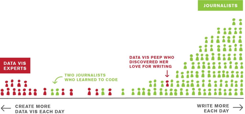
In newsrooms, two kinds of people deal with data visualisation:

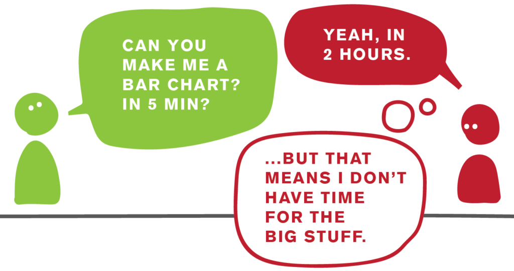
On the one side of the are the Data Vis experts. They use their full eight hours per day to create data visualizations (or prepare for it) or to go to data vis conferences. They know everyone in the scene and follow their peers in other newsrooms on Twitter to learn from them, but also to see if they came up with a better election results visualization. And they know shit. They can design, code and analyze data like pros (that’s because they are). They want to use their tools and skills to make something great. Something big. Something grand. And award-worthy! Dare I say field-changing!! And then they get tapped on the shoulder by the journalists and get asked: “Can you make us a bar chart?”
Journalists are the ones on the other side. They’re excited about their ideas, their sources, their stories, their writing. They’re also excited about charts – at least some of them – but only if time allows and if they’re brave enough. Because brave they need to be: Too often they went to the Data Vis experts on the other side of the newsroom and asked them for something seemingly simple. “Oh my, that’s complicated.” was the answer. Or: “That will take at least five hours/two months/a year to make.” So for journalists, charts and maps don’t seem like something that can quickly enhance their articles. Charts seem like a huge deal; rarely worth the hassle.
That leaves us with both sides being frustrated: Journalists are dependent on the Data Vis experts even for the simplest charts. And Data Vis experts want to make something big, but get held back by the Journalists.

The-world-is-not-black-and-white-note: The situation is not like that everywhere. I’m not even sure if the situation is like that in most newsrooms. In many newsrooms, Data Vis experts and journalists have found technical or organizational solutions (like internal charting tools) that work really well for them. But in too many newsrooms, I’ve experienced this frustration first-hand.
It pains me to see this frustration.
I don’t want Data Vis experts to make simple bar charts. I want them to make something great, big, grand, award-worthy, dare I say field-changing. Changing the field is important. As a designer by training, I have been interested in finding innovative ways to visualize data since I started to visualize data. It’s just tons of fun. And I’m very happy with the community around data vis precisely because there’s always someone doing something freshly; challenging all the others to think about what we should do, or why, or how. And these people should continue to challenge. They should not be held back by making simple bar charts eight hours a day.
I also don’t want journalists to get less excited about charts and maps because it seems like a big hassle. I want journalists to make more charts, not less. This is actually really close to my heart: I want journalism to give us all fewer anecdotes, and more context. (I talked and wrote about this a year ago.) And I see Data Vis as the new kid in town, waving, shouting “Heeeey y’all, I’m perfect for context! I’m here to give overviews! Comparisons! Use me!”. And I see that kid being all disappointed every time an article states “x was done to people 8942 times” / “Our country now does x 3839284 times” without explaining what that means (with a simple bar chart).
The Solution
So that’s where I see the solution: It should be damn simple to make that bar chart. For journalists to be independent, and for Data Vis experts to save time for the big stuff. No code. Just data in, bar chart out.
And that’s where a charting tool called Datawrapper comes in, and my reason to start working on it. After trying out 24 data vis tools, plus Datawrapper, I found that Datawrapper is the best choice for exactly that use case. Datawrapper sucks at scientific visualizations (better use R, Python or Plotly for that). It’s not great for analyzing big data sets (I recommend R or Tableau). And you won’t be able to make innovative stuff with it (d3.js, NodeBox or Lyra are a good choice for that).
But Datawrapper makes it damn simple to create that bar chart.
Data in, bar chart out.
Datawrapper delivers so well because it is niche. From the beginning, the team behind it didn’t ask: “What do people out there need to create data vis?”, but: “What do journalists need to create simple charts for their web articles?” Turns out: Responsiveness! Done. Good chart design even if you have no clue about charts! Done. Interaction! Done. Maybe also a way to style it in the newsroom brand colors and fonts? Done.
Datawrapper is not perfect yet. Sometimes the tooltips on the new map feature don’t show. Sometimes I change colors, and nothing happens until I reload the page. There are smaller bugs here and there. But the team, their goal and how they go there, impresses me a lot. And their company goal aligns with my professional goal: To enable journalists to make more charts, better-looking and faster.
So that’s why I end my freelance life (mostly for the Berlin newspaper “Tagesspiegel” in the last six months) and start to work at Datawrapper. Let the journey begin.
If you’re curious what I will do at Datawrapper, read this short article I wrote to answer that question.


Comments