
Remind readers of the colors in your data visualization
October 11th, 2023
12 min
This article is brought to you by Datawrapper, a data visualization tool for creating charts, maps, and tables. Learn more.
This is part 2 of a series on “Which color scale to use when visualizing data”. Part 1 / Part 3 / Part 4
In part 1 of this series, we clarified terms like categorical/qualitative color scale, sequential, diverging, classed and unclassed.
This article, part 2, tries to answer: When should you use a quantitative color scale (sequential or diverging, e.g., light blue, medium blue, dark blue), and when should you use a qualitative one (e.g., red, yellow, blue)?
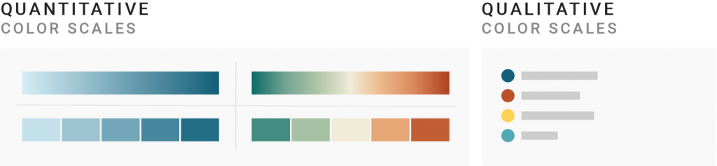
Here’s a disclaimer: To not use these very long terms quantitative color scale and qualitative color scale in this blog post, I’ll often use the less correct but easier-to-read words shades and gradients for quantitative color scale and hues for qualitative color scales.
So when should you use shades for your data? And when should you use hues?
1 Use hues when your values don’t have an inherent order
2 Use shades to emphasize an underlying order
3 Use shades to distinguish between sub-categories
4 Use shades to distinguish between highlighted and not-highlighted areas
5 Use shades to make (a few!) categories less colorful and easier to read for colorblind people
6 Use hues to better distinguish between categories
Let’s start with the answer that applies in 90% of the cases:
Use hues when you can’t order your color-encoded values. Use a sequential or diverging color scale when you can.
For example, if your values are industries or countries (Iran, Morocco, Pakistan), use hues: Morocco is not inherently better than Pakistan or the other way round.

If you want to encode e.g., unemployment rates (3.4%, 1.4%, 2%) with color, use a quantitative color scale.

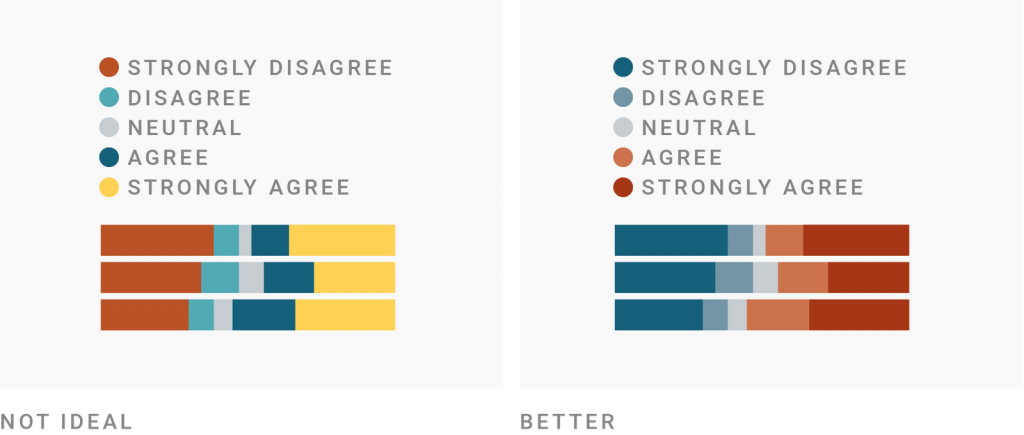
That’s not necessarily a question of text vs. numbers. There’s an inherent order to Likert scales (strongly disagree, disagree, neutral, agree, strongly agree) or clothing sizes (XS, S, M, L, XL, XXL). These are also quantitative scales, so strongly consider using quantitative color scales when you visualize them.
In 1946, the psychologist Stanley Smith Stevens introduced a theory of “levels of measurement” into nominal, ordinal, interval and ratio data. It’s still widely used, so you might have heard of this classification (also called “NOIR”). I don’t think it’s necessary to understand his levels to visualize data well, so don’t bother if you just want an overview. For everyone else, here it comes:
– Nominal data is qualitative data (also called “categorical data”), like gender, genre, countries, industries; or binary distinctions like yes/no. You can’t do any math operations on them. You can’t even rank them: “Male is inherently better than female” is not a valid statement.
– Ordinal data are already quantitative – because they have an inherent order and therefore can be ranked. They can still be categories, though. Examples are Likert scales and clothing sizes, officer rankings (think police, military, etc.), gold/silver/bronze, the orders of runners finishing a race, or binary data like “wrong/false” or “guilty/not-guilty.” With ordinal data, you can make statements like “gold ranks higher than silver” or “right is better than wrong”, but you can’t sum up, subtract, multiply or divide it.
– Interval data looks like numbers and while they are quantitative, they have an arbitrarily set zero. Examples are years, temperature in Celsius, or BMI. You can sum or subtract them, so you can make statements like “30 years before 1970 was the year 1940,” but you can’t multiply or divide interval data.
– Ratio data are the stereotypical quantitative data with a true zero, like revenue, age, distance, price, or the number of sales. You can sum them up, subtract, divide and multiply them (“Today I’m three times older as I was ten years ago”).
So which color scale should you use for which? It’s as simple as you hoped it would be: Use qualitative color scales for qualitative data, and quantitative color scales for quantitative data. Meaning, use hues for nominal data, and gradients for ordinal, interval or ratio data. Here’s a good overview by Adobe.
But let’s go a bit deeper. Because when you look at great data visualizations out there, you’ll sometimes find qualitative data visualized with a quantitative color scale as well as the other way round. Here’s why that is:
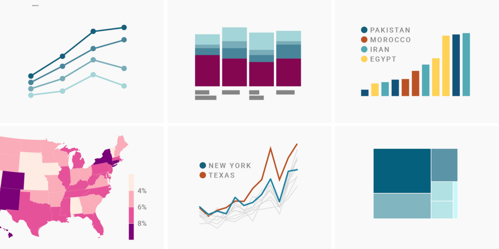
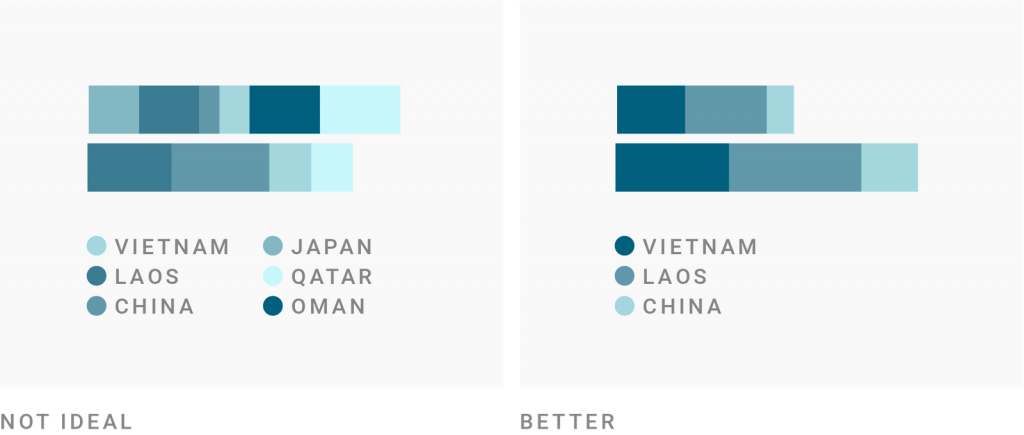
There is always some number underlying your categories. That could be simply the values that your categories are encoding (like the unemployment rates in states). Or the count of your subcategories. Or the rank of your categories (Vietnam: 1st, Laos: 2nd, etc.). You can use qualitative color scales to show these underlying values.
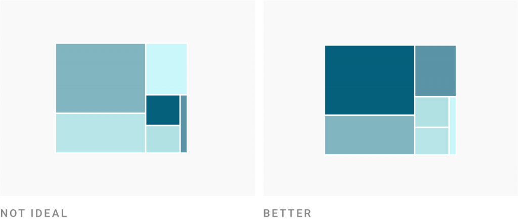
Treemaps are a good example:
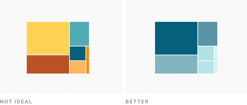
Yes, you could color your categories in a treemap (e.g., to define countries or industries) by hue, like on the left. But your treemap becomes better readable (and less like confetti) if you color them by the box size.
“Wait a second. Why not go one step further?” you might think. “I could use the color to encode a completely new variable!” For example, if you order your boxes by the unemployment rate, you might consider coloring them by GDP per capita. Or, if you order your boxes by revenue in a certain country, you could color by global revenue.
You could. But it’s very, very hard to read.
The treemap on the left tries to do too many things at once. Even with a great color legend, reading a chart like this one is a challenge.
In most chart types, avoid coloring by values that are not already encoded by, e.g., position or order. If you want to color underlying values in a chart that should be quick to read, make sure these values are already visible without color.
It’s a tricky decision to make. Using color to encode a new variable makes most charts incredibly hard to read – but there are some where it works. Let’s look at two more examples to increase your intuitive understanding to make this decision.
First, here’s a chart by data visualization researcher Stephen Few. He created it in 2008 for his paper “Practical Rules for Using Color in Charts” (PDF) and I recreated it in Datawrapper. What do you think: What work is the color doing here?
Here’s what Stephen Few says about this chart:
We […] meaningfully assign these colors to the four sets of bars […] to encode the order in which four manufacturing facilities performed relative to the production plan during the course of the year as a whole, from the worst (California, with the darkest set of bars) to the best (Montana, with the lightest).
I believe that only very few people got that the colors signify the yearly variance – because of a few minor, fixable reasons and two major reasons. Here are the smaller ones:
But even if Few would fix this all, I still don’t think his coloring would work. Here are the two big reasons:
I don’t want to leave you with the impression that coloring by an underlying variable that’s not already encoded is always a bad decision. Here’s a counter-example by The Economist:
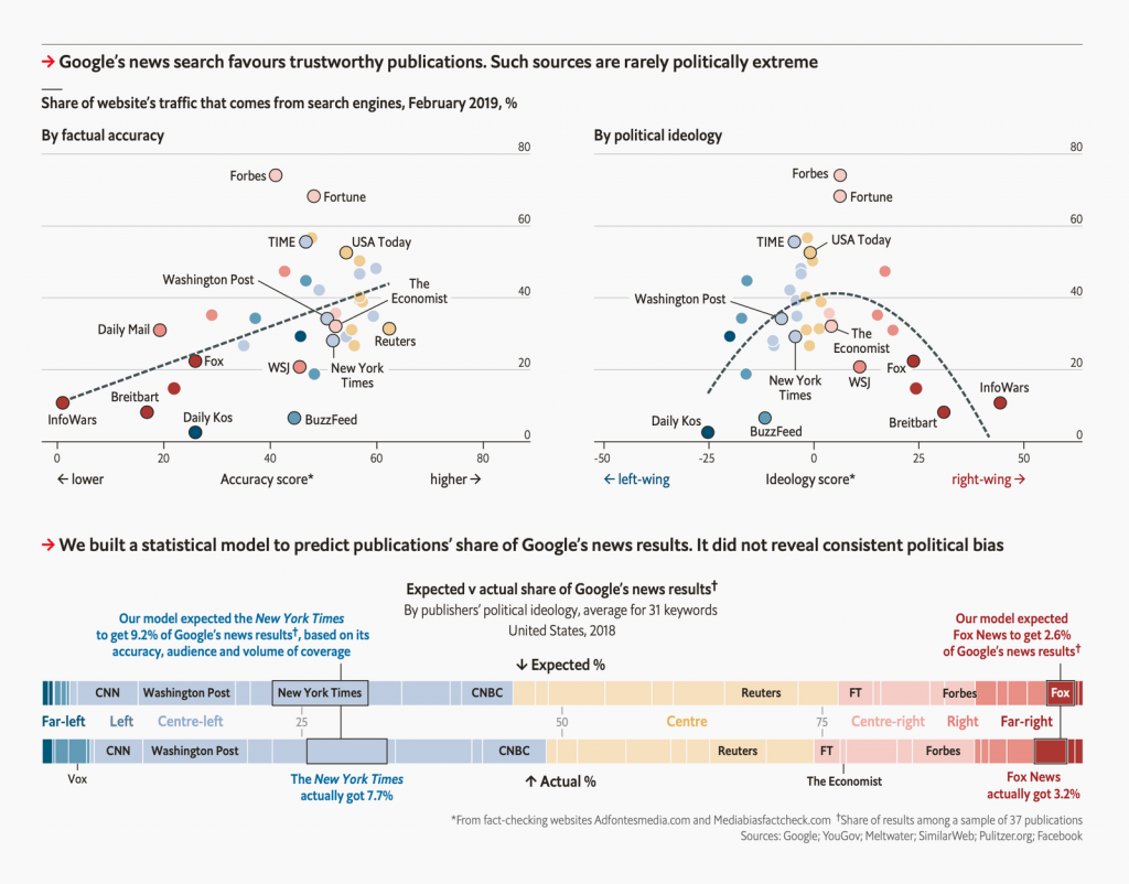
Let’s focus on the scatter plot in the top-left. Scatter plots are one of the few chart types where coloring by underlying values without encoding them by, e.g., position, length, etc., can work surprisingly well. I assume that’s because scatterplots are similar to symbol maps, where readers are used to seeing dots colored by underlying values.
And still, it takes us a few seconds to understand that Economist chart.[1] Note how the scatter plot to the right is easier to read because it double-encodes: The political ideology is shown by position (left and right) and shades.
But I’d argue that the scatter plot on the left works, too – and precisely because of the scatter plot to the right and the stacked bar chart below: They both function as big color keys on how to read the colors of this first scatter plot.
These big color keys are essential. No matter if you’re coloring by a new or already encoded variable, only do so if it’s easy to spot which value your shades are (double-)encoding.
So far, we’ve looked at treemaps, column charts, and scatter plots; so let’s take a line chart as an example:
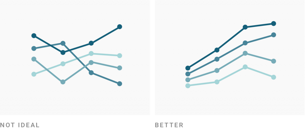
In both of these line charts, the shades are used to double-encode the order of lines at the first date. But in the chart to the right, it’s way easier to see that – because the lines are ordered the same throughout the chart. The chart on the left leaves us confused.
There are more reasons to color qualitative values by a quantitative color scale instead of a qualitative one. Here’s one: To distinguish between subcategories. The following Economist chart shows how:
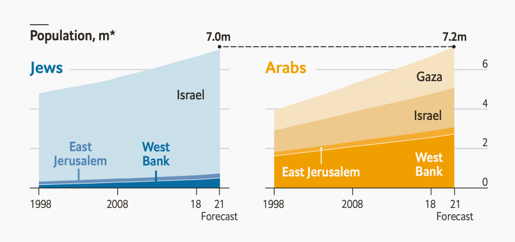
The categories are Jews (blue) and Arabs (yellow). The subcategories are the territories, shown in blue and yellow shades.
Here’s a similar example:
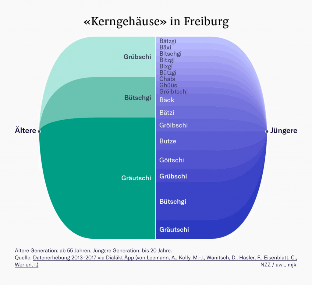
The NZZ uses hues (green and blue) to help readers distinguish between the two categories Ältere (the elder) and Jüngere (the young). And the shades help differentiate between the subcategories: which words elderly and young people use to say apple core.
(Note that both charts don’t need colors at all: All areas could be gray with white lines separating them. That’s because all these areas are directly labeled. The words Gaza, Israel, Ältere, Gräutschi, etc. directly appear in the charts, making a color key obsolete. Unlike Few’s chart above, these colors are freed of the task to show readers which category they represent.)
Ok, ok, I hear you protesting: “The subcategories in these two examples have an underlying order; that’s why the designers used shades! Not because they’re subcategories.” So here’s a chart I worked on that shows a slightly different approach:
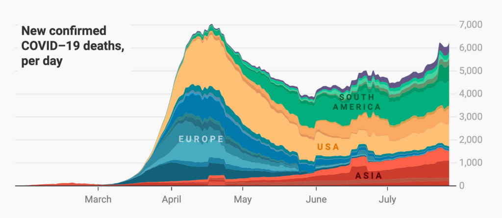
Unlike the two charts we’ve seen so far, the shades within the individual categories (Asia, Europe, etc.) in this example are in no order. The subcategory at the bottom/top is not the darkest/lightest or the other way round. I could have done that. Instead, I brought darker shades between lighter ones, to make countries with only a few cases better visible. (It’s especially obvious in the yellow part).
This works, too, because readers won’t expect the shades to tell them anything about the values. When you introduce subcategories, your readers intuitively understand that the job of the shades is to help them distinguish between them.
Your categories don’t need to have the same importance. If you want to highlight one category, it’s totally ok to color all other ones in shades of one hue (often gray):
This chart basically turns the categories (married, single, divorced, widowed) into subcategories, by sorting them into bigger categories (highlighted and not highlighted). As we’ve just seen, shading within subcategories doesn’t confuse readers – so this chart doesn’t do so, either.
There’s this mantra in data visualization that helps practitioners make their data visualizations accessible for vision-impaired readers: “Get it right in black and white”. The idea is that colors should have different brightness levels so that it’s easy to distinguish them if you turn them into grayscale.
Well, ok then – what’s the darker color, this ⬤ or this ⬤? How about ⬤ and ⬤? Surprise: The first two colors both look like this ⬤ in black & white. The last two colors both look like ⬤.
It’s hard for mere mortals to judge the lightness of two colors if they have different hues. So “get it right in black and white” is easier to achieve for data vis practitioners if they use shades of only one hue.
Plus, by using only one hue, your boss (or readers) won’t complain that it looks “too colorful”. If you’re visualizing a serious topic, that might be high on your priority list.
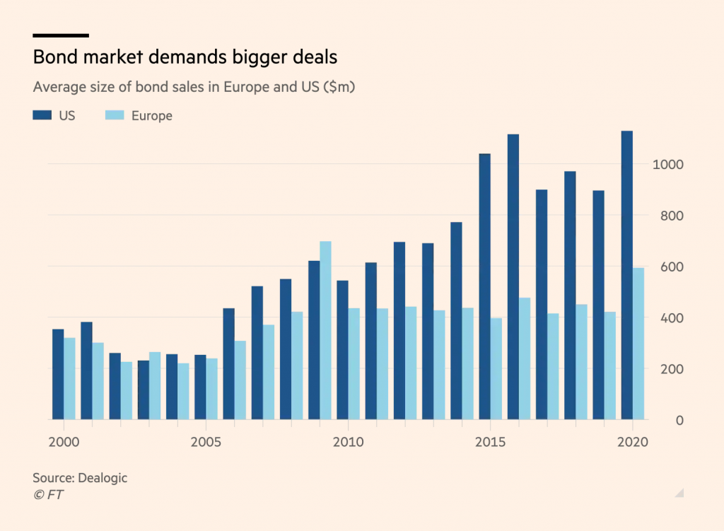
These two reasons – more likely accessibility and a more professional look – might convince you to choose shades more often than hues when it comes to categories. And it can work. The Financial Times does so here:
But there are some things to keep in mind when attempting this.
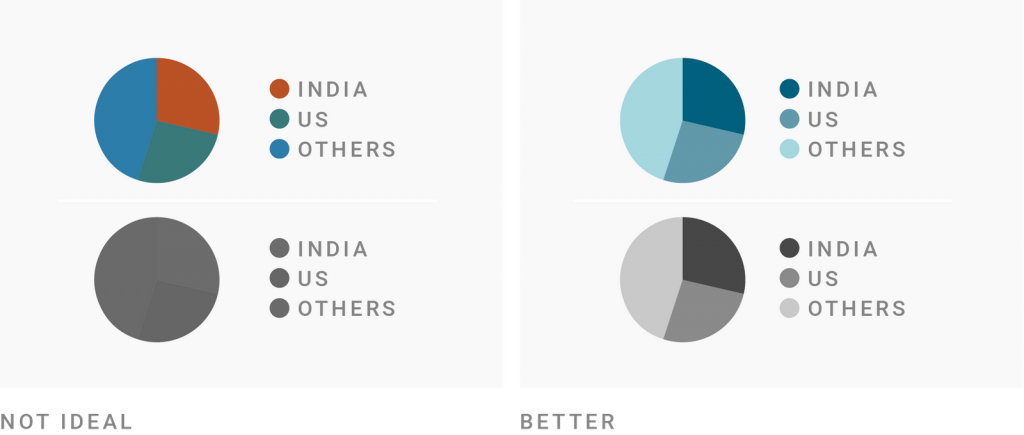
First, expect some readers to “rationalize” your colors. Even if it’s not your intention, they might search for an explanation why shades are used. “The US is shown with a darker color because it has higher values.” Or: “…because it’s more important for the story.” Don’t color randomly.
Cynthia Brewer made that same point when she talked about showing binary data (yes/no, public/private, present/absent) on maps: “The map maker decides which category is more significant given the purpose of the map, and the more important of the two data categories should be darker. If neither binary category is of greater importance, treat the scheme as qualitative with only a slight lightness difference between two hues.”[2]
Second, as a rule of thumb, the more shades you use to encode categories, the harder it becomes to read. It’s doable to distinguish between two, three shades of the same color. Your readers will give up with four, five, six different shades, especially if they’re not ordered and/or directly labeled and/or use just one hue (light blue to dark blue), not multiple (light yellow to dark blue).
Third, if you do want to use shades, keep to the shades of one hue if there’s no meaning in introducing a second one.
Here’s an example. To avoid using too many shades of one hue, the Financial Times sometimes shows shades of multiple hues:
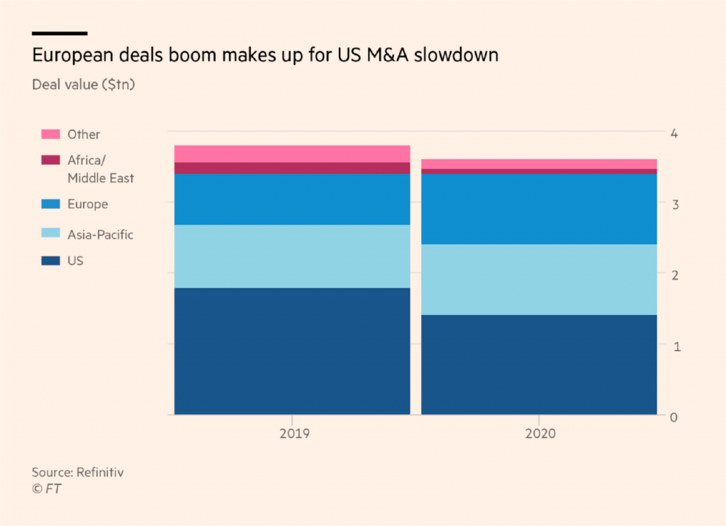
This doesn’t work well. Are “Africa/Middle East” and “Other” in another category than the blue parts? The chart author probably didn’t want readers to interpret their chart like that – but they likely do.
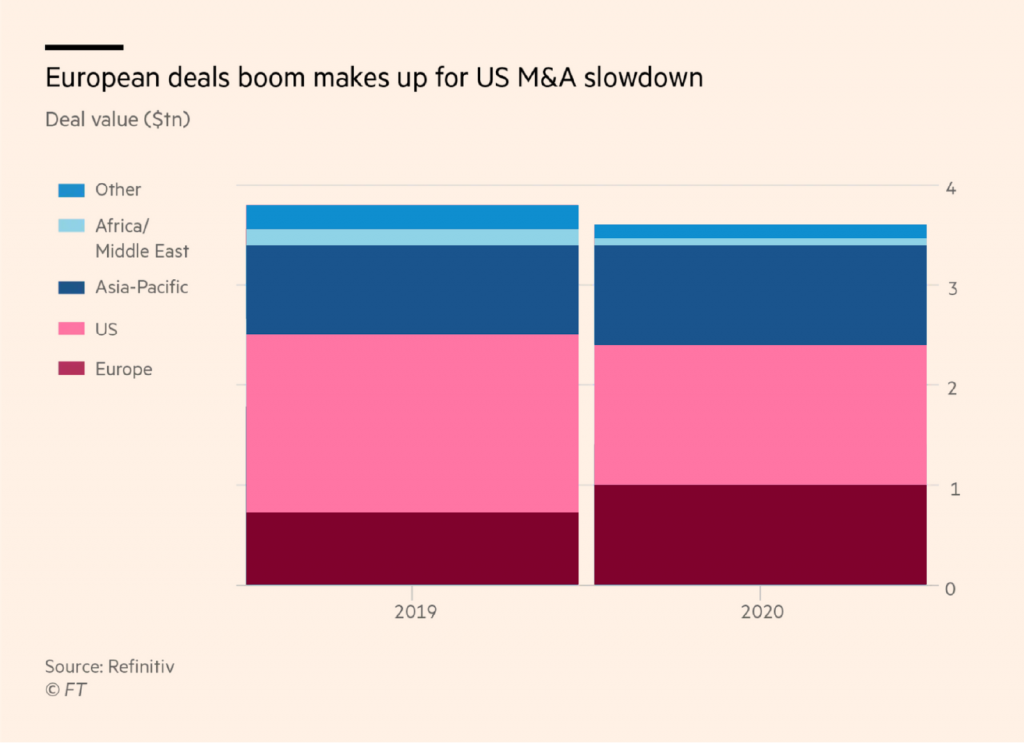
If you find yourself using too many shades like the FT chart designer, use another type of visualization. Or ask yourself what your statement is and highlight the parts you want readers to see with another hue and its shades – like Europe and the US in this FT chart:
So far, we overwhelmingly looked at reasons to use shades instead of hues: to emphasize an underlying value, to distinguish between subcategories, or to make your chart more accessible and less colorful. Here’s a reason to use hues when you could also use shades:
A while ago, the Financial Times published a chart grouping selected European countries in different “facets” – depending on if they saw a large/moderate/slight increase in new recent Covid-19 numbers or a decrease (called At through).

Steven Bernard and John Burn-Murdoch, the designers of this chart, decided to use hues for the different countries in each group. Data vis designer Cédric Scherer wasn’t convinced. “[I] would likely use a sequential color ramp for each facet,” he replied on Twitter, and even made a quick sketch of what he had in mind. It looked a bit like this:
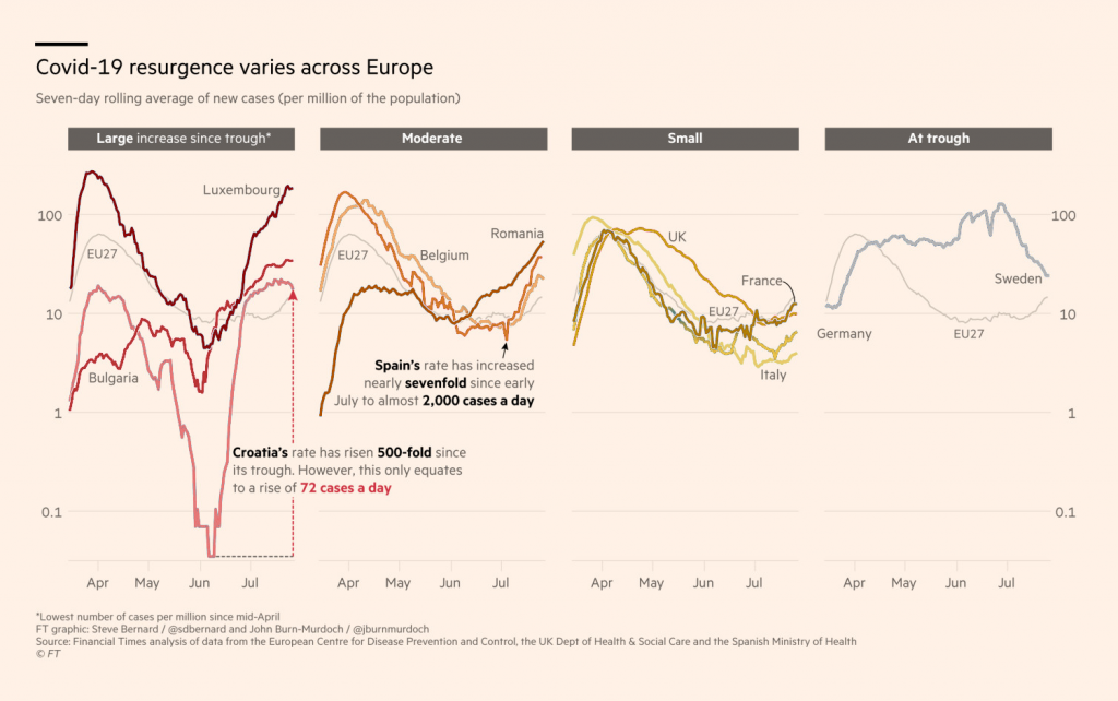
I asked Steven why he used hues instead of shades. Here’s what he replied:
The rationale behind the colouring was really to make the lines as distinct from each other on each chart whilest keeping the ranking the same across the four charts. Using a different coloured sequential palette I feel would be much harder to spot the same ranking across the four charts. The approach we adopted allows the viewer to see from the first chart that dark blue is highest, pink 2nd, light blue 3rd and green 4th and follow that order across the other three.
When looking at Steven’s chart, I didn’t get that the dark blue line ranked first, the pink line scored second, etc. I think that’s due to two reasons: As illustrated above, it’s hard to spot quickly that shades/hues are double-encoding something in an entangled line chart. And second, readers (like me) don’t expect hue-encoded categories to have an order. If they had an order, they would be encoded with shades.
And still, I think that the hues work well in Steven’s chart. It is indeed easier to follow the line for Belgium or the UK in his version than in my remake.
Like so often, the question is: What do you want to optimize for? In this case, the FT optimized for enabling readers to distinguish entangled lines instead of emphasizing the order.
This was part 2 of a series on “Which color scale to use when visualizing data.” If you decided that you should shades instead of hues, there are two more questions: Click here to go to the next part of the series where we answer if you should use a sequential or a diverging color scale. And in part 4, we learn how to decide for a classed or unclassed data scale.
References
Comments