
Remind readers of the colors in your data visualization
October 11th, 2023
12 min
This article is brought to you by Datawrapper, a data visualization tool for creating charts, maps, and tables. Learn more.
Choosing good colors for your charts is hard. This article tries to make it easier.

Choosing good colors for your charts is hard. This article tries to make it easier.
I want you to feel more confident in your color choices. And if you have no sense of color at all, here’s my attempt to help you find good ones anyway. We’ll talk about common color mistakes I see out there in the wild and how to avoid them.
This is not the right article for you if you’re trying to find good gradients or shades. But if you need to find beautiful, distinctive colors for different categories (e.g., continents, industries, bird species) for your line charts, pie charts, stacked bar charts, etc., then read on.
00 Before we start…
01 Broaden your understanding of colors
02 Don’t dance all over the color wheel
03 Use saturation and lightness to make your hues work
04 Use warm colors & blue
05 When using green, make it a yellow or blue one
06 Avoid pure colors
07 Avoid bright, saturated colors
08 Combine colors with different lightness
09 Make your colors equally “colorful”
10 Avoid too little contrast with the background
11 Avoid too much contrast with the background
12 Choose a background that’s desaturated enough
13 Copy colors, or understand them
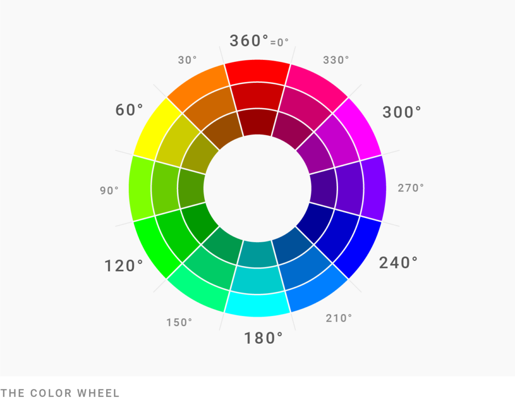
I will mention saturation, brightness, and hue a lot. The HSB (Hue, Saturation, Brightness) or HSV (Hue, Saturation, Value) color spaces work fairly well to check them:
To convert your colors from HEX (e.g. #cc0000) or RGB (e.g. rgb(207, 176, 58)) to HSB/HSV, use a tool like colorizer.org.
A relative of HSB/HSV is the HCL color space. It uses the same parameters (Hue, Chroma = saturation, Lightness), but is closer to “how we really see colors.” Datawrapper uses the HCL color space for its color picker:
But since you won’t find HCL in Adobe Photoshop or colorizer.org, every time I mention degrees (like 0°) or percentages, I’ll be talking about the HSB/HSV color space.
All right, let’s do this:
You might think like this: “I need five colors for my chart. So I’ll use green and yellow and blue and red. And… um… maybe orange? Or purple!”
If you haven’t thought much about colors since you were a kid coloring in your coloring book, this thought makes sense. So today I’m here to tell you: There are more colors than that.
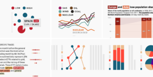
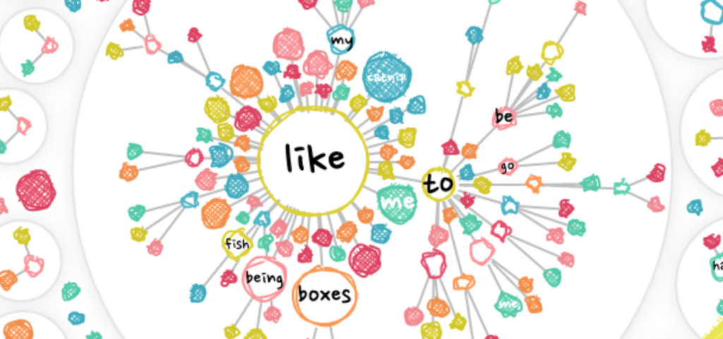
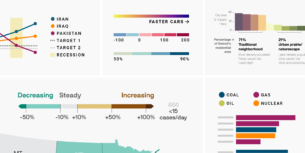
Look at this graphic’s colors and compare them with the basic ones ⬤⬤⬤⬤⬤⬤:

They’re different. The red that Nadieh uses ⬤ is different from your typical red ⬤. The green ⬤ is… can you even call it a green ⬤?
So before we impose rules that limit us, let me freak you out a bit: There are thousands of colors you can use. There is yellow-ish red ⬤ and blue-ish red ⬤ and everything in between. There is gray ⬤, but there is also cold gray ⬤ and there is warm gray ⬤. And then there is blue. So much blue! Like this ⬤, this ⬤, this ⬤, this ⬤ and this ⬤. And we haven’t even talked about orange and yellow.
You have lots of choices. Which means you can stay in a small area of the color wheel and still have many options. Which means:
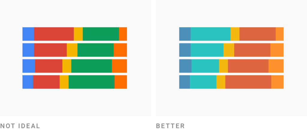
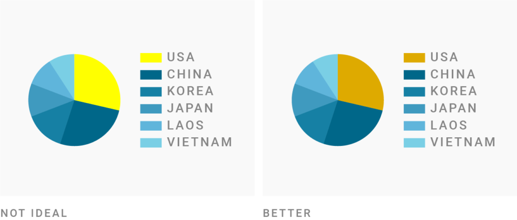
There’s no need to rely on hues from all around the color wheel like ⬤⬤⬤⬤⬤⬤ for your visualizations. It will look more professional — and therefore more trustworthy — when it only uses a few hues and their neighbors.
Here’s where it becomes a good idea to actually look at a color wheel. You can use Adobe Color or Color Calculator to do so.
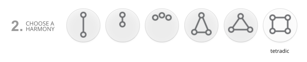
Lots of these tools let you choose different harmonies. One of them is called “square” or “tetradic.” Don’t use it. It will result in too many hues — and we’re on a mission to avoid that.
In the video above, I used the color tool Paletton to start with a tetradic harmony and then decrease the distance. Note how much more beautiful the color combinations become.
If the distance becomes small enough, you’re basically using complementary colors. And that’s a great choice! Lots of complementary color pairs look fantastic together. When in doubt, use complementary colors and their neighbors.
So let’s do this — this time with Adobe Color:
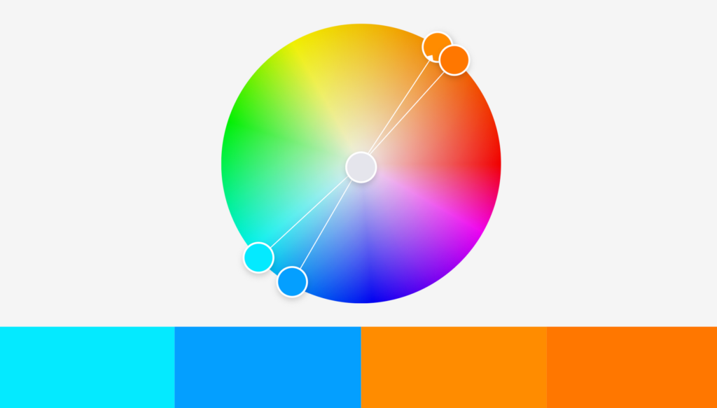
Our colors are opposite each other on the color wheel, so they’re clearly complementary. Yay! But they’re also unusable: The two oranges are way too similar. And everything looks so… bright.
There’s where we need to change the saturation and lightness:
Saturation and brightness are as important as hue. In fact, you can create new colors when you change just the saturation and brightness. Here are two color pairs with the same hue, just different saturation and lightness: ⬤⬤ / ⬤⬤. (If you change the hue just a tiny bit, you’ll achieve even better results: ⬤⬤ / ⬤⬤.)
Let’s come back to our color combination: ⬤⬤⬤⬤. After playing around with the saturation and darkness, it becomes this:
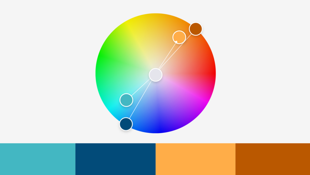
I desaturated the light blue ⬤ and the lighter orange ⬤ and made every color darker except the lighter orange. Heck yeah, we can work with that!
So if your color combination doesn’t look awesome yet, don’t immediately add another hue. Change the saturation and lightness first and see if that’s better.
That’s what I did to all of these color palettes: ⬤⬤⬤⬤ and ⬤⬤⬤⬤⬤ and ⬤⬤⬤⬤. They’re all roughly complementary, and they all come with different saturations and lightness. That’s what makes them work.
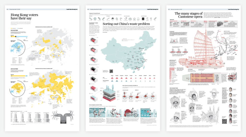
There’s a complementary color combination that is especially loved by data visualization designers: yellow/orange/red and blue. Scroll through graphics portfolios like this one from the South China Morning Post or this one by The Economist (PDF), and you’ll notice that they use these colors far more often than colors like purple or green.
That’s because these warm colors and blue are super versatile for categories. Yellow and orange and red look very pleasing together, but people will still perceive them as different: ⬤⬤⬤ — which is exactly what we want for categorical colors. And blue is more flexible than any other hue. Lots of blues, no matter if dark ⬤ or light ⬤ or saturated ⬤ or not saturated ⬤, look pleasing, calming, and professional.
And they are accessible: colorblind people can easily distinguish blue and orange/red from each other.
So when in doubt, use an orange/red with blue.
Forest green covers a full sixth of the color wheel, from approximately 90° ⬤ to 150° ⬤, with 120° as its peak ⬤. However, you will find few well-designed visualizations that use it. Why is that?
First, forest green is just very dark. And lightening the forest green means going into an awkward neon ⬤. So you need to lighten and desaturate green enormously — more than other color — to get to a nice one. That’s exactly what the Washington Post does with their green ⬤ here:
It’s a 142° green, but only 14% saturated. Here’s what the same hue with the same brightness would look like 100% saturated: ⬤. Yikes.
And remember our colorblind friends: A pure green in combination with red, orange, or brown is hard for them to distinguish.
So when using green, make it a bit yellow or a bit blue. You can see this in the examples at the top of this article: All of the greens except FiveThirtyEight’s ⬤ have a hue greater than 160° (= bluer) ⬤⬤⬤ or less than 60° (= more yellow) ⬤⬤. Nadieh uses both yellow-green and blue-green in this project we’ve already seen:
Looks like you can use them in your visualization as two different colors, as Nadieh does: Win-win!
“Pure” hues are the ones that are located at exactly 60°, 120°, 180°, 240°, 300°, or 360°/0° in the color wheel:
Here’s an example: In HSV/HSB, the Hue value of this bright blue ⬤ is 180°, the Saturation value is 67%, and the Lightness value is 91%. You can also check the RGB values of your color: If at least two of the values are the same, they’re “pure”. For example, our ⬤ is a rgb(77, 232, 232).
To make your colors look more natural and pleasing to your readers’ eyes, you can either tone down the saturation of pure colors or make them darker. If you want to have bright, saturated colors, rely on mixed colors at least 5-10° away from the pure hues.
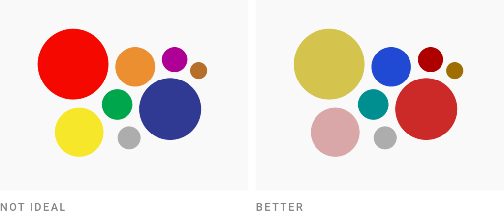
In the image above, the red and orange, the blues and the greens have the same saturation and lightness. The only difference is the hue: The red ⬤ (0°), blue ⬤ (240°), and green ⬤ (120°) look more colorful than the orange ⬤ (40°), medium blue ⬤ (211°), and blue-ish green ⬤ (170°).
Neon colors will definitely attract the attention of readers. But these readers won’t thank you. Most of us get a bit stressed out when we see them: “Highly saturated, light colors will NOT be appropriate [to communicate] Serious or Trust, or Calm,” researchers Bartram, Patra, and Stone explain in their paper “Affective Color in Visualization” from 2017 (PDF).
If your colors come close to 100% saturation and 100% brightness, it’s likely your colors are too colorful. That’s definitely the case for pure colors like ⬤⬤⬤⬤.
“But I’ve seen such crazy colors before, and they look good,” you might say, and refer to projects like these:

But if you compare the colors from these examples with colors like ⬤⬤⬤⬤, you see how the former ones are all less saturated or darker. A 100% saturated and 100% bright green ⬤ becomes less saturated in the New York Times ⬤, and less saturated and darker in both the Bloomberg article ⬤ and the Pudding article ⬤.
They have the same fun, attention-grabbing effect as neon colors have, while being easier on the eye.
This works more or less because the people at The Pudding, The New York Times, and Bloomberg are great designers. When in doubt, avoid 100% saturation combined with 100% lightness.
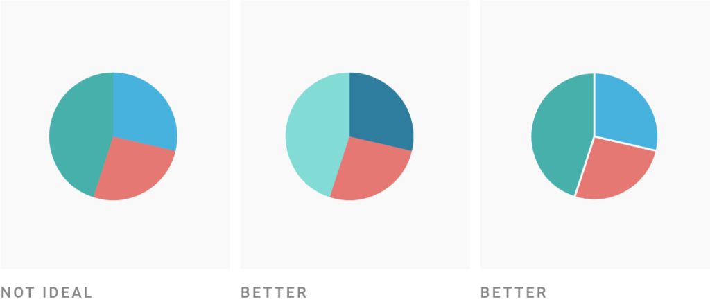
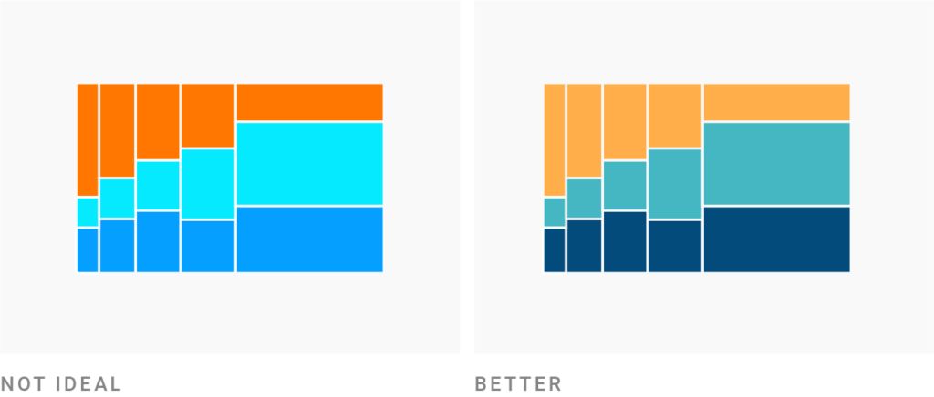
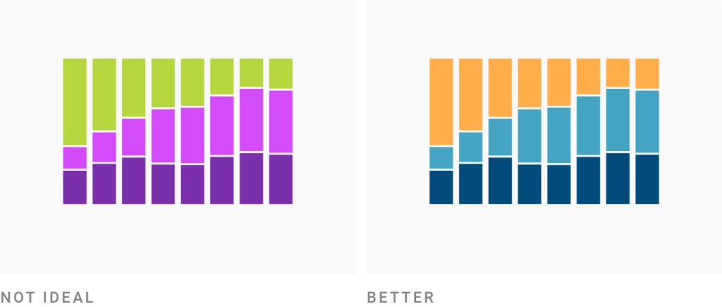
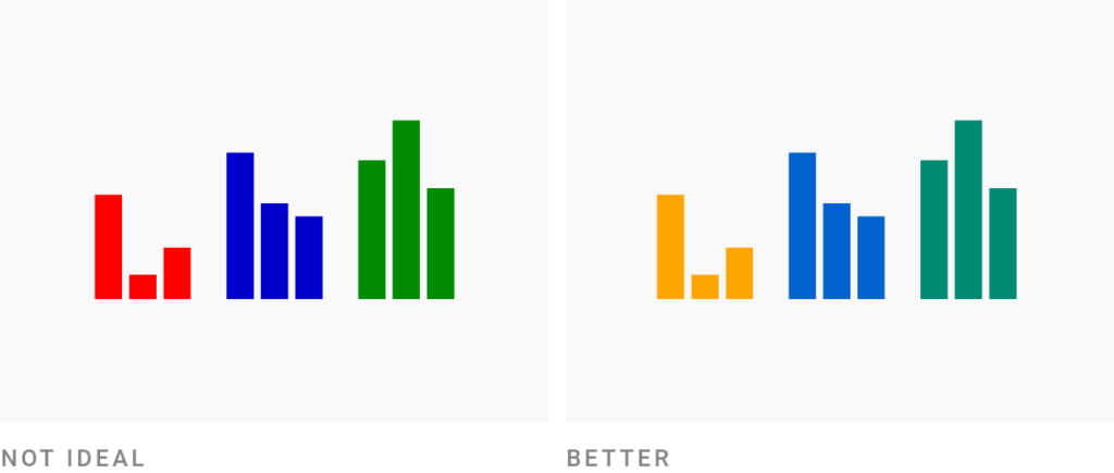
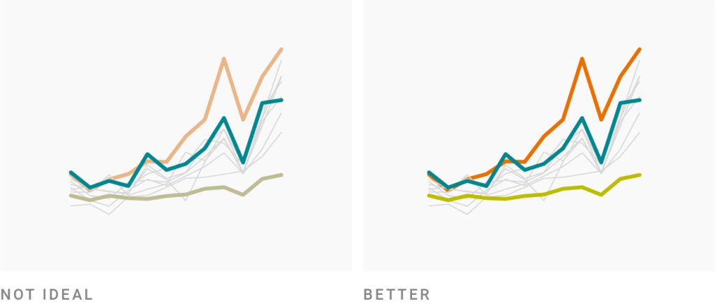
I sometimes see charts — especially area charts — where neighboring elements have the same lightness. You can easily check this: Just convert your colors to black & white (e.g., with an external colorblindness simulator or with our Datawrapper colorblind check). If they all have the same gray, they’re the same lightness.
For example, the ⬤⬤⬤ from the far left chart look like ⬤⬤⬤ in grayscale.
To avoid that dull and eye-hurting experience, you have two options:
I highly recommend the first option (you can still put a white border around it if you like the style): The colors will look more dynamic, and colorblind people will thank you. Actually, everyone will thank you, regardless of their color-seeing abilities.
In fact, a valid way to pick colors for categorical data is to pick colors from gradients like these ones:
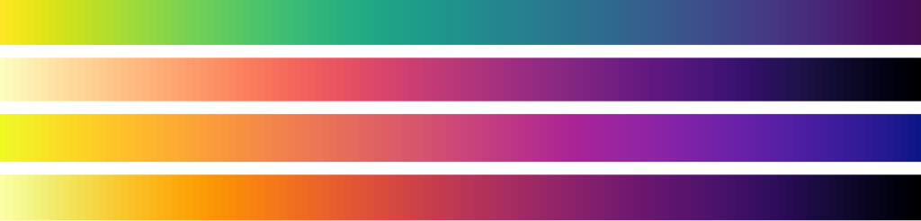
All these gradients move smoothly from light to dark, so colors you pick from there will all have a different lightness: ⬤⬤⬤⬤⬤ or ⬤⬤⬤⬤⬤. Try this Color Palette Generator if you’re a fan of that approach.
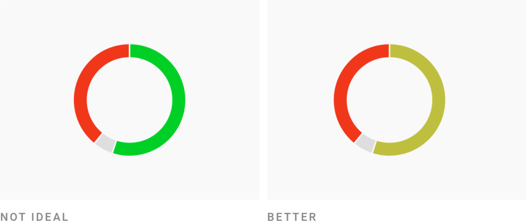
In your visualizations, you often want colors to stand out. There are different ways to achieve that. Colors stand out:
But you usually just want one or two colors to stand out. Most of your colors are supposed to be more or less equally attention-grabbing.
If you’re using colors with different lightness (“Get it right in black & white”), you’ll need to balance them out. Try to desaturate bright colors. Put more saturation in dark colors.
Or choose a less pure hue: in the image above, the green ⬤ and blue ⬤ are very pure, so I darkened them. (Here’s how they look with 100% brightness: ⬤⬤.)
I then wanted to bring a red in… but the bright red would have been too intense as a pure hue (at 0°) ⬤⬤⬤. So I had two options:
I chose the second option to make it look a bit more friendly. But both options work.

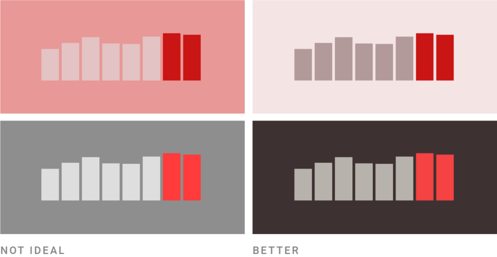
A surprising number of charts on bright backgrounds use very pastel-ish colors. They’re often not very saturated, and awfully light.
That comes with problems: If you work with small areas like lines and dots, light and desaturated colors can be hard for your readers to distinguish. But even if legibility is not an issue — e.g. for bigger areas — your visualizations should have enough visual contrast with the background to confidently communicate: “Hey, I’m here, and I have something to say.”
Here’s what to do when your colors are too desaturated and light ⬤⬤⬤:
Of course, that’s also a matter of taste. But if you’re not sure if your colors are too pastel-ish, simply try to make them more saturated and darker. Just see how it feels. And if it feels good, keep it.

The opposite is true, too: Don’t make your colors too dark and saturated when you’re using a bright background. If in doubt, try it out. Make your colors lighter, pull some saturation out of them and see how it feels.
Once you become more confident with colors, colorful backgrounds can seem like a good idea. But they come with two big drawbacks: First, they easily distract from your data. Second, they’re limiting your potential color palette and are therefore hard to work with. In fact, the more saturated your background, the harder it gets — so desaturated colors are your best bet. Here are some rules of thumbs for the HSB/HSV color space:
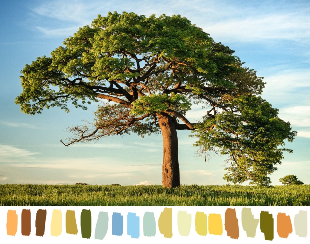
Picking good colors is hard. It’s totally ok to be bad with colors, to keep being bad with colors, and to just copy colors. Seriously, there’s no shame in stealing. I wrote a whole article about where to get inspiration for colors: From movies, artists, color palettes others have created, etc. (And may I add: Other data visualizations are an excellent source.)
If you do want to build a better intuitive understanding of which colors fit well together, try this: Analyze them. Some ways to do that include:
Also, the next time you’re creating a data visualization and you’re not happy with your colors, analyze them in the HSV/HSB color space, e.g., with colorizer.org:
With time, your understanding will move from “that’s beautiful, but I don’t know why” to “that’s beautiful, because…” And you’ll find that you can break more and more of these rules I explained here — and still create great color combinations.
I hope this article was helpful! If you want to continue reading: There are quite some articles on this blog about color, e.g. about colors for gender, colors for political parties, colorblindness (part 1, 2, 3), and what to consider in general when using colors in your visualizations. If there’s a great trick this article is missing, let me know at lisa@datawrapper.de or in the comments below.
Comments