

The world could be your oyster, but it depends on your passport
October 10th, 2024
4 min
This article is brought to you by Datawrapper, a data visualization tool for creating charts, maps, and tables. Learn more.
Hi, it’s Rose. I write for Datawrapper’s blog, and I edit every Thursday’s installment of the Weekly Chart series. This one marks a pretty big milestone!
In November 2017, my colleague Lisa published a short post on this blog. There was dot plot about Germany’s aging population, a few paragraphs discussing how she’d designed it, and an announcement: every week from now on there’d be a new post in a similar format. Call it a “Weekly Chart.”
Three hundred weeks later, the Weekly Chart is still going strong! Over the past five and a half years, it’s become a forum for all our colleagues — from backend developers to office managers to design interns — to create visualizations, use the tool they build, and share their interests with each other and with you. To celebrate this milestone, this week I’m taking a look back at what they’ve made.
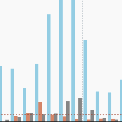
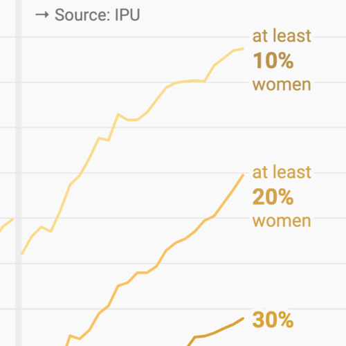
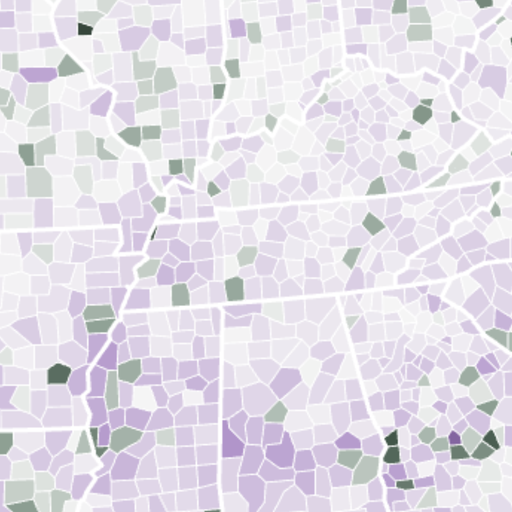
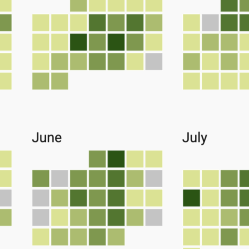
It’s interesting to compare this history to the overall usage of each Datawrapper chart type. Like our users, we love the line chart, choropleth map, and table. (In fact, this strip plot-style visualization is really a table using our heatmap feature.) And some chart types don't get much love from either group: donut, grouped bar, and multiple pie charts have only shown up in one Weekly Chart each, and the election donut is still waiting for its moment.
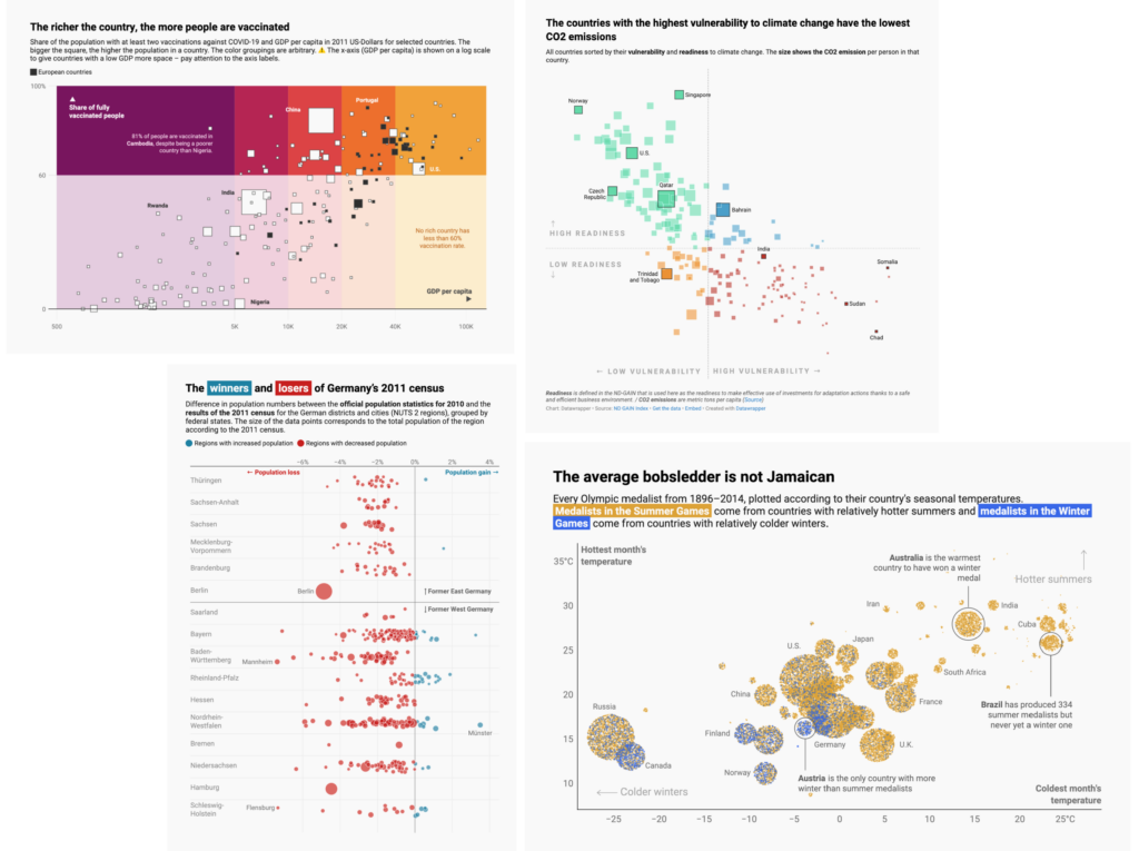
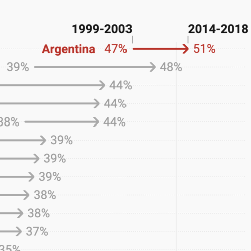
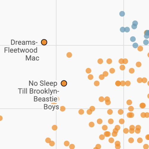
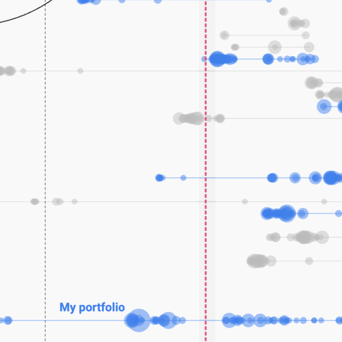
Less like our users, we’re also massive fans of the scatterplot. We've used it for relatively conventional purposes:
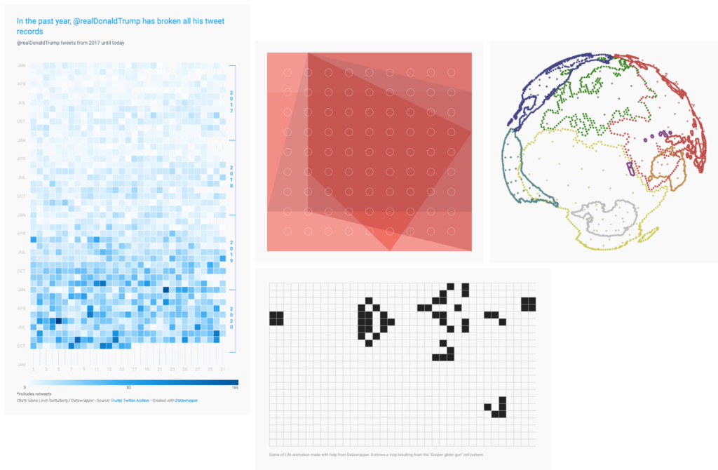
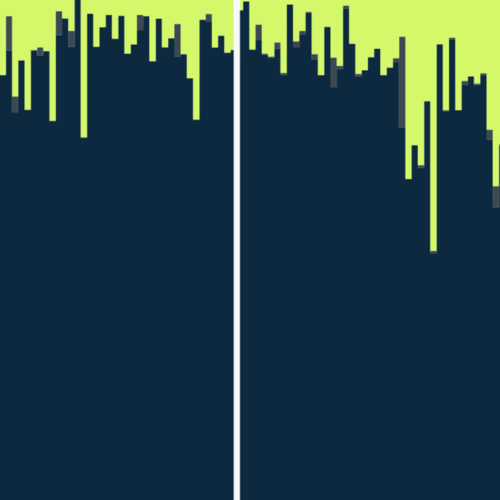
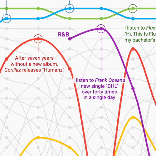
But we've also stretched and twisted the chart type, making visualizations that few people would recognize as scatterplots:
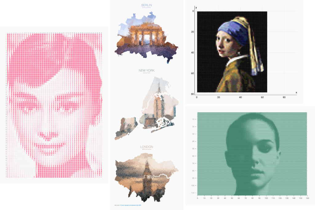
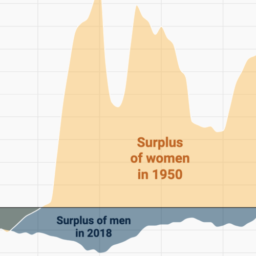
In this area Elana deserves a special shoutout. She's taken "chart art" to its limits:
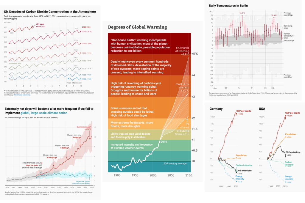
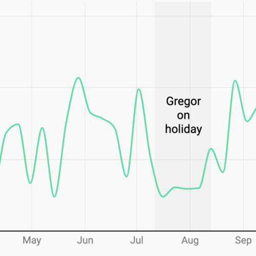
As the Weekly Chart's editor, I get a sense of how different writers draw their inspiration from different places. Besides Elana's chart art, I know I can count on Anna for a fascinating historical anecdote and that Margaux is not afraid to get out there and collect her data by hand. If it's Jakub's turn, we might get some original opinion polling, and Gregor is likely to provide some sobering climate data:
It's not easy to sort every Weekly Chart into one of these categories, but I gave it a try. Not surprisingly, my I-give-up "other" category was the most common — and that was especially true in the early days of the series. As we've hit our stride, topical subjects (related to a current news story, event, or time of year) have gotten more common, as have posts inspired by our personal lives.
How else has the series changed over time? In the first year and a half, it was pretty much a solo project: Lisa wrote 75 out of the first 85 Weekly Charts! And those early posts tended to stick to the one chart + discussion formula. Since the Weekly Chart became a group effort in June 2019, there's been more time for contributing longer, research-heavy pieces.
I had a lot of fun looking through the Weekly Chart archive this week, and one of the things I enjoyed was seeing how the same idea occurs to different people — and how they make something completely different of it. I put together a few Weekly Chart "playlists" so you can see these recurring themes as well.


Do you have a favorite Weekly Chart? Write us in the comments! Next week we'll continue with the 301st installment.


Comments